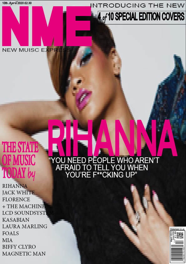
Category: Preliminary Print Tasks

My Tour Poster

Below I have done some research on folk music tour posters/album covers, for my product I am aiming to design a Conventional tour poster, but also keeping a unique perspective. By looking at different tour posters I have been able to deconstruct ideas to use:

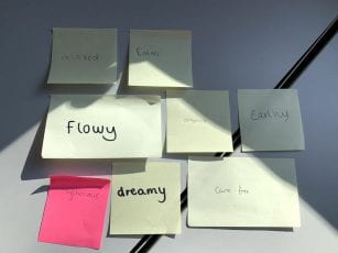
Fonts- Fonts have impact on the audience and also display the genre, by the genre being folk I think bold writing will have a good effect due to the fact it’s simple and clear, however, the ‘pacifico’ font will be useful since it is flowly creating a relaxing atmosphere for the reader, although it needs to be kept to a limited use.

Colour- Through researching I have been able to depict that pastel colours are most common as they signify a calm mood.

Overall the tour posters are portraying a organic image for the audience with a use of limited writing which gives off a stronger effect.

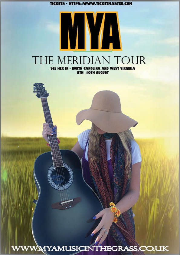
Above I have created a tour poster including the image I captured and the genre ‘Folk’. By using indesign and photoshop I have been able to cut and develop my image in ways I want, but also keeping in mind what is most appealing to my target audience. When creating my tour poster I kept in mind the slideshow I included above to help portray my ideas.

Please click on the image to see a clearer copy.


My Magazine Front Page Swede

The first photo displays my attempt at a mock-up page for a front cover magazine.  The task assigned was; we were given various different music magazines from NME to copy in their style.  By doing this task I learnt how to use Adobe INDESIGN, which has many useful factors that I will take into consideration when producing my magazine. One important skill I have learnt is the placement, size, width, and colour of text. Also another skill I have learnt is how to showcase the main cover star, which happens to be Rihanna, while also giving the masterhead plenty of attention.

In my attempt:

3 strengths:

  • All writing is located in correct area
  • Changing the colour on texts
  • Placement of the text

3 weaknesses

  • Proof reading
  • clarity of images
  • Space between letters

Getting a photo was difficult due to the fact I couldn’t find the same one, so I had to improvise eventhough the photo was grainy. I have noticed their are lots of little differences, for example the fonts, however these were hard to find.

Targets:

  • Proof reading
  • Clarity of images
  • Colour of text when in front of image (ie- not black text on a black background.)

Youtube clips which could benefit in improving my targets:


The Camera Talks

Below is a canvas created from our photoshoot with various photos displaying different distance angle and narrative.

So we were able to get different angles and denotations, such as the photo portraying subtle, emotion in a midshot however, we need to spend more time correcting the focus and lighting. We were able to achieve a low standard of our goal but need to develop our photos better. Although connotations and denotations can be made, which is a key factor needed.This will help for our magazine because we want to be able to also send the message through the photo so it can widen our audience.

Technical Camera Terms

We explored a camera; and the focal length and shutter speed, Slow shutter speeds allow more light into the camera sensor and are used for low-light and night photography, while fast shutter speeds help to freeze motion. Aperture – a hole within a lens, through which light travels into the camera body. The larger the hole, the more light passes to the camera sensor. We learnt the easy ways to take photos matching the details needed. The basic information is aperture is to do with the light whereas shutter speed is about how quick the photo is taken, and this helps depending when your taking photos. For example; a sporting event would want quick shutter speed, because you need to be able to capture the images quickly. However, if you were taking a photo of a flower the aperture would be important as the focus and light would need to be kept in mind to take the perfect photo.

Above our the pictures we captured while keeping in mind about the distance and angle to communicate a narrative to the audience. Each photo has their own story.

My image that uses mise-en-scene to communicate meaning.

Here we got the genre “Folk” and created a mood board which we linked to Mise-En-Scene. We linked it to it’s stereotype as well, creating a authentic and simplistic image. The conventions made it easier and quicker to develop our production.

Made with Padlet
So from our mood board we then dressed someone up relating the costume to our ideas and got the class to add words they thought would fit the vibe and image they are seeing.This made it clear to us what image we were presenting to the audience.
So below are the thoughts from the class which include; flowy, dreamy, calm, organic ect. This worked well because it fit with the image we were aiming to present. Next we began our photo shoot:
Below I have deconstructed the pictures from our photo shoot;
So the research and audience feedback has confirmed the image we wanted to portray has been portrayed and the correct connotations can be made. Which helps us to now concentrate on the details to improve our product fro the magazine. Knowing how the audience depict our product helps us develop and improve further and on specific details such as stance and pose, as well as keeping in mind Mise-En-Scene.
Above being our final shot.

Print Media that Communicates Meaning

The denotations (things) all have connotations (meanings). So below is an example of how I have decoded  and deconstructed the signs and symbols of the poster. While doing this you need to keep in mind of ‘MES‘ which is; colour, location, costume, makeup, hair, props, and lighting and this is reflected throughout the magazine.

This will also have an impact on my own work as I will need to think about the production of my magazine and how to develop it, and how to grab the attention of the audience.