Critical Reflection Essay
ADELAIDE ALLEN
Critical Reflection on Component 3
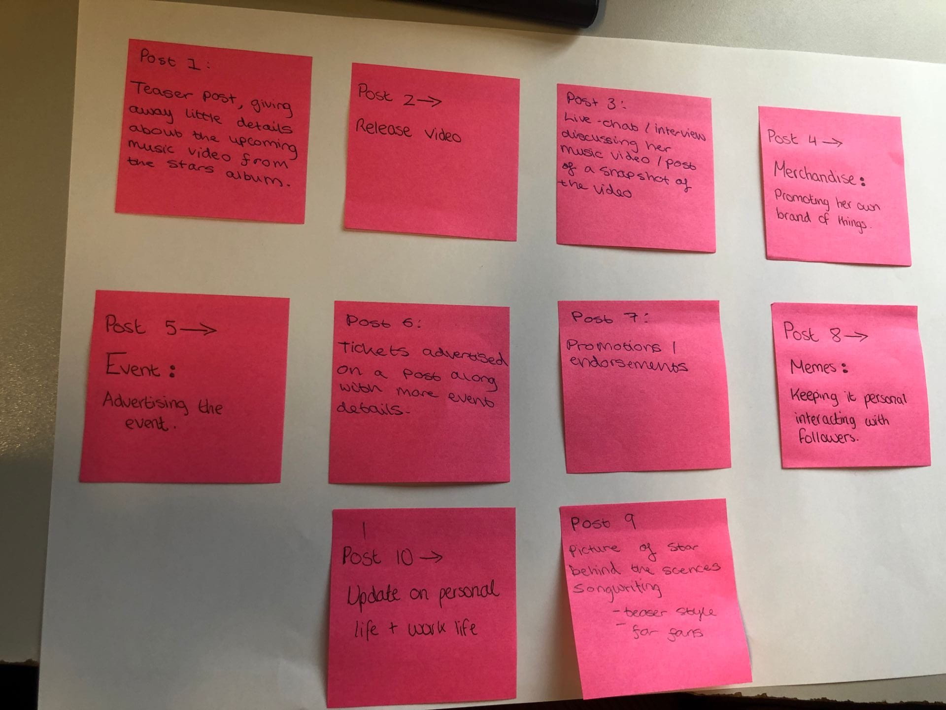
COMPONENT 3 BRIEF COMPLETED:
A promotion package for the release of an album, to include:
-
a music video (major task)
-
a social media page (minor task)
-
a digipak (minor task)
Table of Contents
- How do the elements of your production work together to create a sense of ‘branding’?
- How did your research inform your products and the way they use or challenge conventions?
- How do your products represent social groups or issues?
- How do your products engage with the audience?
 A brand is the main impression the audience will see, it needs to be easily recognisable so the producer will need to work hard on making all of the products one, and blended together. Being a producer you want to be able to encode the ideologies for your audience to decode through branding – which Hall would agree it will result in a preferred reading for the audience.
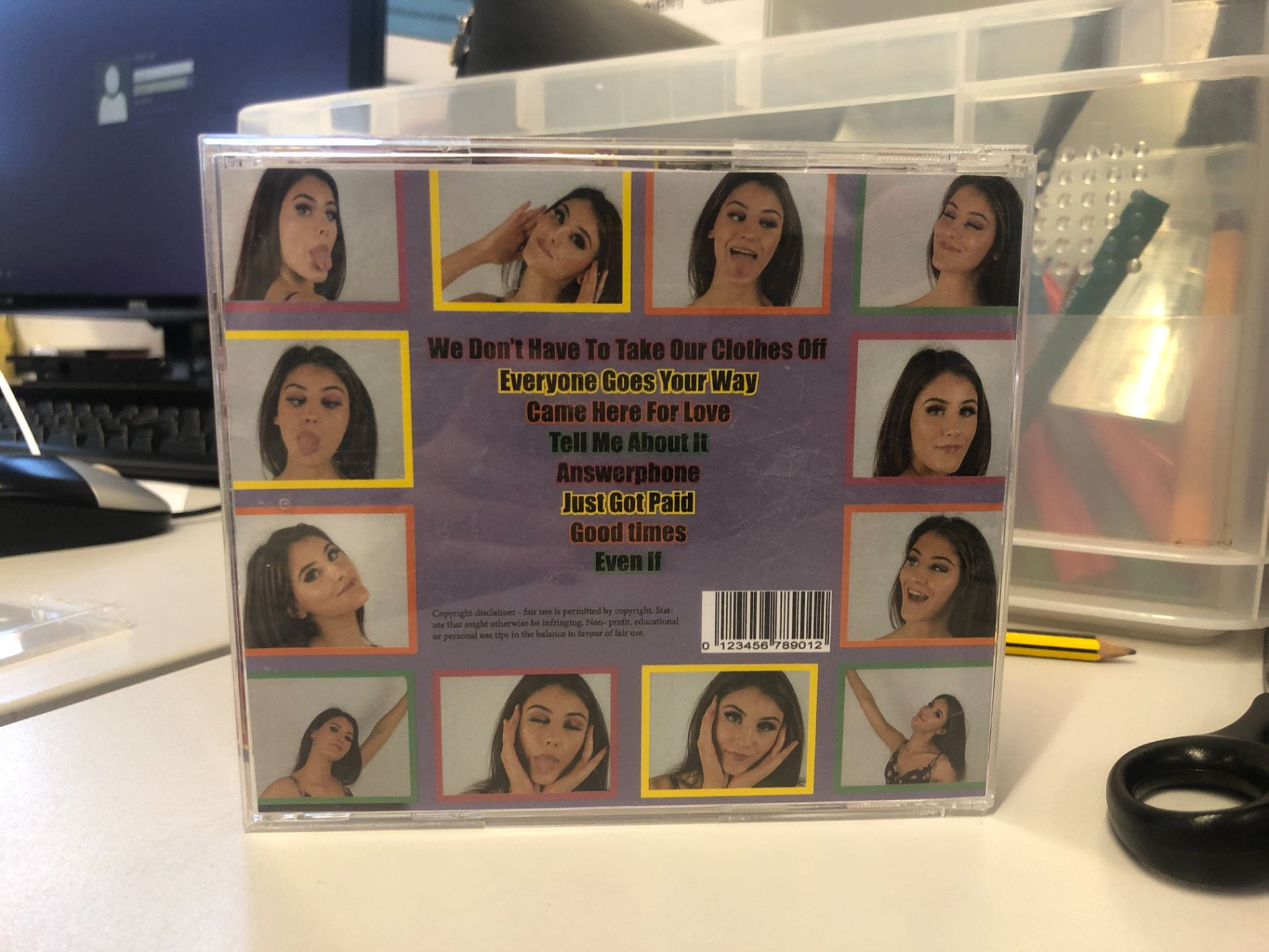
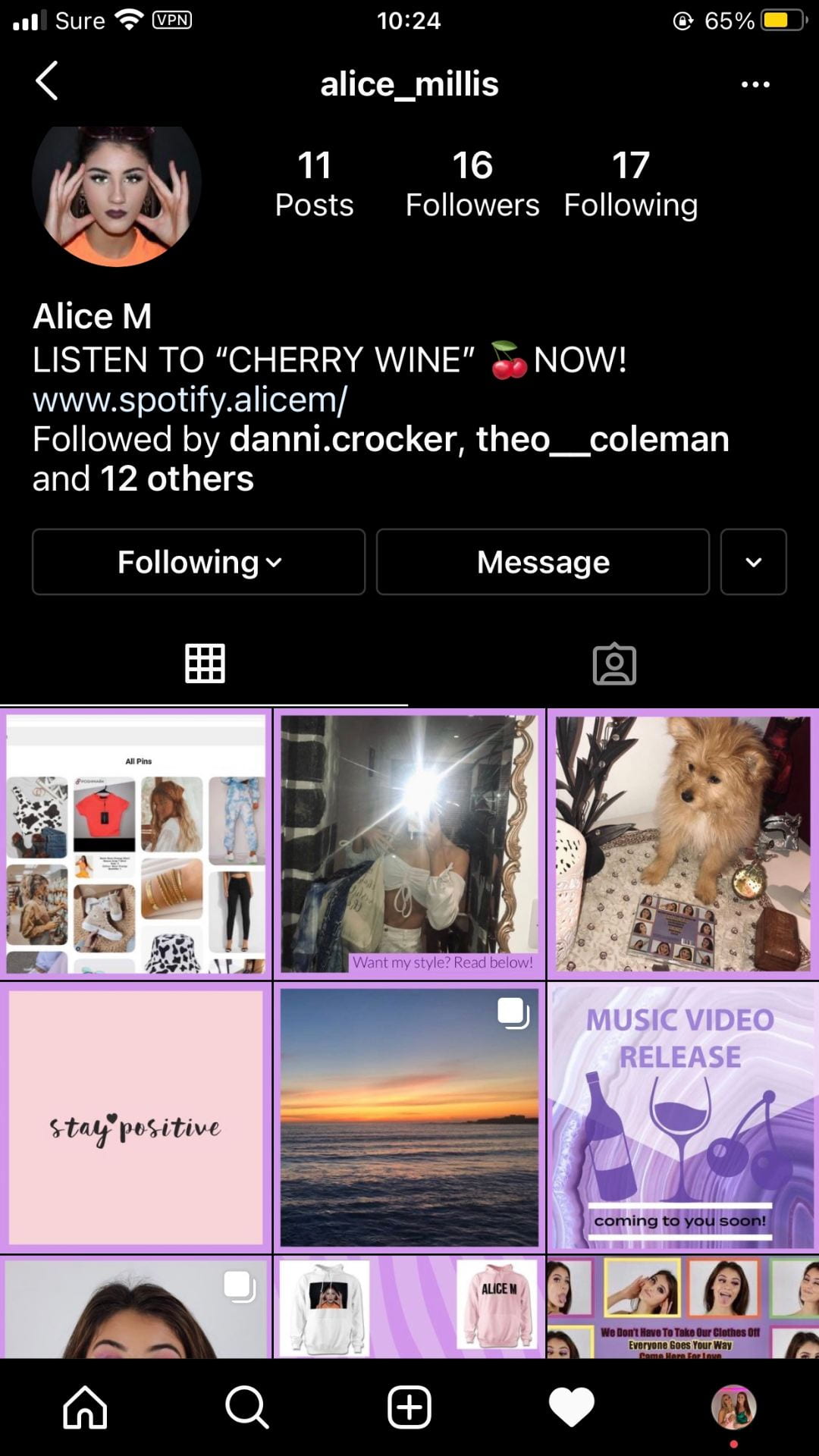
The mission statement of our artist included key descriptions including ‘fun, independent, strong’. All of the products in the package work together to encourage a preferred reading which de Saussure would describe as using clear denotations that have relevant connotations – the signifier and the signified. For example the colour palette; purple, orange, green, within each product is bright and vibrant. 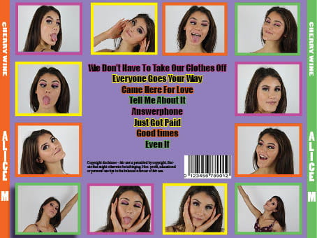 The social media page was made clear when the various posts were brought together to see Dyer’s idea of extraordinary and ordinary like how she does everyday hobbies. The SMP helped display a clear sense of branding to the audience. Each product contributes towards building the sense of branding and paradox of the star which is conveyed to the audience.
For example the elements of the star’s metanarrative that my target audience would expect  to see were the representations of the idea of confidence and strength with a mellow, fun outlook. This was evident in all of the products – a naturalistic music video conveyed in a calming, serious way. Meanwhile, in the DP, this was somewhat juxtaposed by symbolically representing her as powerful with a serious look on the front cover while breaking the 4th wall, as well as conveying her as fun with photobooth images on the back cover. The paradox of the star with her both being ordinary and extraordinary are clear to see in the branding. The semic codes of the thoughtful expression in one of the images and the cultural code of the rural setting are all examples of what Barthes would term the narrative code. Our audience should be able to decode the idea that whilst she is an extraordinary character living life as a celebrity she is also just like any person with similar emotions and thoughts. These two products were heavily promoted on the SMP where the fan base would expect to be teased and tempted to follow her exploits and also feel involved in the promotion of her album and music video. Throughout the posts it’s updating them on the products and creating the sense of branding. Having an overall mission statement that stated she was fun and confident really helped me design the overall brand which was represented with a conventionally vibrant colour palette, signifying a conventional metanarrative of a fun, outgoing, bold, and confident pop star, with the idea of being yourself and loving yourself.
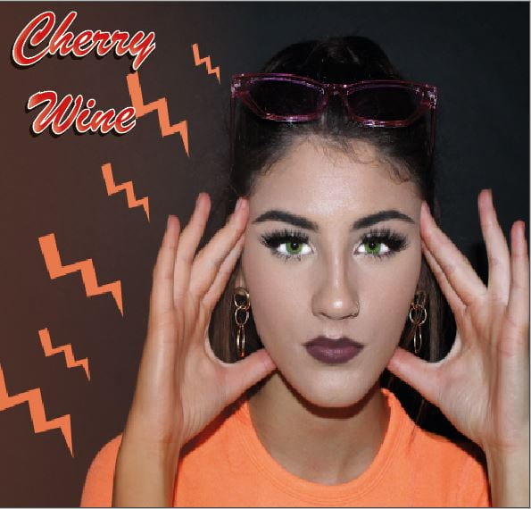
 We included Lacey’s idea about the repertoire of elements – those expected ingredients that our target audience would expect to see. And Altman would argue, and as a result of understanding that a blueprint was apparent for all genres, we researched the conventionally recognisable features for an R&B music video. We understood they were mainly narrative videos, with vibrant colours, and urban settings, and also used conventional Mise En Scene of bright costumes of contemporary high street fashion –like blue, orange, yellow, coloured makeup, big eyelashes, urban settings chosen; such as the bowling alley, areas in town, graffiti wall.
  The urban areas are our chosen background setting; therefore meaning we stuck to conventional locations like alleyways, abandoned places. In particular we watched ‘Gravity’ by Ella Eyre and decided to use some of the generic conventions of MES like the vibrant colours to connote a happy, fun vibe, while also presenting the star with passion and enthusiasm by using close ups to convey her facial expressions, that in detail showed her sincerity. We did this by adding various shots of her laughing and adding colour.
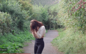
In our production I used the conventions of a narrative and performance video. We felt that creating a more performanced based narrative would spike the audience’s interest to listen to the meaning behind the song, while also challenging Hall and his idea that 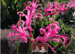 the audience only want their preferred reading. We used a narrative showing a girl stuck in a judgemental society full of expectations. However in our narrative the girl is upset by society, and through nature and having an outside perspective understands she doesn’t need to follow societies ‘rules’ and doesn’t need to care what people think. Long shots were used to show her immersed in the woodland, and close ups of her smelling a rose. It’s conventional for the song to be filmed this way because the song is slow so fast camera edits aren’t conventional. This style of filming fitted with the generic conventions of the R&B genre that has dissolving transitions, and longer takes. Having a narrative is another example of what Lacey would call a repertoire of elements, as for many genre’s a narrative is expected.
We were hoping to give the audience an authentic perspective of the star, this was highlighted when creating all the products to achieve a successful package.
Our star is known for their outgoing, fun, bold, inspirational personality and as such their meta narrative is one that displays her strong, passionate nature and evidences the extraordinary aspect of Dyer’s paradox of the star. The symbolism of nature within the video conveys how nature brings peace and beauty. On the digi pack Flowers were used as a visual metaphor to convey the star through the elements people associate with them, this follows Barthes symbolic code. They symbolise beauty.
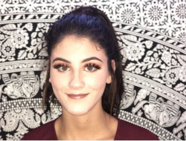
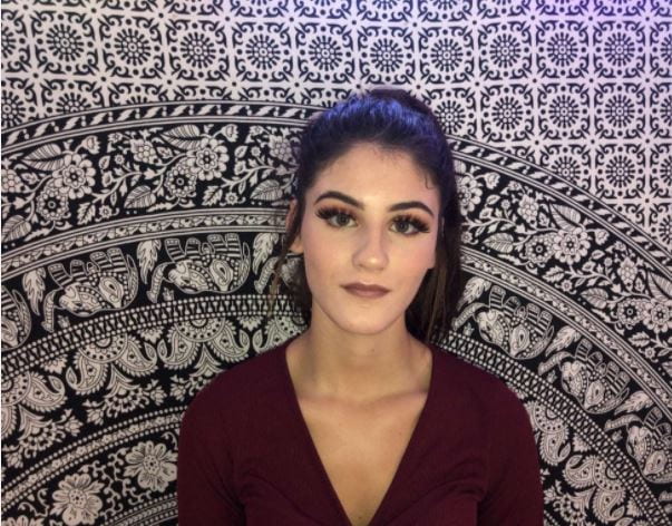
I wanted to represent her on the DP as an independent, confident star, who is also fun and free, so we aimed to portray her the same way but just exaggerate for the media. I took photos of her in high key lighting, displaying different sides of her personality like serious and fun, something that Dyer would term as a paradox of the star. This way we can include the ordinary and extraordinary. This also helped represent her as more down to earth and friendly which will benefit the star, as her audience may look up to her in a more realistic way, which highlights the Dyer idea of being present.
A main point we looked at when creating our product was colour. Following Barthes semic code, and one the audience would decode as signifiers of positivity and energy. With colour we wanted to be able to encode her personality within; for example using bright vibrant colours like purple and orange presents the star in an unaggressive manner, and reflects a fun, active mood for the album.
We used flowers to represent her and the album; for example her mental state being mellow and relaxed, and the freedom nature brings. Presenting the star as ordinary in the back cover photos it evidences the paradox of the star. In the cover photo she breaks the 4th wall by staring straight at the audience, presenting her as intense, but also connecting her to her fans.
Engaging the audience is the main aim for any marketing, advertising campaign. Success relies on the audience being fully connected and invested in the product.
The Social media page is full of opportunities to engage the fans of Alice M. For example, having fashion favourites with a pinterest. As Hall describes, encoding the media text with the expected signs and symbols is vital for the target audience to decode it and have a preferred reading of the text. For example, having a post with her dog, helps the audience relate to her on a personal level, by representing her as ordinary. Through this she was able to interact with the audience, by replying to a comment about her volunteering. The star couples up with Bershka which displays how the star synergises through the SMP. Through cross media convergence on the radio it has protected her products, and herself personally. Also we used integrated advertising in order to maximise the number of platforms that the star can be promoted through.
When creating the SMP we were aware of Hall’s theory by catering to our audience’s preferred reading; by encoding posts for the audience to decode. For example creating a post included with her dog, it adds in extra information but also on a personal level, as then she interacted with fans in the comments about relatable issues.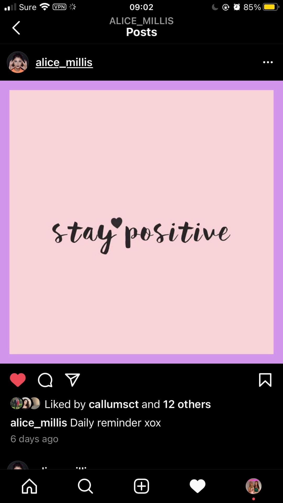 By researching the demographics of the audience it meant being able to engage them was made easy. Evidencing the idea of ordinary – paradox of the star.
Our SMP was entertaining, informative, provided opps for social interaction and reaffirming the personal identity of the fan, which is something B and K argued was essential for successful engagement with the media.
For example, fans can interact on the page by commenting on posts or privately messaging the star. There was also a link to a merchandise page that enables the fans to feel included and in particular wear the fashion associated with the star, as linked in with a pinterest board.  This evidence blumler and Katz uses and gratification of social interaction. It was also important that the page had all the relevant information and entertainment for the fans to feel fulfilled so I included tour dates, teasers for the digi pack release, and in particular personal photos and information for the audience to be able to relate to and be inspired by. Blumler and Katz Uses and Gratification are key here in entertaining and personal identity through the images portrayed. Having a post saying stay positive helps the audience relate to the ideologies of the star who may not always have a good day just like any person. All of these examples of the SMP were directly crafted and produced to maximise hits, clicks, likes, reviews and comments by the target audience. We are also focusing on our captions, making them seem personal while also including hashtags to help enhance our reach. Evidencing the uses and gratification as her personal identity is shown the most through the SMP, while we also aimed to entertain and inform.