MY TOUR POSTER

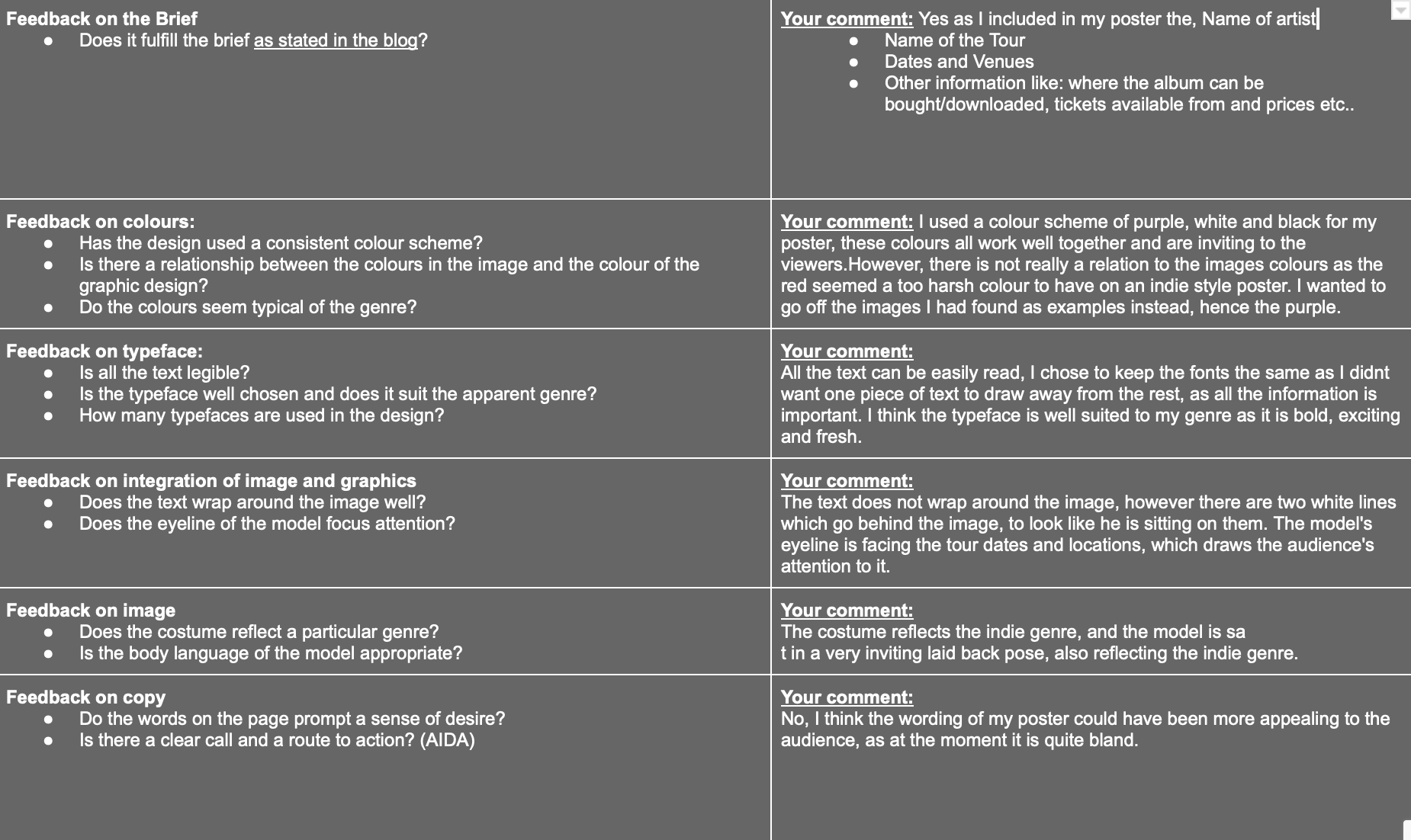
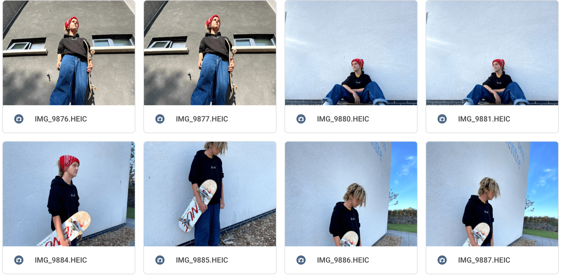
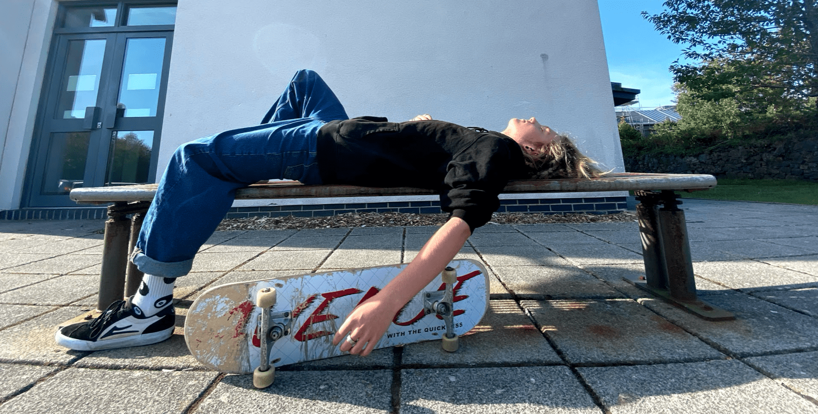
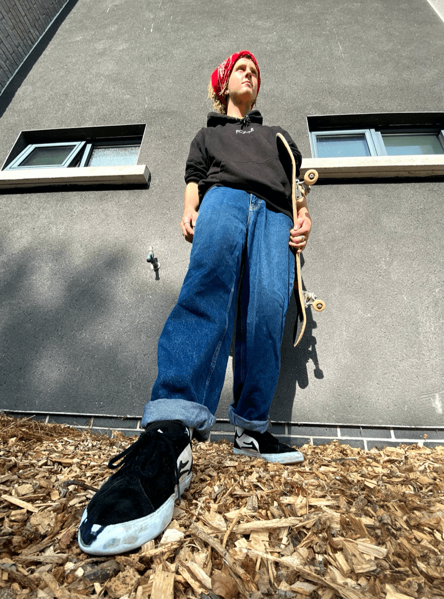
For this task we were asked to create a tour poster using the images taken a few weeks previous. We had already looked into the Mise en Scene of the image, so our core focus on this task was to get the tour poster looking authentic and using all the aspects of the genre, by especially using AIDA-

  • Attention 
  • Interest
  • Desire 
  • Action

In order to do this, I created a mood board showing examples of the indie pop genre’s tour posters. 

While creating my poster, I will look into fonts, colours, wording, placing and the general aesthetic of the posters. For example, most indie style posters I have seen, have purple backgrounds, this is a very inviting colour and looks mystical and vibrant. I want the typography to be simple yet effective, clear for the reader but relatable to the genre.

Below you can see my first attempt at using Photoshop and InDesign to create a tour poster. Despite the images being of a lower resolution and the poster not turning out quite how I would of wanted, I think my tour poster looks similar to those of which in my Mood board.

This was also only a first attempt, I hope to further my skills on using these apps. The task will help me in future with my final Music magazine front cover as I now know how to analyse the fonts etc.. but also how to create a poster using InDesign and Photoshop.

Please click on image to see PDF

THE CAMERA TALKS

After being allocated in a group of three with Max and Amber, we set off to take images around the school, focusing on the use distance, angle and framing to show how the camera can make meaning. As you can see in the contact strips, at first we struggled getting the correct exposure to set the mood of the images that we desired. However, eventually we started to have a better understanding on this.


After taking close to 150 images, we varied from the angles high, low, close up and far away. This is not just the only thing that creates a story in the image. The Mise en scene must match the angle of which the photo is being taken at. For example, if you are wanting to create an image that portrays loneliness, having the model being the sole person centred in a shot from far away, it will immediately give the consumer the feel that the model is very much isolated and alone.

Here you can see a collage of our top 8 photos that we took during the shoot. It shows a varied range of:

  • Facial expressions
  • Colour
  • Body language
  • Proxemics
  • Pose

One of the most powerful images was where the model has do not enter tape up to his face, and the shot was taken close up. We wanted to show a character that had been forced into a dark life, when in reality he wants to live it otherwise. The fact the model is behind the do not enter tape shows he is on the wrong side of the rules, and his facial expressions looking numb yet the eyes staring straight into the  camera really portrays the story. We were able to create this story by using Mise en Scene, and being creative with the angles used.

From this photoshoot, I have learned that you can create a story through an image. Each shot should be thought out, instead of being random, the more you tell a story, the increase in interest of the audience. I will use this while in my photoshoot for the Music magazine, I will ensure that I use Mise en scene and angles to create to the best of my ability a front cover that not only is eye catching and striking, but gives the reader na insight into the models life


MY IMAGE THAT USES MISE EN SCENE TO COMMUNICATE MEANING

In a group with Toby and Lils, we created a mood board that we thought represents the music genre ‘Indie’ which we were allocated by lucky dip. Initially, when I thought of Indie, it came to mind laid back and welcoming, however after looking more into the genre I came to realise its quirky and alternative as-well as this.

Using Mise en Scene we had to decide what to dress our model in to represent someone ‘Indie’, including:

  • Costumes
  • Hair
  • Makeup
  • Body language
  • Pose
  • Facial expressions
  • Colour
  • Lighting
  • Props

From this we have learnt that, an Indie performers star image should look inviting and not too extravagant, its very sensitive and reserved. They normally style themselves in oversized clothing such as baggy jeans and jumpers, with layered chains, necklaces and rings. This controversially looks like the ‘skater style’. Which is unlike most genres which are very out there and staged.

We also looked into the angles that Indie stars use, commonly using a wide lens from lower angles. These full body shots, creates an illusion and shows the quirkiness of the Indie style.


Below, you can see the post it photo showing the classes views on the Mise en scene of our images. They each had to describe in one word, what they thought the vibe was of our model.

  • Laid back
  • Friendly
  • Chilled
  • Relaxed
  • Vibey
  • Casual
  • Reserved


Here you can see our top three images, we thought these best reflected the genre indie. Our model was dressed in baggy denim jeans, an oversized hoodie, skater shoes and a red bandana (in some images), we wanted to really emphasise the casual and laid back vibe of indie stars, this is because while decoding a genre, you have to find connotations, and these two are very significant to the genre.

From this task, I have learnt several different things. One being using a mood board can be extremely useful, especially while trying to get a better understanding at using Mise en scene to the fullest, but also while decoding a genre. Although, everyone used slightly different styles on the mood board, this actually ended up increasing our knowledge on the genre and we were able to see everything from other peoples perspectives. Now, with a full understanding the full importance of MES, I shall use this while planning and creating my music magazine. However, also choosing the final photo as this is critical, in order to create the most relatable image to the chosen genre.

TOUR POSTER ANALYSIS

After looking at several different music posters, it has really enhanced to me the importance of appealing you’re media to the appropriate audience. For example, a poster promoting classical music would not be written in large robotic fonts, to fit the style of music, the font should be flowing and give off an old school, almost wealthy feel.

Below, I analysed this poster from the artist Duo Lipa’s, Hotter than Hell tour. Looking at the:

  • Body language
  • Colour
  • Language
  • Font
  • Costume
  • Ect..

After looking thoroughly at this poster, I’ve come to terms that while in my music magazine cover. It isn’t as simple as embedding a photo onto a piece of paper, you have to take into consideration several different aspects to the poster. I aspire to really utilise this, and in my poster go into small details such as  a piece of jewellery or the positioning towards the camera. As little things like this can turn media from being simple to having meaning and purpose.