Here is my emaze presentation I created which showcases my analysis of my magazine.

Here is my emaze presentation I created which showcases my analysis of my magazine.
Below is my screen castify of me going through my magazine explaining how my product will engage readers and the distribution plan.
Please click on this link if it doesn’t work
Below is my Piktochart I created which answers question 4.
Below me and a peer wrote a podcast together explain how our production skills have developed throughout this project with a target audience being year 11’s who are considering in taking A level media.


After all the hard work I have completed my first every magazine design! I have learned so much and have made amazing progression along the way. Back in September we started the preparation learning the technical key terms of magazines as well as the conventional features. We learned how to attract our target audience for a preferred reading through media language as well as the competition before we began designing. We did a practical task were I dressed up as a music star from a randomly selected genre this taught us how the use of mis-en-scene is very effective in creating a star image then we learned how the different camera angles can convey different feelings and tell a story.
We began learning the basics of indesign and photoshop by copying a magazine cover which taught me most of the basic skills I need to start designing on my own. We created a tour poster using the photos from are practical which further developed my knowledge of these software. Then we did a course on learning how to use the camera in a studio and setting up the lighting to get the best quality pictures and planned out the mise-en-scene to create a star image I wanted to portray.
Finally, after all the tasks we began the designing process which just from comparing my first draft to my final piece I am really proud of how much I have improved and I’m very happy with how it all comes together.
A magazine contains lots of different ads that companies pay a lot of money for. To complete my magazine I have chosen 2 advertisements that I think best suit my genre and my target audience demographic. My target audience is older teens to young adults so from ages of 16-21 and a majority female audience.
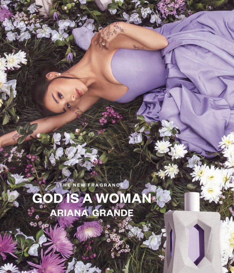
This is my first advert, it’s an advert from one of the most famous pop stars Ariana Grande which my target audience will easily recognise. The colours and atheistic match the fun girly vibe my magazine has. The product is a perfume which my target audience will really like and fits the female demographic.
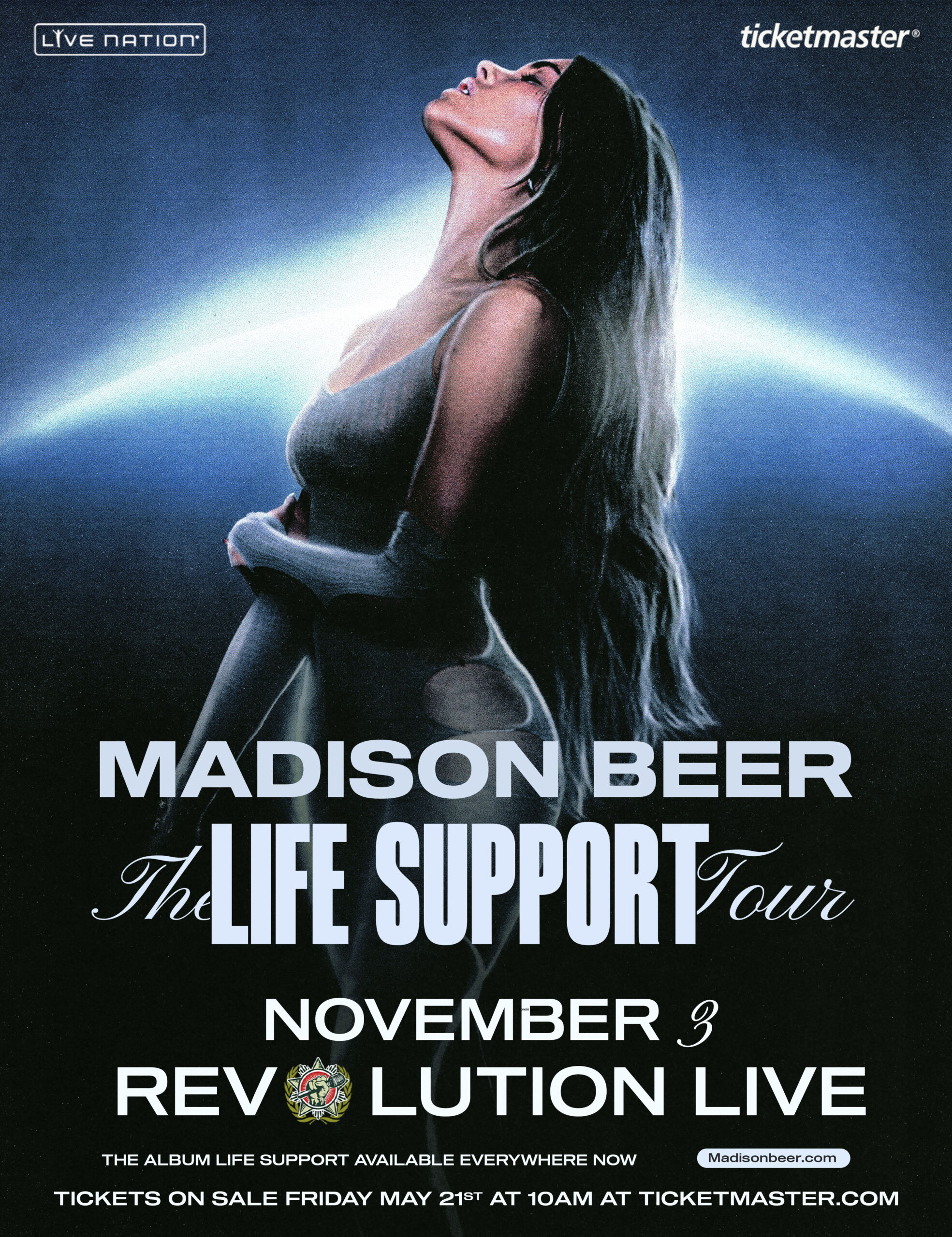
This is my second advert, it’s advertising Madison Beer’s tour. Since this is a music magazine putting a tour advert is very fitting, she also is very popular with my target audience age demographic and I did some research and found most of her fans at her concerts are female which is perfect for my magazine.
Now that I found my ads, I can do the finishing touches for my magazine and join it together.
Below are all 3 of my designs for my magazine in their 3rd draft. I have also embedded my teachers feedback below.
In summary here are the improvements my teacher recommended:
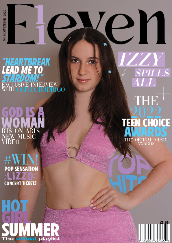
Front Cover
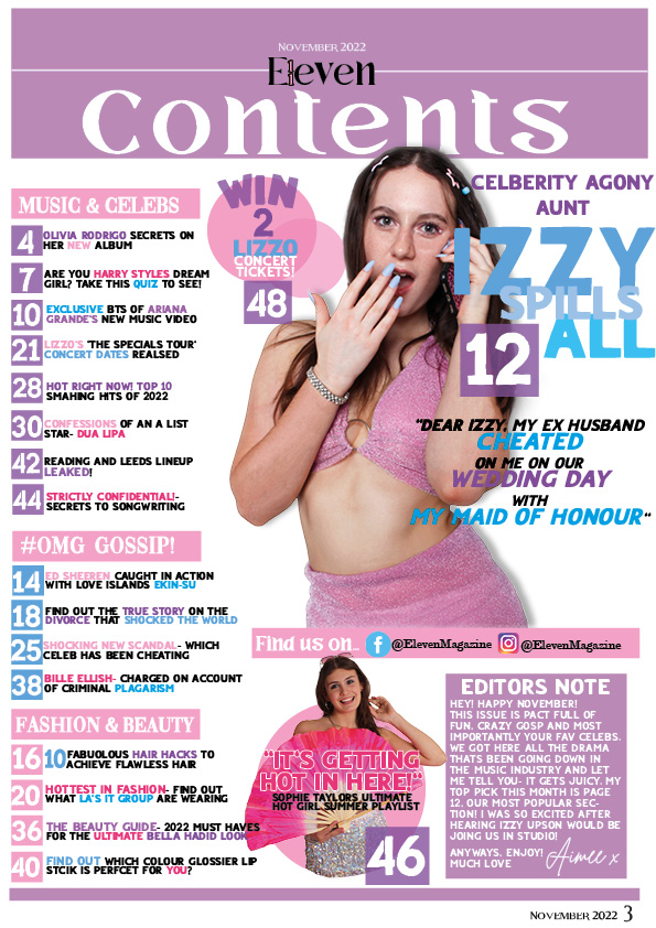
Contents Page
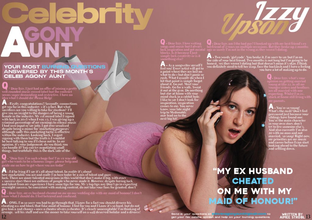
Double Page Spread
Now that I have received my feedback I will be making these final changes and adjustments to complete my first ever magazine.

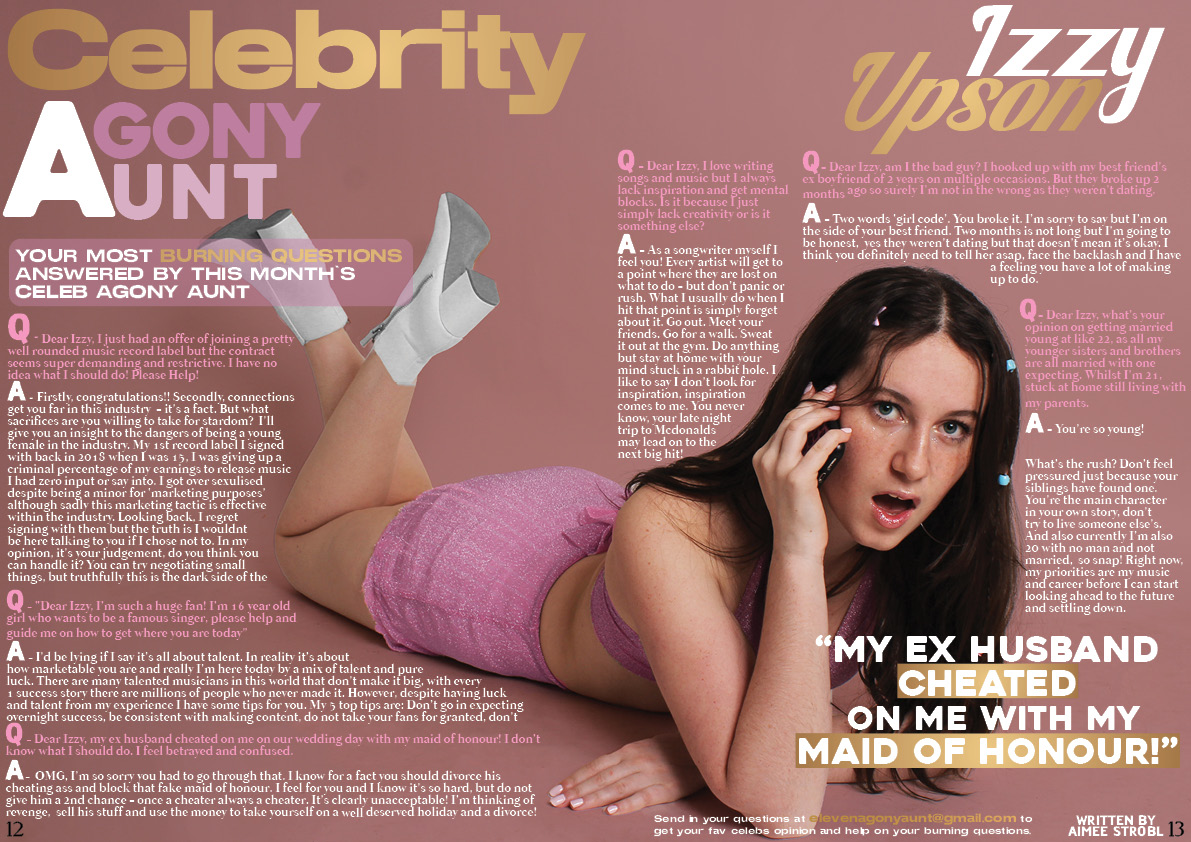
This is my second draft of my DPS, I’m loving the layout although unconventional I feel as if it’s very exciting and works well.
Whats New?
Whats Next?

Here is my 2nd draft of my contents page.
Whats New?
Whats Next?
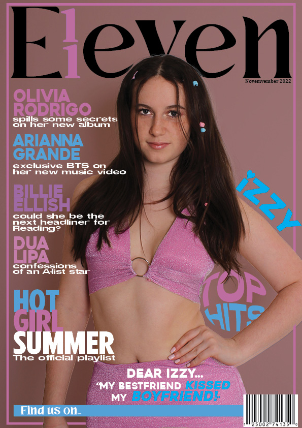
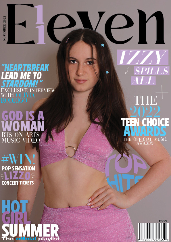
Here is my 2nd draft, I started from scratch as I wasn’t keen on my 1st draft and pretty much changed the whole cover.
Whats new?
Whats next?