Below is my Piktochart I created which answers question 4.
Category: Preliminary Print Tasks
My Tour Poster
Here I found 10 different tour posters from male and female hip-hop music artists.
AIDA (attract, interest, desire and call attention). Media producers need their product to look the same as the typical conventions of a hip-hop tour posters while also different in order to attract the right audience, interest their target audience, make sure it looks fun and worth their time (the desire to go) and finally make it stand out in order to reach a wider audience.
From observation, I have noted that they all have a black/dark background, looking contemporary, which is very conventional for the hip-hop genre as it connotes mystery and is quite intimidating like how a lot of the artists present themselves. Moreover, they all tend that have a colour pallet of red and a yellowy gold on the poster which these colours have connotations of confidence, success and creativity- mirroring their personality and the genre. Some of typeface used is very bold, blocky and modern as you can see it’s very commonly used throughout the tour posters. Conventional images are the main artists looking confident and tough creating this cool, gangster image I’ve seen whilst studying this genre. The camera angles seem to vary but majority are either mid-shots or close shots of the star.
From this I can now transfer these conventional features on the tour poster I create in order to attract, interest, call attention and give people the desire to go to the tour in order to achieve the main purpose of the media industry- to make money. I’m hoping I can successfully create a conventional yet engaging and unique tour poster with help from my research.

This is my final draft of my tour poster, I enjoyed using indesign and photoshop to create/design this tour poster, it’s really helped me get to grips on how to use certain features which will help me in the future when I use indesign and photoshop for other projects like my music magazine and digi pack. Also, I now have the knowledge of AIDA which I believe can also be transferred for when I do my magazine cover.
Here is my personal evaluation:
Feedback on the Brief
|
Your comment: Yes |
Feedback on colours:
|
Your comment: Yes, I have kept a constant colour scheme of red, black and white. I chose red as I made the image of the star red so it all matched together nicely. I made sure to have a black background as this was the most common convention I have seen in the hip-hop genre as well as the red colours I have seen used commonly. |
Feedback on typeface:
|
Your comment: I have chosen a big blocky font for the mast head and the cover line, then I chose a more graffiti-like typeface matching with the genre. I made sure the typeface was big and bold as it is very conventional in the hip-hop genre. Altogether, I used 2 fonts. One thing I could improve is that the cover lines with the states on may not be legible and are hard to read as it goes over the image which is also red, so next time I may use a different colour like yellow or outline the letters in a white. |
Feedback on integration of image and graphics
|
Your comment: I put the cover lines with the dates and locations over the image as they show important information, and then I put the image over the cover lines on the left to make sure the image/main cover star stands out. The model is looking towards the audience which also helps focus attention. |
Feedback on image
|
Your comment: The costume reflects the genre well as the body language because it shows an action in which she is holding a gun up to the audience which reflects this gangster image, and I added a bullet hole to make it seem like she has just shoot. The costume is very hip hop with the iconic backward hat, fur, aviator sunglasses and long jewellery. One thing I may change would be to switch the pearls to chains as I find chains to be more conventional to the genre. |
Feedback on copy
|
Your comment: There is a clear call and route to action on the poster as there is limited but informative language, which keeps it easy to locate information in order to make it easier to sell. With the name of the star being the biggest text on the page which makes it easily identifiable and draws attention. Maybe next time I could add some phrases to the poster to prompt more of a sense of desire like “live for the first time”. |
Feedback on connotations
|
Your comment: The ideas being communicated through the text are that it’s a gangster, cool hip-hop star and I believe the colours, costume and acting communicates this. The colours used have connotations which match the genre with red connoting the danger gangster side and the costume and acting connotes a cool, confident side. |
My Magazine Front Page Swede
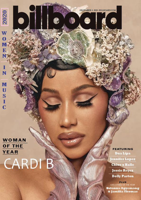

In order to learn how to use some of the features on InDesign, I picked a magazine cover and copied the technical forms and conventions used, in order to gain understanding on how they used these techniques. The top image is my attempt and the bottom one is the one I copied. From doing this, I have learned how to layout the cover lines in different ways like the “women in music” cover line. I also learned how to use the different typeface and colours trying to find the same fonts and colours used in the original (as best as I could). All magazines have conventional features, in order to achieve a preferred viewing- a magazine has to look like a magazine! The feature we can see on this particular cover are: masthead, main cover line, main cover star, plug and cover lines.
Reflecting on my work, I believe I did well on the bottom right hand side cover lines, the proportions and layout look almost the same, I managed to find very similar fonts to the original. Also, the black and white colours and when words are capitalised or in lowercase have been copied accurately. One thing that I struggled with is the purple colours, I was unable to match the colour accurately to the original, I need to learn how to mix colours and make swatches. Moreover, next time I need to make sure the photo used is at a high resolution and not blurry as the main cover star in mine is a little blurry in comparison to the original, making it look less professional.
Having the skills to use and edit on InDesign will help me when I begin to make my music magazine as well as looking closer to the time this will help me design my tour poster for my hip-hop star. I can now successfully create a masthead, cover lines, place and size an image as well as using different typeface and graphological features- all vital skills to create a successful conventional magazine cover.
In order to help me improve I’ve linked 2 video tutorial which will teach me how to make and access more colours:
The Camera Talks
As a group we went around the school taking lots of photos using different angles, framing and distances to communicate meaning and different narratives. It was really interesting learning about how the way a photo is taken can have many connotations and are able to tell a story just from the angle or distance it was shot. Underneath each photo I used a hashtag to show the camera technique, the denotation of the photo and connotation. For example for our low angle image, the denotation was a man standing at the top of the stairs but the result of the angle, framing and distance of the photo it gave connotations of power to the man in an almost sinister way making the receiver feel more vulnerable and weak in comparison feeling like there is no escape and they are cornered creating an entire narrative just from one photo.
Now, I can take everything I have learned and transfer it to when I do my future media productions like my music magazine or my social media account. I will now consider the angle I take the photo as if I wanted to convey my artist as more powerful I now know I would use a lower angle. Moreover, I now know the key terms of different types of shots and framing which will help me in the future as I can now recognise why different media producer use those techniques and I will be able to decode the connotations which will help me design my music magazine.
My image that uses mise-en-scene to communicate meaning
As a group we created a padlet mood board to represent the hip-hop genre of music, which was allocated to us, presenting different hip-hop artists, album covers, colour pallets and concert photos. With these photos underneath we annotated the mis-en-scene used in the images and analyzed what it connotes and how it represents the hip-hop genre. For example, most of the acting in the photos presents the genre as rebellious and tough due to the quite serious, gangster facial expressions. Another example, are the costumes for the men are quite street and black with pops of colour connoting a sense of fun whilst defiant. Similarly, despite hip-hop being male dominate, the women’s costumes are quite tight and revealing whilst also having pops of colour which represents them as confident and fun.

From our research, we dressed the model in an outfit which had some of the conventions of what a female hip-hop artist would dress hoping to successfully convey that to the audience. Our classmates then wrote on a post it note some words they thought he costume connoted. In the end we got 5 adjectives from our peers, these adjectives were: naughty, confident, romantic, fun and focused. Therefore, we successfully communicated the star image we aimed to achieve, the confident and rebellious side of hip-hop, as evident with the adjectives used to describe the outfit.
Our photo shoot pictures
Firstly, for the mis-en-scene of the costume we went for a bright pink and black colour theme as most hip-hop artists wear black with a bright colour. The leopard print and pink fur jacket is really bold and creates this diva image commonly seem with female hip-hop stars as well as a bright pink tube top and short skirt making it more revealing representing the confident and fun side of the genre. A lot of inspiration for the outfit came from the two most famous hip-hop artists Nikki Manaj and Cardi B. For the props, we picked out a gun as from our research this was a very conventional prop seen in hip-hop media it created this more gangster image, one improvement I would say is to find a gun the fits the colour scheme or just a black gun as the one we used isn’t the most “gangster” gun and more western. Another use of mis-en-scene was the acting and poses we made the model to have a serious, tough look holding the middle finger suggesting the naughty and rebellious side to the genre as well as pointing the gun to the camera overall connoting a deviant character.

My Chosen Photo
I chose this photo as I believe it conveys the mis-en-scene the best and represents the genre effectively. The prop of the gun and the pose of me pointing to the camera with it emphasises the gangster image, and represents a rebellious side. My facial expression comes across as focused, as if I’m targeting the viewer, but also a bit naughty as I’m slightly grinning which creates a thuggish yet cool image- mirroring the hip-hop genre. The costume is quite typical for a female hip-hop star, with bright colours mixed with black. The aviator sunglasses and the backward cap are very recognisable and arguably the most conventional hip-hop accessories along with big layered jewellery and the chunky gold hoops. I preferred this photo to the others as some of the other poses didn’t really mimic the hip-hop genre as some hand gestures looked more like rock music then hip-hop.
Overall, I enjoyed learning about how MES is so important in order to communicate meaning and to tell a story, it such a great and useful skill that I can now transfer for when I do my magazine cover in the future. For example, I will take into consideration the way my model is posing and make sure they pose in a way which conveys the meaning I want my audience to understand. Moreover, I will make sure the costume they wear is suitable to the music genre and attitude that my music star has to really communicate what type of person they are and their music genre without having it written on the poster (tell a story with an image).
A Textual Analysis of a Tour Poster
This is a textual analysis of Justin Biebers 2021 tour poster, where I decoded and deconstructed the media language in the poster. Every element of the poster was carefully chosen by the text producer to tell a narrative to their audience. As a media producer you need to be able to decipher media in able to understand how media language is used to communicate a story or an image of the artist so you can construct your own media.
A key aspect of the poster was the choice of colour they used being red. Red is a very strong and bold colour with connotations of danger and love which overall creates a very sexual atmosphere perhaps representing how Justin Bieber is no longer a little boy and is not as innocent now. This really matches his target audience being mainly teenage girls who most likely grew up along with him from when they were younger. From this I have learned that colour is very vital, and now for my music magazine I will carefully choose the colours to represent the narrative I want to communicate to my target audience, about my artists and their genre of music. Moreover, I will need to make sure that the colour I choose matches the geographic location of my target audience as colour can symbolizes something differently depending on their culture.
Furthermore, the text producer uses typeface to fit his target audience. As you can see, they use bold, blocky font which is very modern, designed to attract his younger target demographic as well it mirrors his music (also being modern). This use of media language, can also signify him as powerful and important due to the bold text. For my music magazine, I will design it so the font attracts the demographic I’m targeting. So if I was targeting a younger/teenage audience with modern music I would use a similar contemporary typeface in this tour poster but if I was trying to target a more older generation with classical genre of music I would choose a more cursive style font.