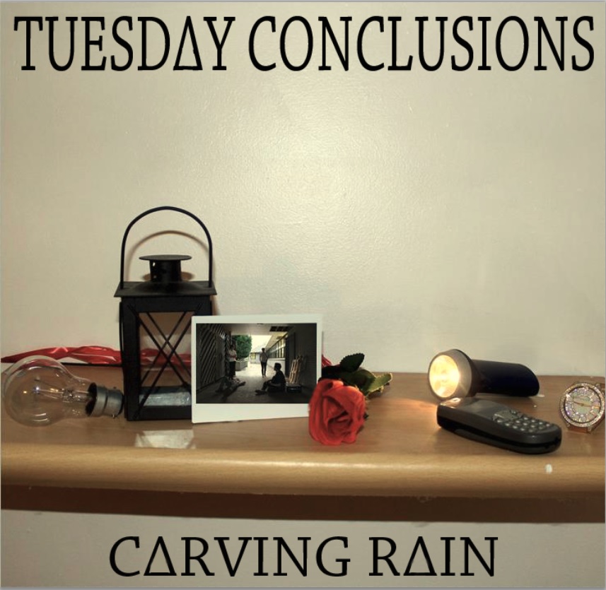
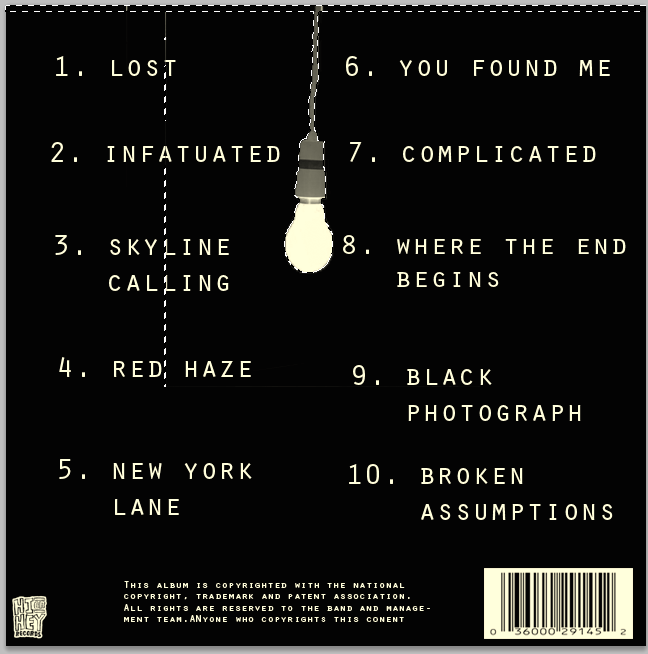
We have created a digipack that fits within our Indie/Rock genre and includes the conventional features of a digipack which consists of band name, album name, image, record label, copyright information and bar code. We altered this version by changing the font on the front cover in order for it to be consistent. Likewise, we changed the A’s to triangles to make it unique and different. Also, on the inside left we transformed the image to black and white so that it fits in with our genre. In the inside right we combined a texture from a blanket to form these black dots which turned out to be effective.
Front Cover:
Left Inside:

Right Inside:

Back Cover:
This is our feedback from Jess:
What went well:
- Interesting font and design
- Good colour scheme
- There is a uniqueness to the objects on the shelf but also gives clues to what to expect in the songs on the album