Month: February 2017

Draft 3 (Edit includes music and foley sounds)

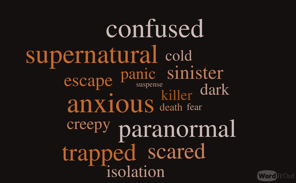
My draft 3 has the feedback that was suggested from our peers after draft 2, we have implemented some of the targets we set ourselves and improved the thriller in the process. Draft 3 also includes our music and foley sounds which adds to the suspense of the thriller and makes it have a more professional and authentic feel. The sounds have added suspense where it is needed and created dark sinister connotation where it is best suited e.g. the shadow at the end.

Please click on the screenshot below to view the screen recording and voice over of the feedback our teacher gave us:

The feedback is summarised below:

Not enough diegetic sound at the start to set an atmosphere. The wind whilst the characters are walking is too loud and should be turned down, could do with being replaced with something like birds chirping or just a general outdoor atmosphere. There is not enough of a build up for the main title. Not enough enough diegetic sound whilst the characters are walking. The change of pace with the non-diegetic music is good when pulling the rope. Dialogue sounds a bit distant, could do with either being louder or re-recorded. Needs more significant ending.

Targets based on the feedback we received:

  • Add some diegetic sound and the start in order to set a better atmosphere.
  • Turn down wind whilst the characters are walking at replace with birds chirping or a more general atmospheric recording.
  • Try to build up the sequence to the main title.
  • Add some more diegetic sound whilst the characters are walking.
  • Re-record or increase the volume of the dialogue.
  • Make the sign appear more clearly at the end and maybe add a sound effect to make the ending more significant.

Sound Production and Editing

Our group decided to edit our sounds and soundtracks using Adobe Premiere Pro(the same software used to edit the video sequence). We used tools such as speed and duration, master volume and transition fades. The speed and duration was useful when trying to sync both the video clip with the sound, it was also useful when creating a deeper more eerie sound the lower the percentage of the speed the lower the sound. The master volume allowed us to increase the sound at more tense parts and decrease sound at less tense parts. The transition fades allowed us to increase the sound gradually so it was a smooth transition instead of an uncomfortable jump.

These are the photos that we took while we were recording our Foley sounds of:

  • Dialogue
  • Door Slam
  • ‘Clang’ for metal hitting the door

Sound Design

As part of our research into sound for our thriller production we listened to an opening soundtrack of a thriller and noted how it made us feel. The process of synesthesia is when sound educes an emotion, the aim for us is to give our audience the authentic feeling as if they could put themselves in the characters positions. Individually we created a ‘Word It Out’ on the picture is a list of words which could be associated with my thriller, this is useful as it help to visualise what sound could be implemented without actually hearing it.

Soundtrack we used:

My Word It Out:

The sounds we may use for our thriller:

‘Dark texture’: Could be used for background noise to fill in gaps when walking.

‘No answer pensive drone’: Maybe be used before a suspense build up.

‘Percussive drums dystopia’: Drums could be used to emphasise a point in the thriller.

‘Sinister string FX drone’: Should be used when suspense in the thriller needs to be high and the audience are at the edge of their seat.

‘Tension build up to disturbing pulse’: Used to create an eerie atmosphere and set the scene.

‘Where Am I’: Could be used where white noise gaps need to be filled or when walking inside the fort.


Both Diegetic and Non – Diegetic sounds are crucial in a films success this is because it adds a whole new layer to the otherwise lack luster video parts. Integrating soundtracks as well as sound non-diegetic sound effects can make the audience relate and empathise with story in a more profound way.

Draft 2 (Edit including titles)

Our draft 2 included titles which we researched by watching other thrillers to use as a guide and inspiration. We also planned our titles e.g. when and what they would display and then we created them using After Effects.

In the feedback we have gathered it is reassuring that the font and animation look good and fit well with our thriller, however the titles may need to stay on for longer on the screen as they change too quick. The main title idea of the ‘RIP’ coming on before the whole title is good.

Targets:

  • Ensure the length of all of our titles are visible for a sufficient amount of time.
  • Make sure the titles are placed in positions that can be easily read.
  • All the names need to be in bold and the job titles need to be in lower case.

We also received other feedback from our peers:

  • Make use of a different effect for the opening shot

  • Employ more interesting animations for the titles
  • Have the main title on screen for long enough

  • Maintain the final shot for longer

Titles Design and Production

Here are some of the possible fonts we looked at using for our thriller, we looked specifically at  some handwritten ones on dafont.com we then decided that something more modern would look so we looked through other fonts on After Effects as well as dafont.com. These fonts made the shortlist we decided something simplistic would be good so it wouldn’t distract from the main action too much.

In the end we decided that it our thriller best suited the fonts that were default on After Effects. We chose this font because although it’s simple it  fits in well and doesn’t distract at all from the action in the thriller. The font we chose was in plain black and it used a typewriter animation purely for effect I do not believe it connotes danger however I think this is a good decision as when it comes the the main thrilling aspects of the thriller the audience will empathise with it more.

Please scroll on the document below to see a screenshot of our titles:

Please scroll on the document below to the tools we used in After Effects to create our titles:

Out of all of these fonts we decided that it would be best to use one of the default fonts that was on After Effects. We did this because we felt they were extremely simple but effective.

Skip to toolbar