October 15

My Tour Poster

Here I have created a slide of the conventional key features of Punk Rock tour posters in order to understand how I might make one of my own. I compared the images of the posters I found on the internet to each other and found that they all used very similar fonts, images and writing size in order to capture the eye of the intended audience. This exercise was useful because I now know how to effectively lay my ideas out and analyse the typical conventions of a different music genres before I begin to design my magazine in a unique way, but with these ideas in mind.

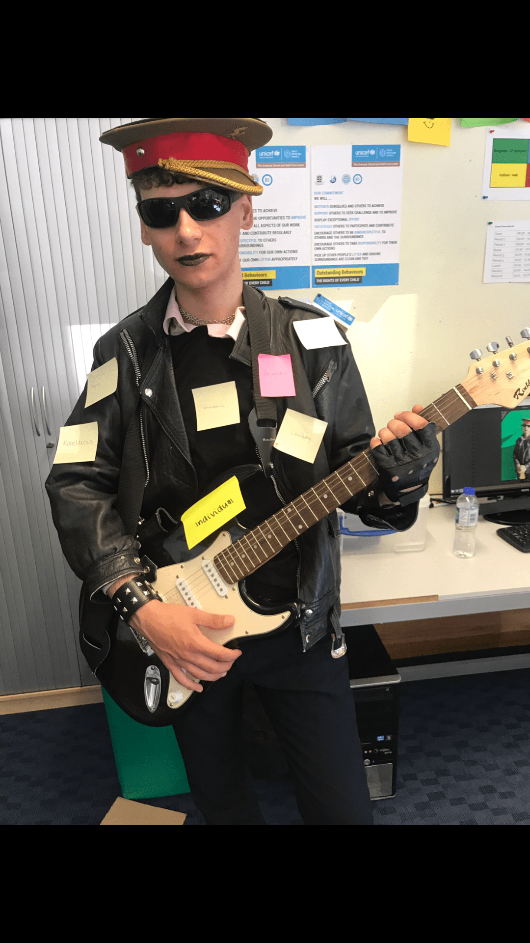
Next I used InDesign and Photoshop to create my own original tour poster using an image of a model I took from a previous photo shoot as the main cover star. I used Photoshop to cut the model from the background and add special effects to the image in order to attract my target audience and then I used InDesign to add writing to the cover. In order to effectively capture the attention of my Punk Rock fan base I used my slideshow to keep in mind the key features needed on the cover.

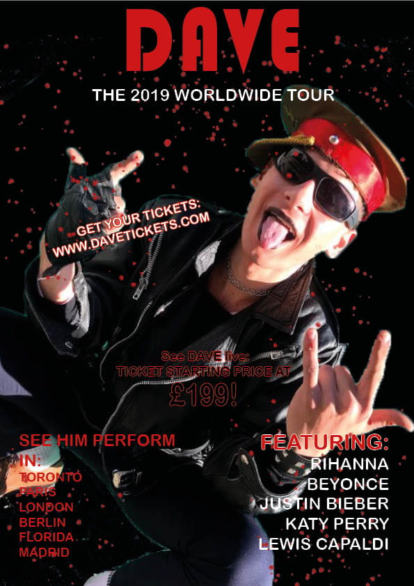
Please click on the poster to see a PDF.


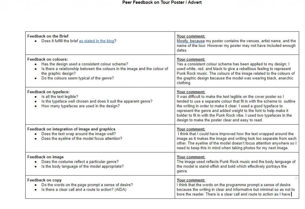
Please click on the image to see a PDF.


October 14

My Magazine Front Page Swede

Please click on the image to see a clearer pdf.

Below is a tutorial for how to use Indesign I watched in order to help me create my magazine cover.

This is the original magazine cover by NME.

In this task we learnt how to use Indesign to create magazine covers. This exercise has helped me as I am now able to make my own, original music magazine cover.

  • I have learnt that using different fonts, colours and sizes in my writing helps to make an eye-catching magazine cover, as well as adding weight and changing the letter spacing.
  • It has helped me to understand the technical conventions of a magazine cover, for example I learnt how to locate the masthead and pugs.
  • I think that my magazine cover was somewhat accurate in copying the original cover because I managed to replicate the fonts of the writing as well as add the correct weight to the masthead, however the image of the main cover star was different to the original one and so made a more obvious difference in appearance overall.

Although I couldn’t use the exact same same image as the one used by NME, I do think I adapted my writing effectively in order to try and replicate the original cover an make the words clear for the audience to see, for example I changed the colours of the quote to black as this made the writing more easy to read.

September 29

The Camera Talks


In this exercise we had to select nine of our images that we had taken from around the school and on each one hashtag the type of shot, (close up, long shot or mid shot etc) denotation, and connotation.

My favorite image out of the nine pictures we took was the high angle of the girls face looking remorseful and sorry. This is because I feel that correctly portrayed our chosen narrative for the image which was to show the girl as guilty and apologetic. The high angle made it seem as if an authoritative figure was standing over the girl making her feel small and insignificant.

Some of our pictures on our mood board are quite blurry and so I feel that could have made them better if we  taken more time to adjust the focus setting on our camera, also by changing the F number or slowing the shutter speed we could have made some of the images brighter and clearer, especially in the image of the model with the helmet as it was very dark. However, overall I feel that my group effectively conveyed our ideas and captured images which showed a clear narrative. The practice of using DSLR cameras this week was very useful as I now know how to produce images that adequately illustrate narratives which will help me to make my music magazine stand out.

September 26

Technical Camera Terms

This week in Media studies we were learning about how to use Cameras to help us with our work. We have learnt how to tell different stories in pictures by using our camera in different ways such as changing the angle, framing, and distance. For example, we learnt that close up pictures can be used to capture emotions of characters, while long shot images could portray the loneliness of a character or give an insight to their surroundings. In our photo shoot we portrayed a variety of emotions with different models but in some cases it was hard to capture the emotions when we didn’t use the right settings on our camera. For example, in one photo of a close up of our model in a dark corridor, there wasn’t enough light exposure for the image to be clear enough to see what was going on. We also had to experiment with the focusing settings on the camera as we found that a lot of our pictures were coming out blurry. Therefore, we had to increase the aperture as it would allow more light into the image. We learnt that in order to display different emotions we had to change the framing and angles of pictures so that they could effectively portray different narratives.

Through a method of trial and error with adjusting the settings such  as shutter speed and aperture, we managed to take some images that were effective in portraying different narratives and emotions. This exercise was useful because it will allow me to be able to take good quality photos for my music magazine as I  now know some of the key features of a camera.


September 20

My image that uses Mis-En-Scene to communicate meaning

In order to understand how Mis-En-Scene communicates meaning we were put into groups and given a genre of music to interpret. Our group was given Punk Rock and we made a mood board to gather information about this type of music so that we could understand how to portray certain genres which will help us create our music magazine.

Made with Padlet


We had to use one member of the group as a model to dress up in the wardrobe of a typical Punk Rock fan. In order to do this we made sure that our model was dressed in lots of dark colours and chains with studded jewelry and bold makeup such as black lipstick. The idea was to give off a defiant vibe and rebellious feel.

In this image people were asked to stick post it notes with words they associated the models look with and what they thought the described the vibe the model gave off. The words people had written were:

  •  Individual
  • Angry
  • Rebellious
  • Intimidating
  • dangerous

This exercise was useful because could successfully continue with our work knowing that we had effectively captured the image of Punk Rock in our model.

I think that this image most accurately represents the Punk Rock image because in the image the model is seen as rebellious and yet carefree. To create this image we dressed our model in:

  •  A leather jacket to give the impression that he is ungovernable and unruly.
  • Studded jewellery to show how obvious and edgy Punk Rock fans are.
  • Chains around his neck to imply a threatening and anarchistic nature.
  • We used a hat because it signifies obedient behavior which is ironic because Punk Rock fans are usually disobedient and rebellious.
  •  The sunglasses we put on the model were effective because they covered his face evoking a sense of quiet cool and mystery.
  •  We used black lipstick to make the model stand out because the colour is dark and therefore often used by Punk Rock fans because of its boldness.

These conventions made it easier to develop our production.

In some images we used an electric guitar as a prop because it reinforces the fact that Punk Rock fashion is derived from the loud and fast-paced music.