Category Archives: Component 1
Question 2: How does your product engage with audiences and how would it be distributed as a real media text? CCR2
Question 3: How did your production skills develop throughout this project? CCR3
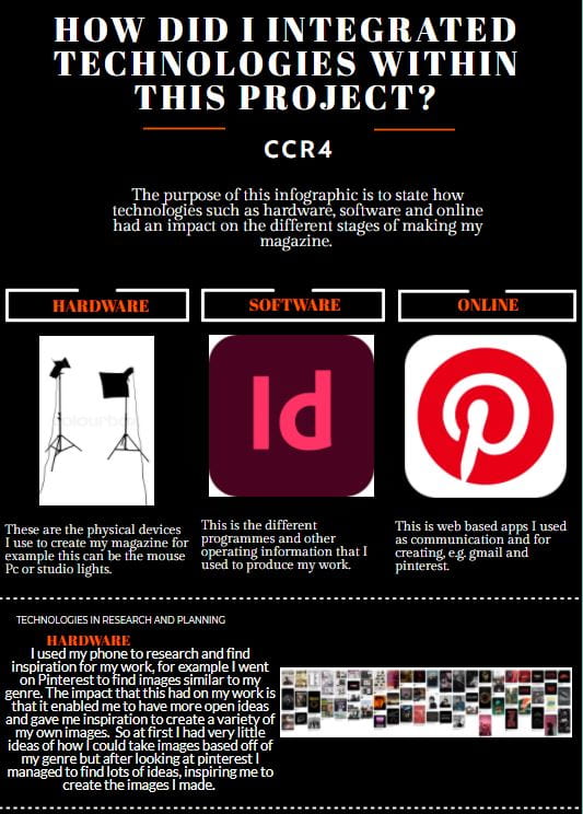
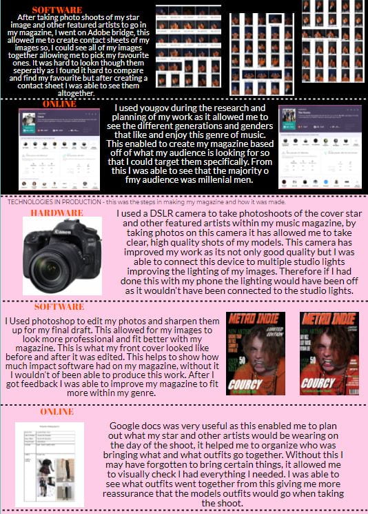
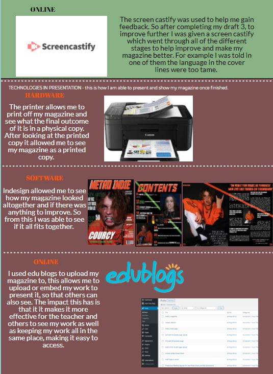
Question 4: how did you integrate new technologies? CCR4

Draft 3 magazine

What’s new…
- Raise contents a little.
- needs a page number.
- play with the photos in photoshop…filters? saturation?
- fill the black space at the bottom – editors welcome?
- watch the sense of the coverlines…come into the industry – does that make sense?
- Metro Indie interviewed – isn’t the magazine called this? And use the Grammy logo for the coverline?
- Metro Indie – listen to them? confused.com.
- no need to repeat Catfish and the Bottlemen twice in the coverline.
- make the star’s names bigger in the captions.

What’s new…
- make him bigger
- more article or have another photo of a quote in the middle so that you wrap the text around it
- centre the questions
- have some other coloured lines in there i.e. graphics to make the copy more exciting to look at
- caption the photo – i.e. Courcy so that we know who he is and that the article will relate to him
What’s new…
- lighten the photo?
- another cover line at least on the left and one on the right?
- make metro indie…bigger, taller, thicker?
- capital letter September
- make him bigger so that some more of his hair goes behind the masthead
bigger masthead or courcy smaller on front
coverlines line up too close to edge move down middle, left font on righ
conetnst smaller, page no smaller, different colour numbers, grammy logo, 37 different band name, smaller gap on apge 8, 22 another line, green around image, same size font bands
chnage double page to 16, more colours, opaque box behind quote at bottom, line spacing between questiona nd answer same answer closer to question, some of it more spread out bring top right question down, write coourcy on img inwhit, make top qoute smaller
Chosen adverts

I chose this advert to go in my magazine as I think it fits best with my genre as singers that are indie rock take part in this festival, I had also mentioned that the singer within my magazine has performed at this concert. The bright bold graphics and sharp fonts used fit in well with the theme of my magazine. This poster meets my target audiences needs as it has a grungy feel to it. The genre of this poster is indie rock. This also fits in with the demographics of my genre as the majority of people who like this type of music are millennials and are men.
Draft 2 front page

These were the targets I set for myself, I used them to improve my magazine.
What’s new…
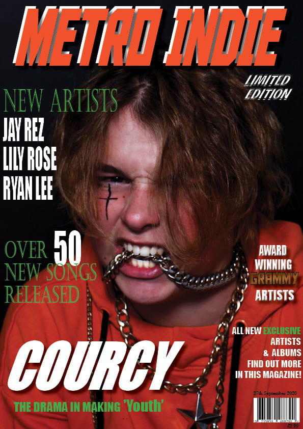
- I Added more headlines – “the drama in making ‘youth,’ All new exclusive artists and albums fins out more in this magazine.”
- I Edited the image more on photoshop.
- I made sure the cover lines are catchy.
- consider and make more layouts – I experimented with this but preferred the original layout.
- Cut out the model more precisely – I decided to change the contrast of this image and made the background black to make him stand out.
What’s next…
- lighten the photo?
- another cover line at least on the left and one on the right?
- make metro indie…bigger, taller, thicker?
- capital letter September
- make him bigger so that some more of his hair goes behind the masthead
2nd draft of double page spread

After looking at what improvements need to be made for my double page spread, I made further adjustments to improve it. After collecting my feedback that’s written below, I have completed each one to make my double paged spread better and more professional.
What’s new…
- Centre the quote.
- I moved him to the left a bit and made him bigger.
- Got rid of hyphens.
- Added graphics – I added the orange line to add depth.
- The headline had to be something about him – for this I used a quote of what he said.
- I made Metro indie small and put it in the corner at the top.
- Submitted my article for feedback.
- I also edited the cover star on photoshop to improve the quality of the image.
For my next draft of the double paged spread I will improve it from looking at the feedback below.
What’s next…
- make him bigger
- more article or have another photo of a quote in the middle so that you wrap the text around it
- centre the questions
- have some other coloured lines in there i.e. graphics to make the copy more exciting to look at
- caption the photo – i.e. Courcy so that we know who he is and that the article will relate to him
2nd draft of contents page

This is my second draft of my contents page, to improve draft one of my contents page I edited each image individually on photoshop, I then made sure the spacing between objects is equal . I added the line in the background to add some depth. I made sure that the page numbers related to each person. I completed the targets that were given to me below.
What’s new:
- Photo shop my images before I create the real thing.
- Consider more layouts.
- Maybe use less fonts.
- Make sure the spacing is equal between images and text etc.
- Maybe incorporate another colour within my contents page.
What’s next:
- Raise contents a little.
- needs a page number.
- play with the photos in photoshop…filters? saturation?
- fill the black space at the bottom – editors welcome?
- watch the sense of the coverlines…come into the industry – does that make sense?
- Metro Indie interviewed – isn’t the magazine called this? And use the Grammy logo for the coverline?
- Metro Indie – listen to them? confused.com.
- no need to repeat Catfish and the Bottlemen twice in the coverline.
- make the star’s names bigger in the captions.
Draft of the double page spread

I made a draft double page spread, this will allow me to see what I need to improve on for when I come to making the real one.
Here is what I need to improve on for my second draft of my double page spread:
- Centre the quote.
- Move him to the left a bit and make him bigger.
- Get rid of hyphens.
- Add graphics.
- Headline needs to be something about him.
- Metro indie can be small and in the corner at the top.
- Submit article for feedback.