My tour poster

I created a mood-board to inspire me to create a tour poster and give me a clear idea on how to make a tour poster. From doing this I discovered how the conventions on a tour poster work, this has enabled me to create my own and to consider the layout of the tour poster. I have also found out that the typical features of a heavyrock tour poster are that they all have the very dark and vibrant contrasting colours, if there is a cover star on it then they all have long hair and there are usually skulls involved if its just the branding, all of these features allow these tour posters to be distinguished easily.

Please click on the image to see the PDF


After looking at inspiration of hard rock tour posters I created my own tour poster with the genre of Hardrock above. I used a bright red outline to link in with genre but to also make the focal point stand out and catch the readers eye. I used a rustic font to convey the kind of rebellious feel to the poster. I thought out the layout of my poster and considered attention, interest, desire and action.  reflect on the moodboard …what did you discover about the conventions, the typical features of a metal tour poster?

Please click on the image to see the full self assessment.

An introduction to Indesign and my magazine front page swede

Please click on the image to see the PDF

We were given the task to recreate a magazine front cover on InDesign, this was to help us understand and get used to indesign so that when we come to making our own magazines we know how to use it and get used to it. From this I have learnt how to create a magazine front cover I have also learnt how magazines have conventional features.

The conventional features of a magazine I have learnt –

  • Plugs
  • Masthead
  • Title
  • Cover lines
  • Main cover line
  • main cover star
  • Barcode
  • Price
  • Pug
  • Insets
  • Captions

3 strengths of my magazine-

  • I think the placing of the different features of my magazine with the original one is quite accurate.
  • The colours in mine are very similar to the professional one.
  • The size of the font looks the same.

3 weaknesses of my magazine –

  • I couldn’t achieve the right thickness of my fonts.
  • I couldn’t find the same image for my magazine.
  • Some of the fonts are slightly different to the magazine ones.

I found that most of it was fairly easy I got used to it quickly, I struggled with getting the correct width and weight of my writing so I will need to improve this. This will help me when we come to making our magazine as it has given me a clear insight of how to lay it out and use all the different tools on Indesign.


The camera talks

We were put into groups and then given the task to go around the school and take photos of each other at high angles, low angles, mid shot, close up, long shot etc. We had to create some sort or story or meaning to the image. After we collected the photos we chose nine photos and used Canva to create a collage of these nine photos; on each image we had to include three hashtags, so one with the technical term (#longshot, #highangle), then the denotation (#personlookingintothedistance) and the connotation (#lonely, #happy). I now know that I can use the angle of the shot, distance and even the features of mise en scene to convey a narrative.

How we constructed this image:

  • The model stood at the top of the stairs whilst we took the photo at the bottom, this photo was taken at a low angle, giving his a sense of dominance and strength, making him seem intimidating.
  • This photo is a midshot, with the focal point centred in the middle, this composition helps to convey his emotion of calmness.

When making our magazines this will help me to consider how I take my photos and the meanings I want it to portray, I will make sure that I use the right angles and the right kind of body language.

My image that uses Mise En Scene to communicate meaning

Made with Padlet

We were given the genre of music to do which was hard rock.

we found that a lot of these fit in with the theme:

  • The colours black and red.
  • skulls
  • certain hand gestures
  • chunky boots
  • studs
  • Long hair and Mohicans


He is portrayed as confident and gives the impression that he is aggressive due to his facial expressions, the frowning helps to convey this suggestion. I think that we encoded our model with most of the appropriate MES. We considered the body language, facial expression, posture and camera angles etc when taking these photos. I chose this photo because of the whole composition and mise en scene to it. The images we took were taken at different angles such as low angle, high angle, mid shot, close up, long shot etc. This process will help me with my own productions as it will enable me to consider the different aspects of mise en scene and how I can ensure to include this into my work. The different conventions of this photo makes it more appropriate and relevant for a magazine.

Here are some relevant adjectives as to how this genre is generally represented:

  • Dark
  • Brave
  • Loud
  • Edgy
  • Rebellious

Mise en scene

  • body language – He is portrayed as confident and gives the impression that he is aggressive due to his facial expressions, the frowning helps to convey this suggestion.
  • facial expression – His facial expression represents anger and power.
  • posture – His posture leaning towards the camera helps to create that intimidating, aggressive, impression from the model.
  • Lighting – The lighting makes him stand out creating the sense of confidence.
  • proxemics – The of this photo is a midshot, I think that the proxemics of this image makes it more personal being able to understand and see his emotions more clearly.
  • costume – We made his costume includes a black shirt with a black leather jacket with a chunky belt jeans and a black hat, this was inspired by looking at the hard rock artists and how they dress.
  • properties – A guitar was featured in the image to show rock as well as drum sticks being shown in other songs.
  • colour – Black and red is included in the image to represent confidence, strength and power.

Tour Poster Analysis

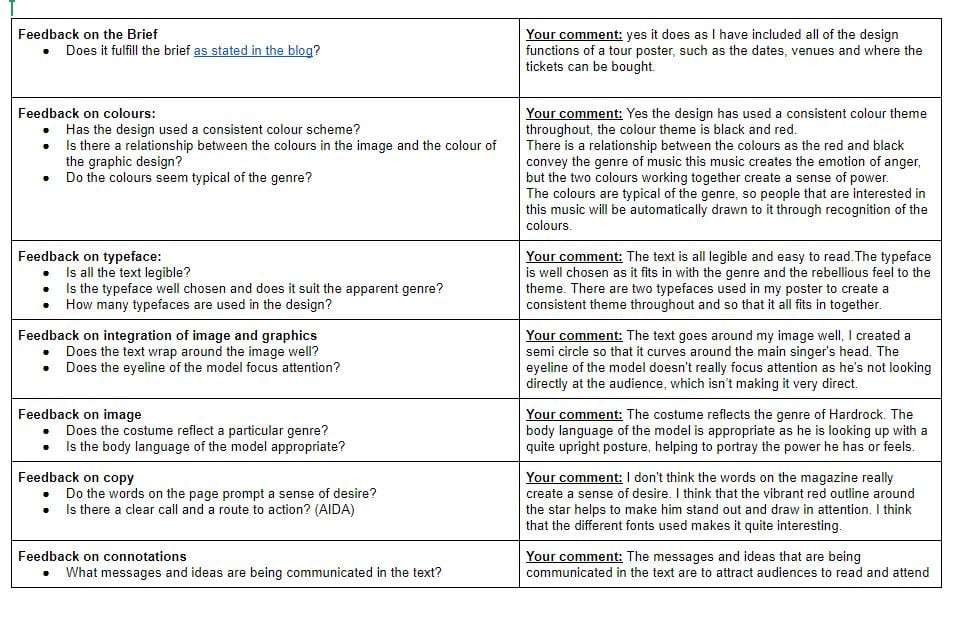
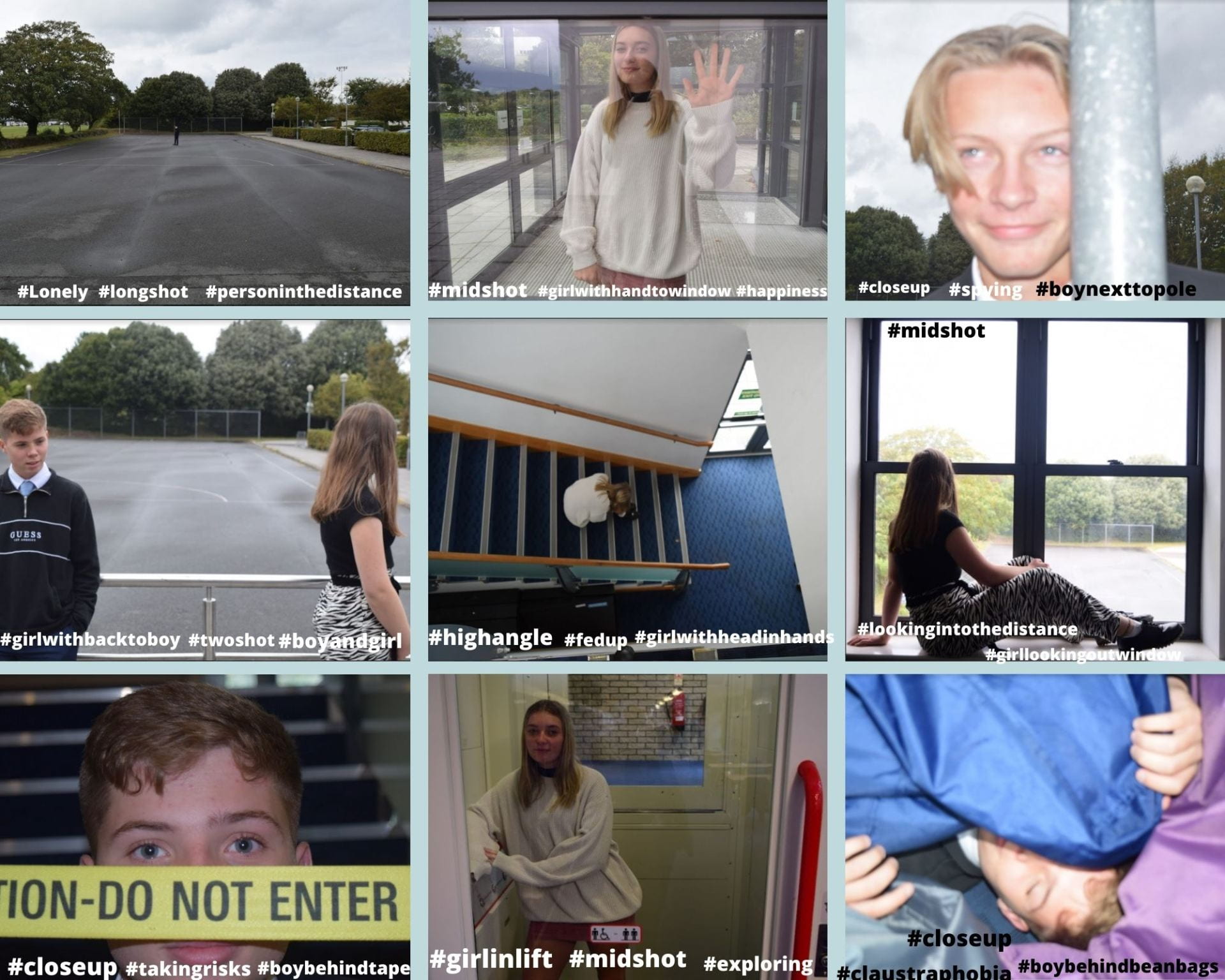
The mise-en-scene used in this is his hair style, colour and body language, all of these together symbolise peace. The colour used in the poster reflects happiness and calmness, the denotation of this is yellow.

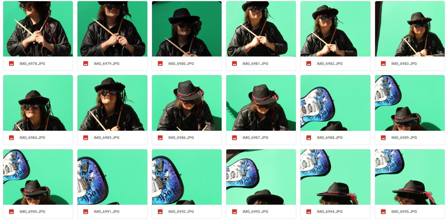
This is a tour poster analysis, we chose a poster which we thought was a good one to deconstruct, I chose the Weeknd tour poster as I felt there was a lot to write about on this one, we then had to annotate the tour poster. I wrote about how the different colours portrayed and signified different emotions, so for example black can signify grief but also confidence which are too very contrasting emotions, the black that was in the poster suggested the emotion of confidence rather than grief due to the other factors, such as it being a tour poster so the main purpose of it is to attract people and the body language in the poster suggested confidence.

what have I learned?

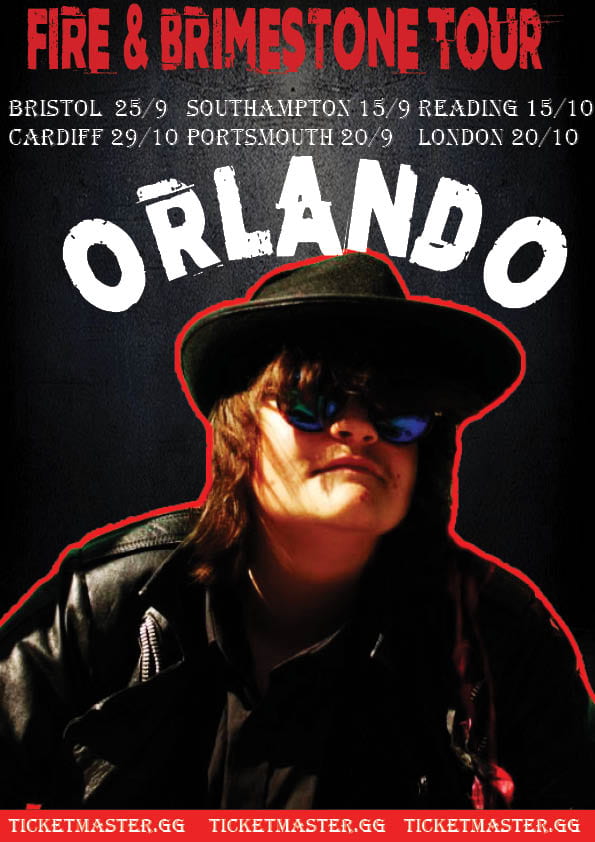
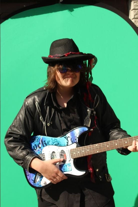
  • I have learned every small detail has a meaning and is trying to convey something, for example it could be something as small as his hair style, so in the poster above he has dreads signifying that he is chill.
  • I have learned that body language can have a big impact on the way people can see you and how it should be presented when advertising, so for example the person in the magazine portrays confident body language which is appropriate to the media he’s being presented on, but if he was slouched and looking down it could connote that he is shy and perhaps not motivated, which would create the wrong message towards their audience.
  • The style of font is important when advertising too, certain fonts are used for certain themes, for examples if your were writing a letter you would tend to use a more fancy, handwriting font that flows well as its more traditional.
  • Colour has an impact also on how you observe and take in things. Every colour has a meaning or represents an emotion, so if you are creating a poster you want colours that signify positivity on it, to attract your audience, colours such as orange which has happy connotations and signifies enthusiasm and red which implies the feeling of love and passion should be conveyed. I think that the colours should also depend on the type of music, if its very calm music then a colour such as blue should represent that calm feeling. The denotation of colour is a property possessed by an object of producing different sensations on the eye as a result of the way it reflects or emits light.

What I have learned will impact my own magazine as it will allow me to consider the colours that will signify different emotions carefully, to make sure that it can portray the correct emotions for my audience. I will also make sure that the body language creates the correct message, I want it to get across. I will also look closely into the fonts, images, language and costumes shown as these can also have a lot of impact on how people observe the poster. My analysis of the tour poster aided me in decoding all the different aspects of it, therefore helping me when we develop our magazines.


Skip to toolbar