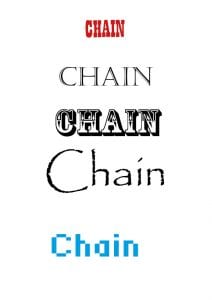
1st- The font used is ‘Playbill’ I changed the spaces in between each letter, I made them closer together. This font is okay but not the best.
2nd- The font here is ‘Castellar’ again I changed the width slightly and also changed the height, the reason of changing the height is that I feel like it looks similar to a group of skyscrapers which represents the high life of rappers.
3rd- This is my favorite Mast head. The font used is ‘Rosewood Std’ I like this font as it looks like a chain so it gives my Masthead a meaning other than just being a image.
4th- This image is boring and I don’t think it is very good for my genre. I changed the boldness of this font. The font used is ‘Papyrus’
5th- This font is ‘standard 07_57’ I think that this font is awful and is definitely not appropriate for my genre, the font looks like it has been created for a younger, less mature audience.
The font I have decided to use is the third one, ‘ Rosewood Std’ as I feel it creates the most meaning of the 5 and it suits my genre, Rap, very well.
What Was I Tasked With?
I was tasked to edit and create 5 different Mast Heads for my music magazine ‘Chain’ while creating my designs I had to think about:
- Legibility
- Colour
- Typical Conventions
- Size
What Have I Learnt?
I found out that the different Mast Heads create different meanings and connotations, for example the last one creates a feeling that it is directed to a younger audience that are into gaming and things alike.
How Will This Help Me in Future?
I will use this in my future work as I will be more cautious on thinking about what I want to communicate and what audience I want to attract when picking my Mast Head and colour of my title.