February
12

February
8
Question 3: So… How did your production skills develop throughout this project?
February
7
Question 2: So… How does your product engage with audiences and how would it be distributed as a real media text?
February
5
Question 1: So… How does your product use or challenge conventionsand how does it represent social groups or issues?

January
23
Adverts
To complete my magazine, I will need to adverts that will appeal to my target audience and fit in to my magazine successfully.
Here is a selection of adverts I think could fit in my magazine:
Here are my two favourites:
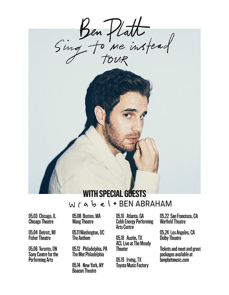
I have chosen this advert because it advertizes an artist that my target audience would be interested in: Ben Platt. His target audience is similar to mine and my audience are at an age where his songs are relatable: they have experienced what he is singing about. I decided to use this advert as my back cover because it has a different colour scheme to mine which reinforces it as an advert. I have also chosen this advert because it links back to my dating profile for someone who like pop music – Ben Platt is one of their chosen artists and they look for someone who is kind and considerate – a bit like Platt’s music. 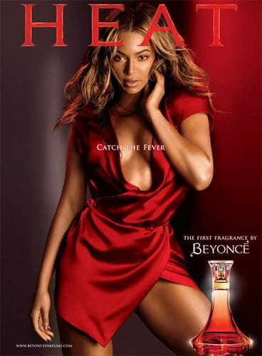
I have chosen this advert because Beyonce has a similar target audience to mine and she is recognisable to my target audience. I am sure my target audience will enjoy seeing the poster as it features a current pop artist. The advert is also simplistic, which refrains it from over powering and taking the readers attention away from my magazine. The advert doesn’t overload the audience with information which is useful because it will be next to my contents page. A simple page also links into my dating profile for someone who likes pop music because they like to relax and take things easy, so a busy advert would be overpowering.
Overall, I am happy with the two adverts I have chosen for my magazine because they:
- fit the pop genre
- feature an artist my target audience would be interested in
- they’re not too overpowering
January
20
A New Improved Complete Magazine Draft
Here is my second draft of my magazine:
Click on image to view PDF
Click on image to view PDF

Click image to view PDF
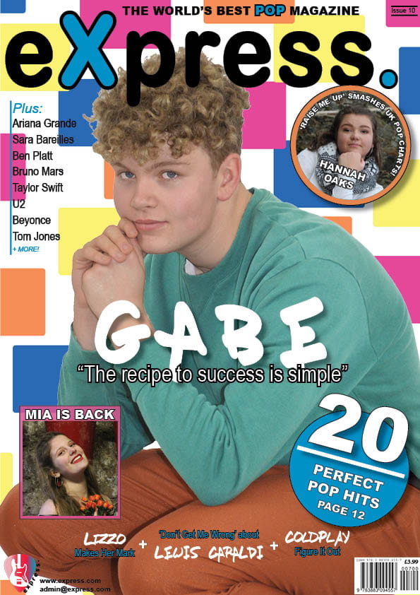
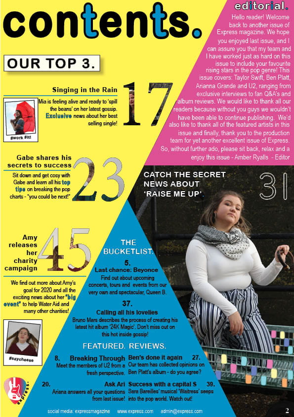
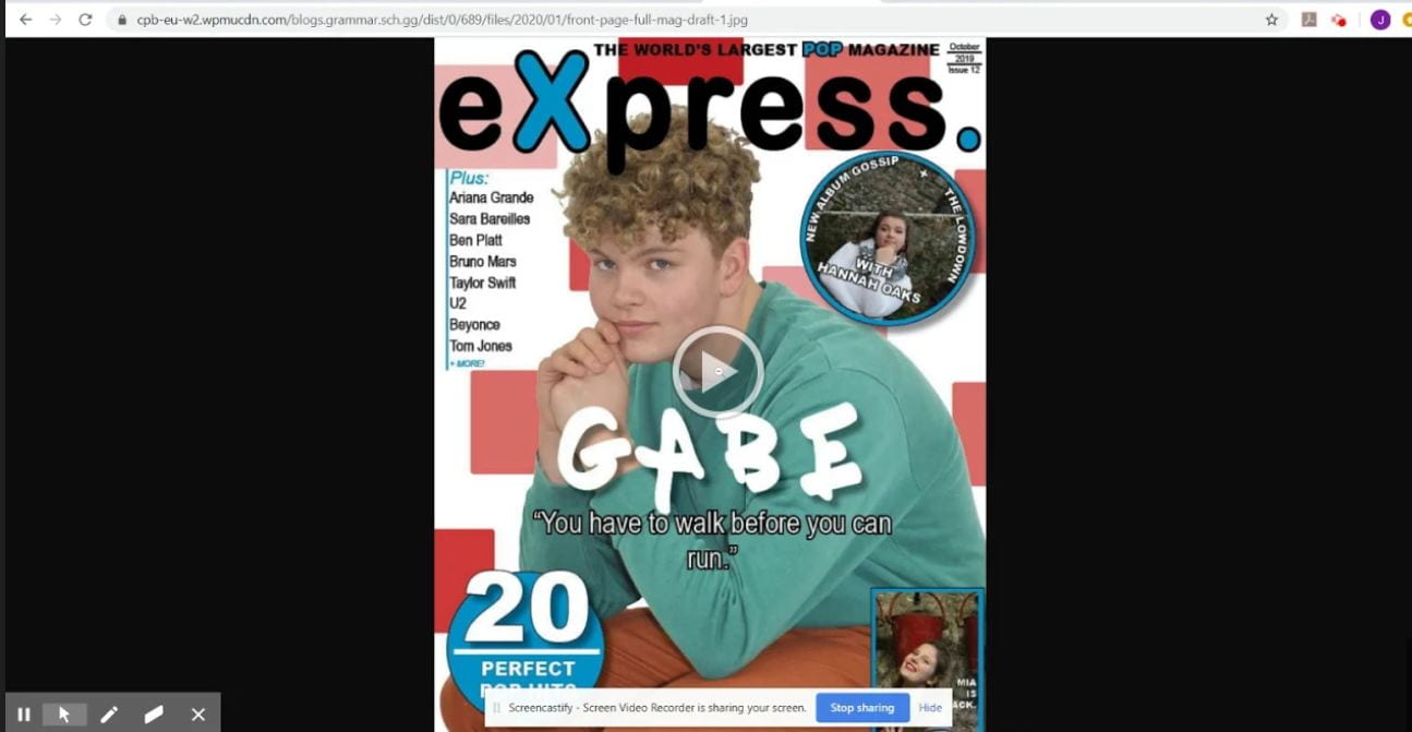
Above is my full draft of my final magazine. I think that the improvements that I have made have been successful in conveying the pop genre. Improvements I have made include:
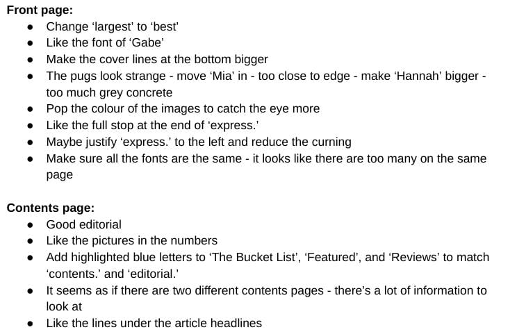
- Front page:
- moved the headline ‘Gabe’ and the pug with ‘Mia’ in down
- moved ‘Mia’ to the left and flip image changing places with ’20 perfect pop hits’
- added colour to the pugs that fit with the colour schemes
- Contents page:
- centred the text under ‘The Bucketlist’
- made polaroid insets bigger
- added colour to the main image
- Double-page spread:
- made one headline bigger than the other to clarify which one is the main headline
- made headline more catchy
- moved ‘Hannah Oaks’ to the bottom of the left page
- put drop capital at the start of the article not the standfirst
- changed the background colour – too much blue
- added pink box behind article
- added blue corners on pink box
- put my main image in a polaroid picture allowing the article headline to go at the top and ‘Hannah Oaks xox’ to go at the bottom as if she was signing off
- added ‘sssshhh!’ around the edge of the page to link in with the idea of secrets
- put song titles in blue instead of white in article
- added another pull quote bottom left and moved original pull quote up to the right
- added three insets of polaroid pictures
January
17
So… How is it going?
A transferable skill is ‘an ability or expertise which may be used in a variety of roles or occupations. Examples include communication, problem-solving and self-control’.
Throughout the process of making my music magazine, exploring mise-en-scene and developing meta narratives to create a meaning, I have developed my transferable skills. I have achieved the skills listed below:
- Communication: I’ve learnt how to communicate with peers in class who I wouldn’t normally communicate with. I have also used different forms of communication e.g. speaking to people in person and over social media. My teacher has also communicated with my via comments on posts.
- Problem-solving: When facing issues on Indesign and Photoshop, I have overcome them by researching ‘How to’ online and especially YouTube. These have helped me, however there have been cases where there wasn’t a video, so I used persevereance to tackle these issues. When all else failed, I asked my peers and my teacher for advice.
- Self-control: I have given myself targets and fixed improvements that I dislike and listened to feedback from my peers.
- Team work: I have worked together with peers, showing them how to do some things on In Design and Photoshop and vice versa. I have worked well in groups, adding my bit to contribute to discussions and group essays.
- Time management: I have managed to get in any essays or work in for set deadlines, and I have prioritised certain tasks that need to be completed before others.
In my opinion, I believe that I have used my time wisely which has enabled me to come out with good images from my photoshoots, detailed research about the pop genre, artists and magazines and carefully planned magazine pages. Even though I think positively of my work, there are improvements to be made. For example, I need to keep working on my colour scheme and I need to edit and experiment with my main images, adding flourishes of colour to them so that they fit in with the pop genre. I would also like to alter my mast head design.
January
17
Design Skills 2
Throughout the process of creating my magazine, I have developed my design skills on Indesign and Photoshop.
Overall, I think these design techniques that I have been experimenting with and using have been very beneficial in the process of creating my magazine because they’re helping me to convey my narrative and genre.
January
16
Complete Magazine Draft
Below are all three pages of my magazine; front page, contents page and double-page spread.

My teacher has looked at my first draft and here are her comments:
Click on image to view screen castify of feedback from my teacher
Here is my summarised feedback and targets from my teacher:
Click on image to view full document
January
16
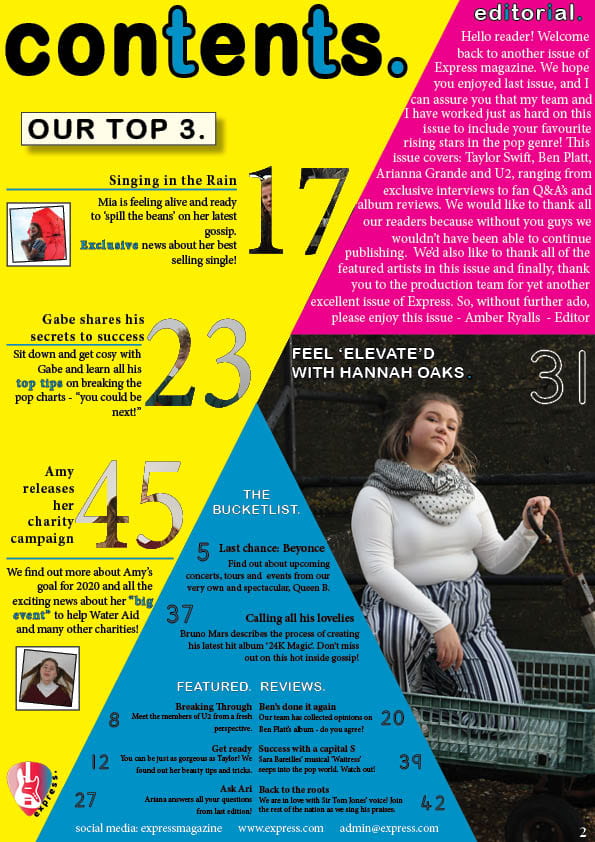
A New Improved Contents Page
Click on image to view PDF
What has changed:
- removed any imperfections on my main image
- added an editorial and contact details to complete the page
- added larger line specing in between the articles on the blue section
- changed ‘Last chance: Beyonce’
- made the blue words letters further apart to increase readability
What remains:
- add colour to the main image to fit with the genre and stand out on the page
- decide on a final colour scheme and change on here and the rest of the mag so it all links in
I asked for some feedback from my friends on my new contents page, and asked them these questions:
- How does the contents page work in tandem with the front cover?
- Is the font/typeface consistent with the front cover?
- What genre of music is the contents page featuring?
- Describe the images of the stars using adjectives.
- Which cover-lines tempt the audience to read on and which ones stand out and why?
- How do the cover-lines reflect a music magazine? If they don’t, which ones need to be adapted?
- Which areas, aspects have distracting areas of integration of copy and images?
- What aspects do you consider conventional or unconventional? (page numbers, inserts, captions, catchy cover lines, editors comment)
Feedback and targets:
- the same fonts are used – can tell the two pages are linked together
- change the colours on the front page to link it to contents page
- the colours used on contents page are very bright and reflect the pop genre
- my star looks: confident, intelligent, knows what she’s doing, a very up-lifting person
- ‘Charity campaign’ – very wholesome, reflects the modern day audience, young people want to make a change – appealing to a teenage audience
- like the highlighted words – brings attention to the articles
- ‘gossip’ – trendy vocab, modern, reflects target audience
- the blue box with the black writing – could make the writing a bit bigger or change the font or change the colour to white – then highlight section headers to make them stand out again
- make the images inside the numbers more obvious – can’t really tell who is inside them
- the shapes and layout is conventional to the pop genre
- confused where to look first – lots of information