October 15

My Tour Poster

I have researched punk tour posters and I have learnt that they have the conventions of:

  • a black background
  • have a splash of colour (pink, orange, red)
  • a drawn or animated image of the artist/ what they’re associated with/ no image at all
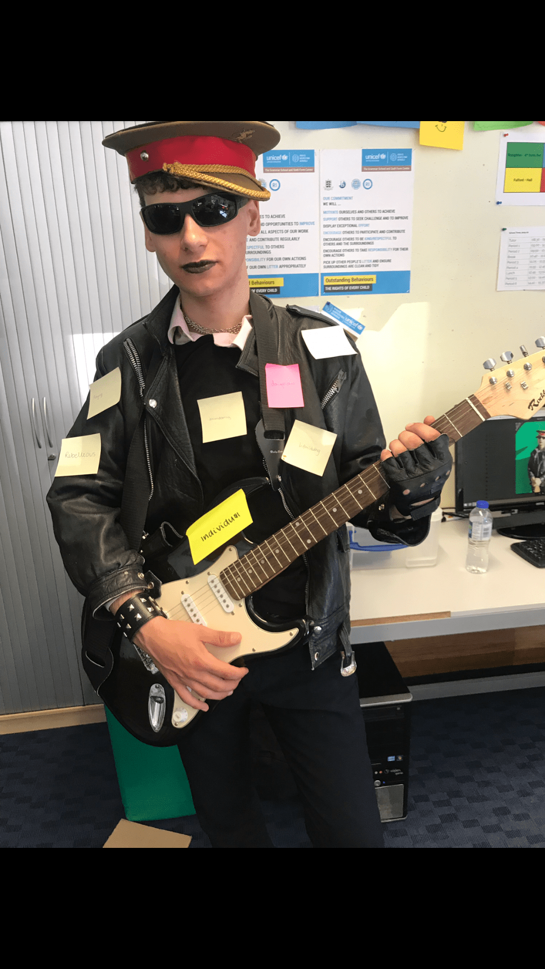
  • the artist (if any) is looking anarchic and rebellious
  • the main cover line is on an angle
  • the font is blocky, distressed, scratchy and hand written
  • there are aspects of Serif font in captions
  • there are images of skulls or skeletons

As well as my tour poster being conventional, I also want it to be unique and different in order to create attraction and interest for my artist from my target audience also ensuring that they will not be disappointed.

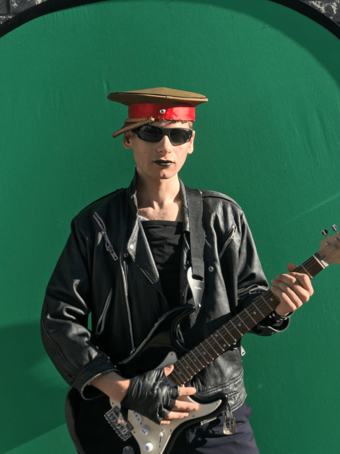
Below is my tour poster.

Click on the image to see a clearer PDF

By using Adobe InDesign and Photoshop I have been able to create my punk tour poster by cutting and developing my image in order to make it appealing to my target audience. Below is my reflection on my tour poster:

My poster is conventional of the punk genre because:

  • there is a colour palette of black and white with splashes of colour
  • my model is wearing leather and bold make up
  • the font is blocky and distressed
  • the model looks disobedient

However, as well as being conventional, my poster is also unique because:

  • despite not having the main cover line on a diagonal, the cover line and the captions are on an angle, making my tour poster unique
  • I have used an image of my artist but there are aspects of animated drawings

My poster addresses AIDA (Attention, Interest, Desire, Action) by featuring:

  • a large image of the artist
  • large fonts for the artists name and the tour name

Reflection

As a whole, I really like the way that my poster has pieced together with the image and the colour scheme. The different fonts direct where your eyes go and the large image of the artist informs the audience who the poster is about. However, I would change the direction of the models eyes in order to help the audience focus on the information about the tour, rather than beind drawn to the left side of the poster where there is no information. But otherwise, I think that my tour poster is very successful at portraying the genre of punk and promoting the tour.

October 9

My Magazine Front Page Swede

Original Version of NME magazine cover

My version of the NME magazine cover

Please click on the image to see the clearer PDF

This week we have been using Adobe InDesign and I now know the basic skills of how to use it. To put my skills to the test, I created a replica of an NME magazine front cover. From creating my front cover, I have been able to include different magazine conventions like the Masthead, Main Cover Star, and Main Cover Line, all piecing together to create a convincing replica.

What was successful in creating my cover?

  • I wasn’t able to find the same image but I was able to find a photo of Rihanna from the same photo shoot.
  • I was able to match the colours of the fonts.
  • I was able to use the correct proportions with the size of my fonts and images.

What could be improved?

  • My magazine would look better if the image of Rihanna didn’t come out so pixelated – as a smaller image it has good quality, but every time I tried to enlarge it, the image got blurry.
  • I struggled with the text “4 of 10 SPECIAL EDITION COVERS” because it was originally covered by Rihanna’s hair, so I had to move Rihanna down in order for the black font to be seen. This then meant that I had a white gap at the top of my magazine so I had to cut the top part of the magazine and add it to the top in order to cover up the white gap.
  • I struggled finding the correct fonts for each bit of text because some of them have Serif font and others have Sans-Serif font, making it difficult to find the correct fonts for each different text.

These youtube videos are great tutorials on how to use Adobe InDesign. They all give detailed instructions and advice on how to use it and will help me in the future to create the best piece possible.

September 27

The Camera Talks

I created a moodboard of the 9 best images from our practical work that I think convey the best stories. This exercise helped me with my understanding of what makes a great photograph because I had to write the technical camera terms, the denotations and connotations of each image.

My favourite photo out of the 9 I’ve chosen is the one on the right on the middle line. I believe that it has successfully created the narrative of a rebellious bully looking down on someone. This was done by the low angle used as it gives a sense of superiority and power to the girl in the photo, also making the audience feel weak and vulnerable. This is also reinforced by the forbidding facial expression from the girl in the image.

I think my group and I were very successful in creating narratives in our images, fulfilling the main task focus, however we could’ve made our images better by taking more time to get the images in full focus the camera and adjust the aperture and the shutter speed to create the correct brightness for our images. This especially applies to the image in the middle on the top line because, although we got the reflection very clearly, we needed to make the image a bit darker by making the aperture smaller to let less light through to the camera sensor.

These skills will be very helpful when creating my music magazine because I now have a better understanding of how to use a DSLR camera successfully, and how to change the brightness and focus if my first shot comes out wrong. I can also think about the angles and the distance that the image is taken from to help convey a narrative. This will also help me in the future when thinking about my music magazine because it will help me to get my intended narrative across making my music magazine more successful.

September 27

Technical Camera Terms

We explored how a camera works including the aperture (focal length) and the shutter speed. The shutter speed changes how fast the photograph is taken. With a slow shutter speed, more light is allowed into the camera. This is normally used for low-light photography, whereas a fast shutter speed helps to freeze motion – this is commonly used when capturing images of motion, for example, running. The aperature is the hole in the lense which helps light to travel through the camera – it is able to change size to let different amounts of light in at a time, also changing the focus of the camera. The larger the hole, the more light passes through the camera to the camera sensor – this makes the photographs brighter. Likewise, the smaller the hole, less light is able to reach the camera sensor, making the photograph darker.

We learnt the best and easiest ways to take photos. To summarise:

  • the aperature changes how dark or bright the photograph will come out.
  • the shutter speed is how quick the photograph is taken – this adapts what the photograph looks like; blurry or crisp.

For example; a sporting event would require quick shutter speed, because you need to be able to capture the images quickly and for it not to be blurry.

However, if you were taking a photo of a flower the aperture would be important as the focus and light would change if you wanted the flower in focus and the background fuzzy or the whole image in focus.

For each photograph, we also took into consideration the direction, space and angle of the photograph in order to portray a narrative to the audience. For example, an extreme close up is used to convey emotion and helps the audience to feel connected to the character. Whereas, on the opposite end of the scale, an extreme long shot can convey a relationship to the characters and their surroundings and it could also portray loneliness or isolation.

The angle at which the photograph is taken is also very important to take into consideration. A low angle can portray importance and power from the character in the photograph making the audience feel weak and intimidated, whereas a high angle can symbolise that the audience has more power than the character in the photograph because they are looking down on them; it could also connote poverty or vulnerability.

This will help me when producing my music magazine because I will consider what angle and direction will be best to use when creating my narratives through my images and I will also consider what I want my audience to feel when looking at my images.

September 20

My image that uses mise-en-scene to communicate meaning.

Moodboard

We were given the genre of Punk and in our moodboard we included pictures of artists, styles and mise-en-scene that are associated with the punk rock genre. We found that the conventions of punk are:

  • Leather jackets
  • Extreme make-up in bright colours or black
  • Fingerless gloves, chains and studded jewelry
  • Vibrant and rebellious hair styles
  • Agressive facial expressions

Made with Padlet

We decided that some of the most important and prominant aspects of punk was the leather clothing, extreme and individual hair and make-up styles, and the defiant facial expressions. We found that the punk style gave off a very rebellious, defiant and anarchic vibe which we tried our best to interpret when creating our star image.

People were asked to stick a post-it note onto our model with an adjective to describe the mise-en-scene in relation to the music genre. Some examples are:

  • Rebellious
  • Angry
  • Intimidating
  • Dangerous
  • Edgy
  • Individual

This was useful for us because it confirmed that we had created the correct atmosphere with our mise-en-scene, the audience decoded our star image accurately and we successfully communicated what we felt punk was.

Contact Sheet of Images from Photo Shoot

The Overall Look

I think that the two images below are the best photos from the photo shoot because they successfully used the mise-en-scene to depict the image of a punk rock artist. The aspects of the photos that worked best were:

  • The crooked army hat gave off a rebellious and anarchic image suggesting that our artist was part of a rebel movement.
  • The black colour palette gave a dangerous and edgy vibe to the artist, especially because it was all one colour – it gave the image a menacing tone.
  • The black lipstick was aggressive and bold portraying an unruly punk artist reinforcing our star’s antaganostic appearance.
  • The strong and pointed body language of our model suggests that the artist has an attitude and is defiant and disobediant. This is also reinforced by the direct eye contact with the camera, making the audience feel uncomfortable.

These images seem to work better than the others in the shoot because I feel like they have a more anarchic and violent atmosphere to them. Our model was looking directly at the camera and his facial expression is very challenging; creating the perfect tone for a punk rock star.

Reflection

Overall, I have learnt that mise-en-scene is very important when directing my scene and actors because it impacts on the whole scene; if something doesn’t look right, the image is ruined. It is used to create a meaning in an image, for example, if flowing material is used you can get a relaxed and calm feeling. It can also be used to tell a story, for example, if an actor takes off a jacket, it could symbolise that he is warm or stressed about something, portraying a narrative through mise-en-scene.

This will impact on my research and production of my music magazine because I will be more focused on what is important to be in my image and what the mise-en-scene is communicating to the audience; am I getting the right message across? I will also pay closer attention to the detail of my image and I will be specific on what I want them to do and what poses and actions signifies the emotion I want the audience to feel.

September 17

Print Media that Communicates Meaning

This task taught me how important every aspect is in media when creating posters or videos. Every aspect in media is there for a reason, nothing is there by chance. All these aspects are there to create a narrative – for example the colour red symbolises love and passion which can also be reinforced by flowing and fancy writing implying a feminine touch.

When analysing my tour poster, I looked specifically at the mise-en-scene and thought about how these aspects (Costume, Lighting, Acting and Proxemics, Make-up, Props and Setting) added to the overall image and narrative of the poster. This will help me with my music magazine because:

  • I am able to understand what colours I need to put on my magazine to get the correct response from my audience and to create a specific message.
  • I am able to choose a typeface that makes an impact on the audience helping them to understand what the poster is trying to convey.
  • I know what is necessary to go on the poster with my knowledge from the Blumler and Katz theory because this helps us know that it is an informative text.

These aspects ensure that my magazine is successful in portraying my narrative to the correct audience.