Critical Reflection Essay
Elisha Horsepool – 4085
COMPONENT 3 BRIEF COMPLETED:
- A promotion package for the release of an album, to include:
- a music video (major task)
- a social media page (minor task)
- a digipak (minor task)
How do the elements of your production work together to create a sense of ‘branding’?
How did your research inform your products and the way they use or challenge conventions?
How do your products represent social groups or issues?
How do your products engage with the audience?
For a brand to be successful, the audience needs to recognise that the products link together which creates a cohesive and blended campaign. The mission statement of our artist describes her as ‘sunny, joyous, quirky’. Our products work together to create a cohesive representation of our artist across different texts – de Saussure describes this as using clear denotations that have relevant connotations encouraging a preferred reading through the signifier and the signified. Our music video (MV) and digipak (DP) were brought together by our social media page (SMP) where we could clearly see the overall product helping to create the overall sense of branding.
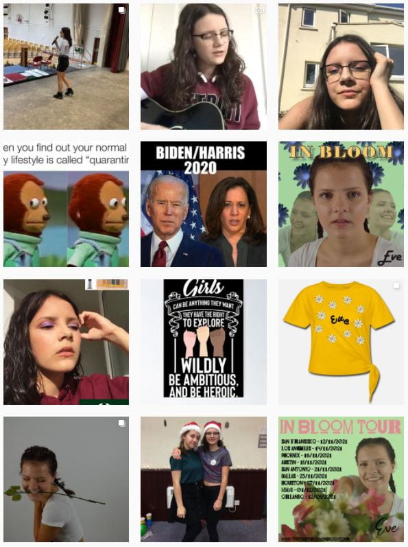
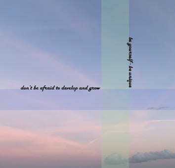
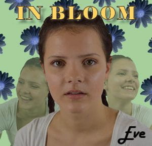
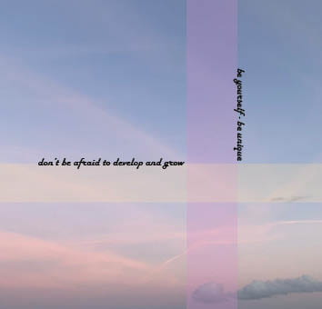
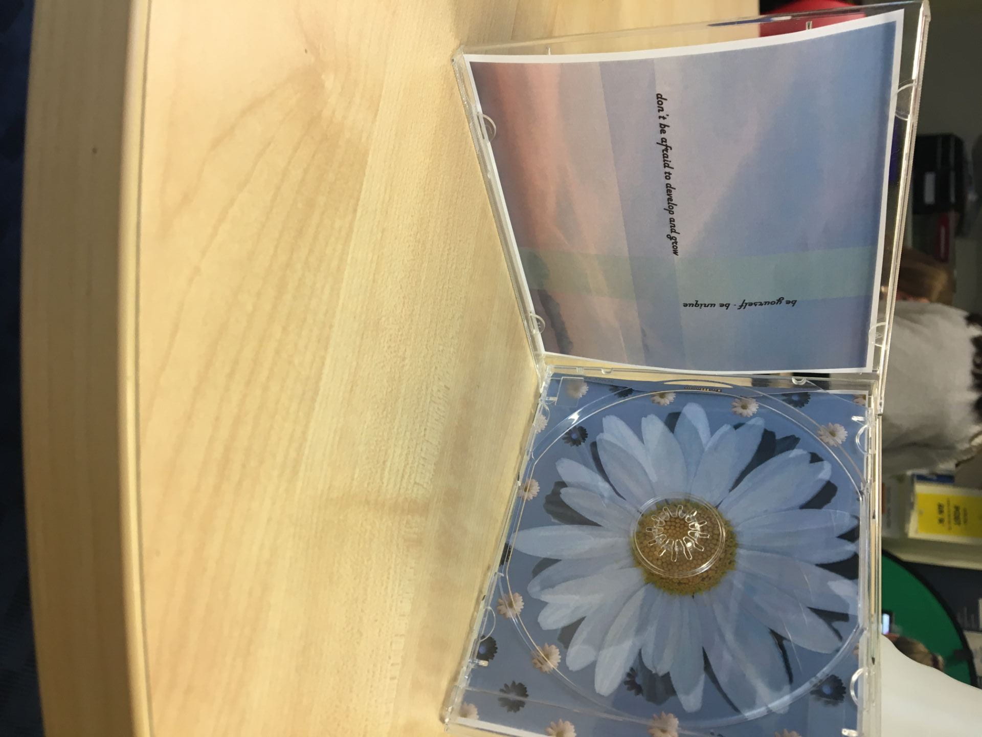
Some of the star image that my audience would decode and expect to see was the overarching idea of her calm and joyful nature as an indie/folk star. Her message to ‘be yourself’ and ‘be unique’ was evident in all of our products, particularly our DP inside left pane which featured this message in the text, as well as a storyline of breaking out of the social norms in the MV which conveyed her message successfully. The semic codes of laughter and the more composed pose and the cultural code of the daisies are examples of Barthes narrative code and would be decoded as part of the unproduced, natural brand message. The brand was heavily promoted on the SMP where the fan base would expect to be given hints about what
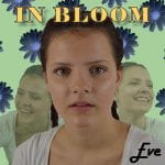
 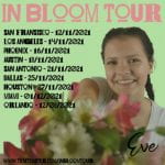 she is up to and what might be available to them, for example her ‘In Bloom tour’. These promotions help the fans to feel involved in the MV and get excited for the release of her album. Having an overall mission statement that stated she was ‘joyous’ and ‘quirky’ helped to create and design an overall brand which has been represented through my products with a conventional indie/folk colour palette, atmosphere and metanarrative.
Lacey’s repertoire of elements (RoE) are the expected features our audience would expect to see in a MV. We researched professional  indie/folk music videos and understood that they were a mix of narrative and performance videos with relaxed atmosphere and also conventional MES of romantic boho clothes, natural make-up and flowing hair. In particular we watched ‘Older’ by Ben Platt and decided to use some of the generic conventions such as natural, high key lighting to connote authenticity alongside the neutral colour palette of our star. Altman would also argue that Lacey’s RoE are the blueprint for a successful and conventionally recognisable indie/folk MV.
As well as following conventions of the indie/folk genre, in our production I decided to develop and challenge those conventions to help stand out in a crowded market. Instead of the conventional balance of performance and narrative video, we decided to include more narrative than performance. Although this strays from Altman’s blueprint 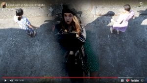 that the audience would expect, we felt that a more heavily narrative video would give space to explore our message and would allow our star to stand out. Our narrative told the story of a girl trying to break out of the stereotypical mould of what a girl should be; pretty, happy, innocent; instead transforming into her unique, angsty self, liberating her from her monotonous life. We filmed this using an episodic structure, our footage sometimes hand held and shaky to show her breaking out of the mould. Our narrative has no complete ending which is unconventional for stories as Todorov would claim conventional stories should be structured, however, in music videos it is now widely expected to be unconventional because it allows the audience to be in suspense, to ask questions and want to watch it again.
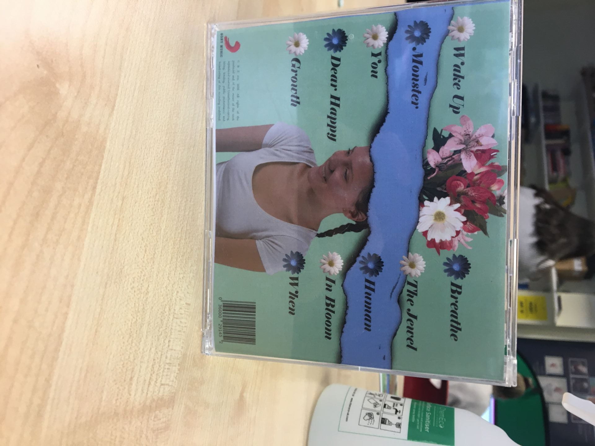
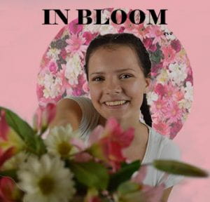
 To represent our star successfully, we aimed to present her as authentic and kind in the products we produced to create a successful brand. Barthes states that using symbolic imagery is important to create products. We used the image of a daisy to connote Eve’s caring nature. We also tried to make her seem as ordinary as possible without taking away the element of her being iconic in fear of her fans’ losing their awe towards her; Dyer’s paradox of the star (PoS) suggests that fans are able to relate to and feel closer to stars if they seem more ordinary and down to earth. We tried to present her as calm and relaxed in order to make her seem ordinary and present in her fans’ lives.
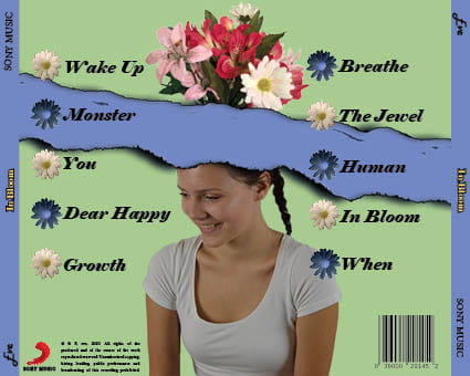
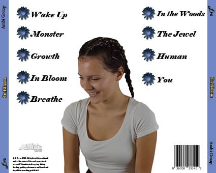
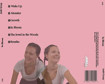
I wanted to represent her on the DP as a thoughtful and happy female indie/folk star, so I followed and developed the conventions of her representation. The images we used of her combined aspects of being both ordinary and extraordinary through the two paler images of her laughing which were more relaxed and unproduced, and the main one of her which is more staged and theatrical reflecting  the PoS. This helped to represent her as happy, mirroring our MV narrative where our main character changes personalities. This could also be implied from our inside right pane where we have a daisy and inverted daisy overlapping each other which suggests two different personalities. Barthes would argue that the representation through the semic codes of hard lighting and bold, solid colours wouldn’t be read as soft and caring which could change the fans perception of our star. However, Hall could say that they could be decoded differently as the codes of the daisies are symbolic and cultural; only certain demographics would decode the daisies as being pure and simple.
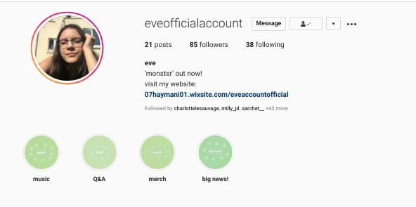
 Our aim for our marketing and advertising campaign was to engage our target audience. We ensured that our SMP was full of opportunities for our audience to engage with Eve.
We made sure our SMP allowed our audience to be informed, entertained and engaged. Blumler and Katz’ Uses and Gratification Theory argues that it is essential for any piece of media to allow the audience to have opportunities to reinforce or strengthen their personal identity and social interaction. For example, there were opportunities for the fans to interact with our star with the Question form on her story where she did a Q&A entitled ‘Ask me anything!’. This also addresses the idea that Dyer proposes about a star being present and ordinary, allowing their fans to relate to them. There is also a link to her website in the bio where fans can buy merchandise and tickets for her tour. This allows the fans to feel connected to 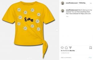 the star which can create an element of social interaction as well as personal identity. It was also important that key information was displayed on the page in an accessible place as well as posts to entertain. I included tour posters, gifs of the MV, videos of the star singing and behind the scenes footage from photoshoots. These elements were constructed to maximise interaction with our target audience. The posts contained captions, hashtags, photographs and videos, which conveyed her character, encouraging a preferred reading from the audience, for example, the use of lower case letters and emojis in the captions ‘speak’ to the younger generation more than the older generation as it uses language and features that they use in day-to-day life.