Final Draft Of Digipak

When creating our digipak we ensured that we used and followed our mission statement in order to create the best representation for our star image and genre. Making our digipak conventional allows our audience to engage with our product and ensures they don’t reject our media text. From research we learnt that we needed to make our front cover appealing and engaging to meet our audiences needs and wants, to do this we used photo manipulation to create a clear, crisp image of our model looking directly into the camera so that she can instantly connect with her target audience, this also shows the representation of female empowerment. We ensured all technical conventions were used including a barcode and copyright declaration, this allows our product to be viewed professionally.

Final Draft of ‘THINKING LOVE’ by Mia Elise

In conclusion, my group and I worked well together to create and complete our digipak, we have used peer and teacher assessment feedback from previous drafts to involve new ideas into our product and maximise it’s potential. Our digipak covers all grounds relating to the music industry and pop genre, which therefore allows it to be appropriately and successfully fitting with our music video and social media page.


Digipak Draft Three

As a result of our final feedback we received from the screencastify, as a group we have been working on and ensuring our digipak has improved from previous draft and best displays our star image and genre of pop.

As a whole, we have completely changed the design and album name of our digipak since draft two. This is because we felt the theme and layout wasn’t cooperating effectively with each other, so we decided to experiment to see what would work best with our mission statement and model whilst keeping it fully conventional. Firstly, our album name is now called ‘Thinking Love’ as opposed to ‘Seasonal Love’ as we found trying to carry the theme of seasons would be too difficult in relation to our images and previous work we had completed. We have changed the images across all four panes as they now each flow coherently across our digipak, for example it is conventional to have the model looking directly into the camera on the front page of a digipak, so we changed this to make it more engaging with our audiences. Other elements we have altered include the font, colour palette and text size to allow the significance to soley be on the model.

We printed our draft three of our digipak and placed it in a plastic CD cover, this allowed us to view our product together and understand the visually pleasing elements and what works well, it also gave us an insight in seeing how it would look as a real, professional digipak.

Draft 3 in CD case:

Feedback from peers;

Finally, we completed a survey where we made a sheet containing seven genres and we asked our peers to mark the genre they thought or digipak relates to best. The majority of people guessed correctly, this highlights that our branding works effectively and conveys our genre successfully,

Digipak Contact Sheets Two

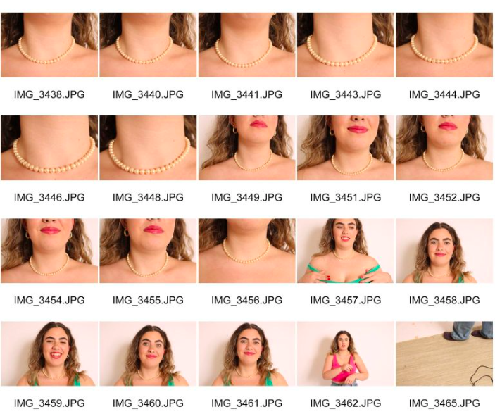
When it came to creating our digipak, we realised we didn’t have enough images that were engaging and personal. Most of our images contained our model with sunglasses on, as a result of this we took the opportunity to do a reshoot where we would also include the pearl necklace, as this is a key element of our music video and is important to keep the theme coherent throughout our products.

We found that these images also fitted better with our genre of pop, as from our research we learnt that models looking directly into the camera was a conventional feature.

Digipak Draft Two and Screencastify Feedback

Below is draft two of our digipak. This includes both inside panes as well as the front and backcover. As a whole, we have changed and included elements such as images, typeface, positioning of the text and colour palette. We have altered this to gauge different ideas and opinions on our digipak to understand which layout will connote and represent our star image and genre proficiently.

Screencastify from our teacher:

Above is a screencastify relating to my teachers feedback on draft two of our digipak. Recieiving feedback and advice relating to our digipak is helpful as it gives ideas on our work and how others view and perceive it as a package brand and product.

What went well:

  • The background of the frontcover and backcover, adds colour and texture as well as making it eye catching to the audience
  • Positioning of the model on the frontcover as she is placed in the centre which focusses all attention on the purposeful subject
  • Included conventional and technical elements such as the barcode and copyright declaration

Improvments for Draft Three:

  • Allow the artists name to be bigger than the album name to convey significance to her
  • Move the tracklist above the models head
  • The text on the spines need altering
  • Add an image where the model has no glasses on, this is more engaging and allows audience to connect personally with the star
  • Change the font to a more current pop vibe
  • Potentially change the blue background to shades of green

This screencastify has allowed my group and I to identify what needs improving and how to change these elements to ensure our digipak is created to the best of our ability, making sure that all aspects of mise en scene are coherent throughout and all technical conventions are included to support the representation and importance of our star image and the genre.

Digipak Draft One

This is the first draft of our Digipak. I have included an enlarged image of both the frontcover and backcover. below I have analysed and decoded the technical conventions and mise en scene elements used to overall grade our digipak and understand what we can improve working towards our next draft.

What we can improve on:

  • Firstly, it is crucial that we do another shoot to get a variety of shots with our star looking directly into the camera lense (without glasses) so that she is engaging with our audience, from research we have seen that this is more conventional to the pop genre.
  • Potentially find a better font then our current one to improve the way it looks and give it more of a modern pop vibe, also using a different font for both the artist name and album name to individually show the importance and representation of both.
  • Recreate the spines by changing the colours to allow it to be more visually pleasing and eye catching.

Contact Sheets for Digipak Shoot

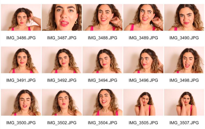
Here are the completed contact sheets for our Digipak. We used a variety of shots including mid shot, long shot, side shot and close up’s. As a group we chose to complete our shoot in the white studio as this was best for the images we wanted to shoot, we then used the projector to project colour onto our model to make it more interesting. 

Our favourite shortlisted images;

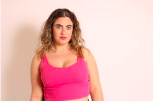
We wanted to go for a plain look for our model so that we could experiment with different saturations and colours to make the images more powerful and bright. These images represent femininity within the pink and purple colours in her outfit which allows the audience to instantly understand that the digipak relates to female pop. Overall, we got a wide range of images containing different angles, poses, facial expressions, outfit, accessories and lighting. Each element aligns with the other to ensure all aspects of mise-en-scene are conventional and link back to the pop genre.

Production Meeting Agenda and Risk Assesment for Digipak Shoot

Our own Digipak needs to contain images of our star for the frontcover and backcover. The pop industry usually places an image of the artist in the middle of the product reinforcing what the album is about. We have decided to use Evelyn who is starring as Mia Elise in our music video, to be photographed for our digipak. In order to complete this shoot, our group have created a production meeting agenda and risk assessment to ensure our shoot runs smoothly. we have included text and images relating to times, date, shots, mise-en-scene and equipment. this way everyone knows what is happening on the day allowing us to be fully prepared and using our time efficiently.

PMA;

Risk Assessment;


Digipak Mockup

Creating a digipak comes down to planning, researching and developing new ideas. To start the process and creation of our digipak we have made a mockup sheet containing our favourite frontcover and backcover layouts, colour palette and album name. When producing our digipak mockup, particular elements were inspired by various album covers and blueprints we had researched, however we will make each element of our digipak unique and ensure it is all original. When decoding and analysing a chosen artists album cover, we understood what we needed to include and think about for our own. This includes the technical conventions of a digipak and how image manipulation and media language can create different connotations to a product. A repertoire of elements was fully thought through and visualised to ensure we have the correct content for our genre and brand.

A conventional digipak for a pop genre includes a bright colour palette, an image of the artist placed clearly on the froncover, a sans seriff font, barcode, track list, artist representation including name boldy shown on the frontcover and a cosistent theme of mise-en-scene and conventions shown throughout the digipak. These visual elements are crucial to include as the first impression of a digipak is what appeals and entices a targeted audience to purchase, it also needs to specifically convey the genre of the album so it is made aware the nature and content of the product.

Our album name ‘Seasonal Love’ will be placed across the lower bottom of the frontcover of our digipak with our artists name ‘Mia Elise’ above. We will have a direct image of our star in the middle so that the audience are immediately introduced to her and understand who the album is about. Our album name was perfectly fitting with our song ‘The Best You Had’ as it represents the raw emotions felt throughout the seasons from our artist, this then allows our audience to engage and connect personally with the product and artist whilst giving them a further and deeper understanding of what the song is conveying. We will be incorporating a seasonal theme on the backcover of our digipak to ensure our product is coherent and including a barcode, song tracking list, duration and copyright declaration to keep it conventional to our genre.

Digipak Mockup Sketch;

Our Chosen Colour Palette;

Creating and discussing mockup ideas for our digipak has given my group and I a stronger and clearer understanding of what is conventional to our genre and the elements that will make our product a competitive advantage and a successful multimedia package to the market and music industry.

Digipak Conventional Analysis


It is crucial to know the conventional features of a digipak. Above I have fully analysed Camilla Cabello’s frontcover and backcover of her album. Digipaks are designed to work as part of a multimedia package to support the new launch of an album. I have explained many visual elements that are conventionally included in a pop album such as the barcode, copyright declaration, publishing logo, listed song titles, album name, colour palette and mise-en-scene. By analysing each element closely  I got an insight into the blueprint of this particular album and how I can include these in our own digipak. By highlighting these features I am more knowledgeable on representation being conveyed through images, graphics, illustrations and the technical conventions of an album. When analysing, I explored image manipulation and how Camilla used this to interpret confidence, female empowerment and sexuality into her album and as a message to her global audience.

I now have a clearer understanding of the technical conventions used in the creation of a digipak as a multimedia product. My group and I will include the visual elements and conventional features of a digipak when we come to creating it. We are now aware of the competition we are up against and aim to make our product and brand successfully.

The Look Book- The Package

Below is a moodboard filled with our own visions of what we want our brand to be. We have prepared a series of colour palettes, relevant images, key descriptors, album covers, social media pages and tour posters which collectively brought inspiration to our digipak and social media campaign.

Made with Padlet

Our Look Book illustrates the opportunities we aspire to create for our brand as a whole, including a repertoire of elements relating to our star image and genre ensuring we promote our brand correctly to keep our target audience engaged. This allows us to view the female pop industry as a visual and gives us an insight to how integrated marketing is used within the pop industry.