November
28


November
6
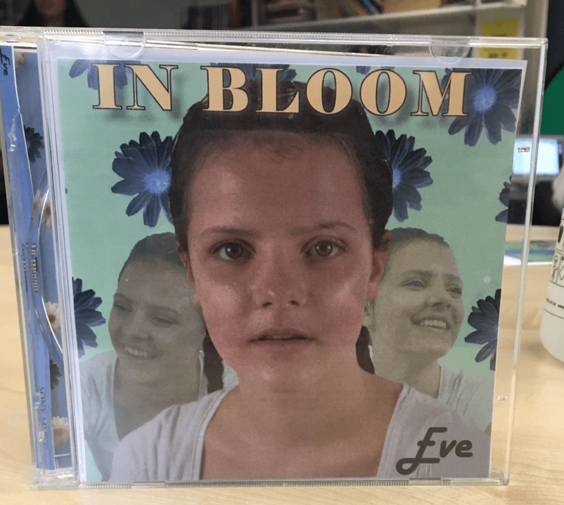
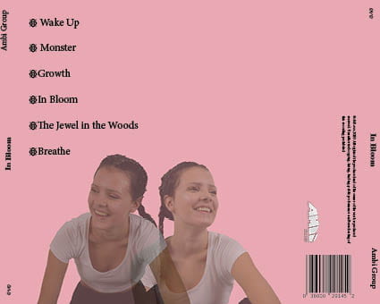
Digipack Draft 3
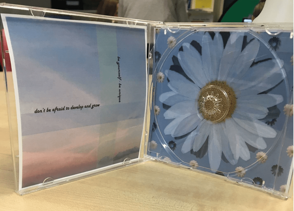
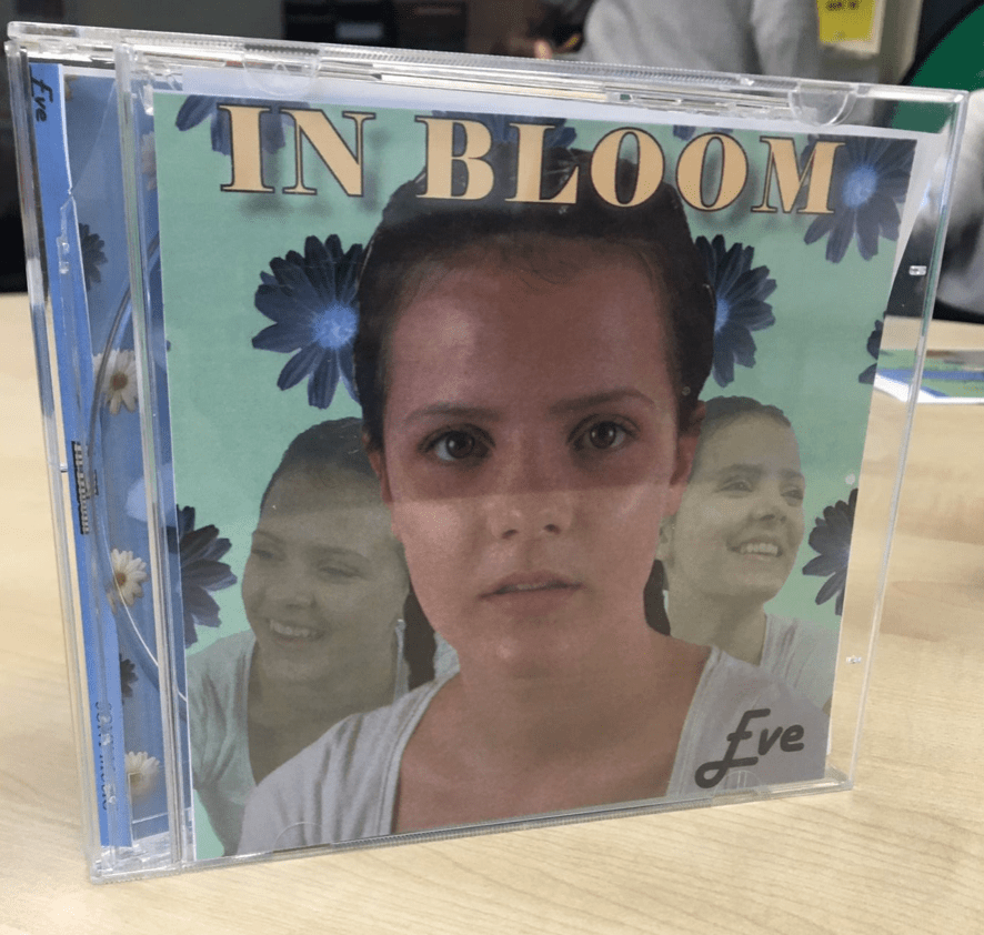
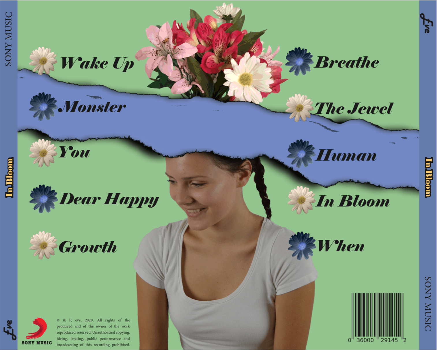
Here is the third draft of our digipack:
Audience tally:
We sent out a survey to our class asking them what genre they thought our digipack was. This was to make sure we were keeping in our genre and that we were being conventional to our audience.

The last things we have to do for our final draft are:
- change Eve’s lip colour
- change the colour of the rectangles on the sunset to match the daisy’s and the green background
- cut out the daisy on right pane properly – still has black edges
- change the font for ‘In Bloom’ and track names
- make daisy’s on right pane more cartoon-like (like flowers on back pane)
November
5
Digipack Draft 2
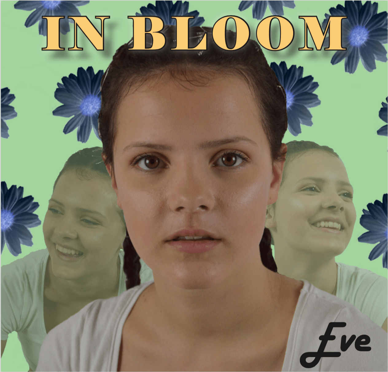
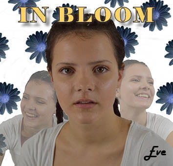
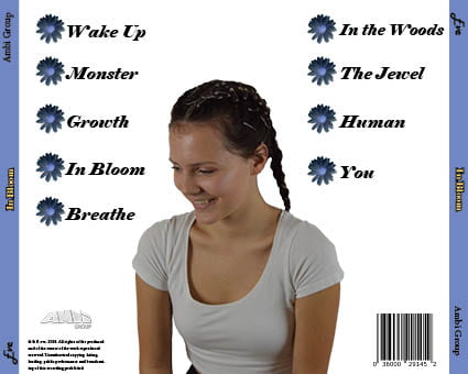
This is the first draft of my digipack:


Teachers feedback:

Targets:
- take away the 2 transparent images behind the main one on the front cover
- change her t-shirt colour
- change the background colour – one of the colours from the sunset rectangles
- change the more yellow sunset to one with trees or a sea sunset
- add the flowers coming out of her head on back cover
- make tracks even on both sides
- alternate colours of daisy bullet points
- make ‘Eve’ bigger
- make back cover image bigger
- play with the ‘In Bloom’ font and the track list font
- give her some colour on her lips
October
19
Digipack Draft 1
Digipak Draft 001 – ‘In Bloom’ by eve

I thought the first draft of our digipack was really good from the theme of nature all the way through to having our star wearing numeral clothing.
However, there are a few things that we will have to change and shape up to make it more relatable to that subject audience. For example:
- Take a photo of flowers as home to replace the internet backdrop of flowers
- Sort out the colour scheme, I feel like the pink doesn’t flow into the brown and green easily, perhaps we could try and match it with the purple colour in the back inside cover photo
- IN BLOOM needs to be bigger and maybe even overlapping the star or put behind
- make the faded stars on the back cover bigger
Self assessment:
I would give the first draft of our digipack a D/C. This is because is it very conventional to the genre however not everything is in line and more editing is yet to be done.
I was grading our first draft off:
- The use of camera and photoshop to take photographs and to enhance images
- The use of mise en scene in photos and what it conveys and communicates
- The use of DPT to intergate images/texts and the use of colour/typefaces
October
18
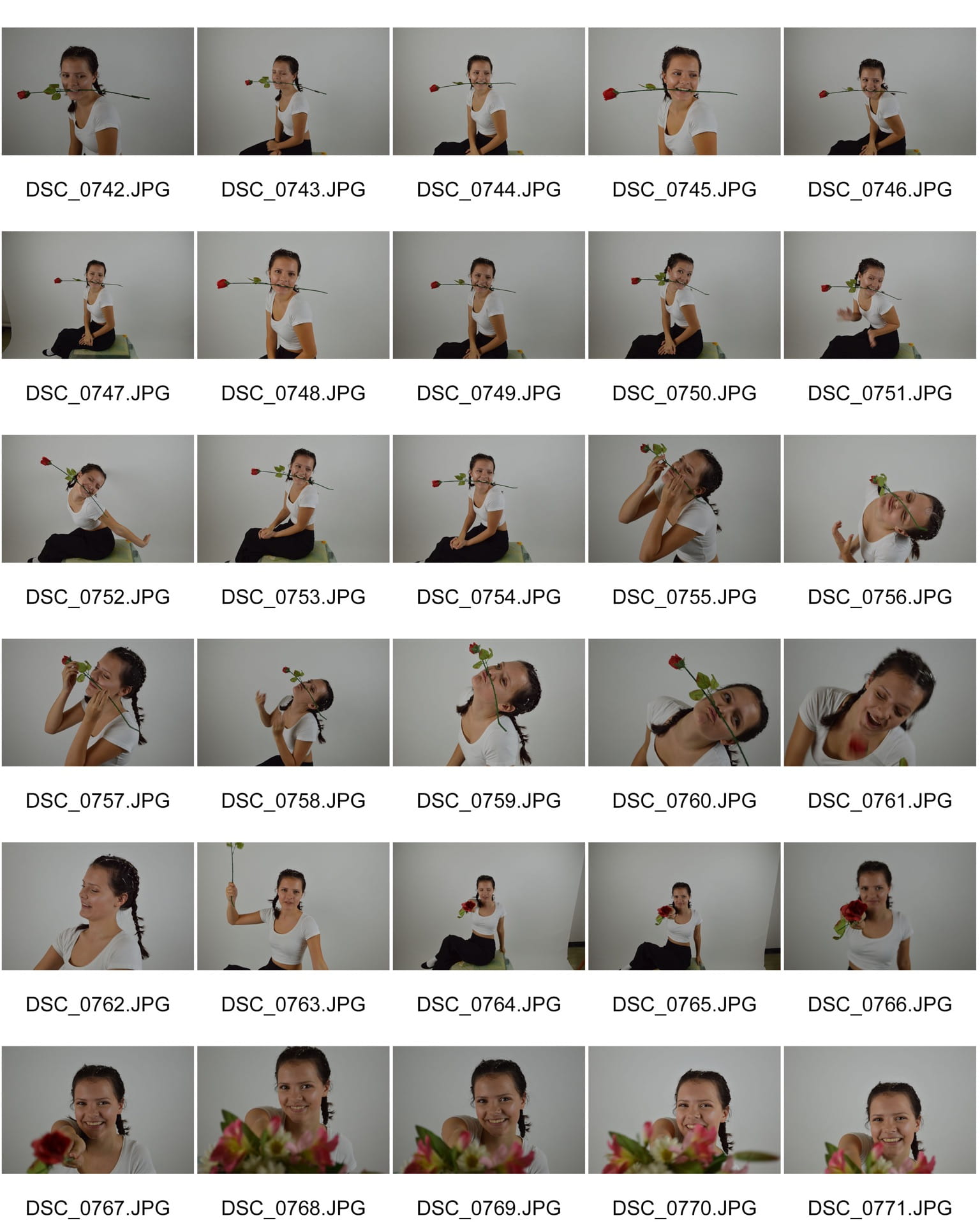
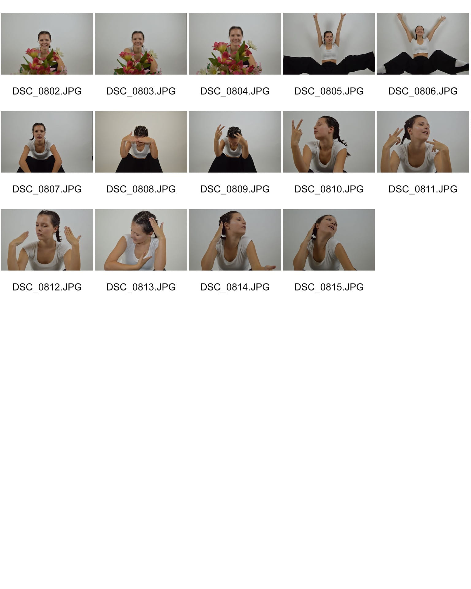
Evaluation of shoot 2
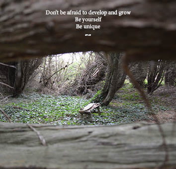
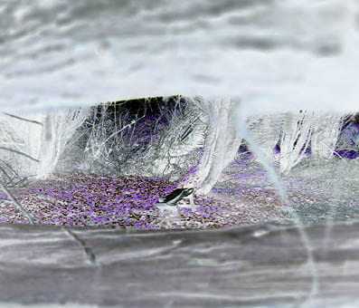
Overall I thought that shoot 2 went well. It wasn’t as sunny as we had hoped, however, we can fix that on photoshop. We wanted to invert the colours and use yellow anyways. The shots we got were good even though halfway through we realised the flash was making the trees go white, so we turned it off.
October
18
Contact sheet 2
October
18
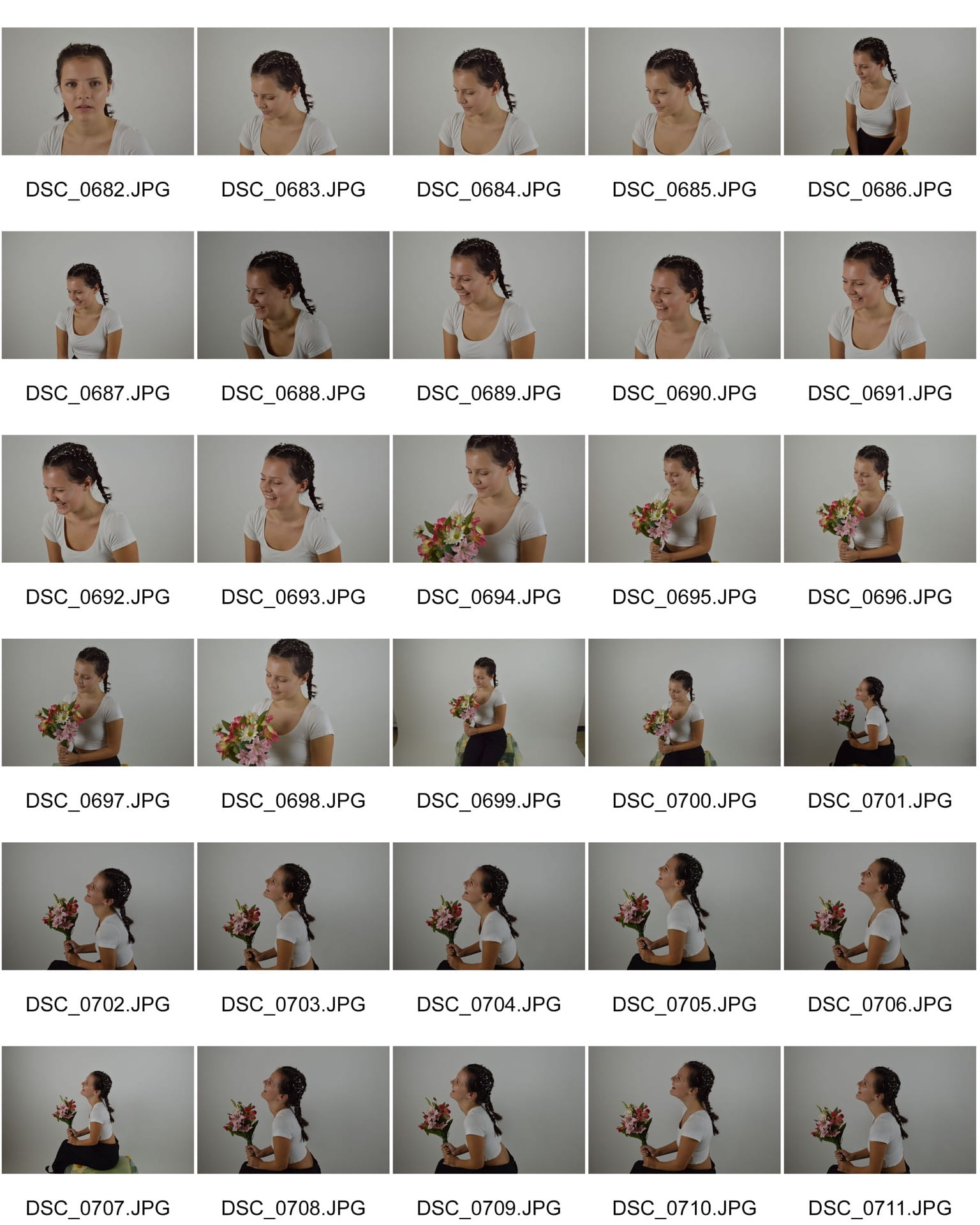
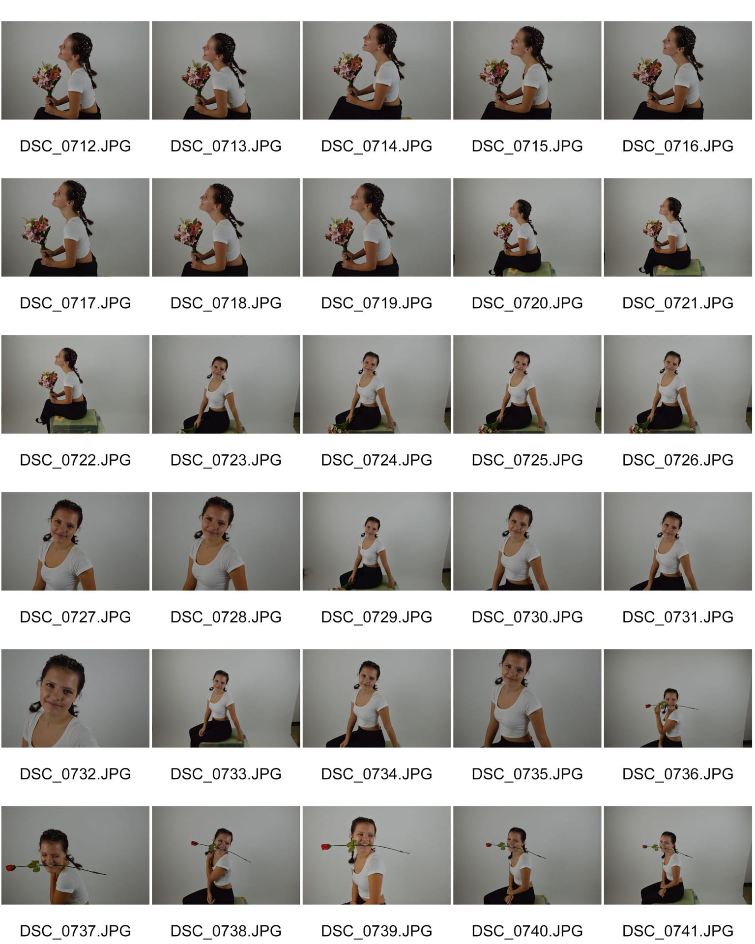
Evaluation of shoot
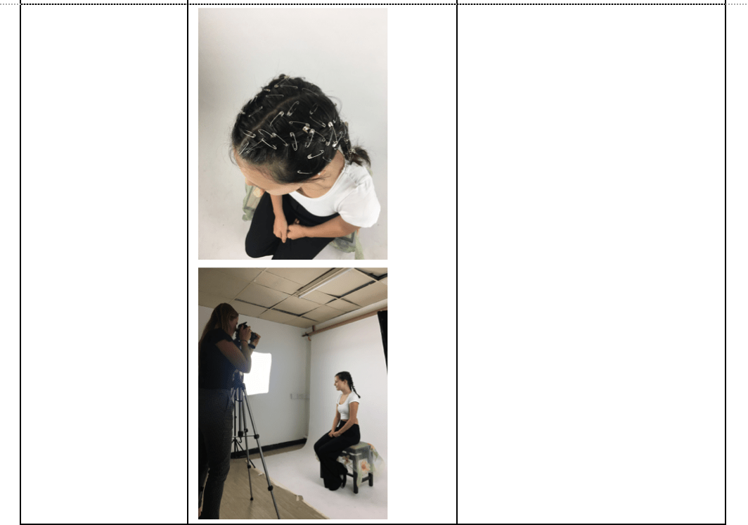
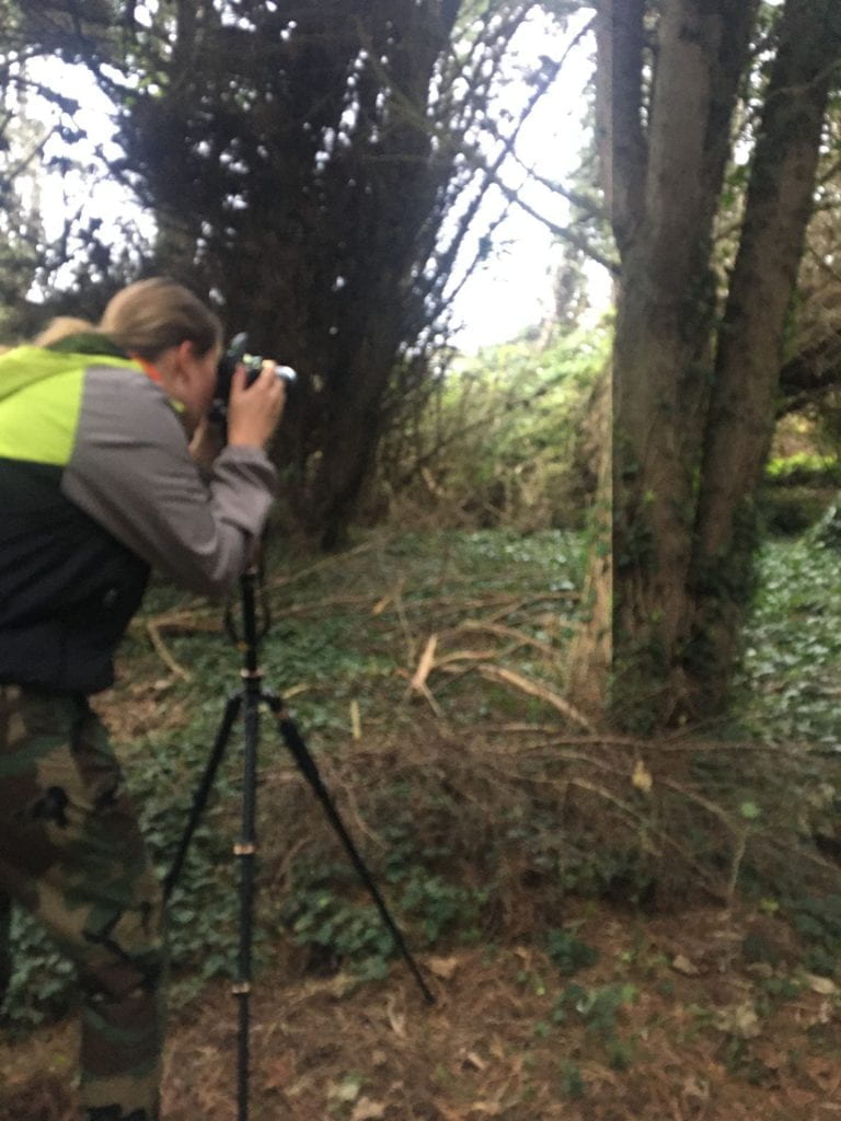
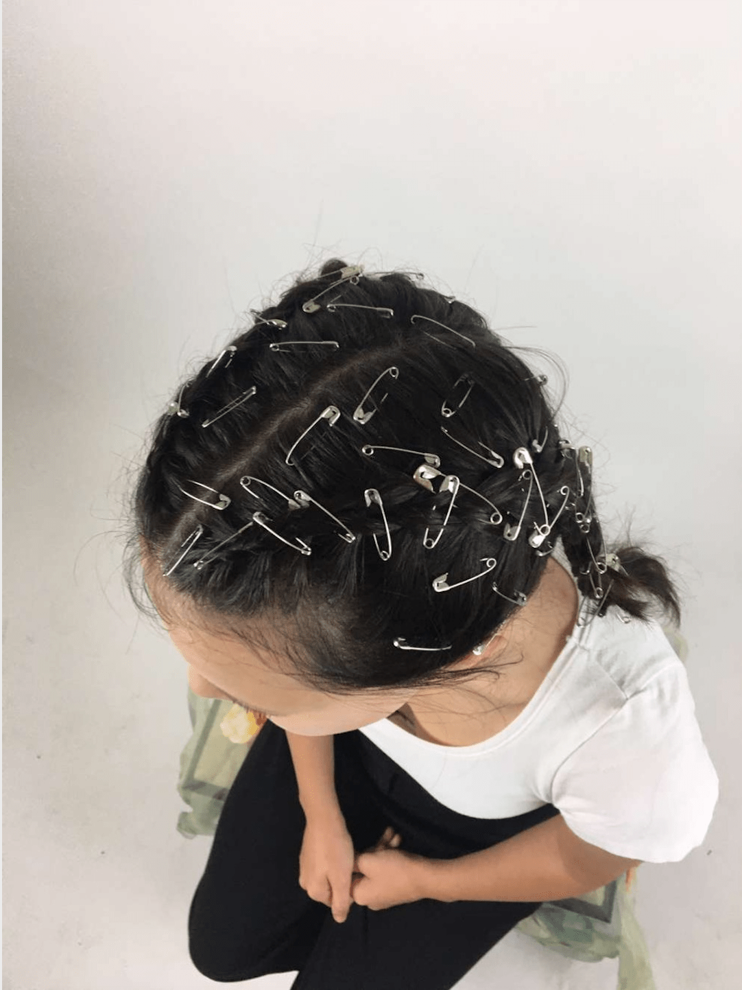
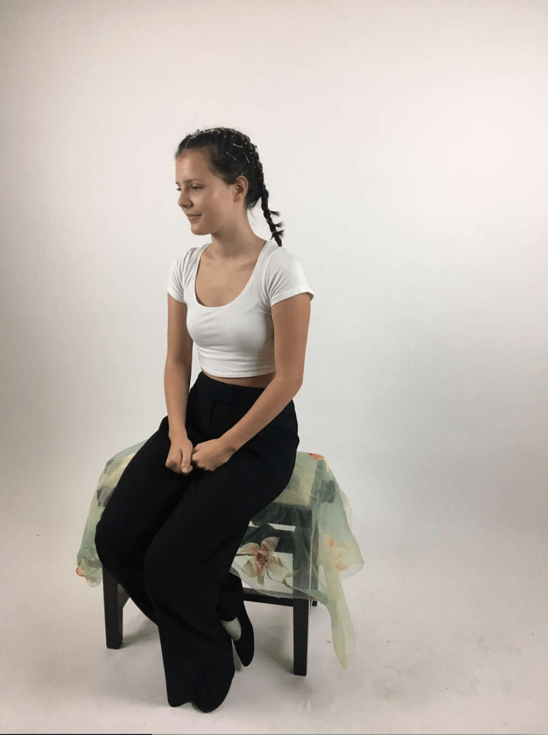
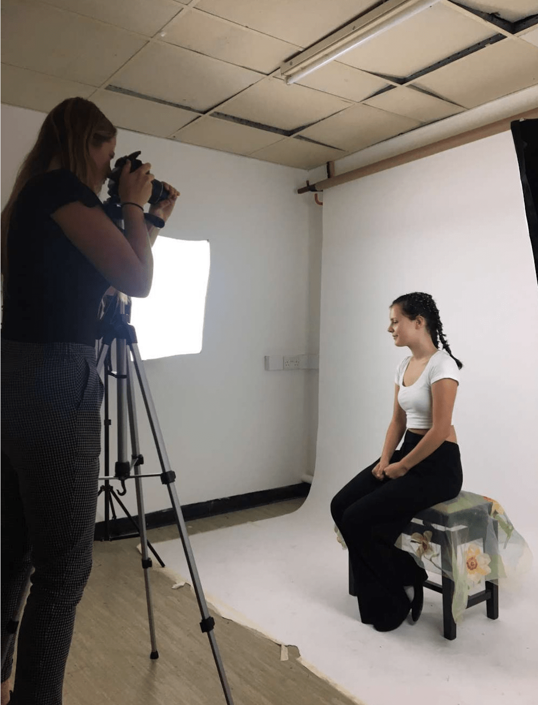
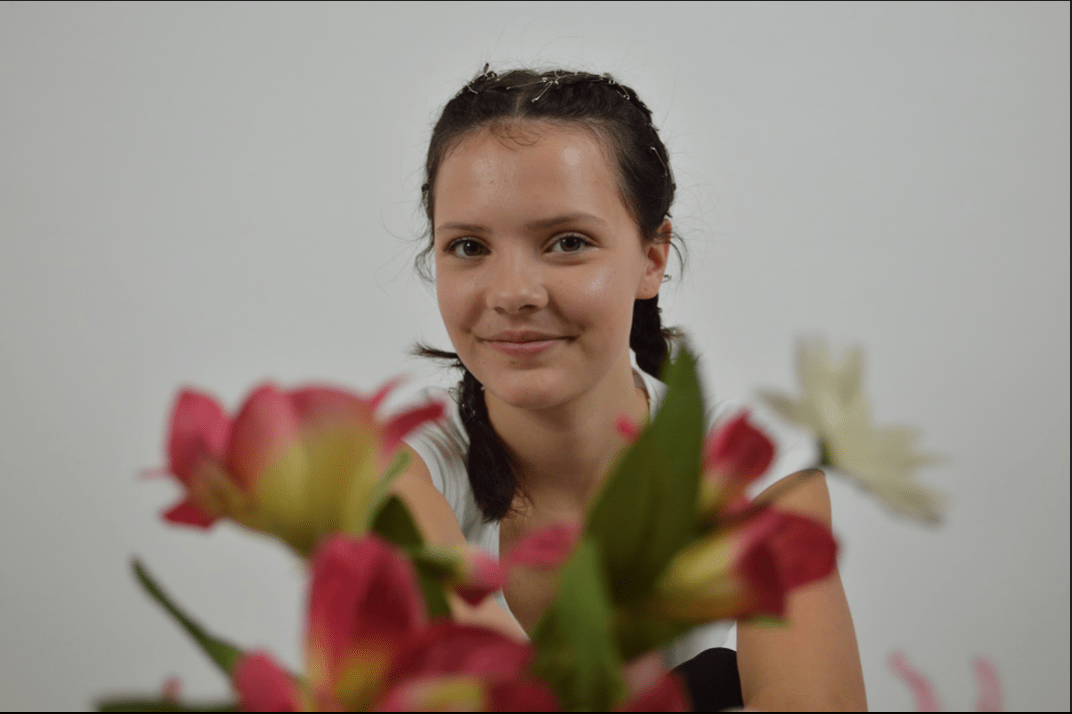
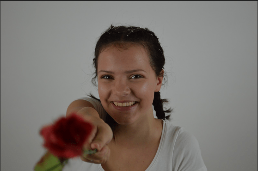
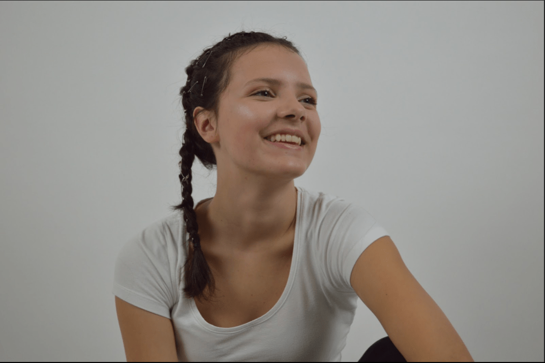
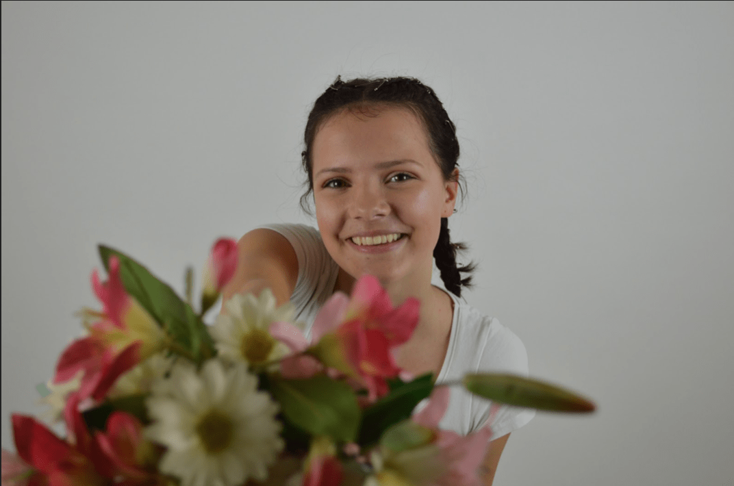
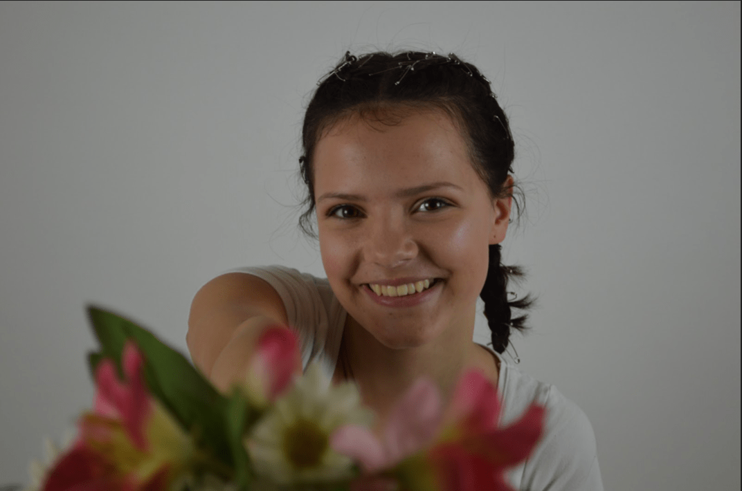
Overall, I think that our shoot went really well and Elisha and I were really happy with the results. We managed to achieve the effect that we wanted in Eve’s hair and it looked even better than we imagined. We think we managed to get some shots to use for the front cover and back cover for our digipak. We managed to get lots of mid shots which are the shots conventionally used for our genre as well as covering all bases and getting high angles and lower angles and side profile shots. Our star was smiling the whole time in order to portray the happy nature of our star image and to reflect the music on the digipak.

October
18
Contact Sheet


October
18
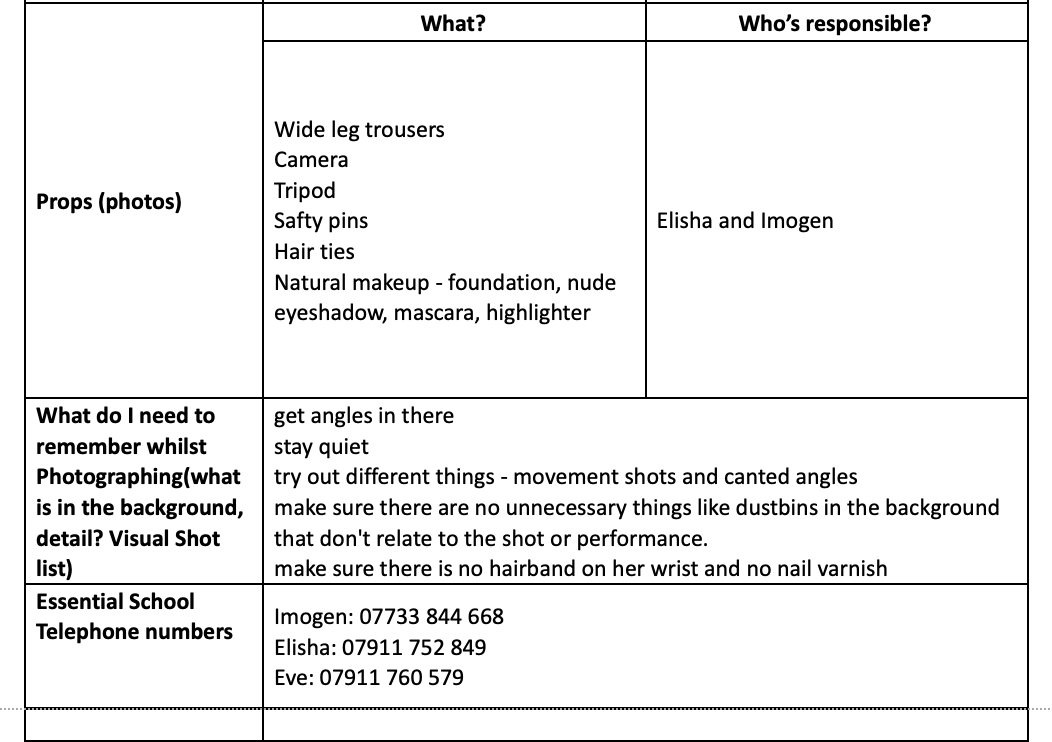
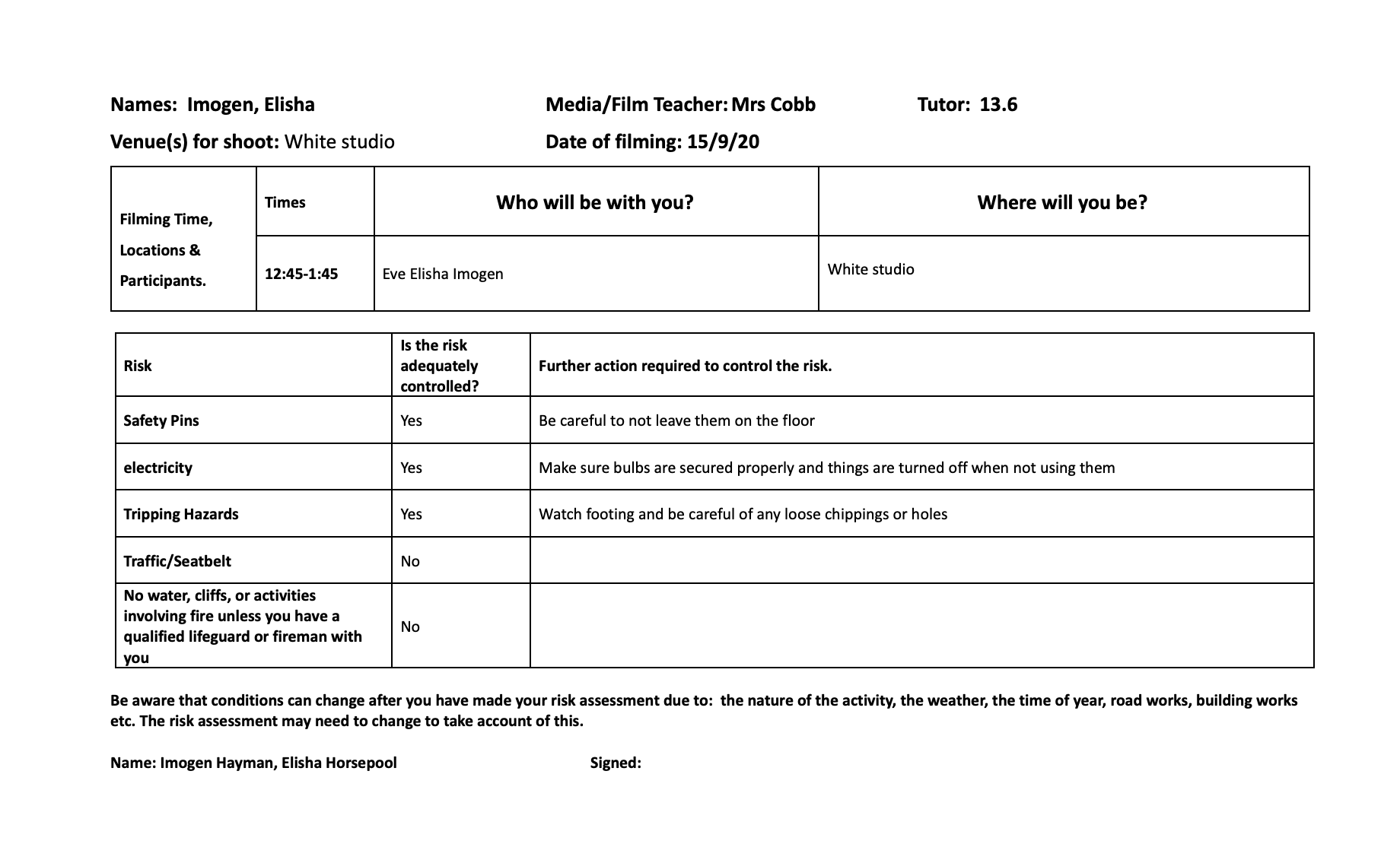
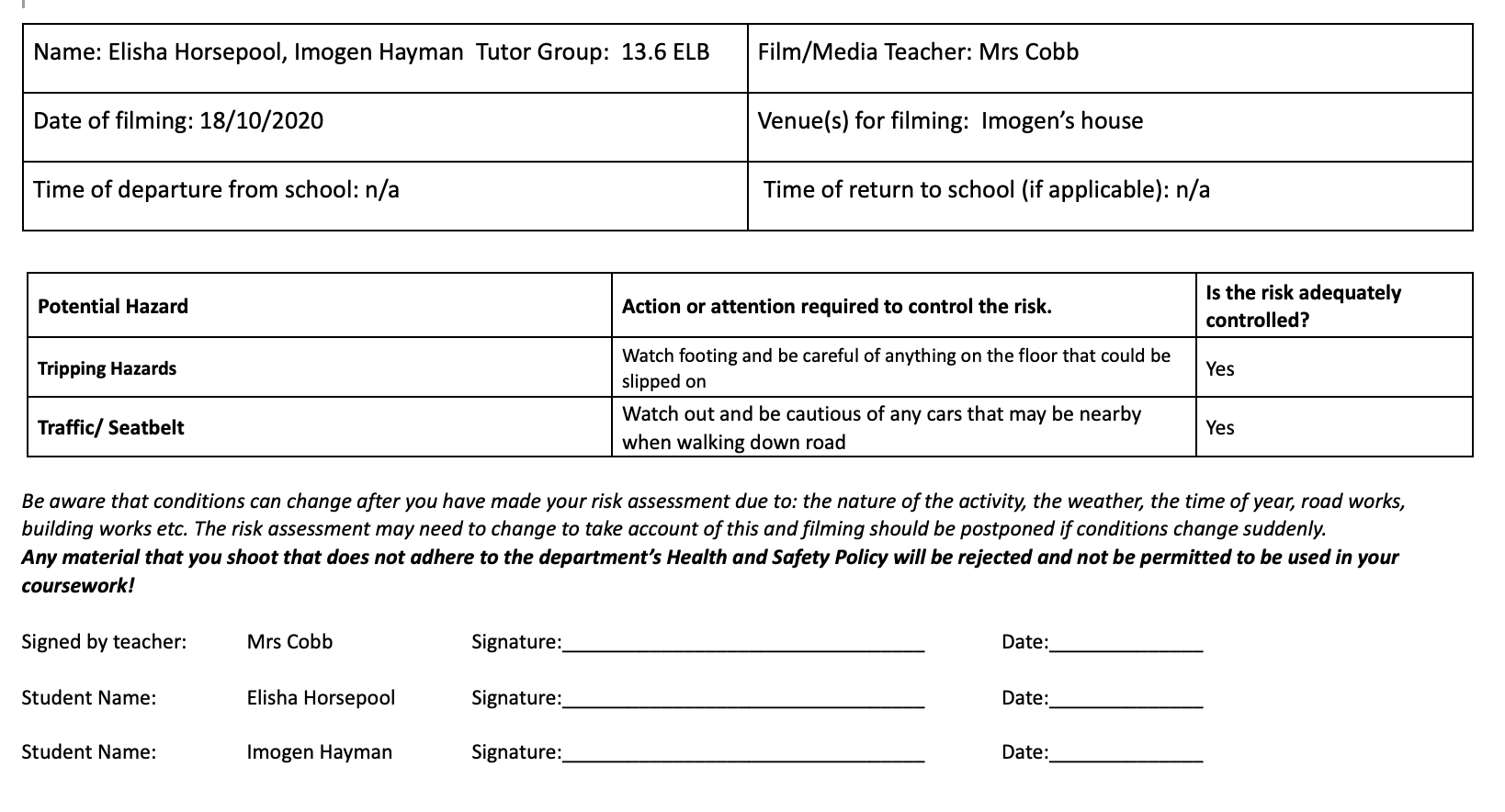
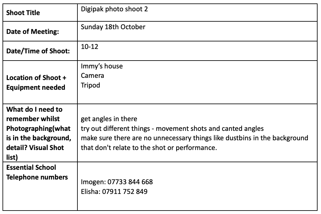
Design meeting and risk assessment shoot 2
October
14