a new and improved contents page


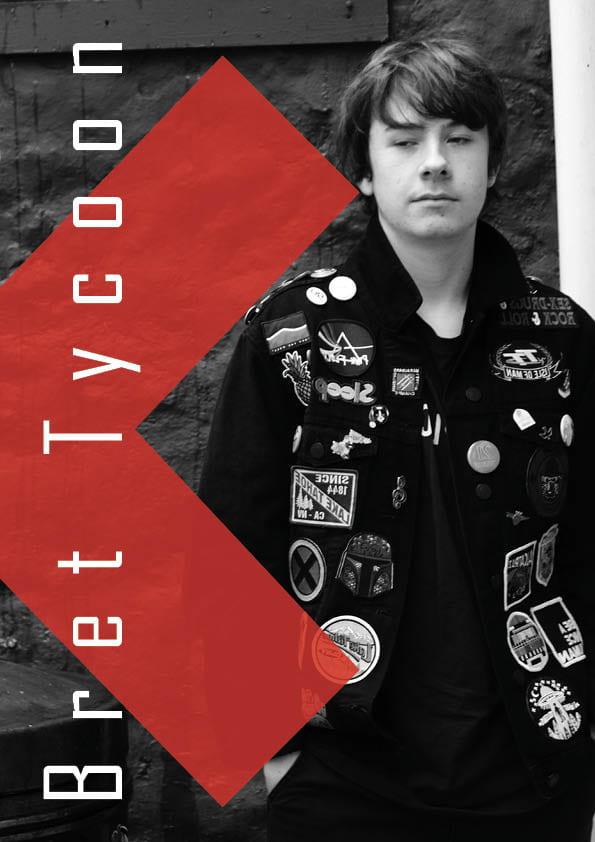
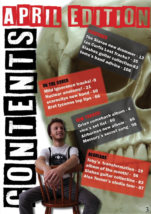
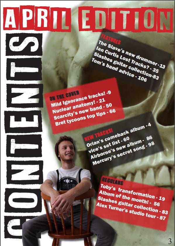
This is my improved contents page, I changed the color scheme as i felt that is looked strange and didn’t quite reflect the punk aesthetic as the colors weren’t strong enough, and I feel the black red and white contrast very nicely. The font i also felt was week and as a result I ditched the miss match font idea in favor of a  bolder font that really reflects a more modern punk aesthetic. The image has also changed from previously a model with a seeming man in a suite, i see now that reflects the wrong thing as the point of punk is too reject society normality witch this character clearly represents so I changed it to my cover model looking quite nonchalant.

Adverts

These are the adverts I have chosen for my magazine, I chose the top add as i belief with the political undertones of punk music the majority of them would be quite aware politically so advertising fro a charity makes sense. The hard rock cafe is also relevant as its an established rock and alternative music ”club” i feel like someone that would be interested in reading this would also be interested, especially regarding the general age of out audience ( mostly between 16-24) a mid range cafe that caters to there style would be appreciated.

A new improved dps

This is an improved version of my double page spread, using the criticism and peer assessment of my first draft of my double page. In the end i didn’t change the typeface of the mast head but I did make it more prominent, I also proof read it so now it all makes sense. In the end   turned some of the text red to so make it stand out and now contrasts very nicely to the white and black background, its also a different red that is slightly darker so when on the cross it doesn’t blend in too much. A new addition is now the pages have numbers witch was much needed.


second shoot contact sheet

This a collection of contact sheets from the second shoot we did that took place in town, i feel i have gathered a good amount of picture including different places and angles. I particularly like the ones of my model by the steps i feel the setting fits the theme really well with the endearingly grime like  background, the pictures in the building i also feel worked particularly well and are quite good background images. I also played with a macro lense witch yielded some nice images such as the Christmas decorations and skulls.

A New And Improved Feature Article

This is the redraft of my article in the second draft i made sure to  make  it obvious what anarchism is and hoe its fits in politically as this what if someone isn’t quite sure what anarchism is or how it works my article wont alianatee them while still not sounding to redundant to any season punk or anarchist.

I decided to also lay off the government and focus more on society as i feel contextually that makes more sense and the topics mentioned feel more as a result of society than a tyrannical government.

I also added some statistics to give the article a bit more structure and substance to my article, its allot easier to take away something from an article if instead of opinions its hard facts and statistics.


So… I am ready to photograph my star

My mission statement for my magazine is ”we make music for people who listen” this could be communicated as its a music enthusiasts magazine for music enthusiasts, compared to pop witch is usually listens too quite passively, my ”brand” would communicate authenticity and a comparable understanding of the genre as if i lived through the punk movement in the 70s. As a result feel my shoot needs to incorporate allot of classic punk elements for instance battle jackets, braces and boots. The setting should also communicate this being grime or dirty like a back ally for instance. I may photograph my start from a lower angle than usual so to make him appear more powerful or with a higher status, i could also incorperate a canted angle to communicate his chaotic vision witch the canted angle has connotations of.

What is a contents page

These are the drafts of what i think my contents page should look like, on the left there a more traditional looking contents page. I like the look of it as its simple and readers know exactly how it look it makes scene and is quite familiar. The flip of that is the far right that is slightly more modern, it showers a contents on the side of simple headlines but then a second column containing images (these could be articles from the cover or features or a couple other options).