Complete magazine draft


.The Green on purple needs to be changed(issues for colour blind people)

.Mast head needs to be broken up

. capitalisation

.Separate headlines

.Price, date

.Work on grammar on the double page

.Change colour scheme in contents

.Change mast head type face

.Seems child like

.Change the image of my star with a businessman

.Grammar


Draft of the Double Page Spread

This is the first draft of my double page spread and i feel it turned out well, although i feel that the main typeface is a tad to big and could do with being a serif font as it would be easier to read, I also neglected to include page numbers witch would have to be remedied. Although i do like my mast head, i feel the font fits with the theme and the white nicely contrasts with the dark background. I also feel the big red x is a nice addition witch breaks up the image a bit more and makes it allot more visually interesting. The type face could do with a change maybe more bold but also needs proof reading with the obvious addition of the article.


article idea development

My article will be a list of top tips for life from the perspective of an anarchistic punk, the target audience for witch will be someone aged between ages 0f teenager to mid twenties and middle class, witch would be the average person who avidly listens to and consumes punk culture and media. These people crave direction in life usually with not many prospects and having something like punk fueled of low income and rage appealed to them and the magazine needs to reflect that.

First shoot contact sheet

I feel that i may have met the standard for my shoot, the images appear to be in focus and not over or under exposed and i feel they meet the theme and have the relevant imagery associated with a punk. Especially in regrades to the battle jacket witch makes it very clear what genera is being emulated. The next time i do it i will make sure to have a clear plan of how to light the studio in regrades because if we had a better plan it might have been a smoother quicker process.

language analysis

I’m looking at Wyclef Jean’s ten top tips for life, as he ”lays down the laws”. He regrades them as his rules for life, almost a how too from the perspective of a rapper/musician, there inst a lot of journalistic language in this as it is mostly mostly from the perspective of the star rather than a perspective of a journalist who is talking to a star and as a result it doesn’t feel as if we are reading something taken from a third party. The language is quite casual unlike a journalist who must be subjective to the matter as it is a star he can just talk as he wishes and say what he wants  the quote ”wild thoughts, as long as it pure and its real its going to happen” demon straights this as it uses very casual language like ”wild thoughts”. This makes the article seem more genuine it doesn’t look or feel manufactured or fake it now feels genuine, real and more like a chat rather than someone reading to me,. They also don’t feel like instructions as a result of his language witch i also feel is important, as in article of this nature where the star is talking directly to the reader if the language was more commanding like traditional instructions it could easily make the star look arrogant or pompous, this also makes the star seem more down to earth and that allows the audience to feel more connected and related to the star forming a bind between them.


Design skills 1

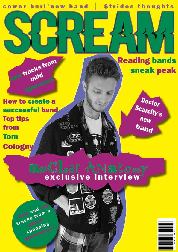
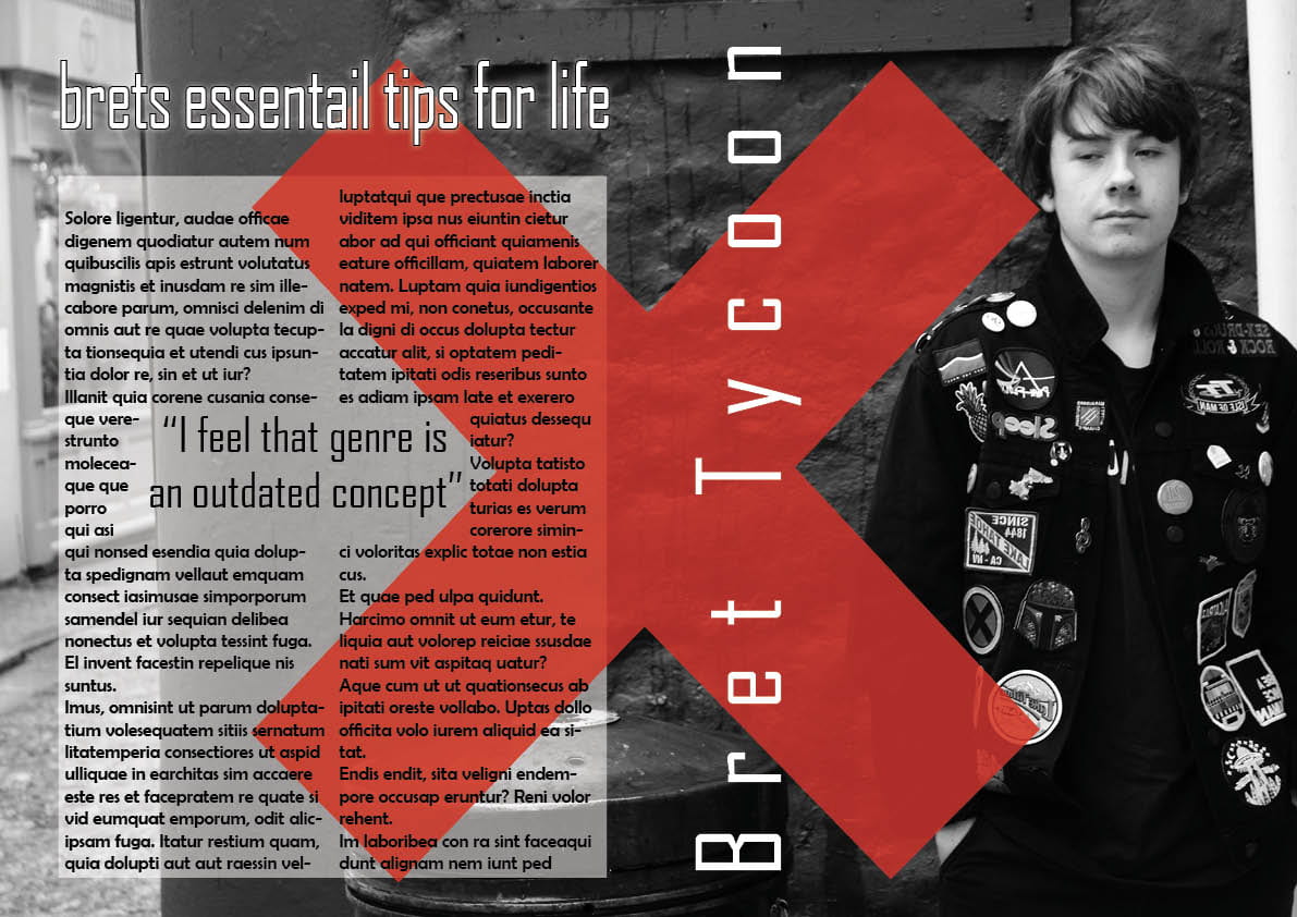
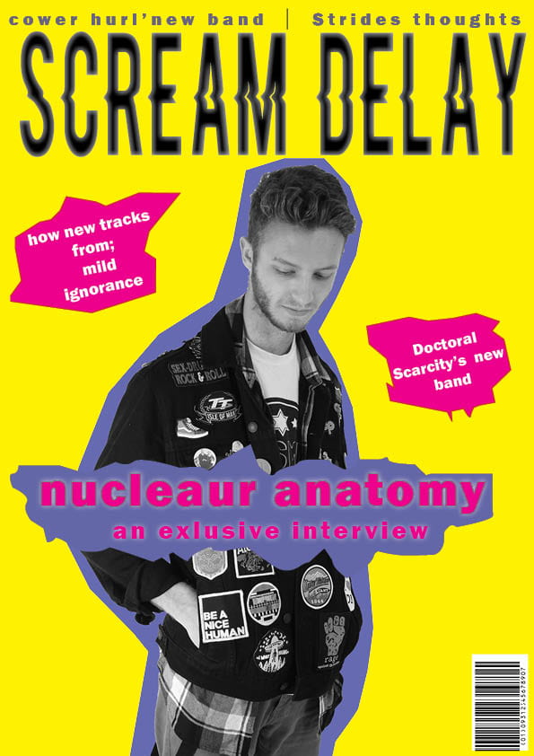
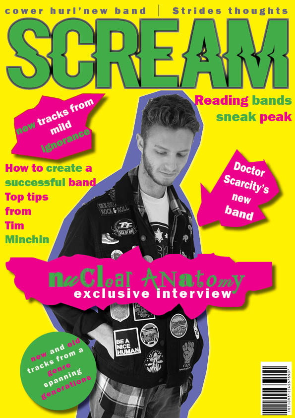
In this term i have learned a multitude of design skills as well as a plethora of camera skills including in design, witch is a program i had previously never used but am a lot more comfortable now, the program was quite intimidating and now  I am fairly comfortable with it. Though in In-design I have made a tour poster and the cover for a print magazine, it did include me learning to use Photoshop  witch is another program I wasn’t particularly comfortable with  and had to lean how to cut out images and feather them for a print magazine and the challenge came when i had to incorporate hair into that. I do feel that the tour poster could have gone better, I feel that I got carried away and added to much possibly ruining the design  slightly, however i am quite happy with my magazine cover.

Image result for select tool photoshop"

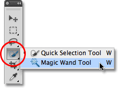
(This is the quick select tool witch is is used to select images in Photoshop to be placed in Photoshop or in-design)


Image result for levels tool photoshop"

(This is the levels tool witch is useful for cutting out hair as you can turn up the contrast and cut out the background witch is allot easier that using the quick select tool)


A New and Improved Front Page


Draft 1

Draft 2

This is my first and second draft displayed next to each other, the second draft i believe came out quite well. I made the frame busier this makes it look less baron or desolate. I also changed the mast head by putting it in green to match it with allot of the text, I also decided to make allot of the text green as i think it adds allot more variety to the cover. The cover has taken allot of inspiration from and album cover of the punk band the sex pistols (never mind the bullocks here’s the sex pistols) there cover made use of bold colors such as the aggressive green pink and yellow. I also added drop shadow to the pugs as i believe it add allot of dimension to the cover. I think if i’m going to build on it more i want to put more on the bottom of the page as it still looks quite empty i also feel that making the star bigger it may look better and showcase him a bit more and also make him look angrier witch fits very nicely into the punk motif.

Draft Front Page

This is my first draft of my magazine it takes allot of inspiration from punk covers such as the sex pistols as evident by the bright neon yellows and aggressive pinks. i feel that it could use a wider variety of colors maybe something a bit more bold, i also feel it could be greatly helped if it became more busy as it looks quite empty, also my masthead shouldn’t be the same color as the background of my star so that should be remedied. I like my mise en scene with regrades to the punk aesthetic but I feel that the models pose isn’t angry or ”punk” enough it feels to tame and thoughtful.


So… I’m ready to make some media!

While designing a magazine cover i have to keep allot in mind so to create something successful and effective. Something useful to keep in mind is mise en scene, this means that everything in the shot places some meaning witch is an incredible tool as it can denote allot, for instance the genre can be shown through the clothes that are worn for instance big boots ripped jeans and jackets covers in patches heavily suggest that its punk. the angle and lights can also do something similar for instance a low angle and hard light from the left could make the subject look powerful, i would love to utilise something similar in my shoot as not only does it denote power but could also be used to create mystery. Similarly the distance can make a huge difference, a close up can suggest intimacy and a mid shot can communicate something more casual like a friendship. The typography eg font gives the magazine a drastically different vibe, for instance an cursive serif font wouldn’t fit on a punk music magazine. All of the factors of this make a drastic difference to both the style and presentation of your magazine but also the audience you  cultivate as a result.