my tour poster

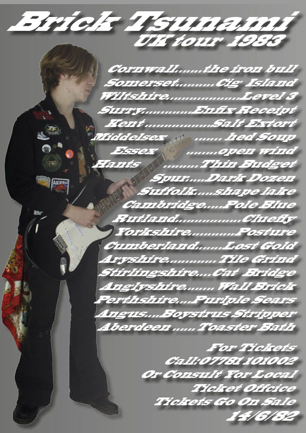
This is a tour poster i created from a former shoot, overall i think that this poster turned out quite well, i like the image used as well as the use of color in the image although i feel more color on the overall poster would have gone a long way For instance more yellow or purples on the titles would have added to the poster a lot. I also feel that the poster is a tad to busy  and less dates would have aided it as it isn’t nice to look at and feels like a chore just to witness it. I do feel over all that it was a success and as a result i’m now allot more comfortable with using in design.


Technical Camera Terms

These images represent the images i had to take to find an appropriate image for my tour posters, there are a fair few  images most represent different things through the angle and position of the models. This shoot also shows how usable footage is as I took many photos but only used one int he end.

The Camera Talks

This can illustrate how an angle or single picture of pictures can tell a story or someone, I feel as if this accomplished that each shot tells a story for instance the close up gives a telling scene of intimation between the viewer and model while the mid shot tells a story of someone being watched, i feel i used a wide variety of shots and it seems i have also communicated different feelings and situations throughout.

Magazine Swede

While working on my magazine, I was working inside Indesign which I had thought to be an incredibly complicated platform to use, though when I started to play and experimenting with it, it became more intuitive. That being said, it was a learning curve especially using text, getting the right font size and boldness became a challenge, even so working with images was a lot easier than anticipated and quite simple. I did notice however that the magazines only used a few colors, keeping it quite simple so as to catch the reader’s eye, with the exception of the bright yellow plug of course. They also liked to put all their text in bold and caps I don’t believe anything on this page was written in lower case but it makes sense for it to be so visually aggressive as its literally begging you to buy it.

my copy of this magazine


Original magazine cover