Digipak Draft 2
Taking into consideration the improvements made upon reflection on draft 1, we continued the process of editing and created draft 2 of our digipak. Below is draft 2:


Teachers Feedback – Screencastify
WHAT WORKs WEll
- The graphics are impressive.
- Love the tonal feel of the digipak.
- The choice of typeface is absolutely perfect on the tracklist and the artist’s name.
- The 2 contrasting images on the front cover work well together – the black and white image is very powerful and striking.
- We’ve used colour correction really nicely throughout – gives an electronic feel which works really well for the genre.
- The back cover is perfectly laid out and excellent.
TARGETS FOR IMPROVEMENT
- Try to make the artist’s name, ‘Elodie’, bigger on the front cover.
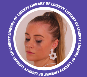
- Not convinced about the ‘Library of Liberty’ following the path of the artist’s forehead – try testing other possible appearances of the album title.
- Re-think the inside panels; maybe integrate the motif of the torn effect – too many images are present, seems odd to place a CD on the artist’s face.
- Replace some images with a graphic – think of the iconography that surrounds our star or what appeals to their audience.
Reflection
The completed draft 2 front and back covers synthesize really well with one another; I think this is because the thematic relations of the ‘rip’ effect are present in both designs. As a group, we agree that the inside panels are the weaker developed and require major adjustments. The overall feel of the inside is flat, there’s no element of dimension in comparison to the depth of the tear. We’ve booked a second studio shoot to get some fancy shots of a disco ball in the hope we can manipulate the images to a liking that would fit a design suitable for the inside. This’ll add an element of quirkiness and playfulness, which was lacking in the previous draft. It also reflects the alternative/indie pop genre perfectly. As well, there is a slight difference in colour correction throughout the digipak, however, this should be easily adjusted within the software available to us. This reflection will allow us to work efficiently and effectively, as we now have a clear understanding of what needs more focus. On the whole, our project is a reflection of our hard work and determination of creating a successful digipak for our brand.