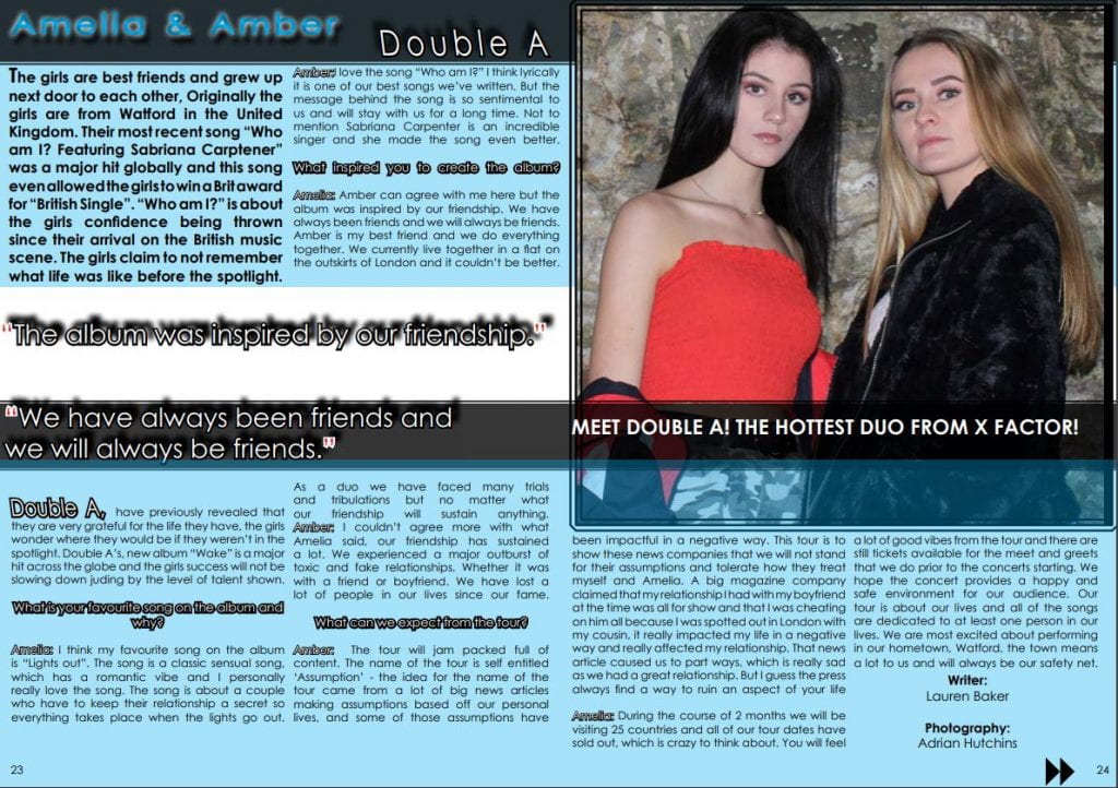
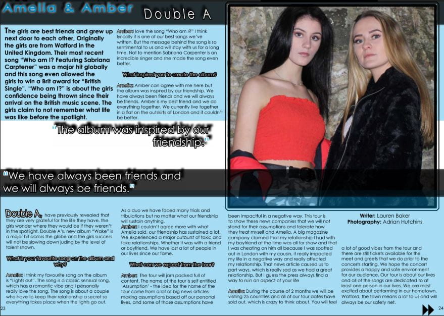
January 23

Adverts

I also need to include 2 adverts that would be suitable for my selected genre of music, and that would appeal to my target audience. I have to think of adverts that are appealing to my audience as they have a preferred style of reading and have specific tastes in what they like. I chose the following adverts because they suit my genre well and I believe that my target audience would like them.

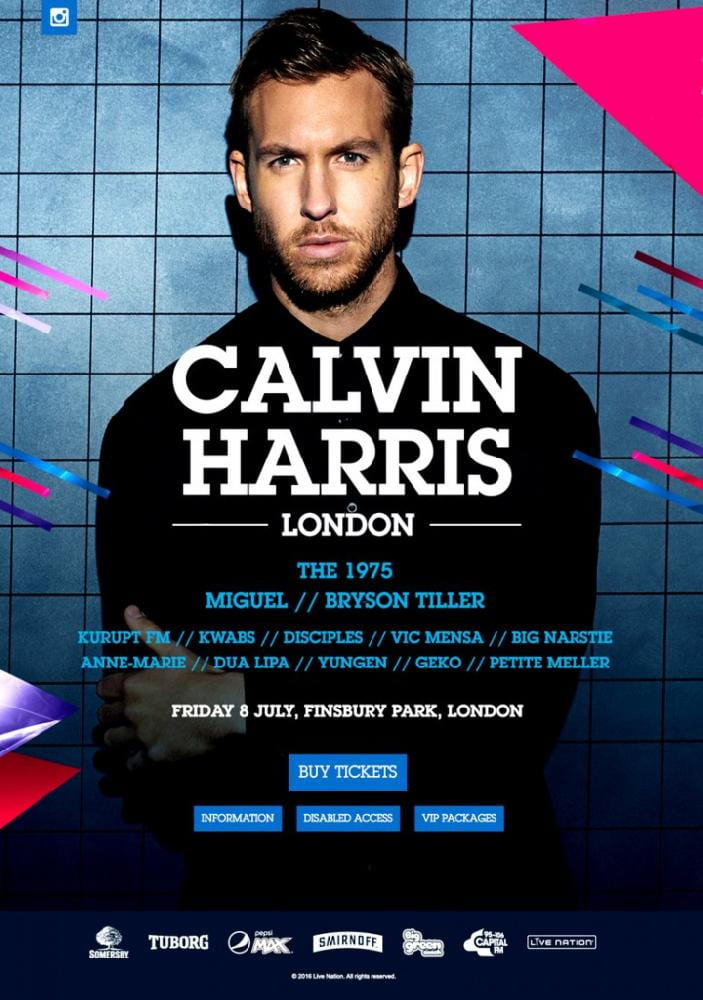
I think that the first advert would appeal to my target audience, as Calvin Harris is a well known electric-pop artists currently. Although his target audience are slightly older then mine, nevertheless my audience are still able to appreciate his music and enjoy listening to his songs.  I decided to use Calvin for my advert due to his specific colour scheme he has used in this tour poster, Calvin has gone for blues, red and purples which is very similar to my colour scheme throughout my magazine.

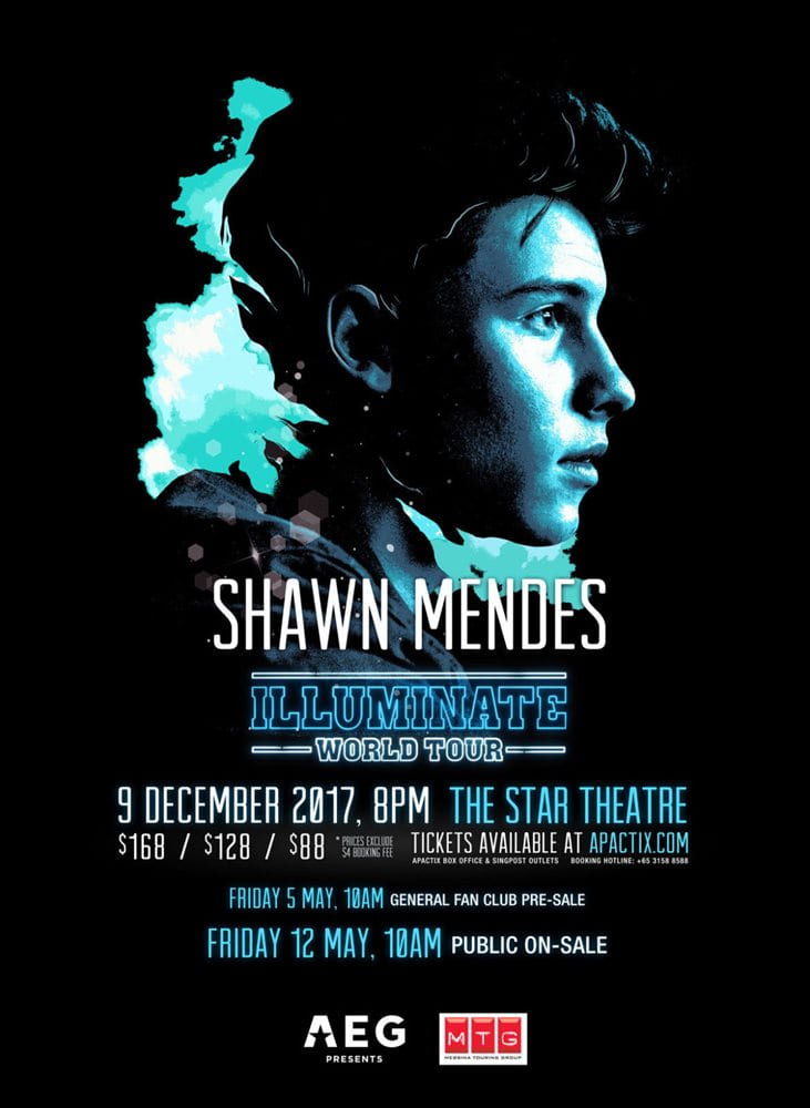
The second advert I chose was a tour poster for Shawn Mendes, I chose to look at Shawn Mendes’s tour poster as she is a big inspiration to her audience, in addition to that she has a similar target audience to my target audience. Although the colour scheme isn’t the same as mine, I am sure my target audience will enjoy seeing the poster as it features one of their favourite artists. The advert doesn’t overload the reader with tones of information which is good. Shawn has gone for a simplistic air to his poster.


Overall I am pleased with the two adverts I have selected for my music magazine. They both fit the genre of pop very well. In addition to that they both feature big artists currently in the pop world. The artists are relevant and current to my target audience, which will attract them to take a closer look into the adverts I have chosen.

January 20

A New Improved Complete Magazine Draft

In order for me to make my music magazine a success, I have obtained some final feedback on my front page, double page spread and my content page from my teacher. This will tell me what I need to do in order for me to make my music magazine a success for my target audience. Below is the feedback given to me by my teacher:

Final Teacher Feedback:

Front Page Feedback:

  • Add graphics on the pug as it is very plain
  • Plug – overlap it onto the masthead a little more
  • Cover line- ‘Tommy tells all!’ shift so its underneath the main cover line ‘Tommy’
  • Change the word ‘Featuring’ from Blue to white

Double Page Spread Feedback:

  • Check column size widths
  • Check alignment of columns
  • Change the black opaque banner for a red opaque banner (The cover line banner)
  • Make Amelia and Amber bigger
  • Try having the questions in upper case

Content Page Feedback:

  • Double check font size
  • Check spelling ‘split’ not ‘spilt’
  • Width of white outline
  • Blake’s Big Break should be on two seperate lines
  • Amelia and Amber move to the white empty space
January 20

A New Improved Complete Magazine Draft

Here is my second complete draft of my music magazine, I have made a lot of changes to mainly the front cover and the contents page. Alongside additional minor changes to the double page spread.

What did I change on the front cover?:

  • I firstly moved ‘Tommy’ into the center of the page so he is more of the main focus
  • I moved the barcode and price from the left hand side of the page to the right hand side of the page
  • I lowered the price of the magazine from £7.99 to £5.99, as this would appeal more to my audience as it isn’t as expensive
  • My masthead was changed from a pastel blue to a bright and bold red as I needed more colour in my theme then different shades of blue.
  • In the masthead originally the font was black but as it was changed it red I felt that the text would be more suited in white.
  • In addition to that I changed the pug with ‘exclusive tour poster’ from blue to red, and then changed it to ‘Exclusive Double A Tour Poster!’ I made the words Exlcusive Double A are in white, while Tour Poster is still in black.
  • In the featuring section I got rid of Ariana Grande’s name and added Little Mix and One Direction in instead.

(I am aware that the image of my main cover star is pixelated, it is being fixed during editing!)

What did I change on the double page spread?:

  • I played around with the line spacing of the columns, I moved the writer and photographer to the bottom of the page
  • When using quotation marks instead of them being blue and white, I changed them to be red and white.
  • I added a caption underneath the girls, so my target audience can get an understanding as to where Double A got their start in the music industry. It says ‘Meet Double A! The Hottest Duo From X Factor!’
  • Finally I enlarged the image of the girls to make them stand out more.

What I did change on the contents page?:

  • I changed the triangles with Double A in red to go along with the theme of red and blue
  • I added the name Amelia and Amber on the girls to show who the girls were
  • I made the social handles smaller as it was taking too much attention away from the catchy captions
  • I changed the @ handles from blue to red
  • I made Tommy be the background for one of the triangles as the previous placement of the image didn’t showcase him enough
  • I removed the hyphen after each number as it was becoming difficult to make all of the text inline
  • With the page numbers I made the outlining of them white
  • For every other catchy caption such as ‘tells all’ and ‘take over’ I made them in white text as I felt as if it would stand out more
  • I removed ‘The real reason’ in the caption: “One direction Split up!”


January 16

Complete Magazine Draft

Click here to fully view my Front cover, Double Page spread and Contents page:


Below is the screen cast that my teacher has produced giving me feedback as to how I can make my music magazine better.

My teacher has given me feedback using screen cast, overall she is impressed with the quality of my work and can see I have put a lot of time and effort into producing my music magazine.

Here is a summary of what she said:

  • I need to add some more colours into my theme, as it is very simple at the moment.
  • Make sure all of the social handles are the same way
  • Add a catchy headlines underneath my photo of Amelia and Amber to attract my target audience
  • Make sure all of line spacing is correct in the Double Page Spread
  • There is the same house style throughout
  • The use of blue is overused
  • Move the plug and masthead up
  • In the content page, to attract the reader make some of the key words bold, like ‘Little Mix’ and ‘Underrated Artists.’
January 14

A New Improved Contents Page

Click here to preview my second draft of my contents page:


What has changed:

  • I have added in more catchy captions to draw my target audience in
  • Added the social handles for a variety of platforms
  • Added a photo of ‘Tommy‘ so the viewers understand who I am speaking about
  • I made the fonts for the captions smaller and not in block capitals
  • I have added lines between the captions to split them up

What Can I improve on?:

  • Fixing the lines between the captions so they don’t go out of the triangle
  • Make the numbers on the bottom section in bold as I haven’t done this yet

In the audio clip above is verbal feedback given to me by one of my fellow peers, I have asked them the following questions:

  • How does the contents page work in tandem with the front cover?
  • Is the font/typeface consistent with the front cover?
  • What genre of music is the contents page featuring?
  • Describe the images of the stars using adjectives.
  • Which cover-lines tempt the audience to read on and which ones stand out and why?
  • How do the cover-lines reflect a music magazine? If they don’t,  which ones need to be adapted?
  • What aspects do you consider conventional or unconventional (page numbers, inserts, captions, catchy cover lines, editors comment?)


Summary of the feedback given:

  • The blue colour scheme works throughout and has a housetyle
  • The captions are the same as the cover lines which provide a housestyle
  • Most of them reflect the genre of Pop, however ‘How to improve your twitter feed’ isn’t music based. To improve this add a celebrity such as Ariana Grande saying how you can improve your feed.
  • The social media logos need to be smaller, as they are taking focus away from the catchy captions
  • The layout of the content pages is unconventional


January 13

Draft of Content Page


Click here to fully view my first draft of my content page:


What went well?:

  • I learnt how to add an image to text box and make it fade out for dramatic effect
  • Used some catchy captions to draw my target audience into viewing the specific article
  • I have used different shapes and a different shade of blue then my front cover and double page spread.
  • I have made the work ‘contents’ bold and bright by using the Drop Shadow and Inner and Outer Glow

What Can I improve on?:

  • Make the size of the pages smaller so I can fit more in the space
  • Add another image into the page (Of Tyler from first photo shoot)
  • Play around with the white background (It doesn’t have to be plain)

Targets for my second draft:

  • Add another image in so I have a variety of different images
  • Make the page numbers and captions smaller
  • Add more catchy captions to suit my target audience’s preferences
  • Move the ‘contents’ logo down more so we can see all of the word fully
January 8

What is a Contents Page?

content page has a very important role within a magazine. A content page acts as a guideline for the reader so they are able to see what is in the magazine and where they are able to locate a certain topic if it appeals them. Therefore a content page must easy-to-read and eye-catching, as well as clear.

The conventions of a contents page are:

  • A title (i.e ‘Contents’)
  • Page Numbers
  • Reminder of the magazine’s name and mission statement
  • Making sure that the colour scheme remains the same throughout the magazine
  • Catchy headlines to draw in your reader

Below some examples of different variations of content pages. Personally I like the third one the best as although it simple it will give me a lot of idea on how I can improve the page. It follows the conventions and would fit my theme perfectly by the arranging of the columns. In addition to that, I was asked to come up with 5 catchy headlines that I could use in my content pages. My personal favourite is ‘Remix Roulette’  I like the use of alliteration and as my music genre is Pop. I think having a remix roulette would be a great addition, as it would feature the most current and trendy songs of the time.

While creating my contents page i will keep in mind AIDA:

A- Attract

I- Interest

D- Create desire

A- Call to action

In addition to that I will also be thinking about Blumler and Katz ideas:

  • Entertain
  • Inform/Educate
  • Social Interaction
  • Personal Identity
December 18

A New Improved DPS

Click here to access my second draft of my double page spread

Above is a second draft of my double spread since the first draft I have changed many aspects of the article:

  • Fix the gap between the Q & A sign
  • When using text make sure they are all to the same side of the text box. ‘Align to left’
  • SA – Bigger and Bolder
  • Fix the layout of columns
  • Added a name for the photographer
  • Moved the quote “We have always been friends and we will always be friends.” down more to showcase the shadowing more
  • Created a logo of ‘Double A’
  • Changed the colour scheme from red to blue
  • Fixed the columns so it is easier for the reader


Although I am happy with the result of the second draft, I still need to improve on the following:

  • Play around with the background as it is very plain
  • Experiment with the words ‘Amelia and Amber’ as they are a little bit boring at the moment
  • Between the last paragraph and the credits for the writer and photographer I need to fill the gap
December 18

Feedback & Reflection on Draft DPS

Targets for development? What’s new and what’s next?

I have asked my one of my peers and my teacher to conduct some feedback for me on how I am able to improve my double page spread they have said the following:

  • Create a Logo for ‘Double A’
  • Make a name for the photographer
  • Make the second and third paragraph not bold
  • Crop the image even more as it is uneven at the moment
  • Move Double A up as it just on the line
  • Move ‘Amelia and Amber’ and ‘Double A’ to the other side as the other side is very bare

My Targets:

  • Make sure my second and third paragraph aren’t in bold.
  • Design a logo for ‘Double A’
  • Make up a name for the photographer
  • Fill the white gap in
  • Change where the quote goes

How will I do this?:

I will take on board my corrections and ensure to play around and listen to the feedback I have been given by my peer and teacher. As this information is critical for me, as this will allow me to create the best possible double page spread. Using my skills on Photoshop and Indesign I will create a logo for ‘Double A’ as this is bring a new flare of something different to my double page spread.

December 18

Feedback & Reflection on Draft DPS

I have asked my one of my peers and my teacher to conduct some feedback for me on how I am able to improve my double page spread they have said the following:

Miss Cobb:

  • Create a Logo for ‘Double A’
  • Make a name for the photographer
  • Make the second and third paragraph not bold
  • Crop the image even more as it is uneven at the moment

Amy Grief:

  • Make sure some texts are un-bold as it is difficult to read
  •  Move Double A up as it just on the line
  • Move ‘Amelia and Amber’ and ‘Double A’ to the other side as the other side is very bare
  • Move the questions down more and the covering the bottom of the image