February
16
December
16
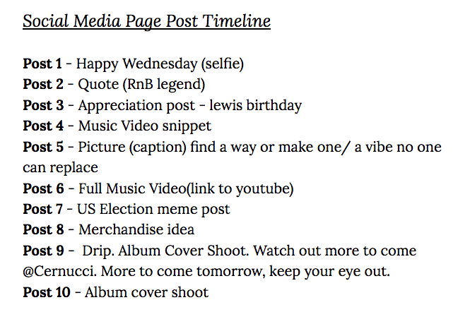
Timeline and Marketing Ideas
December
16
Digipak Draft 3


What we changed in this draft:
- We used a better quality image for the front cover.
- Added a box round the producer rights to make it clearer.
- Added more contrast to the inner left page.
- Added more songs to back cover.
In general we are happy with our changes in our latest draft and we think it fits our RnB genre.
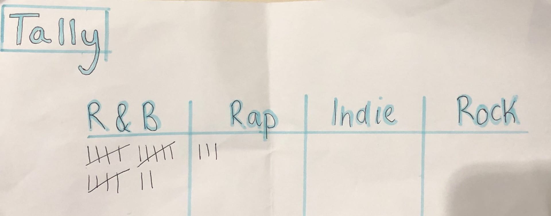
We decided to ask our audience what music genre they thought this was linked to, below is the results from our survey.
December
16
Social Media Page Terminology
We had a task to match up different social media terms to their defintions, this was to help us analyse a celebrities facebook page. Our group decided to look at Usher as he goes along with the same sort of genre. We took screenshots of his social media page and analysed it with the key terms we had just learnt.
Below is the slideshow that I created about Usher from his facebook page:
November
20
Timeline and Marketing ideas
November
20
Audience interaction with a social media page – an analysis
November
13
Digipak Conventions Analysis
November
4
Digipack Draft 2


We also received feedback from our teacher on screen castify:
What we changed:
- We added the singers name as seemed more conventional for our genre.
- Added some colour to the books on the inside page of the Digipak.
- We added the producer rights to the back.
- Added some darker saturation and darker brightness.
- Added the spine.
Our teachers feedback included:
What went well:
- Our teacher pointed out about how they like the location.
- They also mentioned that the contrast fits in well with the genre.
- The colorful books contrast well with the black and white surrouding them.
What We Will Do:
- Making the background of the front cover book black and white around our performer.
- We will add some of the lyrics to the page of the inside cover and lower the trasnparency so it looks distant in the background.
- Add some more tracks.
- Add some shadow to the front cover title as it looks a bit flat.
November
4
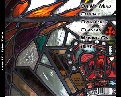
Digipack Draft 1
Here is our First Draft of our Digipak


Self Assessment
WWW –
- I like the contrast of colours I have used on the front cover with the books and on the back with the glass panes.
- Good photo choices.
- Fonts work well with position of photo, very clear.
EBI –
- Back of digipak is over exposed, change the exposure.
- Unintentional shadow on the inside page.
- Add a bit of colour on the inside to contrast to the black and white.
November
4
