Tour Poster

KEY TERMS:   Brief, genre, conventions, AIDA, fonts, images, colour, layout, typography, AIDA

This is your chance to shine now. This is your chance to put all your technical skills with Indesign/Photoshop and your knowledge and understanding of how font, colour, images and language can help communicate a story.

TASK 1 – The Research

Moodboard reflection:

A client has come to you with an image of themselves as a performer. Their style of music will belong to a particular genre. They want you to design a poster for an A4 page in a magazine, advertising and promoting their forthcoming tour.

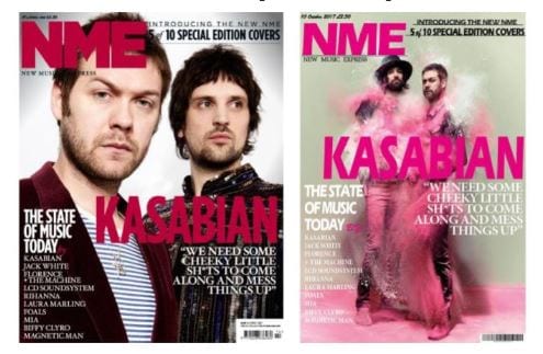
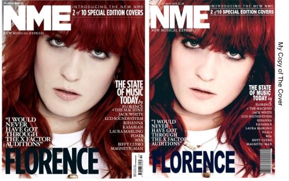
Find @ 10 examples of tour posters for your genre.   After doing your research, reflect on how the colour palette is used across various examples, reflect on the fonts used and use the terms conventional in your analysis.  Where are the examples of AIDA (attract, interest, desire and then call to action). Remember, you want your product to be ‘the same but different’ to be ‘conventional but unique’ so that your audience not disappointed.  Summarise some of the common conventions for tour posters of your genre: colours, images, illustrations, graphics, fonts, typefaces etc.  This should inform your own design now.

Consider AIDA – attention, interest, desire and action.

Look at this presentation of CD covers that relate to specific genres and you will see how ‘conventional’ the colour palettes are for each individual genre.  Make sure you too follow the conventions but create an innovative and eye catching poster.

TASK 2 – The Poster

BRIEF

Using your research on conventional posters for your genre: You must include the following:

  • Name of artist
  • Name of the Tour
  • Dates and Venues
  • Other information like: where the album can be bought/downloaded, tickets available from and prices etc.

Remember,  doodle, muse and research before you open up your Indesign.

TASK 3 – The Reflection

USE THIS SELF ASSESSMENT SHEET – TAKE A COPY, DELETE THE PREVIOUS ANSWERS AND COMPLETE AND EMBED IN YOUR POSTER POST (USE A SNIPPING TOOL TO SAVE AS A JPEG AND THEN ATTACH THE PDF IF IT IS SMALL WHEN EMBEDDED AND UNREADABLE)

Always introduce the post, overview using the key terms in red above and focus forward.

Exemplars

An Introduction to InDesign and your Magazine ‘Swede’

KEY TERMS: layout, proportions, colours, fonts and typefaces, placing an image, sizing an image, 

Lesson 1 

Serena will take us all through the basics of:

  • INDESIGN – how to create a poster template, place a photo, add text, change colours etc.
SHE HAS CREATED A GREAT PAGE ON THE FACULTY OF ARTS WEBSITE TO SUPPORT YOU WITH INDESIGN.

Make sure this the first place you look at for answers to your questions.

Lesson 2, 3, 4 and 5

  • You will be allocated a specific edition of an up to date music magazine, NME (New Musical Express), billboard or MOJO.
  • The aim is to recreate the layout and to recap on the main conventional design features of a magazine cover.
  • Using InDesign – recreate/copy the cover you have been allocated.
  • You do not need to find the exact photo – any one with a similar grouping of performers or artist will do or in fact you can add in a box with a cross through it if you really can’t find one that will do.
  • The main aim is that you have some fun with InDesign – find the right fonts, play with the sizing, kerning etc and do your best to lay out the cover with a conventional layout.
  • Here are some suggestions for cover photos – see the first slide for caveats on what you will and won’t be able to do with them but it might save you time trawling the web.
  • Exporting as a JPEG and a PDF, uploading  to your blog and save as final draft in IDD.

Lesson  6

  • Remember to introduce the content (your mock-up front page)
  • Reflect on what you have learnt – how to use InDesign and how magazines have conventional features and name them – masthead, cover lines, main cover star etc
  • Reflect on how you did – find 3 strengths and 3 weaknesses.  What did you do well and easily and what did you struggle with and will need to improve?
  • Focus Forward – how is this all going to help?
  • Set yourself some targets by finding @ 3 self help YouTube tutorials for any aspects of InDesign that you struggled with and embed the videos in your self assessment post.
  • Make sure you watch them in full this weekend in preparation for your own album poster design next week.
  • Link in the online tutorials that will help you improve your use of InDesign next week.

Here are some examples from last year:


A front cover analysed – attracting ‘that’ audience

KEY TERMS: represent, connote, infers, implies, suggests etc, technical design conventions, demographics, psychographics, audience segmentation, target audience. 

Task Instructions

The Case Studies

Make a copy and file it in your Media Studies folder in your drive.

Individually take a copy of the slideshow and keep the  magazine cover you are going to research for target audience data and how that might impact on the design features.

The analysis should include the following:

1. The mission statement of the publication:

    • Look on their website for a tagline, catchphrase that encapsulates their mission – what they hope to provide to their readers.
    • Here is the mission statement for the Kerrang brand.  I found this by Googling ‘Kerrang Mission Statement’…easy peasy.

2. A description of their likely target audience.

    • You should  refer to the attached audience segmentation document to help identify a suitable classification for the target audience.
    • Your teacher will help you with this. Typically, they might suggest looking at the ads covered by the magazine
      • This doesn’t work online, because Google’s algorithm knows who is looking at a page and puts up ads specific to them…

3.  Demographics and Psychographics of the audience:

    • One way to do this, is to think of a likely reader of the magazine, that you know and then model the ideas on them.

4.  Other information about your target audience:

    • If you have thought of a likely reader that you know, then add more detail in about their likes and dislikes, their jobs, their hobbies, their favourite food, music, media.
    • This is important audience research for a magazine creator to know so they know what to include in their magazine in terms of articles, information, entertainment and advertising, which will satisfy their audiences’ uses and gratifications…remember…?

5.  Textual analysis

Now that you have an idea of who the target audience is, try and unpick, decode, deconstruct the front cover.

  • why have they used certain fonts, colours, images, language?
  • Why would this appeal to the target audience?
  • Consider how those design elements are shaped to communicate meaning, which will reflect the brand and mission statement
    • look for the signs, symbols, colours, fonts, framing, MES, facial expression, body language, language, masthead and cover lines (language) etc that have been used to convey a narrative, to represent a genre, to sell a brand.

Advice:

Use the correct terms for the technical conventions when talking about the design elements attached to them i.:

  • ‘The masthead design represents the magazine as…’
  • ‘The plug language connotes…’
  • ‘The cover lines font infers…’

What a good one looks like:

Here is an example from a previous student that includes some very detailed observations:

This is the format we would like you to follow and use the sub-headings included.

Some of the sections can be bullet pointed or lists, but others will require some analysis to include the terms: represents, implies, suggests, signifies etc when doing a textual analysis.

The Technical Design Conventions of a magazine

KEY TERMS: Technical or Formal conventions, audience expectations:
masthead, cover lines, main cover line, main cover star, barcode, price, plug, pug, insets and captions.

The Design Elements of a Magazine Cover

You need to learn the TERMINOLOGY to describe EXAMPLES of print design. You need these terms to:

  1. ANALYSE professional examples
  2. ANNOTATE ONE FOR technical (formal) conventions

Here is a film magazine with the main design elements labelled.

TASK

  1. In pairs,  choose one photocopied cover and annotate it with the main technical design features.
  2. You will then take a good photo of it and upload it to your blog.
  3. In the blog reflection: list and explain the main design features: masthead, cover lines, main cover line, main cover star, barcode, price, plug, pug, insets and captions.
  4. Focus forward: why is it important to understand the basic conventions/rules of layout for a magazine cover?

Textual Analysis

Your first attempt at completing a textual analysis of a TV drama clip – this will form part of one of your exams.

This is the task:

Analyse the ways in which mise-en-scene and camera communicates the different life styles of the people living and working in Downton Abbey. 

Here is the clip you should analyse:

Help! How is this group essay going to be compiled?

You should use this document to help you make notes and structure your analysis – you will work with a partner and the document is in classroom for you to make a copy of and then share with your partner.

Below is the presentation we gave you on mise-en-scene and camera. You should use this to remind you of the areas you should cover in mise-en-scene. It may also point you to ideas think about within in the sequence.

Here are some useful adjectives and a reminder of some alternative connectives/active verbs to represent.

Please submit your group essay via google classroom and adhere to the submission deadline.

Why not read some of the exemplar essays:

Terms, Significance to themes and issues = 15/25

Analysis, Examples = 10/25

How to present your work

Always attach a PDF to your thumbnail or embedded work.

This means the examiner can see the work in detail and with good resolution.

So in terms of the Canva:

  • Download as a pdf
  • Download as a jpeg
  • Embed the jpeg by using the add media button and selecting the file – you can embed it in various sizes (small, medium etc – see bottom right)
  • Then upload the pdf to your media library by selecting the pdf file.
  • You should then copy the URL of the pdf and attach it to the jpeg (either by using the pencil icon on the jpeg or using the side bar in the media library).
  • It is always useful to add a caption (use pencil icon again) and direct the examiner to see the photo more clearly by clicking on it to read the pdf.

We will practice this in class but don’t attach google docs – looks messy and pdfs are the best way to present your work.

The Camera Talks – #moodboard

KEY TERMS

DISTANCE, ANGLE, FRAMING, COMPOSITION, NARRATIVE, REPRESENT, DENOTATION, CONNOTATION, NARRATIVE, IMAGE AND AN IDEA

This post has three elements to it.


TASK 1

In groups of @ 3, you must take at least 50 photos around school that attempt to tell a story – use distance, angle and framing to show how the camera can make meaning.  Use each other as models or props that are easily obtainable. Think too about MES – particular body language, facial expression, posture, proxemics and gesture but the camera work is your main story telling tool.

For example:

  • an extreme close up of a tear stained eyes could underline a character’s sadness and vulnerability.
  • an extreme long shot of a man standing alone on a deserted beach might portray his isolation and solitude.
  • a two shot of a two people, with one in the foreground looking away from the camera and the other slightly out of focus in the background could add an enigmatic, mysterious feel to the scene as well.

Remember to consider:

  • Angle – high, low, canted x 3, aerial
  • Distance – ECU, MS, LS, ELS x 3
  • Composition – rule of thirds, lead space and Depth of Field x 3

Upload the photos to a folder.


Task 2

Choose 9 shots that show different framing, angles, composition, distance to help represent different narratives.

Using Canva – embed the 9 different shots.

Annotate each photo with:

  • #denotation/#technical term/#connotation i.e.
  • #manaloneincarpark#longshot#lonliness

Task 3

Reflect on how you have used a camera angles, composition, distance, framing and MES of proxemics, facial expressions, body language and props to help convey a narrative and represent an idea.  Use the key terms from the start of this post.


My image that uses MES to communicate meaning

KEY TERMS

MISE EN SCENE, CONVENTIONS, GENRE, CONNOTATIONS, REPRESENTATION  

Remember for this post on costuming and dressing a model for your allocated genre of music performer,  you should include the following 4 elements in this particular post:

1) MOODBOARD

Explain how you were allocated a genre to research and what you found – refer to the moodboard findings.  Create a ‘padlet’ and share it with your group and all contribute to it in terms of images, ideas, costumes, settings, fonts, colour palettes etc that fit with your genre.

Embed the moodboard with images of ideas for how a performer from your allocated genre could be represented in terms of costume, facial expressions, hair, make-up, body language, gestures, props etc. Use adjectives AND describe and pick out some of the most important MES conventions for the genre.

Add in some relevant adjectives as to how that genre is generally represented – edgy, anarchic, produced, synthetic, friendly etc. Use terms Mise En SceneGenre and Star Image (how are they represented/presented to the audience). If you can get the term ‘CONVENTIONS’ in too that would be great – those expectations, commonalities of the genre.

Before next lesson, arrange with your group to bring in any relevant costumes, props that you might have at home – we will have lots here but you never know you might have that ‘punk rock mohican wig’ under the bed!

2) POST IT NOTE PHOTO

You then used all the research and findings to dress, encode your model as a star from that genre. Include a photo with the ‘post-its’ from the class in your test outfit with the comments and adjectives that the class suggested as to how your character was represented.  Reflect on how you, as a producer, used all the conventions from the genre to encode your model with the appropriate MES and the audience decoded them correctly (or not).  Did they read the star image correctly? What were their responses? List and reflect.

3) CHOSEN PHOTO and any others you like

Download the photos to one folder and share with your group. Then individually, choose one photo of your artist in costume with a commentary on how they are represented/portrayed with plenty of relevant adjectives.

Reflect on how and why that image seems to work better than the other ones from the shoot.

4) REFLECT AND FOCUS FORWARD 

Overall, reflect on the importance of using MES to convey meaning – tell a story – an image and an idea and HOW WILL THIS NOW IMPACT ON YOUR OWN PLANNING/RESEARCH FOR YOUR MAGAZINE PRODUCTION?

Skip to toolbar