October
16
Digipack Draft 1
2 panes front and back
Assessed in relation to the assessed PSW examples
Here is the first draft of our digipak, I think that the colour scheme works well to present the mood and star image to the audience, although I think that this draft was rushed and not properly thought out so that it could be as effective as we could make it.
Front

Inside Left

Inside Right

Back
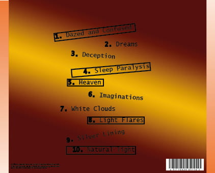
Target Points:
- too many similar colours
- middle left- the image needs to be cropped to see the face and emotion clearly
- the front cover needs to pop our more and have a less boring tone
- feather the image on the front cover
- make the small print more visible
- add the logos
- make it more exciting
- change the colour scheme
- give the digipak more pop