October
5
February
3
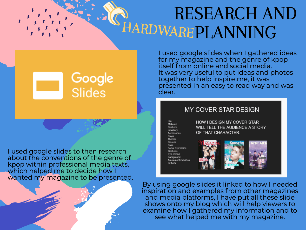
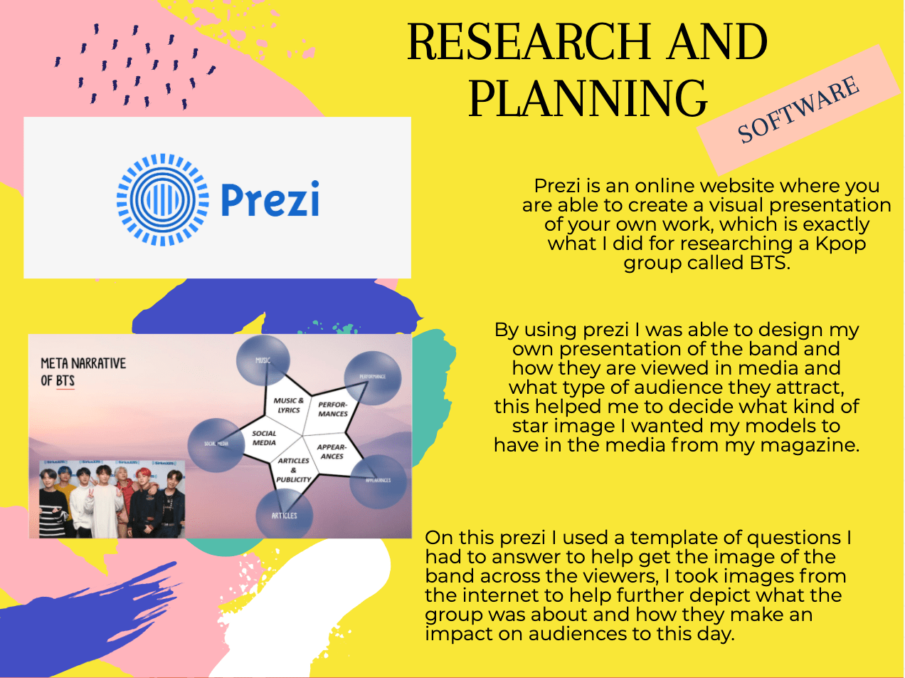
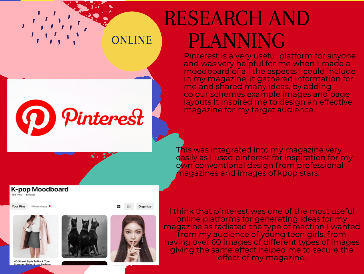
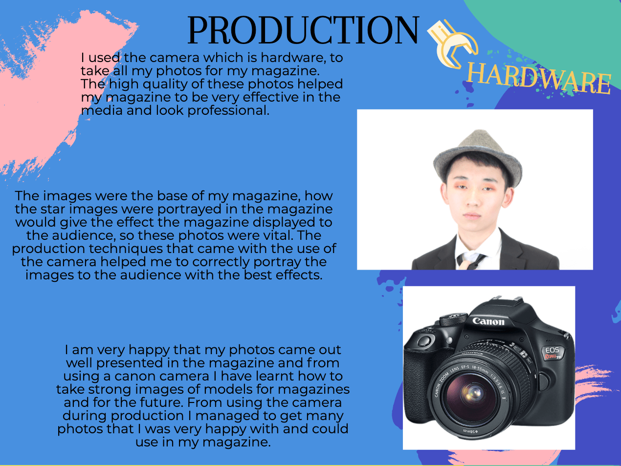
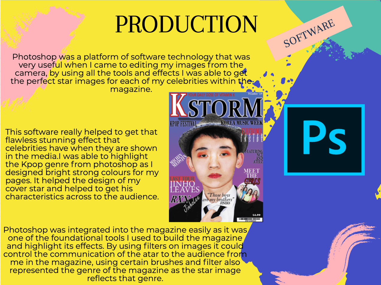
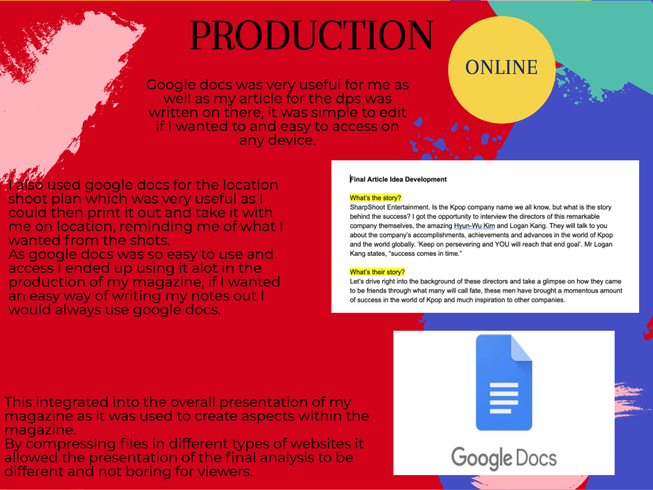
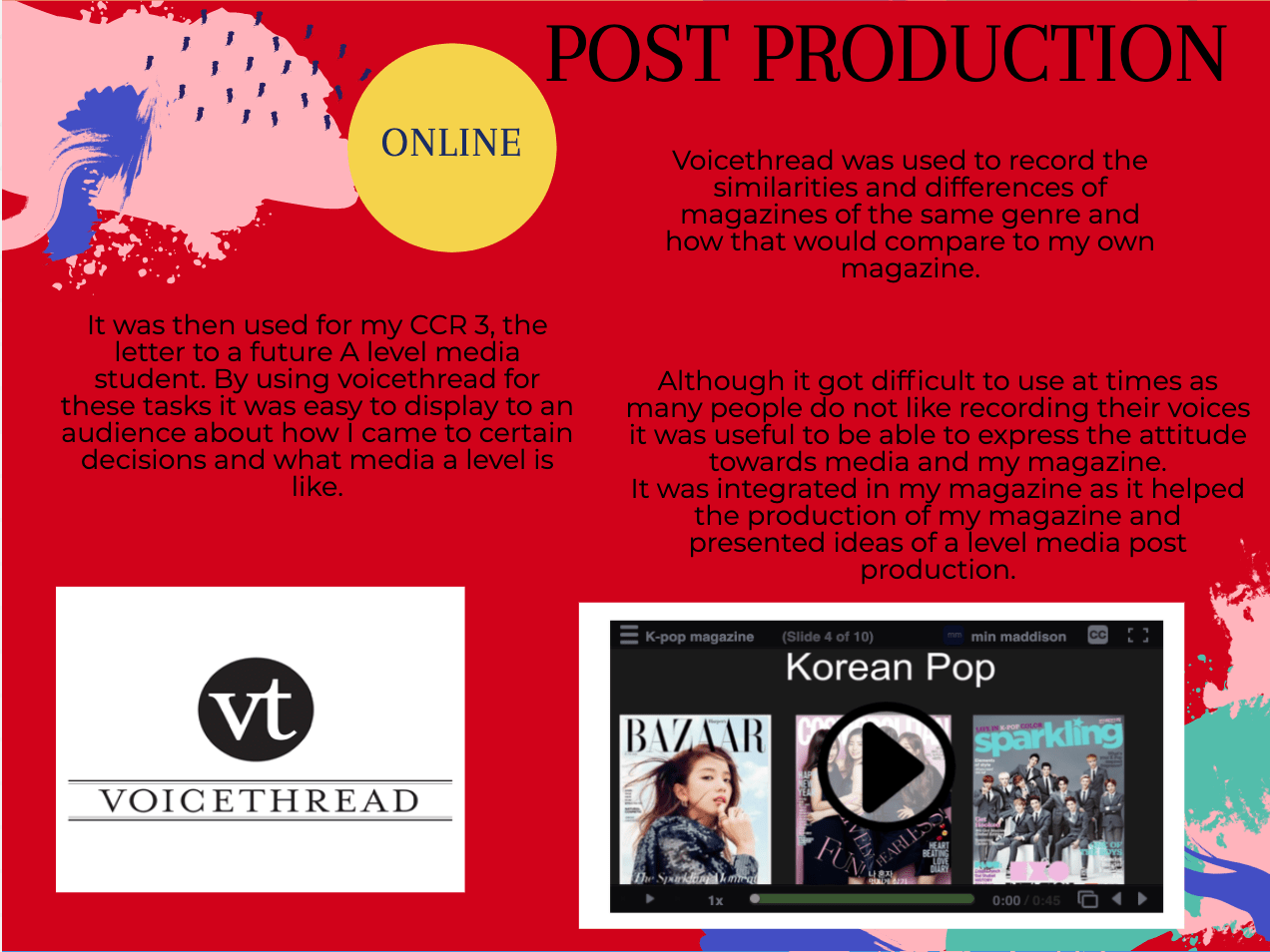
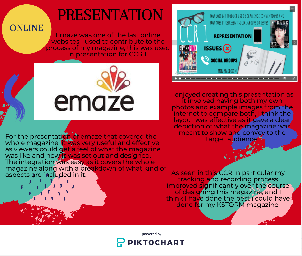
Question 4: So… How did you integrate technologies (software, hardware and online) in this project?


February
3
Question 3: So… How did your production skills develop throughout this project?
My Letter
This is my letter to all future A level media students that outlines the different skills in the course and how they will have effects for jobs and interests, this letter is then illustrated with my opinions and experiences to give the students a wider view on the course and the project of designing a magazine.
February
3
Question 2: So… How does your product engage with audiences and how would it bedistributed as a real media text?
February
3
Question 1: So… How does your product use or challenge conventionsand how does it represent social groups or issues?

January
18
Adverts
Adverts
Adverts have to be targeted to a specific audience to receive the most amount of attention, certain audiences will be interested in different things in adverts, all audiences are different depending on age, gender, where they live and ethnicity.
For example, food magazines might advertise a type of food or ingredient but it would never be seen in a music magazine as it is not relevant, audiences will want to precipitate in the action from the magazine so the adverts have to call out to them.
- Adverts in magazines need to be catered to that specific audience that is going to read the magazine.
- They need to relate to a demographic.
- Need to be attractive and inviting
- By using celebrities audiences are more likely to purchase the product
- If festivals and concerts are advertised within magazines audiences will be more interested
Examples
These images are ideas for adverts, they are all high resolution so that when I put them into my magazine they will be clear and fit in well to the magazine, therefore, completing it as a professional magazine.
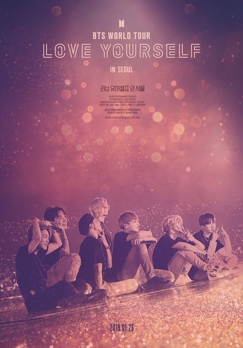
BTS TOUR
This advert of a BTS tour in Seoul would be an effective advert in my magazine as teen girls will want to go to the tour and be part of the community and get closer to the idols, it is a rare experience to go to a Kpop concert as all the tickets sell out. If the tour advert is present in a magazine more people will be aware of the date and times of the tour, the target audience will want to go to concerts and tours as it affects communication with other fans of the group and builds personal interest. From the use of celebrities in the magazine audiences are much more likely to purchase the magazine and what the advert is advertising.

KPOP STYLE
The advert of the Kpop style ideas will give the demographic a sense of personal identity within the magazine reinforcing their interest in the genre of Kpop, by building a sense of interest in Korean fashion audiences will be able to expand their community and get the chance to meet new people who are interested in the same thing. The bright colours and pop in the advert will catch readers eyes, and by following the fashion of Kpop audience members may feel closer to the idols and celebrities. Having this advert in the magazine it relates to the genre of Kpop as it focuses on Kpop fashion.
January
18
A New Improved Complete Magazine Draft
From the screen castify last magazine edit, I have made many changes to all three pages of my magazine which have made it look much more effective to the target audience. I am very and satisfied of my magazine, the magazine looks very professional and powerful. I am pleased with how my magazine has turned out and think it radiates the genre of Kpop well, the language and colours give pop to the pages and connect ti the target audience.
Front cover

Contents page

DPS
January
16
Complete Magazine Draft
Front cover

Contents
Article

Screen castify
Feedback
I have made many changes to the magazine pages as a whole to give more an effect to the audience, I have struggled most with the development of the double-page spread most as I had such a long article and had to cut it down significantly. I have enjoyed creating my magazine regardless of the stress that it came with.
The feedback I received was that the magazine had a good feel of the Kpop genre and good colour scheme, the fonts are effective and work well in the magazine. The repetition of the fonts on each page works well in the magazine, overall the magazine is effective although it is overwhelming at times and the adverts need to be put in.
Targets
- Make the front cover less chaotic
- Lesson the range of fonts on the contents cover
- Edit the layout of the article
- edit colour of article background
- make the pages pop more with less chaos
- simplify the pages
January
16
So… How is it going?
What skills have I learned?
From designing my own magazine including a front cover a contents page and a double-page spread I have learned a wide range of skills and knowledge about what makes media effective for different audiences and readers. Every aspect that goes into a design on a page has an impact on how that page is presented to an audience, the colours, fonts, and style of the page can alter people’s opinions. From doing photoshoots I have been able to understand the vitality of mise en scene in media and how it uses synergy to join with camera angles and shots to create the perfectly produced image.
From the cover page, I have learned that star image and fonts have power over audiences as the way models are posed and placed signifies something to the audience, maybe it is an emotion of aura. The fonts hold effect as they can change the way audiences read the words on the page and can also cause certain reactions.
Furthermore, from designing a double-page spread I have gained knowledge on how to layout an effective and powerful article to make it appear to the audience in a specific light. From being taught how articles gain their effect and attention from design I created my pages so that they immediately looked exciting to readers, therefore, being successful in the media.
Finally, from creating a content page I have realized how important the layout of contents pages are and where they are located in the magazine. They are the pages that tell readers what is coming up in the magazine so if they are not effective the reader is not going to want to continue reading on, the captions and names of the articles have to be bold and bright to grab readers’ attention and draw them into wanting the read that article.
What went well?
From this magazine, I have learned about many aspects and effectiveness needed to create a perfect cover, double-page spread, and contents page. Whilst each page has it’s own uniqueness they all come together as they are the same genre and have the same aim, the layout of the pages change depending on the page so that the magazine looks exciting and inviting.
- The colour schemes are effective for each page
- The fonts are not too overwhelming
- The star image relates to K pop from the mise en scene
- The genre of K pop is radiated through each page
- The format of the images in the pages are powerful
- The magazine does pull you in to read the contents
Even better if?
- I planned my pages in advance
- I did not get as stressed with designing
- I experimented with effects in both photoshop and InDesign
January
16
Design Skills 2
Design skills
From completing my double page spread and contents page I have learned more from both InDesign and photoshop, they have given me the effects and achievements I aimed for when creating all three pages for my magazine. I now have a larger range of knowledge when it comes to design skills and production techniques when doing the photoshoots and planning for my design of the pages.
What have I learned?
Whilst doing these pages for my magazine I mostly used InDesign as the design of the pages took place there and only the editing of the double-page spread photo and background for the contents page was done in photoshop.
For the double-page spread, I have learned about the affective aspects of an article that make it so effective, including the writing style and layout. Many articles have a drop capital which I have included in mine, the photos in articles are usually placed on the right side of the page as that is what readers first see when they move onto that page, it allows the article to pull the reader into reading it from looking at the photo. However, as my photo is a landscape image I decided that the perfect place for it to be would be in the centre of the two pages with both models on either side of the page, this layout for my double page spread is very effective as it draws readers in. I have also learned that articles do not need to fit onto one or two pages and can go onto the next page which is what I have done as my article was too long to fit onto the double-page spread.
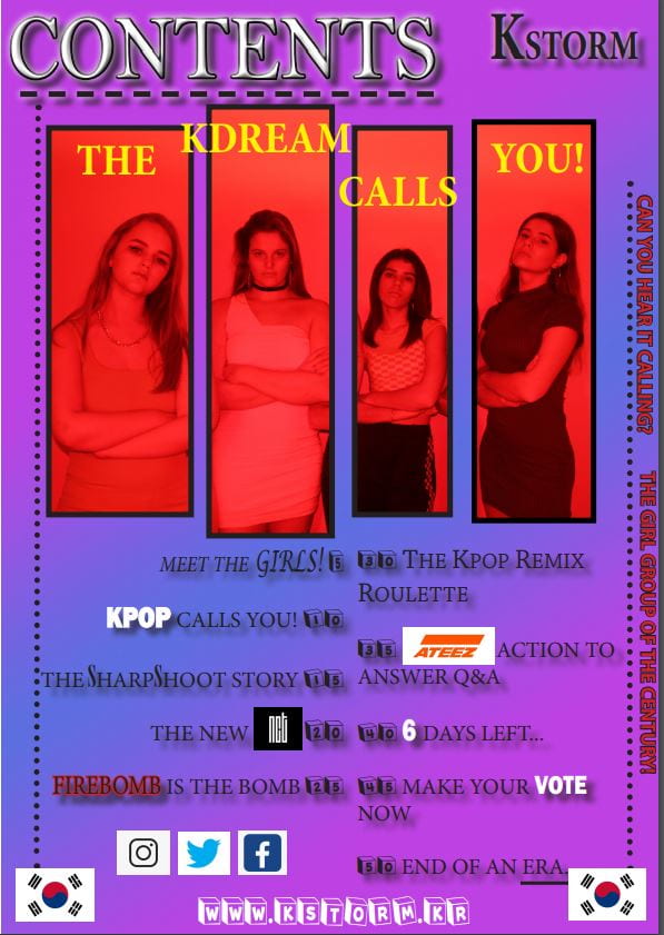
For my contents page, I have learned that everything that goes into a content page has an effect on what the reader may think of the magazine as it is normally the second or third page into the magazine. Similar to other magazines I have mirrored the colours of blue and purple from the cover page in my contents page to create a strong link to the cover, the KSTORM magazine name is also located in the top right-hand corner of the contents page to remind audiences that they are reading. My first draft of the contents page was not very exciting so for my seconds draft I changed the numbers and fonts along with the image to bring more fun to the page, making sure that it shouted out to teenage girls which is my specific demographic.
I know how vital it is for content page article names to be catchy and inviting, short and sharp so that audiences feel excited to read them. People tend to like numbers in captions as it shows how the article is straight forward, language technique is important in captions as they can help make them flow and have colour in the words.
What went well?
In my opinion, I think that the design of the contents page has been more successful than the double-page spread as the colour is more dramatic and looks much more inviting. The article captions are effective and each stands out to readers which is what I aimed for, the image of KDREAM is bold and powerful, it holds sophistication and excitement for readers inviting them to continue reading the magazine.
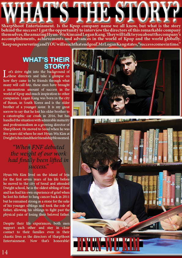
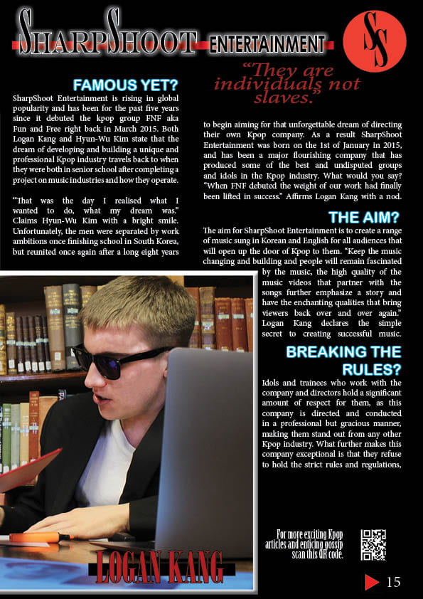
However, I do not think that I was originally very pleased with my double page spread as there was too much going on, I did manage to resolve that issue as removed some of the article and focused on making the words and images look exciting for readers. I really like my article for the double-page spread and think that it truly calls out to young girls and is very interesting by focusing on the world behind K pop, I am happy with how I have placed the SharpShoot logo within the double-page spread as it clearly shows who the article is about. I changed the colours of the background colour of the article from completely black to red and black as it relates to the colours of SharpShoot, the pages are powerful and strong and have resulted in success.
Even better if?
I think that these pages in my magazine could have gone better if I had pre-designed ideas or thought of them before going into InDesign and creating something where I did not completely know what I was going to do or how it was going to turn out. My article for the double-page spread should have been shorter as I would have liked to have it on both pages and not going onto the next page, I would have preferred to have an image that fit onto one side of the page in the article so I could have played with the design more to make it more effective but the image I have does look effective in the centre of the page surrounded by the article.
My content page could be better if I perhaps had some quotes from articles and links to social media but I did not have enough space on the contents page for that, but overall I am happy with my content page and think that is it successful for my magazine.
Impact
All the aspects that go into magazine pages indicate what genre it is from the star image to the narrative of the magazine and each article.
Aspects & impact
Mise en scene- Mise en scene is very important to portray the genre and magazine to the reader, how the model looks and is dressed will cause a specific reaction from the reader. Mise en scene includes aspects such as costume, makeup, setting, and hair, this helps to correctly convey a star image in the magazine.
Star image- Star image is vital to present an idea and genre, it is done through mise en scene and camera work.
Images- The layout and design of images will help to present ideas and emits different emotions from audiences depending on angles lighting and the models’ facial expression and mise en scene.
Camera angles- Camera angles help provide emotion to an image, through the angle, lighting, shutter speed of the camera and shot style lets ideas and narratives to be presented to audiences.
Page layouts- Page layouts invite readers to analyze the page and it’s contents if the page does not look appealing readers are much less likely to be interested in the article.
Colour scheme- The colours within a magazine adds to the genre and can portray an emotion as each colour symbolizes different emotions, for example, red is associated with love and passion whilst black relates to death and depression. Colours also help to portray the star image as the colour in the costume can tell the audience about the image and what it relates too.
Fonts- Fonts in magazines must be legible for all audiences and have to relate some way to the genre and magazine as a whole, too many changes in the font can be overwhelming for readers so it is best to stick to a few that occur in the pages.
Sizing- The sizes of images and fonts create differences in urgency and boldness within the pages of the magazine, this can help present the narrative of the images and magazine to readers.
Captions- Captions within the contents have to be powerful and bold so audiences are intrigued by reading the article simply from its name, readers like short sharp captions that often include numbers as they easy to read.
Genre- The genre of the magazine must be conveyed through the star image, mise en scene, and page design. It is important that the genre is shown through the pages as it reminds the reader what they are reading.
Narrative- The narrative of a magazine is a story that is presented by every idea and image, every story within the magazine must be interesting and speak out to the target audience.
Emotions- Emotions are mainly spoken through image and colour, if certain emotions are presented from the magazine the target readers will often radiate mirroring emotions and feel attracted to the magazine.
Screenshots
The gradient tool from Photoshop has helped me to create effective backgrounds for my magazine, giving colour and pop to the pages making them look more inviting. I have kept with the simple designs of the gradient tool but have experimented with the shapes and different length of gradients to give effects.

The colour changing tool form Photoshop has helped me pick the colours for this gradient allowing me a wide range of colours to speak to the audience and emit specific emotions.

The stoke tool from InDesign has enabled me to thicken the words on the pages of my magazines so that they stand out more and can have a border around them, giving a sense of boldness and power in my magazine.
Finally, the shadow tool from InDesign has allowed me to put drop shadows on words and images to make them appear 3D in the magazine, they are standing out to the audience as the words and images break that 4th wall. The effect helps the words to jump out at the target audience making them more intrigued and excited to read the magazine.
