December 12

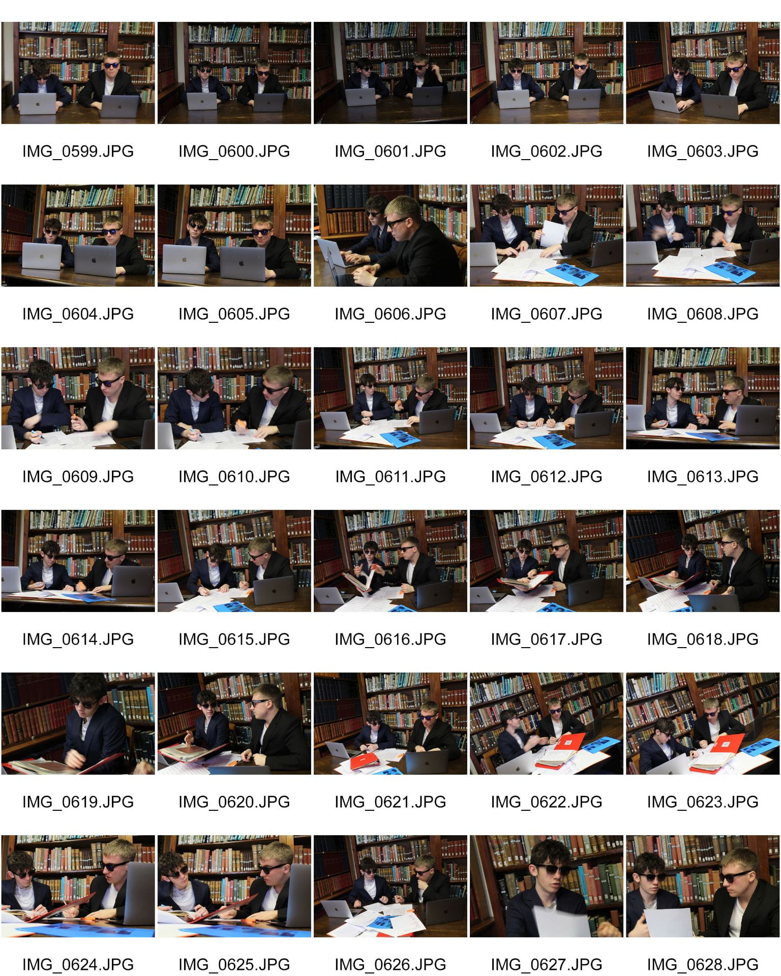
Second Shoot Contact Sheet(s)

Contact Sheets

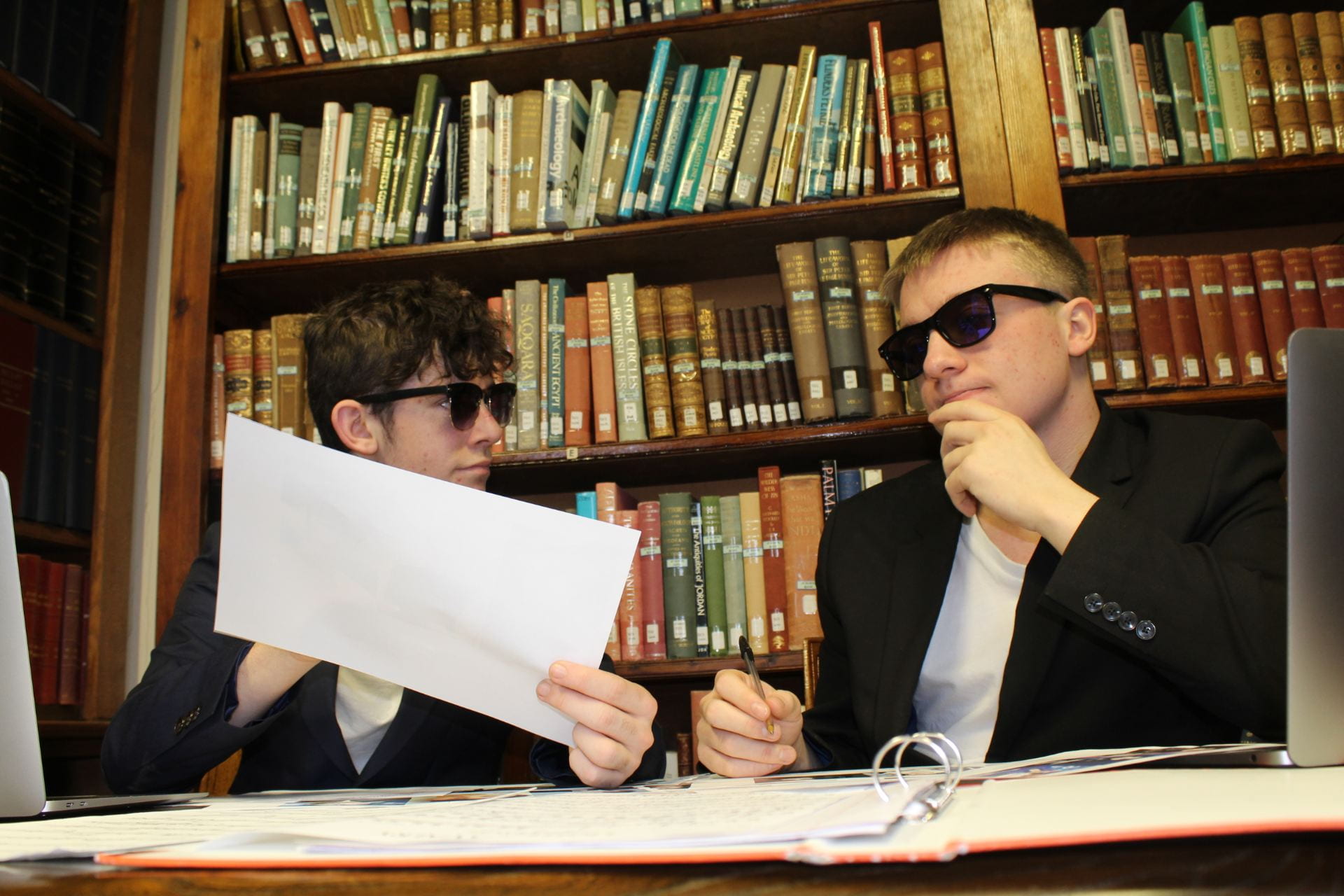
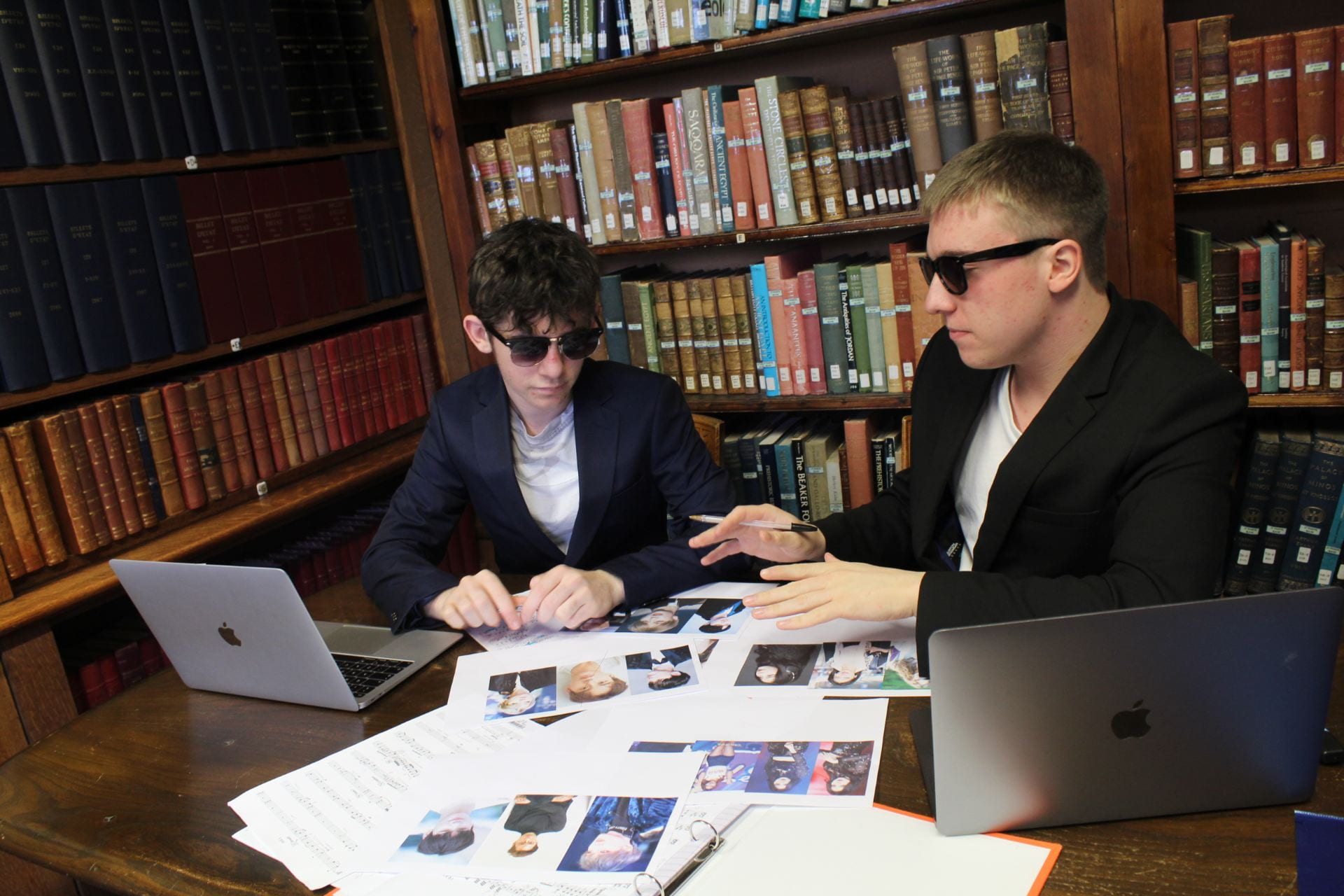
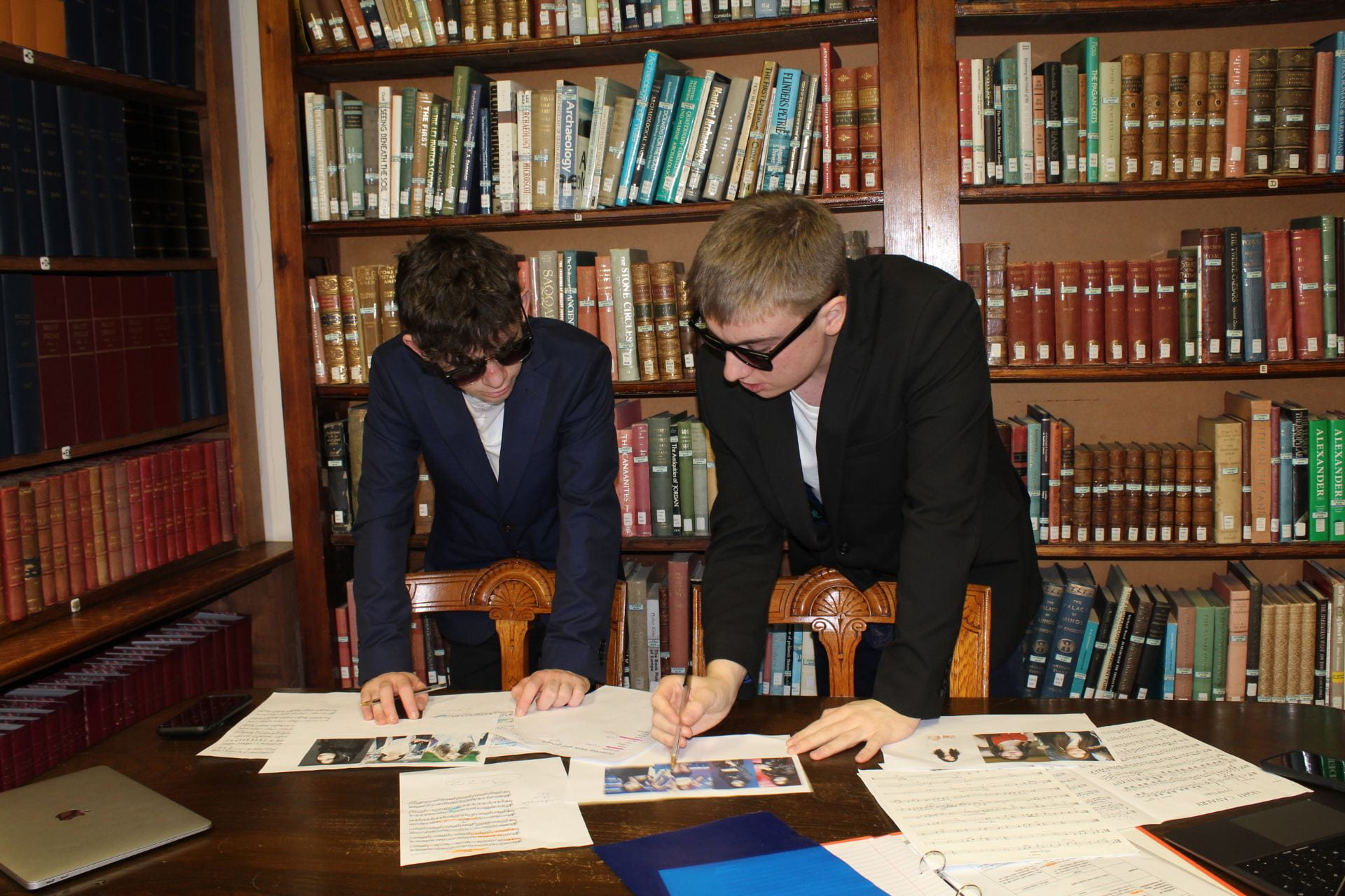
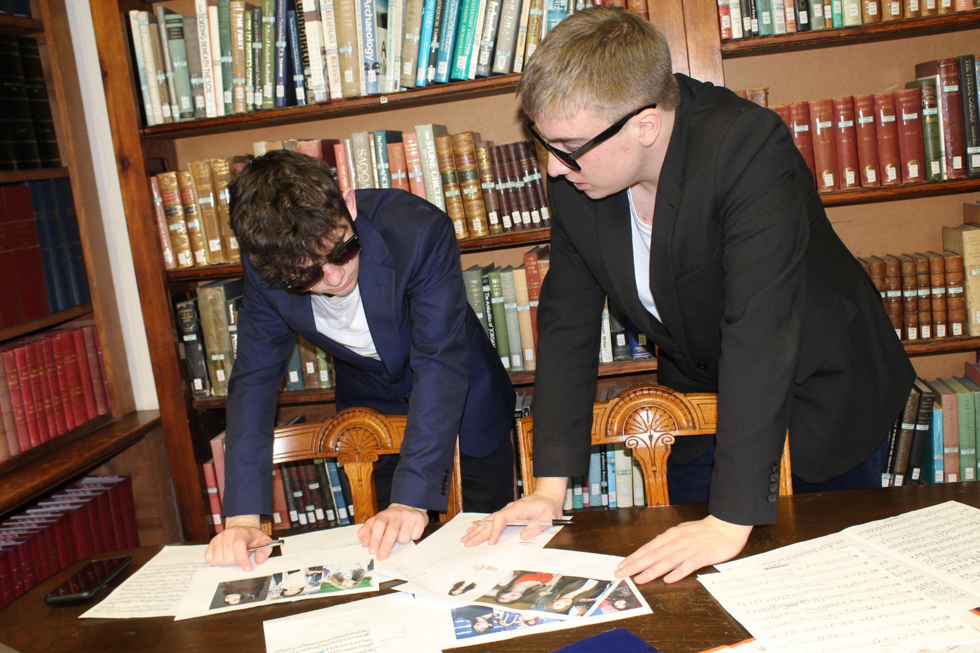
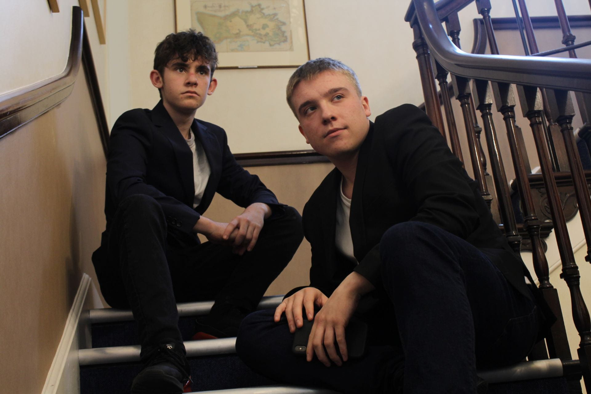
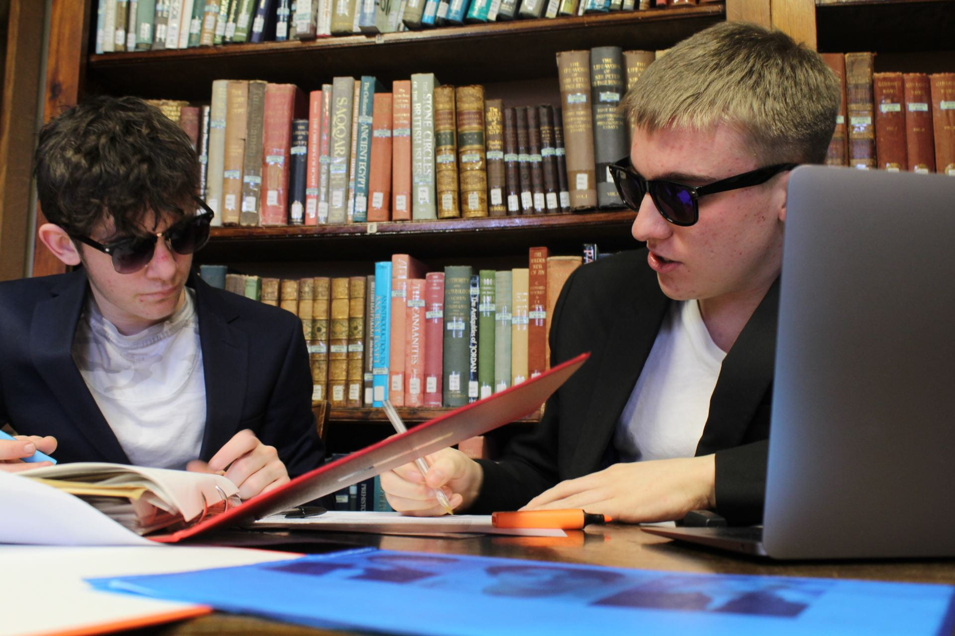
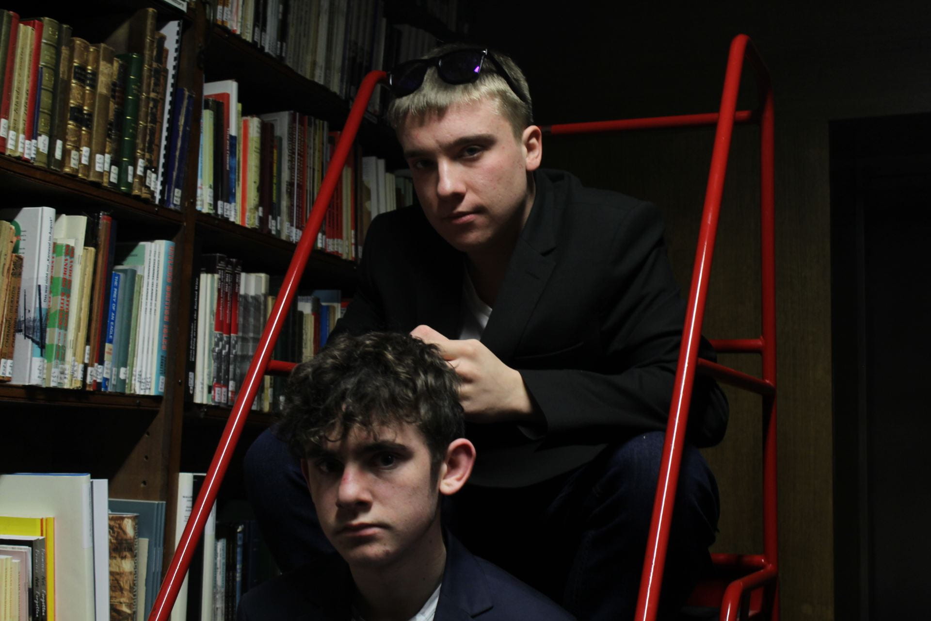
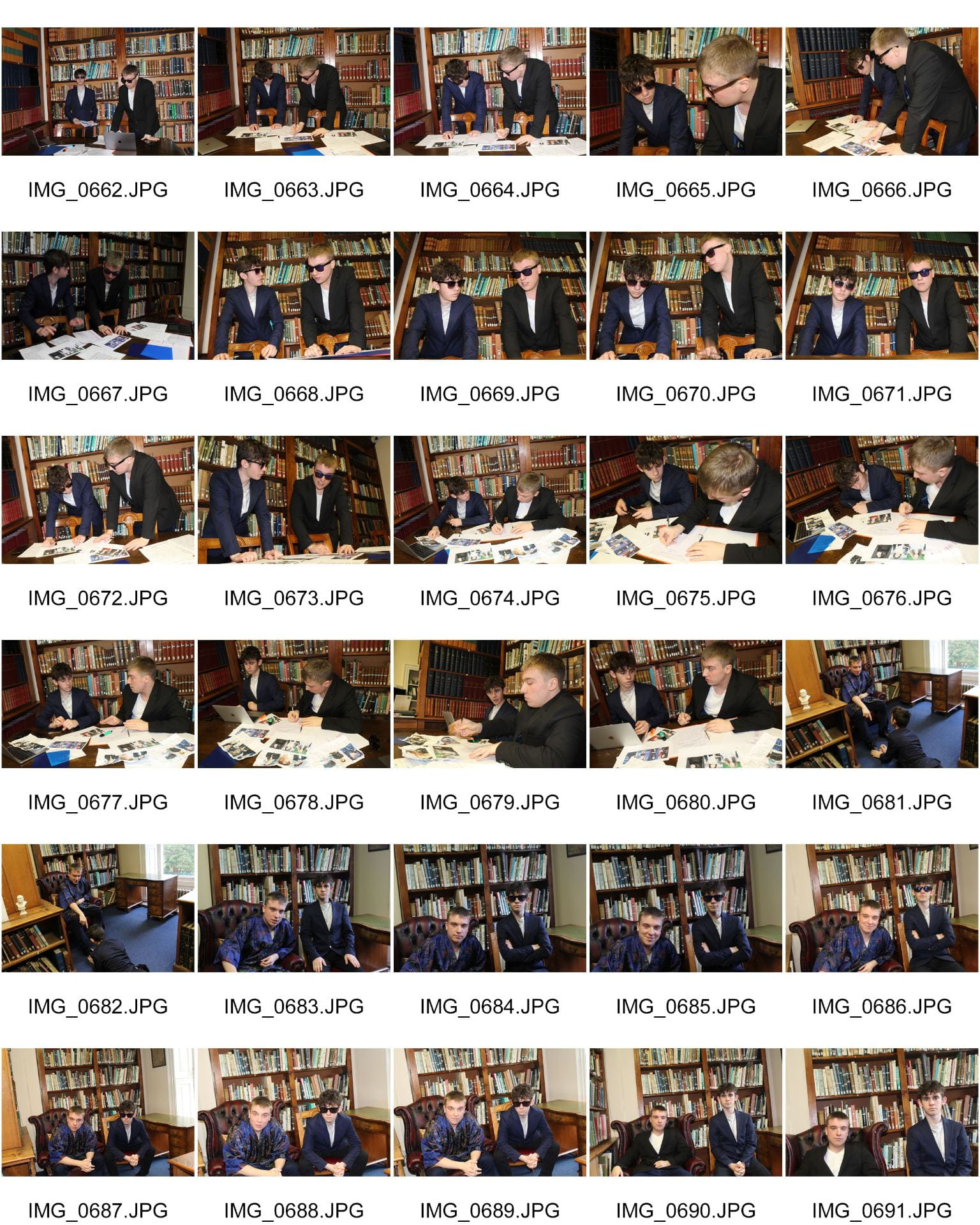
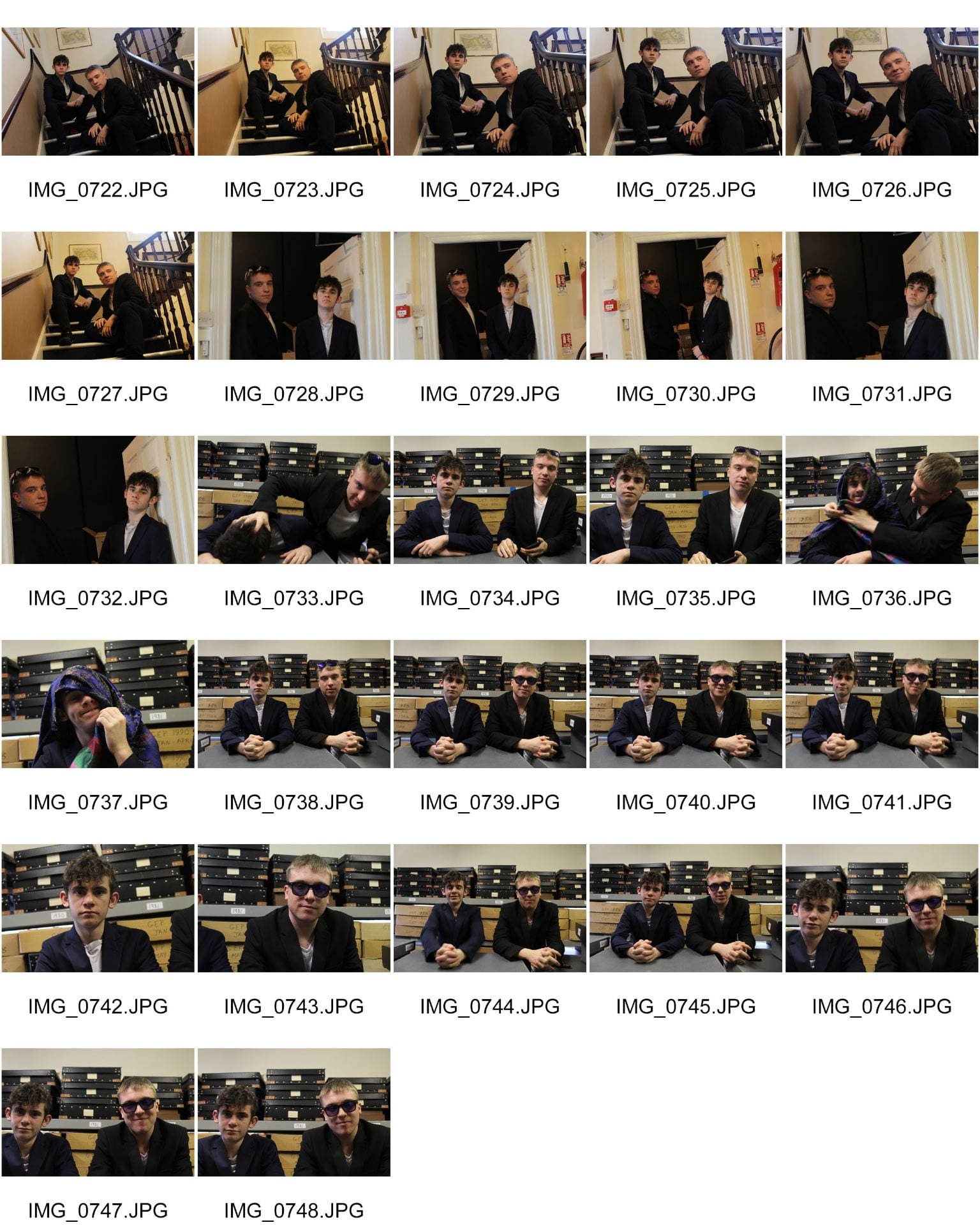
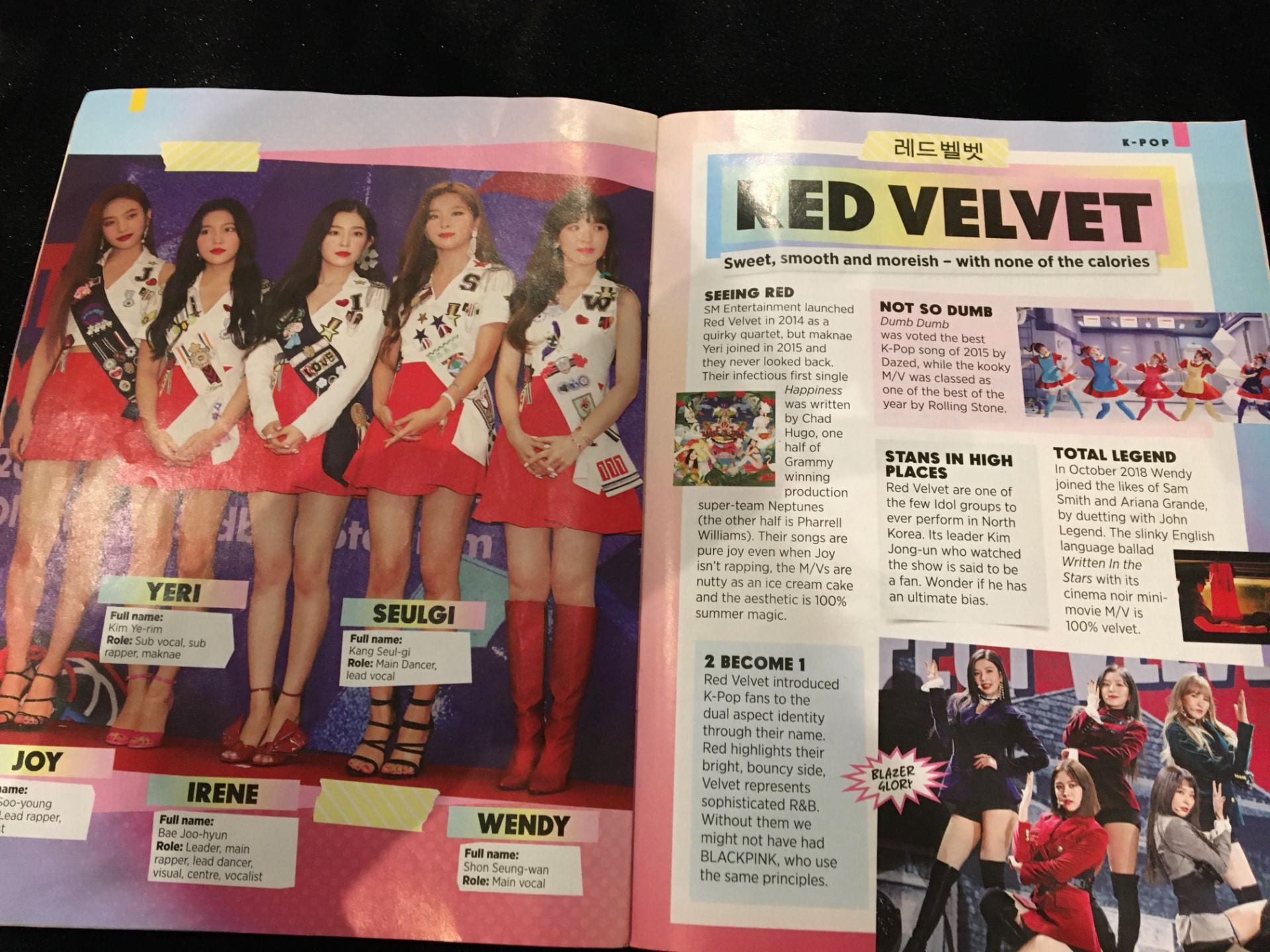
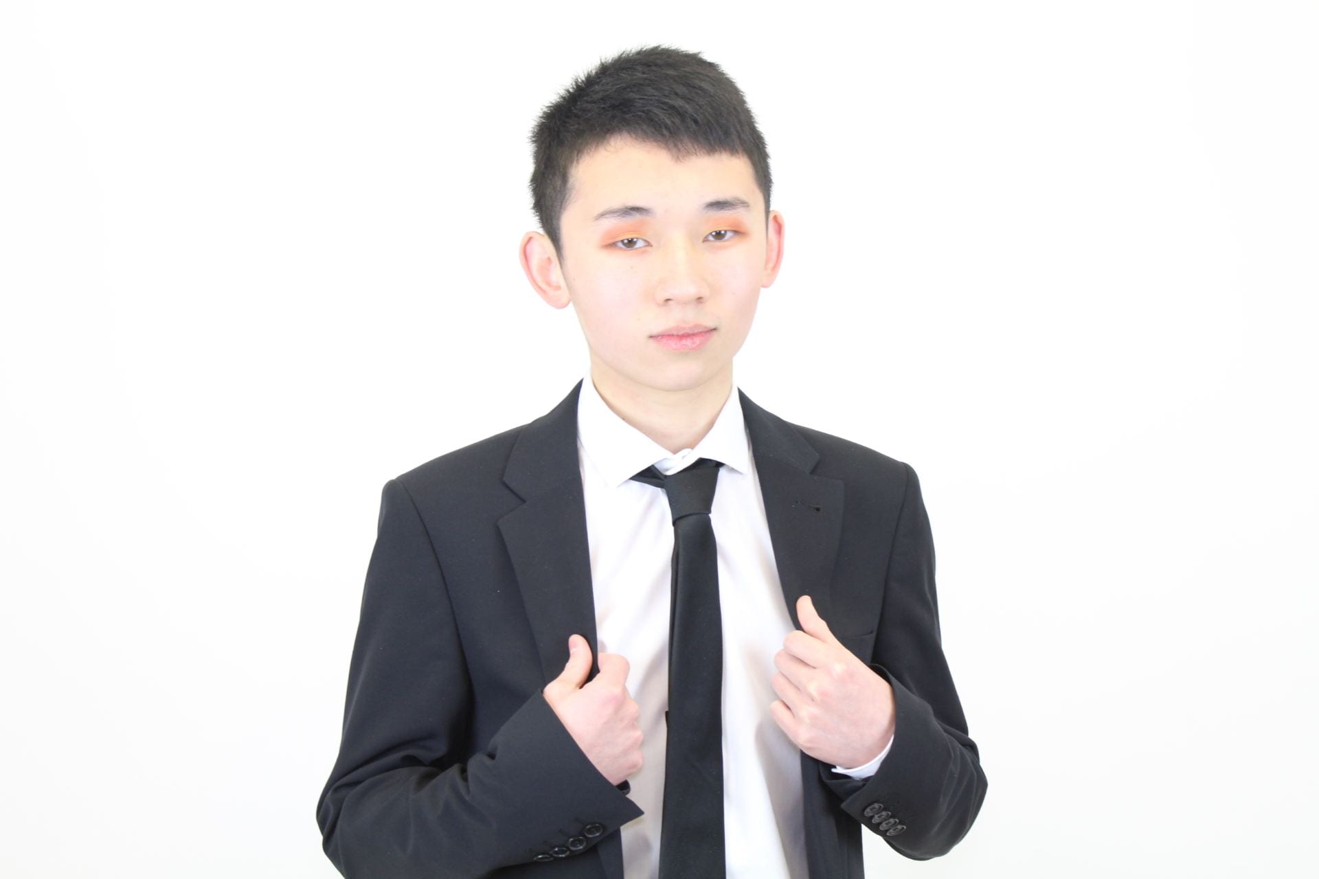
Below are the contact sheets from the location shoot, I think my images came out very effective and clearly display a narrative as well as a professional vibe so that the audience immediately know that these men are important and significant. Out of these photos I came out with about seven images I think are especially effective in the story of the article and show the audience the men’s significance. I chose the setting of the men working and discussing potential kpop groups in a library to further highlight their maturity and influence in the kpop community, this narrative it very obviously displayed in the images below as the two models are in action and appear to be working.

Did I meet the aims?

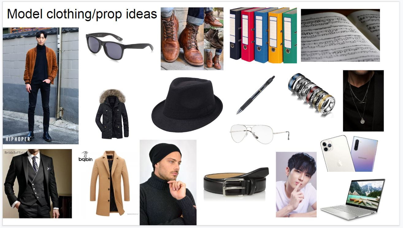
I met many of the aims from my production meeting as I focused on making the facial expression and action visible to the audience, I achieved well lit and well-composed images for the double-page spread that each focus on specific narratives. The way the models are posed and how they were directed really helps to convey the stories, furthermore, the mise en scene of the casual costume with the touch of sophistication and setting helps to show that they are directors.

I had them both moving around and talking whilst taking the images so that they resulted in a much more realistic and natural scene. With a focus on facial expression and setting the makeup was unneeded as the photos showed a naturalistic vibe, I got all the correct costume and props to help add depth to the photos to show the audience of young teen girls how important and vital they are to the kpop world and the creation of very successful groups.


Strong images


December 12

A New Improved Feature Article

A new and improved article

Please click on image to see full article


Changes made

In this second draft, I have made many changes to the structure and contents of the article. I have shortened the part about the Kpop group KDEAM and have a larger focus on how the company came to be and the past events, instead of the part about KDREAM being so large I have introduced the group and have linked the SharpShoot website at the end of this part of the article further interesting the reader to go onto that website. I have then added time and a place for the interview to give it more context and structure, to give the reader a better experience when reading the article.

Furthermore, I have added more language techniques to draw the audience into reading this article. Some techniques include rhetorical questions to break the 4th wall with the reader and alliteration within the text to help the article flow and make it easier to read. The majority of the words in the article are simple and easy to read but some of the words are bigger to have a larger impact on the context and words, I then split the article into smaller sub-articles with titles for each one. These titles are all questions apart from the opening and ending this is to interest the reader to continue on reading as they will want answers to the questions.


Impacts

The impacts I want from the changes in this article are for it to be more interesting for the readers and very enticing, it should visually look very well presented on the double-page spread with lots of colour and pop. The cliff hanger information on KDREAM should lead the readers to go onto the SharpShoot website and look further into the group and other articles and gossip, each question for the sub-article titles should make the reader want to continue reading on as each question will open up new gossip and information for them.

The article itself should give audiences information about the company and about the directors about their backstories as well as gossip about KDREAM, this should make readers want to continue on reading as there are sub-articles within this one so that they will not get bored of the same article in a full double-page spread. I hope that my article interests audiences to read the full article as well as feel very impressed and in awe of how the company is developing in the world of Kpop.


Targets

  • Make the article look exciting and inviting in my magazine
  • Add more language techniques
  • Give it a stronger general tone
  • More powerful sentence openers
  • Word the quotes better
  • Cut it down


Final article draft

Below is the final draft of my magazine article, I have added the targets from above to make it more effective and have a powerful effect on the reader. I am pleased with my final article as it is interesting and clearly informs the audience of the past events of SharpShoot Entertainment whilst also giving the backgrounds of the directors and links to the official website of the company.

December 12

Draft Feature Article

PDF of your Draft article before submitting on Classroom and then use the teacher feedback as your targets.


Article Draft

Shown below is my first article draft of the article for the double-page spread, it tells the reader of the story behind SharpShoot Entertainment and the growing group KDREAM. It lastly touches on the subject of RXN’s Jinho leaving to join the army as he is related to a member in KDREAM. For a first article draft, I do not think it is terrible, it has a nice flow and the writing style is effective.

Please click on image to see full article draft


Voice recording of the article

Below is the voice recording of the article draft, this is to be able to receive what type of tone the words result in and whether or not the audience would be interested in reading the article itself.


Reflection

In conclusion to the article draft, I think that it reads relatively well for a first attempt, the words flow and the tone will capture the attention of teen girls. The words flow quite nicely too as they are mostly simple easy words to read, I like the touch of Korean words in the article to emphasize that part of the article to help make the words sound more energetic and so it links back to the homeland of kpop. The use of quotes within the article from both directors on the interview subject further highlights their emotions towards the subject and makes it seem like they are directly speaking to the audience resulting in the readers feeling more involved and informed of the subject. I have also broken the 4th wall many times as the interviewer make references to the audience through the use of imperatives and questions, in the article the interviewer puts in their own opinions at times to show that everyone can be involved in the article it is not simply an interview with two directors, the audience can all have their opinions.

There are facts in the article as well as the background of the directors giving the article a proper story and structure, the focus on more than one subject in the article makes it more interesting to readers so they can read about more than one specific subject. It is an article with multiple sub-articles within it that all link together to the SharpShoot Entertainment company.

Targets

  • Add more language techniques to grab a larger audience into the article
  • The sentence openers all need to be grabbing and stand out
  • The article itself needs to be cut down so it is smaller so that audiences do not feel overwhelmed when they open the double-page spread
  • Words in some places need to be changed so that it makes sense and is easier to read for young girls.
  • Needs to be a more energetic and familiar tone to the article so I will add in more punctuation and colloquial language
  • Cut down the article as it is too big and drags on slightly
  • Focus on a specific subject in the article
  • Cut down the sub-article of the KDREAM group
  • Put in a time and place of the article to give some context
  • Add in catchy gossip titles
  • Introduce the directors in the article

I will add all these aspects into my seconds draft to make it more effective and interesting to the audience.

December 12

Article Idea Development

The article

The article I am designing focuses on the kpop entertainment industry called SharpShoot entertainment. It will cover how the company became so successful and the designing of the new girl group KDREAM and possibly touch on the subject of Jinho leaving RXN. There are both the journalist’s comments about the company and opinions and quotes from the two directors of the company themselves. This is aimed towards young teen girls so there will be no large blocks of writing but small sections of the article along with images of the directors and KDREAM to make the spread more exciting to the audience.

The teenagers will need information about the company and the groups so that they gain popularity and recognition, the effect of this double-page spread should be that it brings excitement to the reader and does not look boring. The audience will need an eye-catching colour scheme of the pages and enough to read so that they are properly informed, the mix of the photos and texts will make it easy for them to pick out words from each section so that they read it. The language of this article will have to be simple and easy to read so that the information is quick and sharp and immediately grabs the audience’s attention so they do not skip the pages. This double-page spread will be exciting and grabbing to the audience and give immediate information about the company and kpop groups involved with SharpShoot entertainment.


Preparation Documents


Article Planning Document

December 9

Language Analysis

Language Analysis

Below is the language analysis from three articles in a kpop magazine, I have chosen to analyze three as they were all very small and short so I wanted to look at three to see how contrasted each other in the magazine to give different displays of the media stars.

The images of each article are located below the analysis.


Please click on image to see full Language Analysis


December 6

“Production Meeting Agenda For 2nd Photo Shoot and Risk Assessment “

Production Meeting Agenda

Below is my production meeting agenda for the second shoot, it discusses the lighting, costume and other aspects of mise en scene. It states what my aims are for the photoshoot and how I want my models to be portrayed to the audience. I have then added photos of clothing ideas and props that I would like to use in my shoots to tell the story to the audience, and lastly the risk assessment for the on-location shoot.


December 6

A New Improved Front Page

Cover Draft 2

This is my second draft of the front cover page which is clearly more effective than the first one. I have made many improvements from the first draft, including adding a deeper story to the cover.

  • Added in Korean words that say cool and crazy to show the origins of the genre.
  • Korean fashion week as Kpop idols have to constantly look presentable and well dressed.
  • Jinho’s signature along the article about him adds a story.
  • A quote from his interview to further interest audiences into what the magazine includes.


Impact

I hope that these changes make the cover look much more effective and display the genre of Kpop to an audience of young teen girls in bright light so that the genre can become even more popular globally than it already is through the use of my magazine. The business of the plugs and pugs around the main cover star will interest audiences to notice that there is a lot included in the magazine and it is worth the money, the changes in the magazine will have a dramatic impact on how the cover is seen on the market and in the eyes of the audience.


Targets

  • Add another story on the cover page from the location shoot.
  • Photoshop the cover stars lips.
  • reinforce to the audience how powerful and unique the kpop genre is.
  • Add in the SharpShoot logo and a caption


December 4

Draft of Front Page

Cover Draft

Below is a draft of the front cover page of my magazine, the result of the first draft has been successful as I have achieved the sophistication and colour I aimed for when planning the cover page. The fonts are very bold and effective and the images on the cover stand out and are eye-catching to an audience of young teen girls to look and purchase this magazine. The effects on the fonts and images highlight the magazine and emphasize a dramatic aspect of it adding a sense of difference and uniqueness. I have changed the font and colours of the magazine name as it looks bolder and better to the audience and has a bright pop to it that I like and think is significantly more effective than the original one.


Peer Feedback

  • Add in a quote from an interview and place it somewhere on the cover page.
  • Put information about what is in the magazine, such as put page references.
  • Photoshop the lips so that they look less red.
  • Korean words and phrases.


Targets

Some targets I have to improve my magazine cover include:

To further Photoshop the lips of the main cover star as they do not look as smooth and gentle as they could be.

The next aim is to add some Korean words and phrases onto the cover to really express where the genre of music comes from and so that it looks different in the market and catches more attention.

The final aspect I want to add is more plugs and captions so that it looks more busy and exciting to the audience and worth purchasing.


November 25

First Shoot Contact Sheet(s)

Aims

From my production meeting aims, I have successfully met many of my aims as the expression and mise en scene in the shoot resulted in the model looking arrogant and mature as aimed for in my last post, the black suit accentuates the sophistication and gives him a domineering aura that would interest young teenage girls to the cover of my magazine.

At the start of the shoot, I used a light on the top of my camera to give a brighter more gentle light as seen in some of the photos below that really made the images look professional. In the other photos, I used the flash of the camera which then resulted in higher quality photos with sharper lighting and more in-depth detail giving a narrative to the images and highlighting the mise en scene and eyeshadow which I liked.

In some of the other images, I tried experimenting with the coloured plastic over the camera lens which resulted in some interesting shots with the lighting and mise en scene, the different colours gave a deeper narrative to the photo and altered the lighting. However, I decided I did not like these photos as much as the in-depth ones taken with the flash as I really think that they give the stronger narrative and display the correct emotions towards the demographic.


Photos

Below are images from my first photo shoot for the cover photo, I think this photo shoot was very successful as I achieved photos of very high quality and professionalism. In total I took around 200 photos which is a good amount of photos to choose from for the front cover, I managed to find around five photos that I thought would be ideal for a front cover star that conveys the correct themes and feelings I want to express to the audience to get the right reactions.


My five images that could be the cover photo are below.


Below are the contact sheets of photos from my photo shoot.

November 18

Mast Head Designs

Font Styles

In this post my masthead designs are located, the effect of fonts and size will change how the public views my magazine. The colours and fonts used for the masthead will have to match with the vibe the cover star gives to the audience. My magazine is called K STORM so the font that I chose for the masthead will have to reflect the same vibe that the name of the magazine gives, therefore having the desired reaction from the audience.

For most of my font experiments, I have mostly chosen bolder bigger fronts to grab the audience’s attention so that the masthead immediately draws them in and they want to read what the magazine is about. The bold font reflects the magazine name as the word STORM tends to be associated with loud, bold and dangerous events, this could then relate to how dangerously addictive the genre of k-pop is to the audience. In my font for the masthead I want the words to have sophistication and a smooth sleek look that interests the audience, It should stand out and be bold but not too much as it has to radiate maturity.


Chosen Masthead

This is my chosen masthead as this one as it displays the sophistication and individuality I aimed for when designing my masthead, It is bold and stands out and the set letters in the word storm make it bright and big. The letter K is a different font which then gives a roundness to the masthead and reflects the diversity of K pop, the colours I have used are red and black which are both significant colours in Korea and then links to the importance of the K pop industry in Korea.


Other Ideas