October 15

My Tour Poster


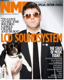
My music genre for my tour poster will be folk, the image above displays a range of different tour poster covers and CD covers that focus on the genre of folk. They are all generic poster covers so they share many qualities that make them into folk genre images, as you can see none of them use extremely bright colours, they are all soft and calm colours to reflect how folk music connects with nature. Furthermore, these colours are very earthy colours as they are browns, yellows and blues which all correlate to nature.

I will use these examples to inspire and help me create an effective tour poster in the genre of folk, all the aspects are vital for an effective piece of media so I need to include the most appealing features to reach out to the desired demographic. I want my tour poster to be ‘the same but different’ so conventional to grab audience attention and is unique therefore looks like no other tour poster for folk, I will need to focus on AIDA and knowing your client so that the colours I use as well as fonts stand out to the target audience.
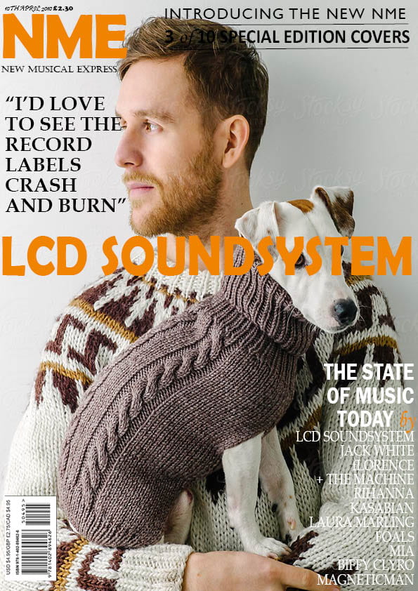


Folk TourĀ Poster

Please click on the image to see a clearer PDF image.


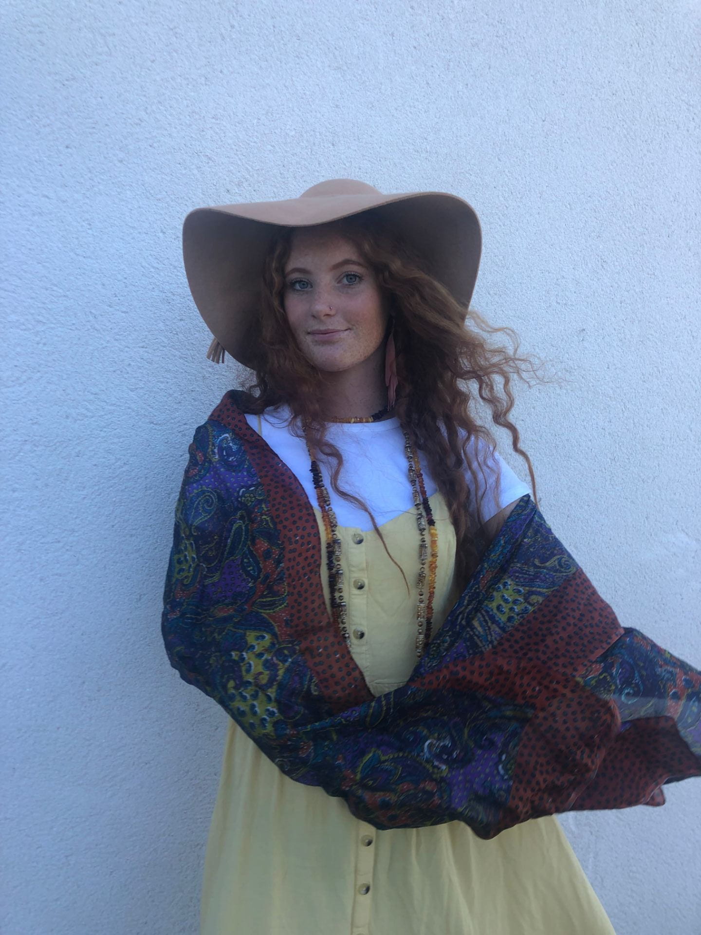
This is the final product of my folk tour poster which I am overall delighted with as it is inviting and conventional, the layout, fonts and colours relate to the genre of folk. The chosen colours of blue and yellow will remind the audience of nature as they represent the sky and the sun giving a bright aura to the poster, they show how folk music relates to the beauty of nature. The position of the model accentuates the interest of the audience as she is looking directly at the camera inviting the audience in, the flow of the shawl gives the sense of wind in the poster interesting people even more.

I am very happy with the outcome of this poster as it is the first piece of media I have created I think it does give a clear sense of folk through the colour scheme and fonts, I have taken notice to “know your client” and have focused on how to please the psychographic of folk music.

Furthermore, I have completed all the aspects of AIDA which all help my poster to stand out. The poster grabs audience attention through the bright colours and a large image of the model, the chosen fonts also lead peoples’ eyes to the poster, it interests people as the colours once again stand out. These qualities then lead to desire in the demographic as they know where the singer is performing and what dates she is singing, the involvement of the site to buy tickets gives the action the audience need to complete to go to one of her concerts and listen to folk music by Aria West.

To improve my understanding of these editing apps I would play around with them more so I can identify what tool to use or what photoshop aspect to include, the more I use these apps the better I will get at editing my photos to create effective pieces of media.


This is my tour poster assessment, please click on the name to find the chart.


October 9

My Magazine Front Page Swede


This is the original magazine cover I decided to replicate in Adobe Indesign CC 2018.


Please click on the image to see a clearer image.


Reflection

I am pleased with how my cover turned out in Adobe InDesign and hope to be this successful in creating my own media cover alone. We did this task so that we could practice using an editing tool, in this case, it was Adobe InDesign CC 2018 as well as get used to looking and analyzing magazine covers so that we can create media that is as effective as professional covers and other media.

Within the covers, we see a range of different aspects that build together to create a successful type of media for a certain psychographic, by mimicking this cover I have further realized how important it is to take the mise en scene into account. The typeface it vital to display a mood to the audience, and the cover stars position on the cover affects how people read the front of the magazine and what type of moods it displays to them.


Successes

I have learned a range of different techniques to use in Adobe InDesign when I am creating my own cover and will use as many of them as I can to help make my cover more effective, I have enjoyed designing this cover to fit the original as best I could and have gained a wide range of skills to use in the future.

Some parts of my cover are much better than others and look visually more appealing, other areas of the cover do not look as similar to the original as I would like. I definitely feel like adding in some of the aspects from the original cover was more challenging than other parts, sometimes because it did not look similar or because the cover star blended into some of the typeface.

Three aspects I thought were the most successful include the layout as mine matches the original and it looks effective, I have matched the correct writing to the original so it appears professional and alike to the original cover. The fonts used in the cover radiate energy and power from the cover and I matched this by finding typefaces very similar to the normal cover.

Another strength would be being able to understand how the software works relatively quickly and being able to know what I wanted in the cover, this helped as I managed to execute the typefaces and colours accurately to the original.

The last aspect which was completed well was the typefaces as I managed to get each written part in the correct font or a font very close to the original, I found doing this part was quite stressful as it took me a while to find the correct font to the original. Overall I found that imitating another magazine cover was both difficult at the start but rewarding to see the completed product as it looks professional.


Struggles

Along with aspects that were successful there were also parts that were much harder to put into my cover, the first thing wad my cover star holding the dog. Due to the layout of the original cover, the front cover line travels over the dog in my cover replication which is not what should happen as every aspect of the cover star should be seen.

The photo that I chose to do my copy with does not fit with the theme of the cover so it makes it come across as very juxtaposing, the man and dog look very chill and calm but the writing over it conveys energy and slight aggression.

Another aspect is that I could not put the writing of some of the cover such as the magazine name behind the mans head so it does not look accurate to the original, it was an issue when some of the writing blends into the cover star such as the writing in the top right corner.

The last struggle was adding in the lines under the writing in the top right corner, it was difficult as the lines do not look straight therefor make the words look wonky on the cover which does not look professional. The thinness of these lines make my cover slightly lose its boldness and effectiveness, it does not appear to be as powerful and grabbing to a certain psychographic as I would like it too.

However, as my first mimic of a professional cover, I am pleased with how it turned out as a whole product of media and think I did this task effectively and successfully and will use the skills I have learned when I come to create my own media poster.


Three videos that I have watched to help with what I struggled with in Adobe InDesign are shown below.


September 27

The Camera Talks

This mood board of the nine photos that I personally view as the most successful demonstrates the power of having a good quality photo, the strong differences between each photo show how angles, lighting and distance, and many other aspects can change what emotions can be seen in each photo.

Along with each of the photos I have put the denotation down by it, the angles and framing of the photos help to express the connotations and narrative.

Girl face looking down- Conveys a sense of sorrow and mourning, dark lighting helps highlight this.

Two people on bench- Conveys anger and frustration as the models sit on opposite ends, the long shot helps the audience recognize the anger as the faces are difficult to see.

Girl face behind bars- Conveys intensity with facial expression, big close up defines the face and makes the bars look more realistic.

Girl looking out of blinds- Conveys an almost sinister mood as the model looks directly at the camera, the dark lighting reflects this.

Two people behind bars- Conveys seriousness as neither model is smiling, catches audience attention as they are both looking at the camera.

Girl looking down at boy- Conveys the feeling of adoration as the girl looks down at the boy, but there is also an edge to it as she looks as she could be stalking him.

Two people in a lift- Conveys a tense atmosphere as one model turns away from the other hiding their face, the dim lighting once again portrays the uncomfortable mood.

Girl behind bathroom door- Conveys fear and shock as the door is half closed, little lighting represents an almost sinister feeling. The audience feels fear as the model looks directly into the camera.

Two girls on stairs- Conveys a strong sense of power as one is above the other on the staircase, the body language tells us the story without the facial expression.

As an individual, I think I managed to achieve my aims for this task, by using a range of different angles and lighting as well as experimenting with different backgrounds I took some successful photos that had a clear storyline within them. It depends on the model’s proxemics and facial expression to help tell that story not just the camera position, by adding both together along with the rest of mise en scene you can create powerful photos that call out to the audience and grab their attention.

Focusing forward towards designing a magazine cover I have learned to take into account that all the angles and distances of the camera and how they can portray a mood are vital for creating an effective photo. Depending on how I wish the audience to respond to the magazine I will use the distances and lighting as well as mise en scene to create a cover that speaks out to the target audience.

September 26

Technical Camera Terms

This task we have completed helped us to understand the basic settings and functions of a DSLR camera, after being taught how to change aspects such as shutter speed and auto/manual zoom we had the opportunity to go out and take our own photos. Whilst taking these photos we also took mise en scene into consideration aiming to have each photo being able to portray a story, the different angles and distances help tell those stories.

The main functions we learned about were; shutter speed, auto/manual focal length, aperture, as well as composition, framing, and depth of field (DOF). For me getting to understand how to use the camera was both difficult and straight forward as I had used a professional camera before but did not know all the aspects you could change, some parts were definitely more complex to adjust than others. But I know the further on we get into the course the more familiar I will get with using professional cameras like the one I used in this lesson.

When we took the photos we took into consideration the layout and angles, we specifically chose the places to take these photos as the backgrounds would be effective. Every photo should tell a story and I think the two-shot one on the bench expresses the most emotion therefor telling a story, another photo that portrays a story-line is the two-shot ones taken in the lift as the placement and proxemics of the models displays emotion and story. We used a wide range of different shots and focuses to blur out the background or focus on a particular object, these aspects added to the composition of each photo telling a clear story.

Distances of photos further helped to express emotion, the medium-long shots of behind the bars represents a cage and tells a clear narrative. Certain angles helped represent moods of the photos such as the high angle in one expressed a sense of vulnerability, all these differences in the photos really convey a narrative and represent stories in their composition. By addressing aspects of mise en scene and the distances, angles, and compositions of the photos we have achieved the goal of telling a story through a photo.

In the future, I will be able to take into account the importance of how images are conveyed, by completing this task I have learned how distances affect moods of a photo and how vital it is for that photo to convey a narrative. For my own music magazine production, I will use certain distances to convey emotion and produce a purpose, each of those photos will have a clear narrative and represent and story to draw in audience attention. I want my music magazine to be as effective as possible so that it is as successful as it can be in the media.

These photos are the result of our photoshoot.


September 19

My image that uses mise-en-scene to communicate meaning.


For this task my group was assigned with the genre of folk, folk is an old genre of music usually passed down generations and involves no prerecorded sounds and beats. Folk is associated with nature and spiritual moods as it is such a calm and chill genre of music, there is very little make up involved along with hairstyles with this genre as it needs to be as natural as possible so women mostly have their hair down.

The costumes are normally dark coloured and women dress in long skirts or dresses and men in casual tops or sometimes waistcoats and sometimes certain types of hats, the locations mainly involve fields and the countryside to reflect the chill natural vibe given by folk. Lastly, props mostly include instruments such as violins or guitars which add to the gentle vibe.

Made with Padlet

Please click on the caption to see all the photos

These are the adjectives used to describe the genre of music through the use of mise en scene. The outfit we designed for this genre clearly reflected the calm gentle vibe we hear from folk, the music style is very unique especially in the 21st century where most music involves strong beats and recorded sounds to help the music come together. In folk music, all the sounds are natural bringing a serene feel to the music as well as being noticeably different from other genres of music.

Many terms associated with folk music are all the adjectives in the image above as well as chill, calm, serene, gentle, energetic, sunny, joyful, soft. Most of the adjectives used to describe folk relate to nature and how it is viewed by people reflecting it into folk by the audience. The connotations for folk music are light materials that flow and that are darkly coloured, simple jewellery and some men wear hats. Overall the mise en scene for folk music is very simple and earthy as the music reflects the calmness of nature.

This is our final image.

I feel this image represents the genre of folk the most as the movement of the hair and shawl emphasis the calm gentle feelings we receive from folk music. All the aspects of the costume depict a sense of serenity as the shawl creates the prominent feeling of tranquillity and the connection with nature as it is naturally being blown up by the wind. The contrast of the yellow dress further gives calm vibes as yellow is often associated with the sun and brightness, yellow shows positivity and energy which is what folk music intends to make us feel. The freshness of the yellow against the detailed design of the shawl complement each other, drawing audience attention as the style is completely unique.

The three accessories definitely add to the style as the dark coloured necklaces mirror an earthy look conveying how folk music aims to connect with nature. The pink feather earrings match well with the lightness of the dress giving a light but bold feeling to the image as they stand out, the large hat adds to the chill vibe of the image as the soft texture of the hat reflects the soft nature of folk music. The pale colour further portrays the importance of staying close to nature.

As the shoot was taken outside the lighting we used was all-natural as it contrasted with the shade, this continues to emphasise the organic feelings produced by this image. As the model is close to the camera and also looking directly into it, it feels as if she is communicating to the audience, she makes a connection by drawing them in. The gentle smile radiates energy and contentment giving the audience a positive perspective on the image, the body language and angle of the model tell the audience that the model is welcoming, intriguing the audience to further analysis the image.

To conclude, this final image from the photoshoot is very effective as it displays all the characteristics of folk music and from feedback we know that the right reactions were produced with this outfit, our design of mise en scene for the music genre of folk was very successful as a chill calm vibe is created along with the effective use of body language and natural lighting.

A process such as this one will be very effective in the future when I come to do other products as I will know how vital mise en scene is for photos, through researching the genre of folk I definitely think we captured the correct aura of folk music by having every detail relating to folk. The mise en scene clearly depicts the music genre of folk as the dress and shawl give a natural feel and the lighting adds to the purity of the image, the audience feedback we received from our peers were very positive as they all picked up on the chill vibe and calm nature. Finally, the design of the image conveys the mood of folk music through the mise en scene, for future products I will always make sure to consider every detail of mise en scene to make sure that my product is the best it can be and that it is clear to the audience what it is portraying.