
Loading…
Loading…
Below is a screen castify of how my media engages with my target audience and how I would go about distributing it. I have had to split the screen castify into two sections due to it going over the 5 minute limit. The first section talks about my target audience and the second about distribution.

Adverts are usually found in magazines. They will be fitted to interest the specific audience that is reading the magazine. My magazine is targeted at Generation Z’s, so I have found adverts that will interest them. Below are two of my favourites and the reasons why I have chosen to use them.

This poster advertises coke but also brings in the theme of music. I specifically chose this poster as Coke is one of the most iconic and recognizable logos. My audience will instantly notice and be interested in what is being advertised. I also chose this advert as my magazine is based on music so it can fit in. The advert is very fun and creative which links in with the style of pop music. It is colourful and busy, making the reader intrigued in what it is about.
![]()
This poster has been chosen as it is all about a music festival. My audience is reading my magazine to discover more about music and so this advert gives them even more information. It is very bright and colourful to attract and please their eyes and includes the very famous and successful pop star; “Lewis Capaldi”. This will intrigue my audience even more as it will be someone they love and listen to.
After receiving suggested improvements to make, I then did them. Below are the new and improved drafts of my magazine pages and the things which I changed.
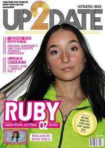

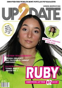
FRONT COVER:
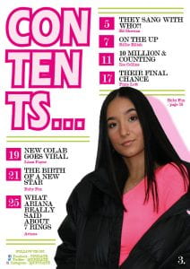
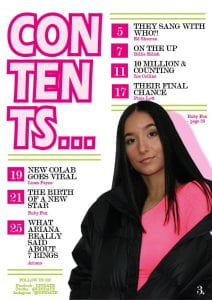
CONTENTS:
DOUBLE PAGE SPREAD:
The final adjustments that I will need to make to my magazine pages are:
So far, I am very pleased with the way that my magazine is turning out. I have finished drafting my pages so to see the media coming together is great. The pages are working together in that they carry the same colour scheme and certain fonts and details and they are definitely portraying the genre of pop. This is being accomplished through my images, colours and layouts. Although I have drafted all of my pages, I do still have improvements to be made. For example, I could take the front cover star image and edit it even more to make it pop and small features such as line spacing need to be changed.
As well as composing a piece of media, I have also learnt many transferable skills such as:
Throughout creating my magazine, I have continued to learn even more design skills that have positively impacted my magazine. These are shown below:
 This is the colour theme tool which has allowed me to pick certain colours out of the images and use them in my magazine. This has allowed me to make my star seem built into the magazine and follow the genre. This has impacted my magazine in that it all looks clean and composed and that my star relates to the magazine. The genre of pop is expressed between the star and the magazine, creating interest for my target audience.
 This is the drop shadow tool and has allowed me to create a three dimensional look. This has formed the idea of realism and creates a connection with the audience as my stars are not just part of the page. This reflects the idea that although the artists are extraordinary, they are also people like us.
 This is a tool which has enabled me to wrap text around shapes and images. I mainly used this on my double page spread where the article wraps around Zoe and the quote which has been enlarged. This has impacted my magazine in that it has enabled the content to interlink and look well put together. It has enabled me to make certain objects (such as the image) larger and more intriguing and interesting for the reader but without losing lots of space for text.
Overall, I am very happy with how my magazine is going and I think that certain design techniques like this are benefiting massively. Although they are small details, they are building up together to positively impact telling my narrative and expressing the genre of pop.
Below is the complete set of drafts of my front cover, contents page and double page spread.

I then received feedback on the magazine:
From the feedback given I can tell that what is successful is:
The parts that can be improved include:
After receiving feedback on the first draft of my contents page, I was then ready to apply those suggested improvements. Below is my improved version and what I did to get to it from draft one.

Please click on the page to open it as a pdf.
The improvements that I made:
I then spoke to my peer about my contents page and how it works within my magazine.
This conversation was quite positive. I need to make sure that I continue making links throughout my pages, including colour schemes, fonts and details and that I am making it as interesting as possible for my audience.