My Tour Poster

Below are example of Indie Music tour posters and the Indie tour poster conventions I have discovered:

AUDIENCE: The audience for Indie music is baby boomers. (50’s plus)

LANGUAGE USED: The language used on the posters is very clear and easy to understand. There isn’t any foul language or slang.

LAYOUT: The layouts are very simple and not too cluttered. The star cover photo  is positioned in the centre of the poster with the dates and places they visit at the bottom. The main cover lines are very large and are either above or below the cover photo.

FONTS: The fonts of the main cover lines are quite unique and represent the individual group or artist. (some are very quirky like the ‘Arctic Monkeys’) The dates and other information about the music is in a smaller font that is clear and easy to read. (The majority are in a sans serif typeface.)

COLOUR: The majority of posters have a black/dark background with not much colour. If colour is used, it is either hint of brown or it is quite washed out and dull.  (for example, even though the Mumford and Sons poster is much more colourful than the other posters, it still isn’t neon or too colourful.)

PHOTOS: The photos used on the posters are a mixture of styles. Most are a mid shot of the artists however some have aerial views of the actual tour or none at all. Quite a few of the images are also not face on to the artists.

From looking at the conventions of Indie tour posters, I have realized the type of components I will need to include when creating my own to catch my audiences attention and interest them. This will hopefully desire them which will lead them to taking action to buying my magazine. However I will need to make sure that my poster is still unique so that is is different and interesting.

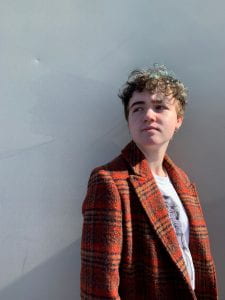
After looking at the conventions of an Indie music tour poster, I then created my own. Below is my final design using my favourite image taken on our photo shoot.

click on the poster to see a clearer version

Looking at my poster,  it has many conventional features such as the colour scheme, fonts and cover image. However there are also feature that are less conventional. For example, the layout is a little different compared to some of the others. The image is to the side with the text down the side. This doesn’t quite follow the ‘normal’ for an Indie tour poster as most of the time posters are split into 3 horizontal sections with the information at the bottom. Using components that are not so typically conventional allows my poster to be unique and interest the audience so they would hopefully then buy a ticket. If it was identical to another, then it would not stand out or draw attention of the audience.

As well as being conventional and unique, I have also added extra details in to draw in attention. For example in the photo used, her eyes are targeted towards the information down the side. This also draws the eyes of the audience to that part, making them read the information. The information is also sectioned by simple white lines to add an extra detail. This helps organise the information, making it easier to read. Due to the lack of text, this also helps to intrigue people into reading what is there which will hopefully desire them into taking action into buying a ticket.

There are features that I like and dislike about my poster. I really like the layout. It is simple and easy to read. It is structured well and isn’t too complicated or cluttered. However I am not the biggest fan of the title as although it fits the Indie genre, I think that it may be too simple compared to others. I am also not the biggest fan of the background. Next time I may find a texture or photo to use instead.

Below is a review of my poster including what has been included and why, whether it is conventional or not and the features that could have gone better.


My Magazine Front Page Swede

After deciding on an NME magazine cover to recreate, I then started to build it on ‘Indesign’. I chose the NME cover which included LCD Soundtrack as their main cover star. Below shows the original magazine cover and then the one I recreated underneath. (please click on my version to see it clearer as a pdf)


Although I was mainly able to recreate the magazine cover, there are still components that I could improve to make it identical.

I think I was quite successful:

  • In making the colours in the magazine match. (especially the oranges on the masthead and main cover line).
  • The cover line fonts compare quite well and I was able to make the spaces between each of the lines match the original. (For example “Florence” and the line below had a smaller gap between them than the others.)
  • I was able to make the plug have the same layout including the lines above and below the text.

However there are also parts that could be improved:

  • I had the same main cover star image however it was slightly more zoomed in on my recreation. This made some of the titles and text seem slightly out of position and proportion.
  • The background is slightly off in that the original had a grey gradient from the top corners whereas mine does not.
  • The Masthead font is a little different to the original. The font is not exactly a perfect match and the “E” in mine does not layer behind his head. In the future, this could be corrected by using Photoshop to cut out my cover star to be able to layer him on top of the background (with the E behind his head).

From this task of recreating a music magazine cover, I have learnt how difficult it is to chose the correct fonts, colours and images, and how they must all be picked out perfectly to fit the intended style. This links back to Mise en Scene; being able to narrate a story through the different components. It has also taught me how layout is very important so that the audience is able to see all the key information without it being too busy and cramped. This piece of media included most of the conventions of a music magazine and so should mine when I create my own. I will also need to think back to Mise en Scene and the colours and language used so that it fits in with the genre and attracts my intended target audience.

Below are 3 Youtube tutorials on Indesign features that will help me when creating my own magazine cover.


So… How can an image communicate meaning?

From looking at Mise en Scene and Camera Framing, it has made me realize how many different components to a photo you need to consider in order to portray a narrative to an audience.

Mise en Scene forms what the picture is actually of and what is included in it. You need to take into consideration the:

  • Costume
  • Lighting
  • Acting
  • Make up and hair
  • Props
  • Setting

Each of these must link perfectly back to the narrative so that they are not just part of it for the sake of it, adding unnecessary confusion.

In addition to Mise en Scene, the photography techniques are also just as important. We have looked at camera angles, distance, and composition; each creating meaning in a picture.

Every decision made will be important and contribute to the narrative. You may decide on some bright lighting (this being a denotation) and not think of it being that important; however the connotations on this decision may add to the message. For example you may associate bright lighting with joy and excitement. Just a simple decision can play a major role in representing the story to the audience.

This has taught me that when making my media, I will need to plan out each style of photo perfectly otherwise my audience may misinterpret the meaning. Below is an example of how I would plan out a picture. It will be important to do this before even getting the camera out.


The Camera Talks

Below displays a mood board with my favourite 9 photos taken with a technique on how we took the photo, a denotation and a connotation. For example, the photo in the middle on the top row is just someone behind a metal gate, however we used it to create a narrative of someone being trapped and alone. We also added the action of her reaching out through the bars which we then focused on with the camera (and made the rest blurry) to add a depth of field. Along with the sorrowful facial expression, this action added to the aura of pain and isolation. This photo is actually my favourite out of all of them as I feel as though the story is being portrayed the best. The darker lighting and location emphasizes the emotion of sadness and the black clothing she is wearing also fits in with the narrative. I also really like the depth of field and how the camera has focused on the hand reaching out. It captures and draws in the audiences attention; making it very striking to look at.

Although the actors are the same in each photo, the use of Mise en Scene and photography techniques allow each image to tell its own individual narrative; creating different emotions and ideas.


Technical Camera Terms

After looking at Mise en Scene,  we were finally ready to start picking up a camera and looking at how the different camera angles, distance and composition helps to contribute in telling a narrative in media. We also looked at how the f spot, shutter speed and ISO affect the photos being taken.

CAMERA ANGLES: These are very important as they show the position of what you are taking a photo of. They allow a story to be told just from where the photo is being taken from. For example, if you are taking a photo up high looking down on something, it presents the object you are taking a photo of as very vulnerable and weak. If you are looking from the cameras perspective, it gives the sense of power and strength.

DISTANCE: This is also very important and contributes massively to the narrative. For example, if you were creating the idea of loneliness, the biggest impact would be a long shot (LS) or extreme long shot (ELS) with a singular person in it. However, if you were to take a close up (CU) or middle shot (MS) of a person, the seance of loneliness may then be lost as the background of the photo is not necessary seen.

COMPOSITION: This allows the photos being taken to have a structure to them, allowing them to tell the story without confusion. The “rule of thirds”, splits the photos up into 3 rows and columns, allowing each section to portray something different. This rule prevents the picture from becoming too confusing and crowded; preventing the story from being understood. Lead space is used to also add meaning. For example, if someone was in the bottom left corner but looking towards the top right corner, lead space may be used in the right of the image to suggest them looking at something specific. If no lead space was used, the story may become difficult to understand. Depth of field is another composition technique used and allows the attention of the audience to be drawn to something specific by making the rest of the photo blurry. This technique is created by altering the f spot setting on your DSLR camera, depending on what you want to focus on.

Once we understood the different photography techniques and settings on our cameras, we then experimented with them around school. As well as using the correct camera angles, distance and composition, we also had to remember to consider Mise en Scene and the story which we were trying to convey.

Below are the photos that we took.

From experimenting with our cameras, it has shown me that when creating my music magazine, I will have to consider the use of the camera as well as Mise en Scene. It isn’t just the costume, acting and setting that is important, but the lighting and camera techniques as well. All components will need to be decided carefully otherwise if one is slightly wrong or vague, the narrative may become misunderstood.

My image that uses mise-en-scene to communicate meaning.

We were allocated a genre of music (Indie) which we then looked at into detail. (costumes, body language, sound, make-up, etc)

We discovered that the Indie music conventions are an independent pop group or soloist, usually having instruments including a drum base and acoustic guitar.  The genre creates the feeling to consumers of a carefree and laid-back style, giving the audience an escape from their busy and stressful lifestyles.

Mise En Scene of Indie Music:

  • Costumes: are very dull and washed out colours. They often wear shirts, oversized jumpers and skinny jeans.
  • Lighting: is quite bright contrasting with the dull colours which they wear.
  • Actions: are quite relaxed and chilled. Many artists are seen with hands in pockets or with their arms crossed. Their posture is quite slouched suggesting they don’t take things too seriously.
  • Make-up: is very natural. Some females are seen to have eyeliner but other than that, nothing too extravagant. Hairstyles are also very natural. Many have their hair down without any style. This presents their natural and unique style.
  • Props: are scarce. Other than the odd drumsticks or guitar being held, they are only really seen as themselves.
  • Setting: the locations of the photographs the artists are seen in are usually plain backgrounds. They are quite often in front of a white wall or sometimes seen in a wooded background.

Below displays a mood board with all of the ideas about Indie music we came up with.

Made with Padlet


After analysing the conceptions about the genre “Indie”, we then tried it out ourselves. We styled our model with a hand draw tee-shirt (to present individuality and quirkiness), black skinny jeans, and a worn, dull jacket. We used no make-up and left their hair in its natural form (messy curls) to portray the relaxed and chilled out vibe. For props, we also used some sun glasses and an acoustic guitar.

Once we had finished styling, we then got our peers to give connotations on our artist. Below shows the feedback we were given:

We were very happy with the feedback given as the words reported back to us included chill, lazy and relaxed. This was the exact vibes we were trying to accomplish. However, one of the words were “bored” which although links into the theme, could also be something negative. As a producer, we would need to make sure that we were achieving the right emotion but at the same time making it interesting for our audience. If we made our artist seem too boring, then the audience of our music wouldn’t be intrigued as it is not very appealing to look at.

From this feedback, it has made me realise that when creating media (for example when making my music magazine), you need to make sure that the message you are trying to portray is being understood by everyone. Although you may associate one thing with another, other people may not make this link. This could prevent the message from being understood. For example, I may link the colour red with love, however other people may link it with blood. This shows why you have to decide on everything carefully so the meaning is not perceived wrong.

We then continued onto the photo shoot where took many photos at different angles and lightnings. If you click on the image below, it will relocate you to a file which holds all of the photos we took.

Out of all the photos taken, below shows my favourite one. I chose this as I felt it portrayed the genre most successfully.

I chose this as my favourite photo as although it doesn’t include any props or accessories, the lighting and body language of our artist fits perfectly with the Indie genre.

The facial expression are very poised (not a smile but also not frowning); adding to the relaxed and chilled out mood. Their head is turned away from the camera, with their eyes following that direction as well. This creates the idea that they are looking ahead of them, possibly referring to the future they will have. Their body language is also not too upright, presenting their carefree vibes.

The fact that there are no props in this shot adds to the natural and simplistic look. All concentration from the audience will be focused on the actual artist instead of something less important. This simple look also allows the colour of the jacket to pop, showing off the worn, dull colours. This distinguishes the “Indie” genre massively as these colours are one of the main associations with it.

The lighting of the picture is relatively bright (brighter than some of the other photos), lightening up the mood and tone of the photo. Some of the other images were almost too dark that they dampened the aura, making it seem less Indie and more depressing.

Print Media that Communicates Meaning

Mise en Scene is essential to portray meanings in media. It consists of six elements which are:

  • Costume
  • Lighting
  • Acting
  • Make up
  • Props
  • Setting

Below shows a poster which I have annotated, showing how these different elements are used to create different meanings.

From looking at Mise en Scene,  I have learnt that when creating my music magazine, I will have to consider all 6 components. For example:

  • Costumes: I will have to decide on what costume the people featuring in the magazine will wear. This will present not just their personality but will reflect the music that is being advertised.
  • Lighting: I will have to consider how bright/dark and the colour of the lighting that the photos in my magazine will contain. This will reflect the mood of the music featured.
  • Acting: I will have to decide on the proxemics and body language of my actors to present the correct message my magazine is trying to reflect.
  • Make up: I will need to chose the correct make up and hair for my actors to wear so that they fit in with the theme of my magazine.
  • Props: The props that will feature in my magazine will also need to present a story that matches the music being advertised.
  • Setting: The locations where the photos taken (that are used in my magazine) will need to be thought out so that it fits in with the theme and style. If not, it will become confusing to the audience.