Critical Reflection Essay

Paige Zabiela (4219)

Creative Reflection on Component 3

COMPONENT 3 BRIEF COMPLETED:

A promotion package for the release of an album, to include:

  • a music video (major task)
  • a social media page (minor task)
  • a digipak (minor task)

CONTENTS:

  • How do the elements of your production work together to create a sense of ‘branding’?
  • How did your research inform your products and the way they use or challenge conventions?
  • How do your products represent social groups or issues?
  • How do your products engage with the audience?


Our music video, digipak and social media page act as a multimedia marketing campaign  for our star and through these we have composed a brand. The mission statement of our marketing strategy is the promotion of “Being Yourself”, the ideology of self confidence in your own skin and not letting others bring you down, and so all of the micro features we have used is consistently shown throughout to create continuity and represent her star image as authentic throughout. We have encoded our marketing campaign, Hall’s theory, with elements which are used to communicate the message and present her star image. The preferred reading we are hoping for is one in which the audience sees their own anxieties, around self image and esteem, reflect in the star’s dilemma; the ordinary person which she is. Although each audience member will decode this to a slightly different reading of her; her branding is still a powerful, resilient individual who has the confidence to express a criticism of an unfair and cruel media representation

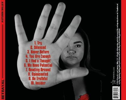
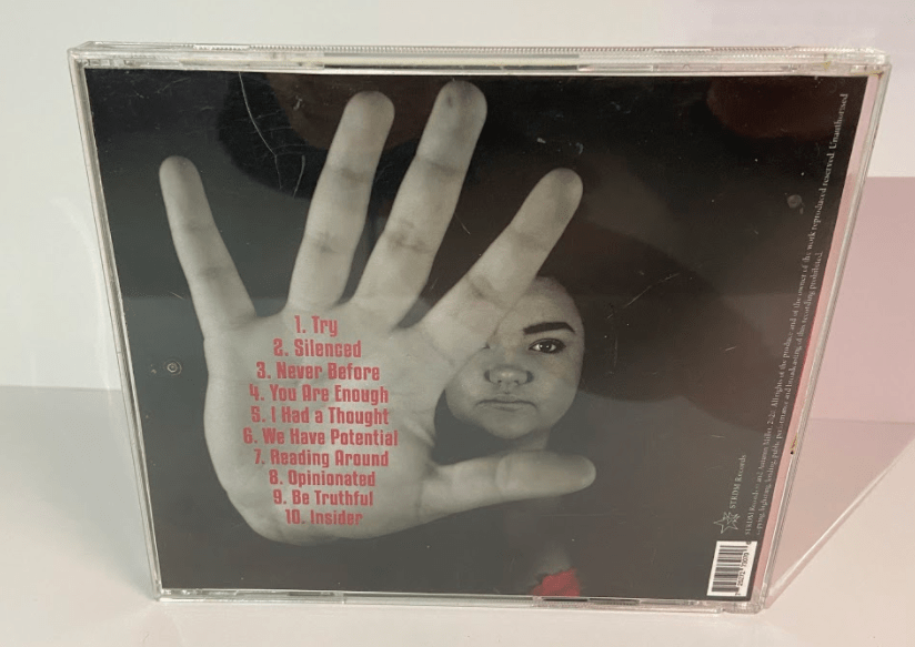
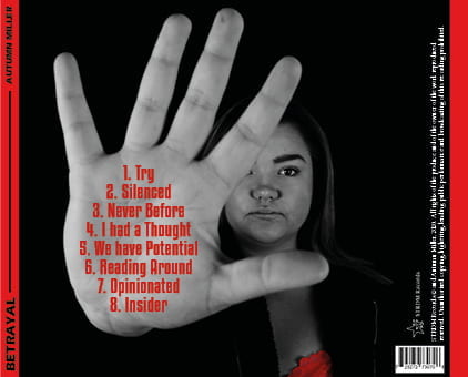
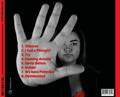
The back of our digipak.

A social media post of a tweet.

We used the colour palette of red, black and white throughout. This continuity emphasises the lack of happiness created for individuals from the media, persisting to the audience that you must be yourself to be truly happy. This message being created breaks the blueprint of artists in the music industry as they are quite often forced to make the media and music industry seem golden, especially in the genre pop where everything is bright and upbeat, and so this confidence shown by our star to express her feelings creates her branding of inspiration and fortitude.

Hiding action from our music video.

We also used bold statements such as the power stop pose she uses, the movement of her hiding herself in the music video and the passionate words (E.g. “the natural you is the best you!”) used in her social media posts. These bold actions present her extraordinary image as strong and helps inspire her audience to do the same; put up a defence and stick up for themselves. That they must put a stop to not being themselves and letting others knock them down.

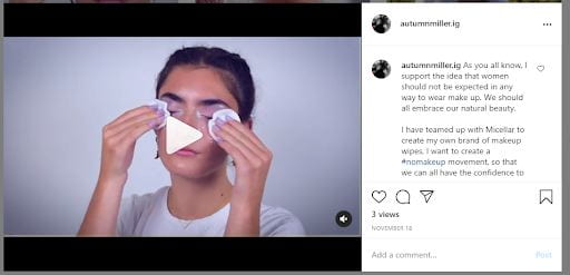
Micellar product endorsement Instagram post.

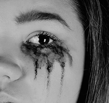
The repetition of the makeup in all three media products also emphasises and underlines to the audience the destruction which it causes and reinforces the metanarrative of being yourself. 

The genre Indie/Pop has conventions of a narrative holding a message which is presented through a powerful star image and performance. The repertoire of elements according to Nick Lacey, which defines the genre, enabled us to define a blueprint for our music video; conventional features to fulfil our audience’s predictable pleasure, which they decode and can then accept the media. Examples of these conventions, which we identified from researching exemplar videos such as Sia’s “Elastic Heart” and Colbie Caillat’s “Fallin’ For You”, include an outdoor setting and more relaxed and neutral coloured clothes. This built a relationship between the artist and the audience as this contract which holds predictable pleasure also holds differences to allow the music video to stand out and allow the message to cause impact for them. For example, we used the settings of the outdoors and lots of makeup and hair to follow the typical generic conventions however when we inserted the idea of taking away the fake you (of being made up), this challenged the conventions and added dissimilarity as it broke the ideology of feminism and perfectionism. This ideology is also evolving with the change of modern media. Social media is becoming more intertwined in our daily lives which makes the critique we are presenting even more impacting.

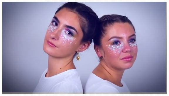
Girls in our music video with full makeup and hair.

We included our performers being made up with makeup and their hair being neatly plaited. This iconography follows the conventions of the pop genre in that the “perfect, glamourised and extraordinary” star image is being composed. This is expected from our audience however we used the actions; the facial expressions and body language of our star, which challenged the expectations of our genre. As Lacey stated; genre is an “act of similarity and difference” and so this difference allowed our music video to stand out thematically and reject the conventional star image, creating impact on our audience. This depressive mood we created through lack of smiling helped to express that perfectionism and
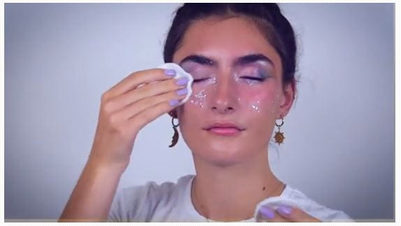
Taking makeup off.

idealised life doesn’t bring happiness. We also used cuts of our models taking off their makeup to create a level of surprise and excitement for our audience as it was not the “predictable pleasure” expected. This unconventional act is presenting our star as an influential individual who shows her audience that being natural and yourself can bring the most happiness. This follows the Indie part of the genre more, challenging the pop dominant ideology, evervently presenting a message of “true self beauty” for the audience.

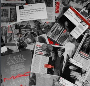
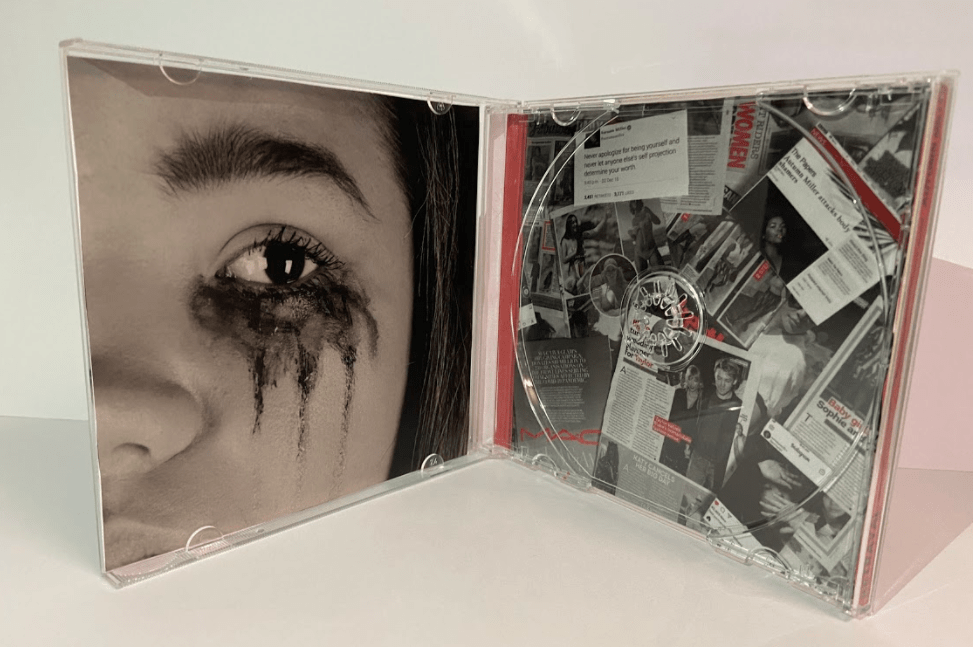
Media collage on the inside of our digipak.

We wanted to emphasise the issue and negative impact which the media, especially mainstream media, have on all of us; especially stars. This is strongly aimed at a young audience, especially women, digital natives and those who are passionate about the media representations and mental health issues: this being currently extremely prominent as the stigma surrounding mental health is being eroded. We accomplished this by encoding specific micro features to represent ideologies; something which Barthes theory covers. We also considered Dyer’s theory of the Paradox of the star, stating that through the metanarrative (E.g our digipak) the star is presented as both ‘ordinary and extraordinary’. We did this to represent her star image as being an influential individual who people inspire to be like but yet ordinary through her suffering and misrepresentations in the media so she still gains respect and has her own separate life.

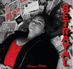
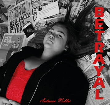
Front cover of our digipak.

When editing our digipak on photoshop, we followed a colour palette of black and white with accents of red. This was not only a cultural code to represent the newspaper tabloids (E.g Sun) but also was a symbolic code to connote the idea of hatred and threat which the whole of media (i.e newspapers, social media, movies, etc)  opposes . The jumbled, confused collage is also a symbolic code and denotes the relentless attention and scrutiny of the media. We used a high angle of our star, lying prone; a semic code signifying the intimidation stars feel from the media and the lack of control which they personally have over their own representations.. This shows her star image as an ordinary individual who is being victimised. The sans serif, bold typeface, with the strong dropshadow we chose culturally relates to a newspaper headline but also connotes a bold statement along with the word itself; making our audience feel the impact of the message being exhibited.

Our star was presented through our meta narrative as being both extraordinary and ordinary. For example we made her up with makeup to show a “perfect” star image yet we also wanted to present her as an ordinary person; shown in our music video with no makeup and being in the outdoors. Her pose was languourous and yet simulataneously adversarial which added to the representation of opposition against the media world and that she is human with a defiant voice which deserves to be heard from the mainstream media.

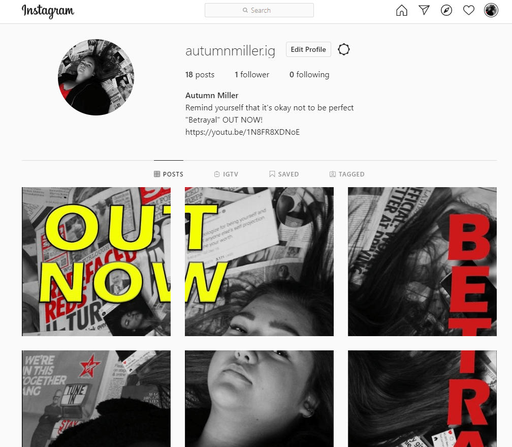
We created a social media page for our artist which has allowed her to build a relationship with her audience. The accessibility of being able to comment, like and share the posts enables social interaction, the portrayal of her life and likes and dislikes forms her metanarrative, impacting on her audiences own personal identity and the teasers and links to charities and news articles add excitement and gives them actionable information on how they can consume their star’s media output. This all covers Blumler and Katz’s “Uses and Gratification” theory. 

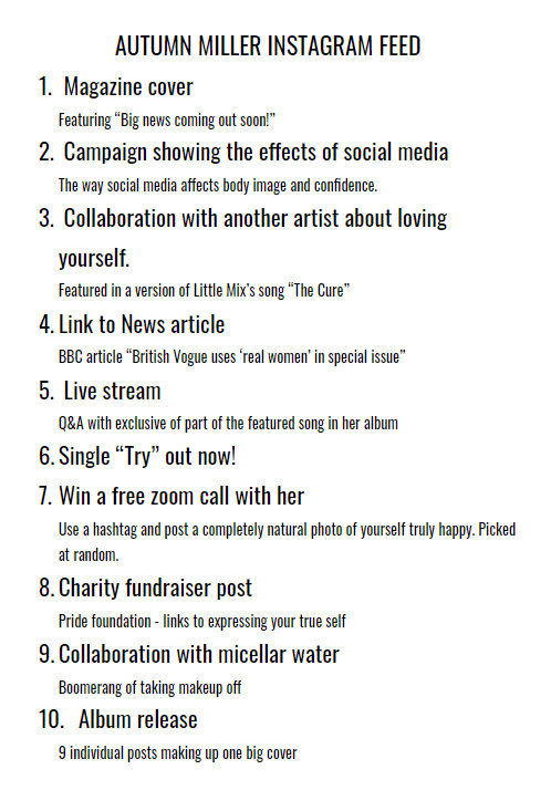
Teaser from our music video.

Throughout our social media page, we posted teasers and snippets leading up to the release of the album. This enables the excitement to build and draws desire and interest from the audience. For example we added imperative phrases such as “big news” and “don’t miss out” to keep our audience engaged and feed their fear of missing out. We encoded certain shots and colour palettes (design coherences), such as the black, white and red, to link and hint to the release of the album. 

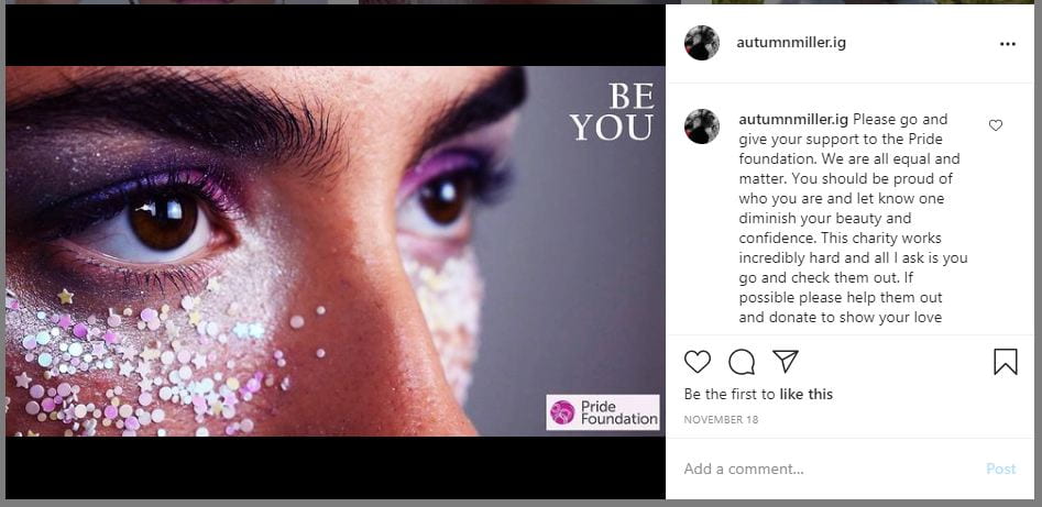
Charity awareness post.

Other posts we included were those on modern day issues. For example we emphasised the importance of true representation of yourself through linking to the ‘Hacked off’ group as well as the Pride Foundation charity and using synergy of product endorsement for Micellar Water; a makeup remover. These posts help to inform the audience about body positivity and it also helps to connote her star image as one that is confident and influential. These posts relate to the likes of her audience; young women and those passionate about modern issues such as mental health and body confidence. 

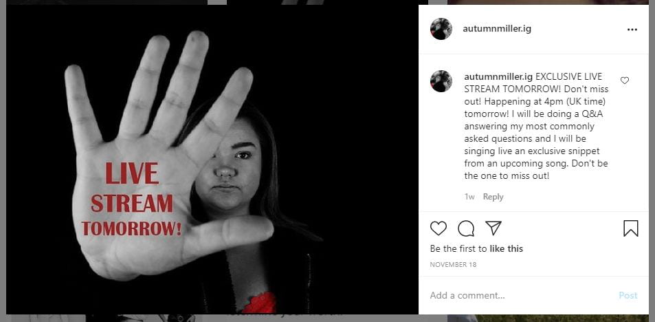
Live stream promotion post.

As well as being socially interacted with her audience through commenting and engaging with the posts, we also used a live stream to add another aspect of engagement. This enables a real time involvement, one where the audience can 100% interact with the star. The build up to the album release is then backed up with links to youtube and other places where the audience can actively go and buy or download the album and songs.

All of these posts have the aim of spreading awareness of the star and her music not only from going viral online through the hashtags, sharing, liking, etc but also through physical word of mouth as well; the most positive part of earned media you can have.


Social Media Page Final draft

We used the comments we received to improve our social media page to all it to engage with our audience to the best ability. Overall we are really pleased with how it has turned out. It is exciting and builds desire throughout the feed leading up to our album release. If you click on the photo below, it will take you to the Instagram page however we have also created a slide show showing you what it looks like on a phone (as the layout is slightly different) and showing you all of the posts individually.


We didn’t change any of the posts themselves however we did edit the comments. Below is a slide show showing the comments which we changed.

Social Media page Draft 1

We have created a Social Media page for our artist on Instagram. This piece of media has been used to communicate with her audience and allow updates to be made on her music releases and work. We have included lots of different marketing tools such as product endorsement, cross media convergence and live features to build her star image and engage with her audience. The posts have been carefully organised so that suspense and excitement is built up to the release of her album. This helps to build desire and we have added links to places where the music can be brought and downloaded so that a call to action is there and the audience knows what they can do next.

Below is the Instagram feed and one of the posts to show an example of one of the comments we have created.

Click on the image to take you to the social media page.

We are really happy with the Social Media page so far. It is very engaging and expresses her star image exactly the way we want; inspirational, resilient and caring.

Self assessment:

  • We need to link our music video (YouTube video) “Try” to the post to add even more call to action for our audience.
  • We are still unsure on the 3 by 3 post of the album
  • We have added lots of different marketing techniques to keep our fans engaged and excited of whats coming next.

We then got our teacher to give us some feedback. It is always really useful to have another set of ideas and eyes. Below is the screen castify of his feedback and a summary of the key points.

  • Likes the 3×3 photo of our album cover
  • Great posts with lots of marketing tools such as synergy
  • The star image is well presented and it follows a theme and style.
  • Could add the word “exclusive” to the first comment to emphasize that the audience doesn’t want to miss out
  • Add more links to the places where the music can be found
  • The same comment is on all 9 posts of the album cover so keep it on the final one but maybe put quotes or something intriguing on the other 8.

We are going to use our self assessment and the other feedback to make improvements to our social media page.

Timeline and Marketing ideas

Below is a plan of the different posts which we will feature in the social media stream. We have planned lots of different types of posts that will attract, interest, desire and make our fans want to take action and buy the album. We have started by adding teasers to build up their attention and then the final post will be the full album released.


Audience interaction with a social media page – an analysis

Before making our own social media page, it is really important to analyse and look into what other similar artist do. We have analysed Lizzo’s facebook feed using AIDA (how she attracts, interests, desires and gets her fans to take action). The overall of a social media page for an artist is to market and promote their music and image and get their fans to take action and buy their music. As we have stated, this is clearly presented in her posts and feed.

Social Media Page Terminology

Before creating our own social media page, it was important that we looked into examples to see what the common conventions are and how stars attract, interest, desire and make their fans take action.

We looked at Lizzo’s facebook page as she is a similar kind of artist to ours. We have taken screenshots from her social media and annotated the different conventions and how and why she has used them.

From looking into an example of a successful social media site, it is important that we use the common conventions and techniques that she has used. For example, using links and images to market our star and their music.

Digipak Draft 3 and final draft

Here is the third and final draft of our digipak.

Overall I am really pleased with the way in which it has come out. It is very powerful and expresses her star image as very influential and resilliant. The message that media is dangerous and destroying us is presented very strong and the images really connect and impact the audience.

What have we changed from draft 2:

  • We pulled out the reds from the collage on the front cover to enable the colour scheme to be presented even more. This enables her star image of power and the idea that media is a very negative thing to be portrayed even more.
  • We have added a drop shaddow to the title on the front. This enables it to seem like its reaching out and impacting the audience even more. It creates lots of interest and enforces the name of the album.
  • We have also pulled out more reds in the third page (the collage) to reinforce the hatred towards the media.
  • We have added two extra songs so that the album follows the typical conventions.
  • We have altered the colour of the font of the song titles slightly to follow the colour scheme even more. This shows continuity.
  • We have rotated the bar code to follow the same orientation as the other components. This makes it seem less awkward.

This is our final draft and so we printed it out using CAM and placed the printed pages into a CD case to present a prototype of our digipak. Overall we are really pleased with how it looks.

We showed our prototype to people to get their feedback on it. It was all very positive. We also asked them which genre they thought the artist was. The genre is Indie Pop which is what people thought. This shows that we have been successful in using the right conventions to convey and represent the genre.


Digipack Draft 2

Below is the second draft of our digipak. If you click on it, you will be able to open it as a pdf.

Overall we are very pleased with this draft.

What we have improved:

  • We have made the title of our album slightly larger to make it more visually impacting.
  • We have changed the font of our artists name. We have changed it from the sans serif font to a script. We decided to do this to add some difference to the fonts used and it also connoted a handwritten and personal touch. This shows how much of an impact she as an artist wants to make as it is coming from her.
  • On the media page (inside right), we have altered the reds that have been pulled out. We have colour corrected them so they are all the same. This enables the continuity to be more present, making it not only more visually pleasing but it also shows a sense of flow and unity within the digipak.
  • On the back cover we have altered the song titles. We have changed the font slightly which creates the look of a magazine font a bit more and we have positioned it so the alignment is centered. We have also arranged the song lyrics so they are presenting an oval effect. This enables the songs to fit the hand much better enabling it to look more connected and part of the image behind. It now emphasizes her pushing the song lyrics towards the audience, building a connection.
  • We have added a copy right and positioned it to the right hand side. We have used a clear white serif font which stands out against the black background. We chose white as it is still clear but shows that it is not as important as other pieces of information as it is not in red.
  • We re positioned the record label logo to next to the copyright.

We then got some feedback on our draft 2. This enabled us to get a second opinion to see what someone else thought of the design. Below is a screen castify of their thoughts and I have done a summary of his likes and possible improvements to be made.

Teacher feedback:

  • The images used are very crisp, clear and engaging. The artists makes a good connection to the audience through her positioning and eye contact.
  • The colour scheme of the red, black and white is very powerful.
  • Likes the Autumn Miller font as it suggests her signature.
  • Possibly add more red to the front cover.
  • Change or play with the title font as it seems a bit flat.
  • The media collage is very powerful.
  • Possibly add more songs as conventionally there is usually at least 9 or 10.
  • Adjust the colour of the song titles to make it even more red. It matches however doesn’t look perfectly right.
  • Alter the capital letters used in the song titles.
  • Rotate the bar code so it is the same orientation as the copyright and record label.

Using the feedback, I have constructed a list of the things we now need to do. Making these corrections will enable the star image and narrative to be represented even more and also enable the digipak to show more continuity and fit the typical conventions even more. We need to:

  • Pull out the reds in the collaged background on the front cover to add even more reds. This will enable the colour scheme to show even more and represent even more power.
  • Play with the font of the title on the front to make it even more impacting and strong.
  • Add a couple more songs to enable the digipak to follow the typical conventions.
  • Make the h’s of “have” and “had” capitalized to show continuity and follow the typical literacy rules on an album.
  • Slightly adjust the colour of the font on the back to make it match slightly better. This will enable the continuity to be even more successful.
  • Rotate the bar code to make it follow the flow of the copy right and logo of the record label,

Digipack Draft 1

Below is the first draft of our digipak. If you click on the digipak, you can open it as a pdf.

Overall we are really happy with the way in which this draft has turned out.

CAMERA AND PHOTOSHOP

I think we have been very successful in the use of camera and photoshop. The photos which we have used works extremely well. The images are very powerful and help to connote the importance of strength and power, helping to express our message of self identity and the negative impact the media has on us. We have used angles such as an aerial shot of our model to help portray the idea that our star is being over powered by the media, an extreme close up of the eye with ruined make up to emphasis the sadness and hatred that is being created and a close up of the hand in the foreground to show the strength we can have in stopping the actions being taken by the media.

We used photoshop to benefit our images and help them present our message further. We adjusted them by altering the contrast and saturation to sharpen the images and make the difference between the lights and dark even more significant. We also colour corrected our images by turning them black and white and pulling out the reds. We did all this to enforce the idea of power and create a stronger impact. We decided to use the theme of the black and white with the pop of red as it enables the red to stand out and suggest the idea of strength and resilliance. The colour red also suggests the idea of hatred against the media.

MISE EN SCENE

We have thought very carefully about the mise en scene which we used. We used the costumes of a red top and an oversized jacket. The red top follows the theme of red which we are using and connotes the idea of strength and dislike towards the media. The oversized jacket was chosen to suggest that she is trying to hide away and get some privacy. The colour of the jacket (black) could also suggest that she is being engulfed by sadness which the media is creating.

The use of the make up, especially in the second page, was chosen to show the impact which being in the spotlight creates. Along with the extreme close up, it really reinforces the depression which can be created from this lifestyle.

The positioning of our model is also important. We decided to get her to lay down on the front cover. This enabled us to use an aerial shot of her showing her as being intimidated. This reflects the emotion which the modern world is creating. The use of her putting her hand up on the back side is also powerful as it is a significant position which shows the courage and fortitude our artist is trying to show. This shows her as being very influential which builds on her star image.

The use of the media pages as a background works really well. We even created our own media posts with our artist featured to relate it to her even more. The idea of using lots of different types of media (newspaper articles, adverts, magazine pages, news post and social media posts) enables the message to be about media as a whole; not just one type. This enables the message to be able to relate to everyone, creating even more of an impact.

DTP

The use of desktop publishing was really useful in helping build our digipak. It enabled us to be able to select the colour red and be able to make it stand out. We were then able to add other features of red (such as the font colour) to be able to show continuity and emphasize the importance the red creates; showing resilience and passion. To improve our digipak further, we are going to take the reds and alter them so that they are all exactly the same. This will enable an even better continuity, enabling a better flow throughout.

We used the same sans serif font throughout the digipak. It is bold and helps to create impact. On the front, we positioned it to the right which follows the eyeline of the star. This then helps the audience to be drawn to the title. On the back, we placed the song titles on the hand as that is the point of focus. All of the font is red to enable it to follow the theme and stand out against the black and white. On the margins, we made them red with a black font to create power and impact. To improve our digipak, we are going to explore different fonts and possibly have more than one. For example, possibly having the album title and the artist name different.