Digipak Draft 3 and final draft

Here is the third and final draft of our digipak.

Overall I am really pleased with the way in which it has come out. It is very powerful and expresses her star image as very influential and resilliant. The message that media is dangerous and destroying us is presented very strong and the images really connect and impact the audience.

What have we changed from draft 2:

  • We pulled out the reds from the collage on the front cover to enable the colour scheme to be presented even more. This enables her star image of power and the idea that media is a very negative thing to be portrayed even more.
  • We have added a drop shaddow to the title on the front. This enables it to seem like its reaching out and impacting the audience even more. It creates lots of interest and enforces the name of the album.
  • We have also pulled out more reds in the third page (the collage) to reinforce the hatred towards the media.
  • We have added two extra songs so that the album follows the typical conventions.
  • We have altered the colour of the font of the song titles slightly to follow the colour scheme even more. This shows continuity.
  • We have rotated the bar code to follow the same orientation as the other components. This makes it seem less awkward.

This is our final draft and so we printed it out using CAM and placed the printed pages into a CD case to present a prototype of our digipak. Overall we are really pleased with how it looks.

We showed our prototype to people to get their feedback on it. It was all very positive. We also asked them which genre they thought the artist was. The genre is Indie Pop which is what people thought. This shows that we have been successful in using the right conventions to convey and represent the genre.


Digipack Draft 2

Below is the second draft of our digipak. If you click on it, you will be able to open it as a pdf.

Overall we are very pleased with this draft.

What we have improved:

  • We have made the title of our album slightly larger to make it more visually impacting.
  • We have changed the font of our artists name. We have changed it from the sans serif font to a script. We decided to do this to add some difference to the fonts used and it also connoted a handwritten and personal touch. This shows how much of an impact she as an artist wants to make as it is coming from her.
  • On the media page (inside right), we have altered the reds that have been pulled out. We have colour corrected them so they are all the same. This enables the continuity to be more present, making it not only more visually pleasing but it also shows a sense of flow and unity within the digipak.
  • On the back cover we have altered the song titles. We have changed the font slightly which creates the look of a magazine font a bit more and we have positioned it so the alignment is centered. We have also arranged the song lyrics so they are presenting an oval effect. This enables the songs to fit the hand much better enabling it to look more connected and part of the image behind. It now emphasizes her pushing the song lyrics towards the audience, building a connection.
  • We have added a copy right and positioned it to the right hand side. We have used a clear white serif font which stands out against the black background. We chose white as it is still clear but shows that it is not as important as other pieces of information as it is not in red.
  • We re positioned the record label logo to next to the copyright.

We then got some feedback on our draft 2. This enabled us to get a second opinion to see what someone else thought of the design. Below is a screen castify of their thoughts and I have done a summary of his likes and possible improvements to be made.

Teacher feedback:

  • The images used are very crisp, clear and engaging. The artists makes a good connection to the audience through her positioning and eye contact.
  • The colour scheme of the red, black and white is very powerful.
  • Likes the Autumn Miller font as it suggests her signature.
  • Possibly add more red to the front cover.
  • Change or play with the title font as it seems a bit flat.
  • The media collage is very powerful.
  • Possibly add more songs as conventionally there is usually at least 9 or 10.
  • Adjust the colour of the song titles to make it even more red. It matches however doesn’t look perfectly right.
  • Alter the capital letters used in the song titles.
  • Rotate the bar code so it is the same orientation as the copyright and record label.

Using the feedback, I have constructed a list of the things we now need to do. Making these corrections will enable the star image and narrative to be represented even more and also enable the digipak to show more continuity and fit the typical conventions even more. We need to:

  • Pull out the reds in the collaged background on the front cover to add even more reds. This will enable the colour scheme to show even more and represent even more power.
  • Play with the font of the title on the front to make it even more impacting and strong.
  • Add a couple more songs to enable the digipak to follow the typical conventions.
  • Make the h’s of “have” and “had” capitalized to show continuity and follow the typical literacy rules on an album.
  • Slightly adjust the colour of the font on the back to make it match slightly better. This will enable the continuity to be even more successful.
  • Rotate the bar code to make it follow the flow of the copy right and logo of the record label,

Digipack Draft 1

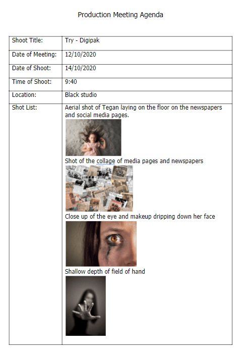
Below is the first draft of our digipak. If you click on the digipak, you can open it as a pdf.

Overall we are really happy with the way in which this draft has turned out.

CAMERA AND PHOTOSHOP

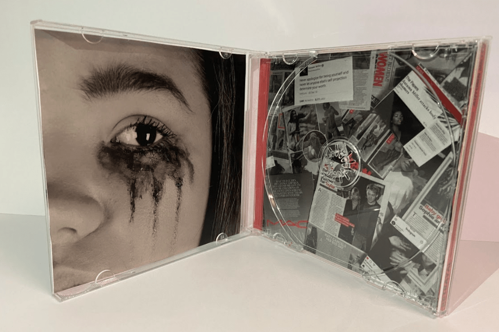
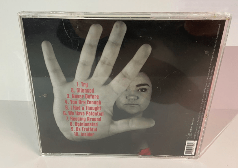
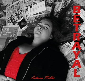
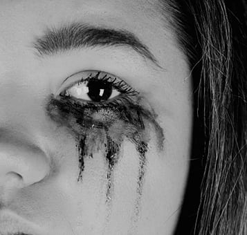
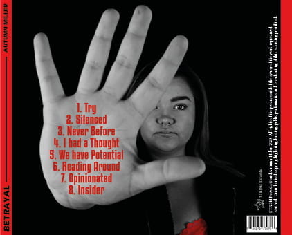
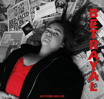
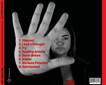
I think we have been very successful in the use of camera and photoshop. The photos which we have used works extremely well. The images are very powerful and help to connote the importance of strength and power, helping to express our message of self identity and the negative impact the media has on us. We have used angles such as an aerial shot of our model to help portray the idea that our star is being over powered by the media, an extreme close up of the eye with ruined make up to emphasis the sadness and hatred that is being created and a close up of the hand in the foreground to show the strength we can have in stopping the actions being taken by the media.

We used photoshop to benefit our images and help them present our message further. We adjusted them by altering the contrast and saturation to sharpen the images and make the difference between the lights and dark even more significant. We also colour corrected our images by turning them black and white and pulling out the reds. We did all this to enforce the idea of power and create a stronger impact. We decided to use the theme of the black and white with the pop of red as it enables the red to stand out and suggest the idea of strength and resilliance. The colour red also suggests the idea of hatred against the media.

MISE EN SCENE

We have thought very carefully about the mise en scene which we used. We used the costumes of a red top and an oversized jacket. The red top follows the theme of red which we are using and connotes the idea of strength and dislike towards the media. The oversized jacket was chosen to suggest that she is trying to hide away and get some privacy. The colour of the jacket (black) could also suggest that she is being engulfed by sadness which the media is creating.

The use of the make up, especially in the second page, was chosen to show the impact which being in the spotlight creates. Along with the extreme close up, it really reinforces the depression which can be created from this lifestyle.

The positioning of our model is also important. We decided to get her to lay down on the front cover. This enabled us to use an aerial shot of her showing her as being intimidated. This reflects the emotion which the modern world is creating. The use of her putting her hand up on the back side is also powerful as it is a significant position which shows the courage and fortitude our artist is trying to show. This shows her as being very influential which builds on her star image.

The use of the media pages as a background works really well. We even created our own media posts with our artist featured to relate it to her even more. The idea of using lots of different types of media (newspaper articles, adverts, magazine pages, news post and social media posts) enables the message to be about media as a whole; not just one type. This enables the message to be able to relate to everyone, creating even more of an impact.

DTP

The use of desktop publishing was really useful in helping build our digipak. It enabled us to be able to select the colour red and be able to make it stand out. We were then able to add other features of red (such as the font colour) to be able to show continuity and emphasize the importance the red creates; showing resilience and passion. To improve our digipak further, we are going to take the reds and alter them so that they are all exactly the same. This will enable an even better continuity, enabling a better flow throughout.

We used the same sans serif font throughout the digipak. It is bold and helps to create impact. On the front, we positioned it to the right which follows the eyeline of the star. This then helps the audience to be drawn to the title. On the back, we placed the song titles on the hand as that is the point of focus. All of the font is red to enable it to follow the theme and stand out against the black and white. On the margins, we made them red with a black font to create power and impact. To improve our digipak, we are going to explore different fonts and possibly have more than one. For example, possibly having the album title and the artist name different.


Digipak photoshoot

We did a photo shoot to take the photos for our digipak. We used the help of our mock draw up and our production meeting agenda to guide us.

Overall we are really happy with our shoot. We were able to get all of the shots we planned and aimed to get. Our photos are clear and in focus and we were able to get lots of good angles. The lighting worked well; in some of the photos we could have lit them more however we will be able to add more light when photo shopping them after. We were extremely happy with the collage of media. It worked really well and presents the message of how media impacts people. The red top worked really well too and will also help to add meaning.

Photoshoot / Design Production Meeting and Risk Assessment

In preparation for our photo shoot for our digipak, it is important to have made a plan of what we want to happen and the aims for the shoot. Below we have created a Production meeting agenda and have also done a risk assessment for the shoot.

We hope that from our shoot we gain clear shots that present the message of power media has on our society and the overarching theme of self image. We need to make sure that our photos are well lit and in focus. We will use a tripod to help with this to avoid any movement when taking the photos. We will take a variety of shots including aerial, mid shots and close ups. We need to remember to think about the mise en scene and all of the small details to make sure that the message and star image is being presented correctly and how we want it to be decoded by our audience.

Hand drawn mockup

Before creating our digipak, it is important that we make a plan of what we want it to look like. Using our ideas and those from the mood board, we have constructed a sketch of the four sides plus the spine.

We have decided to run with the theme of true identity and the impact which the media has on everyone, especially celebrities.

On the front, we will have our star with a background of media (newspaper articles and social media logos) to show the impact that media has on an individual. Our star will be unhappy and in full make up and hair showing the distress and lack of happiness from having to portray yourself in a certain way.

On the back, we will have our star holding her hand up to the camera, showing her dislike of being in constant paparazzi spotlight. The song titles will then be on her hand which will all be titles of power words, showing the strength which she has,

The inside left will be a close up of a runned make up eye. The make up which will have been run will also contain words, presenting the message being shown.

The inside right will be where the magazine will be. We have decided to use a photo from the back ground of the front; all of the media. This will contain our artists name and pictures to show how the media suffocates celebrities lives.

Branding Moodboard

We created a padlet moodboard which collates lots of ideas for our digipak. We have looked at other digipak examples to see the conventions used and ideas that we like. Because we want to express the powerful message of self identity, we looked at a lot of ideas of messages on the body to help inspire us. We really like the idea of having powerful words on the face to present the important meaning. As well as looking at the type of images we will use, it was also important to look at other aspects such as type faces and colour palettes. We have decided to use a black and white theme to present the emotion of sadness, showing the effect that the media has on us and especially celebrities.

Overall this was really useful in getting inspiration and ideas about how we want our digipak to use. It will be important to keep looking back at this moodboard.

Made with Padlet

Digipak Conventions Analysis

Before making our own digipak, it is important that we evaluate examples to gain an understanding of the conventions used not only in a generic digipak but one with a similar genre to ours. I chose Lizzo as she is also an indie pop artist who portrays powerful messages. I thought that this album of hers really emphasizes the message of body confidence which is similar to what we are trying to portray. I have looked at all of the different features used on her album cover (even though the front is not the most conventional).

Overall I think that this was really useful in gaining an understanding of what is typically included in a digipak and it has helped show that everything is chosen for a reason; to help reinforce the star image and present the specific genre and message being shown. This will be important to remember when making our digipak as everything will need to be chosen for a reason to make sure that our star is being presented in the correct way to our audience.