Adverts

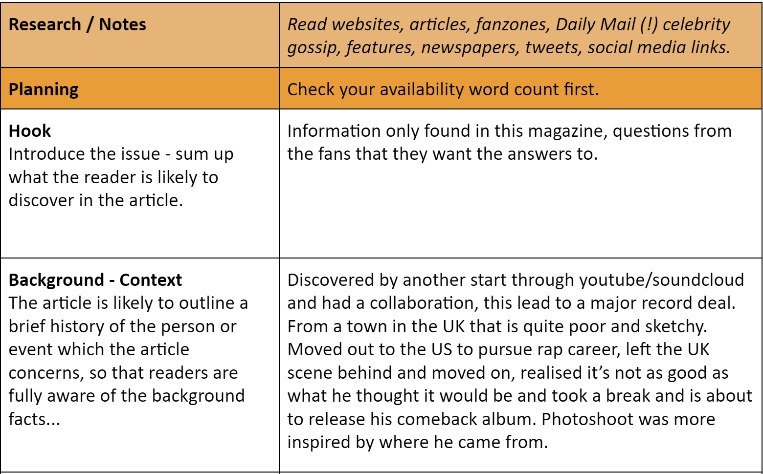
I selected these two ads for my genre, using previous research and our dating profiles we made. Fashion and jewellery is a big part of the rap genre, more specifically showing off expensive clothes and jewellery.

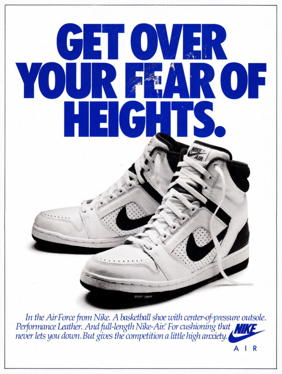
I chose the ‘Nike Air’ design because these shoes are generally seen as fashionable to many people in the genre. Fashion and shoes in particular are a very popular in the rap scene, basketball shoes are seen as fashionable with the leading companies being Nike and Jordan.

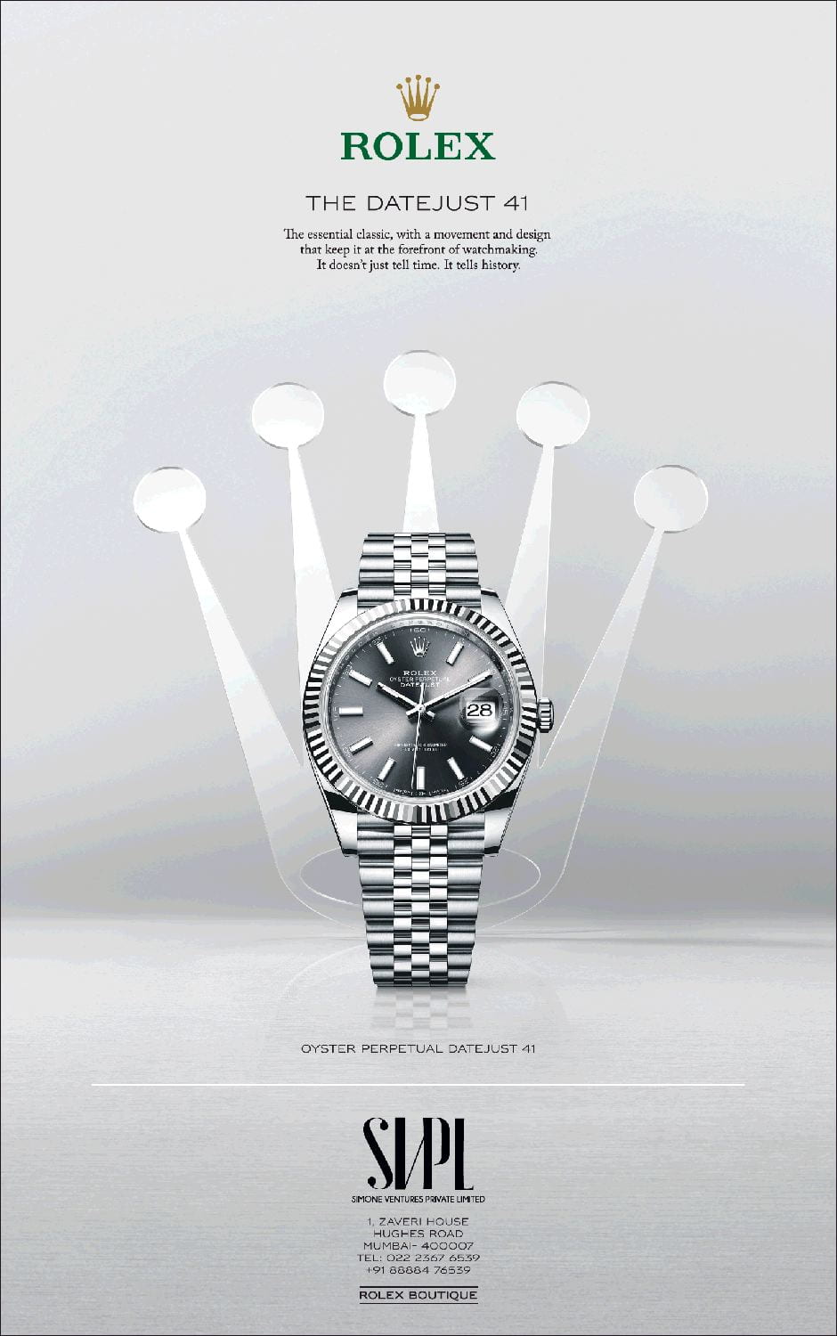
I chose this Rolex advertisement because jewellery, more specifically watches,chains and rings, are very popular in the rap genre. People like to show off their wealth through their jewellery so I though an ad for a prestigious and well-known watch brand was fitting for my magazine.

Complete Magazine Draft

My Complete Music Magazine Draft:

My Teachers Feedback:

Improvements I need to make:

Front Page:

  • Fix Masthead from changing when exported into Google Drive.
  • Some empty space above and below the ‘Exclusive Tyler Q’ part.
  • ‘Tyler Q’ could stand out more from the rest of the text (could be achieved with the use of effects and colours.)

Contents Page:

  • Could possibly add some white to the page.
  • Need more than 6 articles on there.
  • Black clothes from Jacob and Tyler on the black background needs to change, (could be achieved by using glow effects or strokes).

Double Page Spread (DPS):

  • Must write my article urgently. (No.1 Priority).
  • Could widen my columns.
  • Page Numbers.
  • Must make my pull quote smaller than my headline.

A New and Improved Contents Page.

My Contents Page Before:


My Improved Contents Page:

Improvements I made:

  • I had to add white around my images to make them more visible.
  • I added the issue number, page number and date.
  • I changed the scale of the page number to make it more realistic.
  • I added in the article names.
  • I added a stroke to the text to make it easier to read.
  • I re-cut out my bottom image in photoshop because part of the shoe was missing before.

Draft of Contents Page

My first Draft of a Contents Page:

There are a few changes that I plan on making to this contents page:

  • I want to add more articles to the actual content part because six articles isn’t enough to persuade someone to buy your magazine.
  • I want to use some sort of brighten or glow effect around my images because with the black background you can’t see them very well.
  • I want to play around with the positioning of my images a bit more, it might not be permanent but I still want to try and see how I can change it.
  • I would also like to change the size of the text and page numbers.

What is a Contents Page?

We learnt all about the conventional features of a contents page, knowing these features will be extremely useful when I make my own contents page for my music magazines. We put our knowledge of the conventional features by sketching our own design of a contents page and came up with our own headlines. The reason for having headlines that use specific words such as ‘secret’ and ‘exclusive’ is to draw the consumers attention and hook them into the article, once the reader is hooked it is easy to keep them attracted to the magazine with a good article. People use clickbait titles to draw in the consumers which is when your title uses words and sentencing that isn’t all true to the content in the article or it can be very exaggerated. Creators have to be careful with how bad the clickbait in their media is, if it is completely unrelated to their actual media people will make it a concerned and will be negative toward the creator.


A New and Improved DPS

My Double Page Spread Before:

My Improved Double Page Spread:

Improvements I made:

  • Added in my Pull Quote in.
  • Added a red boarder around my text in the top right.
  • Made the numbers for each tip stand out much more with drop capitals and strokes.
  • Added my article.
  • Added my page numbers and plug at the top.
  • Added my photo and article crediting.
  • Added in my Stand first.

Draft of the Double Page Spread

My Double Page Spread first draft:

Improvements to make:

  • Move pull quote.
  • Can’t have black text on the railing.
  • Center text.
  • Space out the colour, so I have bits of red all over the DPS.

My Double Page Spread after making some changes:

  • I’ve added the red bar at the bottom to spread out the colour a little bit more because it was all clumped into one area.
  • I’ve moved my black text away from the railing that it was on before, when the text was on the railing it was barely readable.
  • I’ve moved my pull quote down to beneath the first columns, I have done this because where the pull quote was before it made the quote look like a title instead.


Second Shoot Contact Sheet

These 5 photos are what I believe to be my 5 strongest photos from our photo shoot. One of these photos will be chosen to be the photo in my double page spread.


All of these photos taken are from my location shoot, these contact sheets are only the photos from the shoot that are usable. All of the photos that were unusable (e.g. too dark to use) have been taken out of the contact sheet. I met the criteria from my production meeting agenda (PMA) by using the same equipment, costumes, locations etc that I said we would be using in my PMA, a part of the shoot that wasn’t in my PMA was the cigar as the prop but someone else on the shoot had the cigar and allowed us to use it.