Adverts

Here are two adverts that I think would work really well in my magazine. They are both in high resolution, simplistic and I think they would suit my target audience perfectly.

The perfume advert: I think this is perfect for my target audience as they are young, middle class women who could afford to spend a little extra on beauty products. My demographic are into taking care of themselves, especially their appearance, fashion and shopping. So having a luxury perfume advert is perfect. Jennifer Lawrence is also a very recognisable actor in the age bracket of my demographic so she will draw the attention of my readers.

The awards advert: This is well suited to my target audience as these awards are given to the fresh faces of country. These awards are the BRITS of country music so this is a big event in the calendar of my target audience of young, female country fans. My demographic are also homebodies, so having an advert for the awards on TV is perfect for them. The main artists on the ad are very well known and particularly Carrie Underwood is the perfect representation of young, fresh country music, which is the focus for my magazine.
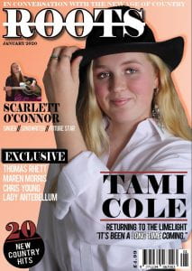
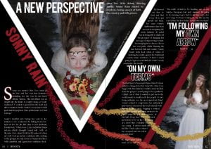
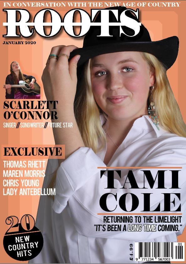
A New Improved Complete Magazine Draft

What have I changed?

  • I have added another colour throughout my magazine, adding the red to all pages.
  • I also changed the background on my front cover so it is a gradient and not boxes. As well as this I added a drop shadow on my main cover model.
  • I have moved the headline and standfirst on my DPS so it doesn’t get lost in the fold of the spread.
  • I also added some small details eg. making the exclusive box on the front cover black, adding an arrow to the end of my DPS to instruct readers to read on and moving Sonny Rain’s name into the blank space to fill it on the contents page.

My teacher gave me some feedback:

  • On the contents page, add cover lines under the two headlines without and get rid of the with under most headlines as it’s repetitive.
  • Increase the line space on the quotes on the DPS.
  • Add text under the last quote on the DPS.
  • The standfirst could be bolder.

Complete Magazine Draft

Here is my first complete magazine draft:

                                                                 Please click to view PDF.

My teacher has provided me with some very helpful feedback. Here are her comments:

A summary of my teachers’ comments:

  • Good coherency throughout.
  • Like the fonts on the front cover.
  • Introduce another colour to the front page eg. on the pug.
  • Add this extra colour to the contents page – alternate colour boxes for the page numbers.
  • Add the artists names to their images on the contents page.
  • Headlines on the contents page to be bigger and bolder.
  • Like the social media icons.
  • Move the headline on the DPS over to the left and move the byline to the other side of the triangle.
  • Check the line spacing.
  • The line for the second image could be in one of the colours from the flowers.
  • Add an arrow to the read on at the end of the article.

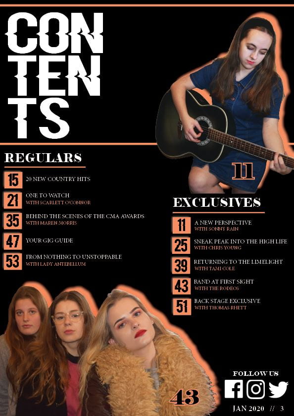
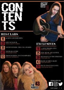
A New Improved Contents Page

Please click to view PDF.

I had a conversation with one of my peers. Here is the recording of her feedback on my second draft of the contents page.

Some of her feedback included:

  • It is coherent with your front cover and the rest of the magazine.
  • It could use another colour being added to add a bit of excitement.
  • You can clearly tell it’s from the country genre.

Draft of Content Page

Here is the first draft of my contents page.

Please click to view a PDF.

Overall, I need to improve this contents page a huge amount. Here are a few suggestions and ideas to experiment with in order to improve it:

  • Make the group photo larger and perhaps consider using another photo for the single shot above.
  • Experiment with the shapes containing the page numbers in; perhaps I could just outline my stars in the orange colour.
  • There is also a lot I need to add to it to complete it like catchy captions for my article headings, social media logos for where to find the magazine online and finally perhaps adding an editors hello.

What is a Contents Page?

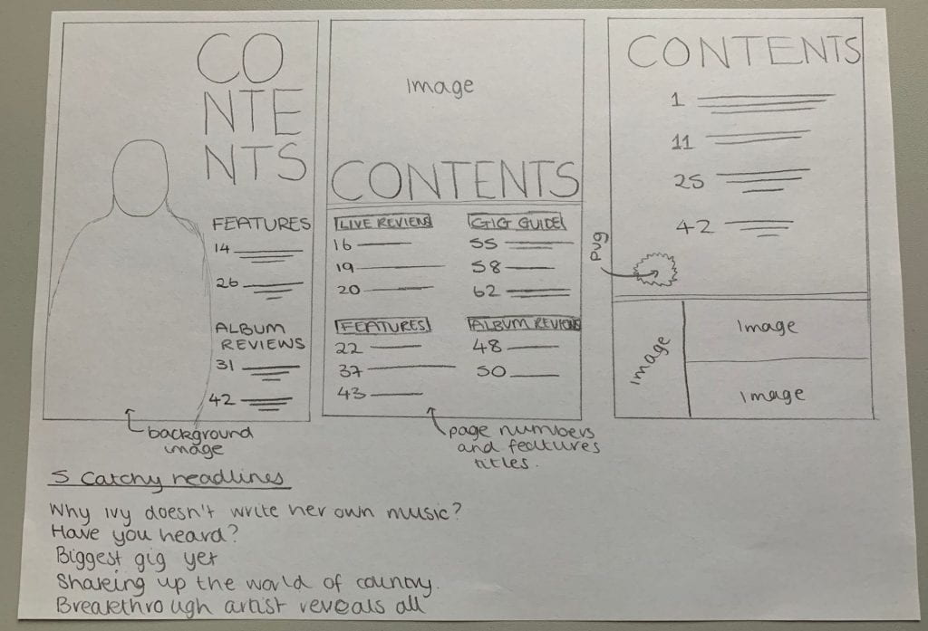
Before beginning to design my own contents page it was important to do some research into other examples of contents pages in music magazines. A contents page highlights what’s featured in the magazine and clearly lays out what’s where so the magazine is easy to navigate.

Some technical conventions of a contents page are:

  • Page numbers
  • Hyperbole and superlatives in headlines to get the reader hooked
  • Image/s
  • Graphic illustrations and designs
  • Reminder of the magazine’s name and mission statement
  • Fonts and a colour scheme coherent with the rest of the magazine
  • The editors hello
  • It is most often situated on the page 3 of the magazine and is only across a single page

Below are some ideas for layout designs of my contents page and a few catchy headlines:

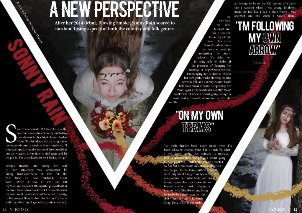
A New Improved DPS

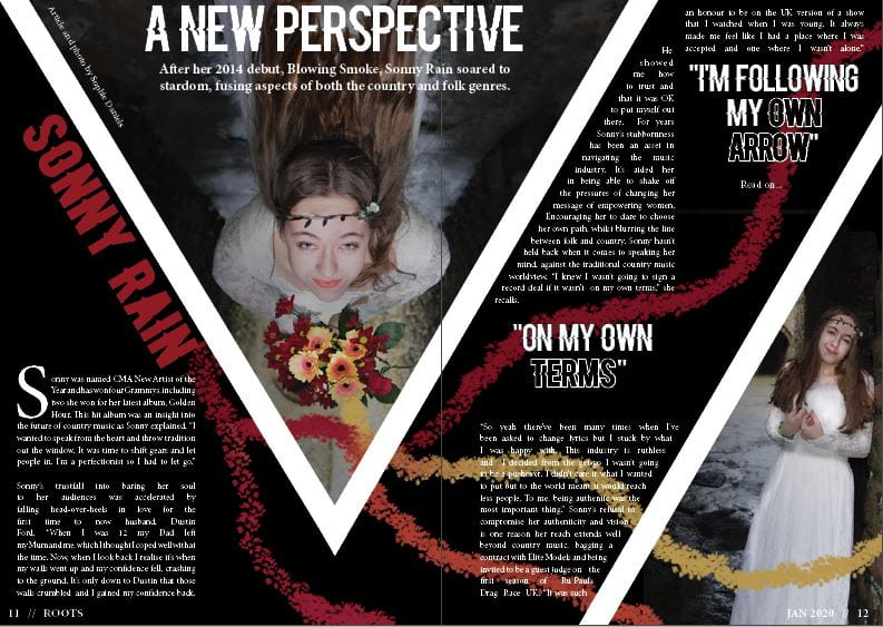
Reflecting on the feedback on my first draft of my double page spread I was able to produce a second draft I was happy with.

Please click to view a PDF.

What have I changed?

  • I’ve added a standfirst.
  • I changed the font of ‘Sonny Rain’ and ‘A New Perspective’ so that it is easier to read, whilst still matching a font from the cover of the magazine.
  • I added a byline and photographer.
  • I also added another photo to fill the space and make it more interesting.

I think that my DPS reflects the country-folk genre well as the colour scheme includes reds, oranges and yellows which are all warm colours and reflective of the country genre. Also the fonts used are very well-suited to the country genre as they have that western feel, as well as matching the front cover fonts well. This is very important so the magazine feels coherent and themed. Finally, I do think the models costume fits the folk category of country which was what I was aiming for as she looks free, whimsical and very boho-chic.

In order to improve my DPS for my next draft, I need to check the alignment of my article and make sure all of the text is clear and easy to read. I could also consider brightening the spread as country music feels warm and homely and at the moment the white and black seems colder.

Feedback & Reflection on Draft DPS

Reflecting on my first draft of my double page spread, I recognise I need to add some essential conventions such as a stand-first and a byline. I would also like to make use of the empty space a bit more by perhaps wrapping the text around the triangle with my model in.

Some feedback from one of my peers, Amy Grief:

  • I don’t like the font of Sonny Rain.
  • Add another quote.
  • Add a byline and photographer.
  • Fill the black gap to the right of the triangle.

Next I would like to use my own targets and the feedback of my peers to make my magazine more conventional of the genre of country and to make sure the layout is clear so that the article can be easily read.

Draft of The Double Page Spread

Here is my first draft of my double page spread:

Please click to see the PDF.

My targets:

  • I need a stand-first.
  • Experiment with the opacity of the image and flowers separately.
  • Check why and make sure the paint lines aren’t out of focus.
  • Change the font of Sonny Rain so it’s easier to read.
  • Add a byline and who took the photo.

Second Shoot Contact Sheet(s)

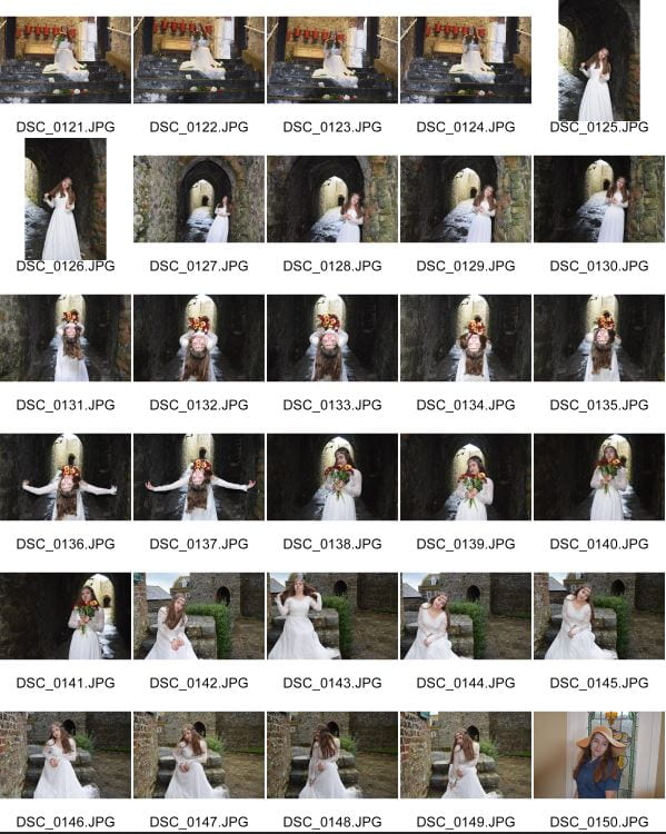
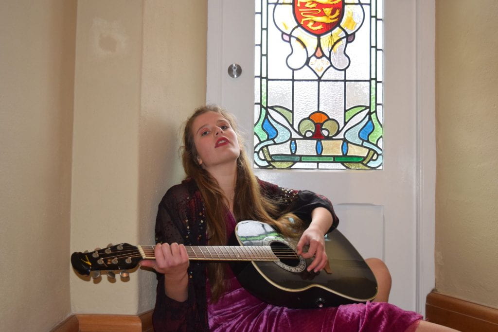
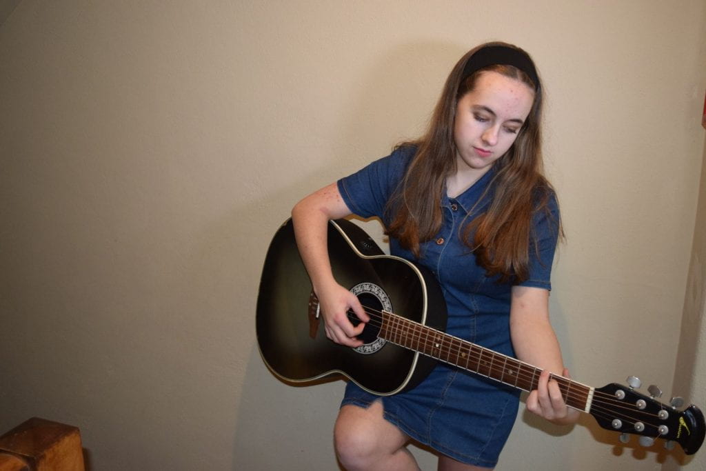
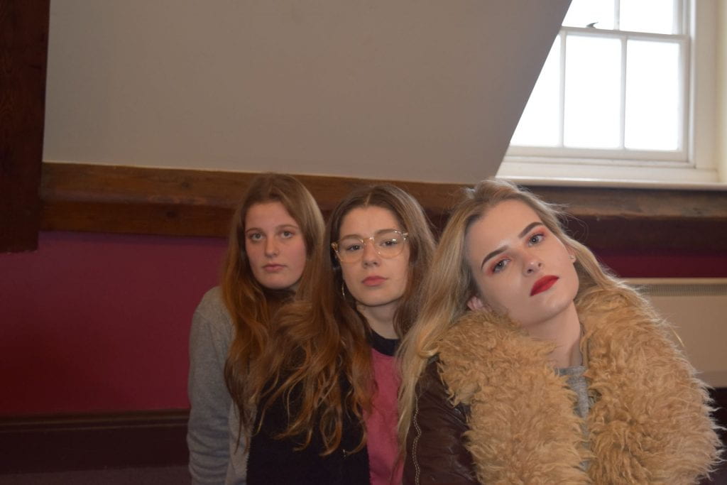
After a day out at a local castle; Castle Cornet, I was able to produce some images I am really happy with from this successful location shoot.

Below are my contact sheets from the location shoot for my magazine. Please click on each one to see a full PDF.


Here are my favourite 5 photos:

I feel happy with the images I was able to capture. They met my aims of being focused, and they were interesting enough to be able to attach a narrative to them. I feel I was able to capture a variety of shots as well, including group shots that I will be able to insert throughout my magazine.