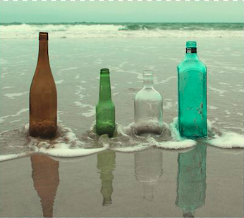
Here is my finished advert for the album ‘The Ride’ by Catfish and the Bottlemen.
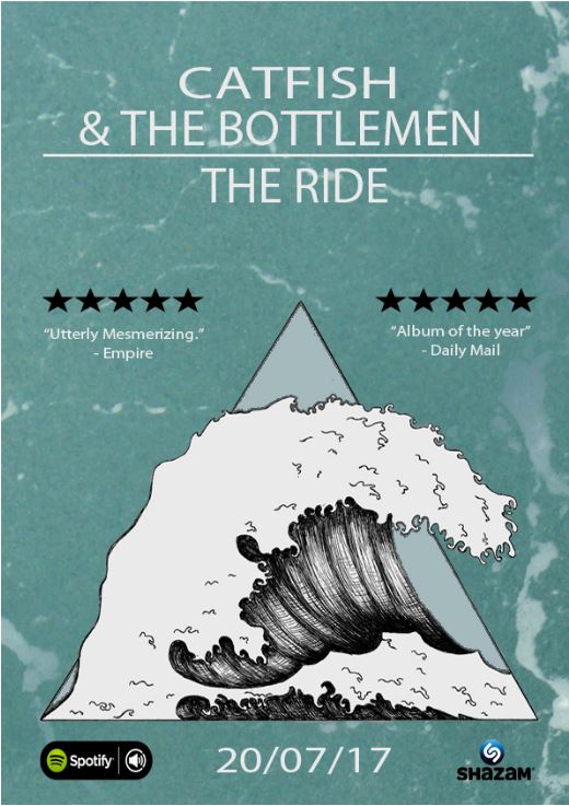
Here is my finished advert for the album ‘The Ride’ by Catfish and the Bottlemen.
To gain feedback for our final digipak and advert we wanted to get a response from our peers and teachers in a different way so, I made a Google Forms page and created different questions for my peers to respond to. I included questions to see what people really liked about the products and what they did not like as much so that I could see how others feel towards our work.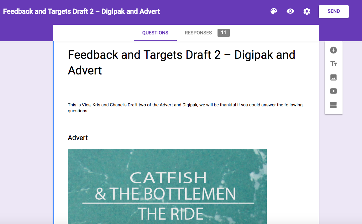
Questions included:
*Do you like the overall look of this advert? why?
*Do you feel the advert and Front cover of the digipak resemble each other well?
*Would you be able to identify the colours and shapes of the bottles as different people, with different personalities?
*Does this work best as a inside right cover for the digipak? why?
*Do you think a photo of the band would be more appropriate?
*What two things do you like about the products?
*Where do you think we could improve?
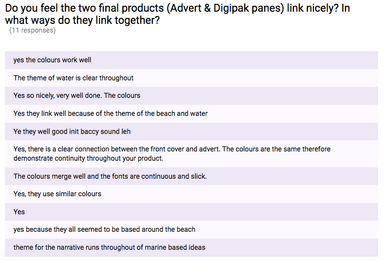
*Do you feel the two final products (Advert & Digipak panes) link nicely? In what ways do they link together?
Feedback:
I was really pleased by the feedback that we received because of the positive outcome. This was the best way to understand putting time and effort into something really does pay off.
Below are some screenshots which show the responses to our longer answer questions.


Below are two pie charts, this is how we received the short answer responses.

Overall I feel that this was a really good way to get feedback because it was informal and a good way to get clear responses.
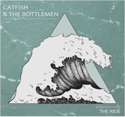
Here is Draft 2 of our Digipak and Advert, you are able to see that they are both quite similar but this was done deliberately. So that the audience and potential buyer would be able to recognise the album once released from the advertisement.
Front Cover:
Inside Left:
Inside Right:
Back Cover and Spine:

Advert:
We have now completed draft 2 of the digipak and advert, so I am going to ask my peers where to improve and make them better. Now that I have exported the advert and front cover of the digipak, the colours do not match so, in the next draft I am going to make sure the colours are correct.
What has changed from Draft 1:
Front cover: Made sure the text and wave are in the same colour and changed the background to the sea to fit the inside right cover.
Inside left cover: Made the silhouette to the bottles on the beach.
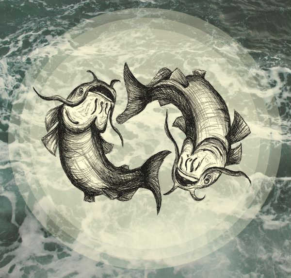
Inside right cover: Completely changed from squares to circles and scrapped the writing,’The Ride’.
Back cover: I have added in a extra hook where feedback said there was a patch of empty space.
Advert: -aligned the main titles into the middle of the advert rather than the left side.
-Moved the icons of the companies to the bottom of the advert, equally spaced.
– Added in another 5 star rating to make the advert more equal and symmetrical.
Overall I am so much happier with the look of the digipak and advert because they all link together through colours and the theme of water and sea.
After completing the first draft of our advert, we decided to get hold of different peers and ask them questions about what they liked and what we could improve on through our advert. In general I was pleased with this feedback because of the critical yet very helpful advice.
We used one of our groups iPhones to record the feedback because it was a quick and simple way to collect information. We used the ‘Voice Memos’ app to record.

Advantages of using Voice Memos:
-Good way to have a record of what the peers said exactly word for word.
-Easy way to ask for feedback, not much preparation needed.
-In general a really quick, simple way to get information about the product.
Disadvantages of using Voice Memos:
-Seemed harder than I first thought to save onto the computer, so it ended up taking a long time to put onto the blog.
-You are able to hear other voices in the background.
Here is the voice recordings of the students:

Positive feedback:
-Good colour scheme
-Wave looks really effective
-Art illustrations fit the genre well.
Negative feedback, Targets:
-The logos are too high up so we will move them lower on the advert.
-The titles are not centred, align the titles into the middle of the advert.
Here is draft 1 of our advert where we have imported and edited the front cover of our digipak onto our advert.
I then made sure that the titles were the same colour of the wave as I thought it was necessary to keep a clear simple colour palette. However I feel there are improvements that need to be made with the music video, for example aligning the text to be centered and changing the positioning of the logos from the music companies as they currently look as if they are in a strange place. There is also a lot of blank space on the right side of the advert where the audiences eye gets drawn to.

Here is our hand drawn idea for our advert, we decided to incorporate the front cover of our album as it is conventional and looks effective. By having the front cover of the digipak as the advert, potential customers will be able to connect and find the album being released as they would recognise if from the advertising previously shown.
I like the idea of having the catfish around the Catfish and the Bottlemen’s band name and album name as it replicates the inside cover of the digipak however I feel that this may potentially look tacky and unconventional.

This is the colour palette that we will focus on for the colours of our advert:

I have created a slideshow of the different conventions of a album’s advert. This slideshow includes the typical conventions of adverts across all genres of music, and a indie rock band named ‘The Wombats’ where I have decoded the advert as a whole and compared it to the front cover of their digipak.
I discovered that almost all genre adverts follow the same blueprint in terms of having the same key factors on the advert for example the name of the band in bold large scale fonts, the album name, the release date and the same image as the front cover of the digipak.
