Posted on

Digipak Draft 2

Here are the final sides to our digi pak. You are able to see below that we have incorporated a clear colour palette, of greys and blues, a water and sea based theme and a illustrative photographical overall idea throughout the whole digipak.

I am really happy with the outcome of this digipak because of the hard work and long time spent creating each side, and each side having their own individual ideas within the main topic of water and sea. I feel our digipak really works well with the genre of  our music because of the arty and simplistic side to each pane.


Front Cover:

Inside left and right cover:

Back cover:

Posted on

Digipak Feedback and Targets Draft 1

After creating the first draft of our digipak we decided to get some feedback from our peers to see where we could improve and what they liked about our products. Below we created different versions of the catfish pane to be able to ask our peers which they preferred and why.

Below you are able to see the difference of the two images where the top has squares outlining the fish. We found that most people ended up liking this image more because of the originality and the way the fish pop out from the sea in a more effective and bold way.

screen-shot-2016-12-29-at-19-06-34

After the first set of feedback we decided to ask our peers again using a tally chart which opacity they liked the squares and the overall colourings of this pane. Unfortunately due to the printer not showing the colouring clearly on the scanned document you are unable to see the changes quite so dramatically. However the lower opacity squares were the favourite.

screen-shot-2016-12-29-at-19-06-46

Below is the back panel of the digipak, I feel this side is the strongest side so far because of the types of positive feedback we have received. Some positive feedback includes; ‘good use of rule of thirds’, ‘colour palette also works really well’ and ‘looks edgy and effective’.

However we did get some feedback in which we could improve on for example, there is some empty space within the image and the models blemishes cause a distraction. To solve this constructive criticism I will put the image back into photoshop and try to cover the blemishes and to get rid of the empty space.


screen-shot-2016-12-29-at-19-06-56

Posted on

Digipak Draft 1

Here is the first draft of the digipak after editing the images and drawing the illustrations. I am really proud of this first draft because of the time I spent on it and the overall fresh and original look it presents. Now that I have completed the first draft I hope to recieve some feedback from my peers and teachers on how to improve.

Front cover:


Inside left cover:

Inside right cover:

Spine:

Back cover:

Posted on

Editing DigiPak images on Photoshop

As part of our inside left cover for the digipak I took a photo of the band facing away from me and imported it into photoshop this was so I could turn the guys into a silhouette look.

To do this I selected the four guys using the quick selection tool and then erased the back ground of the image so that I was left with just the outlines of the guys on the document. I then selected a new layer and clicked on ‘colour range’ where I was able to change all of the guys into black filled in outlines as shown below.

I then noticed that I mistakenly deleted certain areas of the band when erasing the background so I then inserted shapes to the correct size and filled them in with the grey colour shown below. This allowed me to then change the colour of the shapes and look as if the image was never filled in. Without doing this the body outline would be filled in with the sea background colours instead of the grey.

Next I imported the four guys onto another document where I had already selected a image of the beach as the background. This image was a image I had already taken a few months before on a nice sunny afternoon. Once importing the bodies I resized them to get the proportions correct to fit the beach background.

I then decided the grey colour was far too dark on the bodies and did not match the colour palette of the overall digipak, so I selected colour range once more and began to fiddle round with the colour selections as shown in the below, where you are able to see that I was choosing a more green colour to match the front cover of the digipak’s triangle.


Posted on

Digipak – Evaluation of shoot

Once completing our fist photoshoot I thought it was a important thing to reflect on because we had never undertaken a photoshoot before for Media Studies.

What went well?

*I feel our organisation was superb due to the quick imagery taken, setting up of the hooks, tripods and lighting.

*Our team work paid off through the high quality and interesting images produced.

*We managed to get a wide variety of shots so we are able to finely select and choose our strongest photograph.


What did not go so well?

*I was only able to take the images due to the adjustments needed with the camera in terms of aperture, shutter speed and connecting the lamps with the camera in the studio. Also Kris and Chanel were needed to hold the poles with the hooks hanging.

*Not all of the strong images have enough hooks, however Hopefully we will be able to edit more in at a further date.

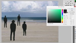
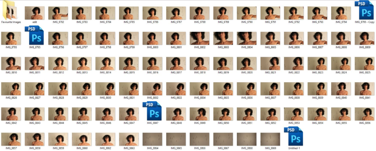
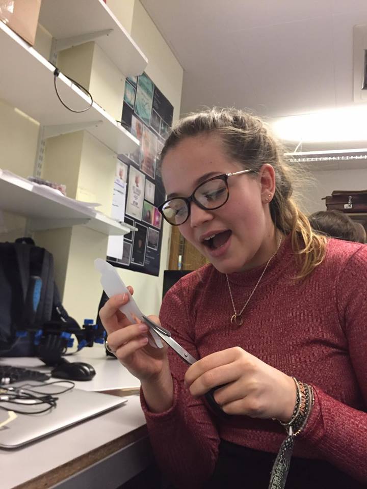
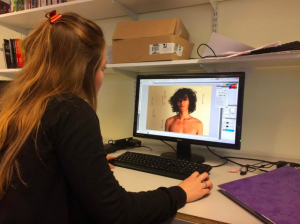
Here you are able to see me actually editing a image from this photoshoot:

screen-shot-2016-12-10-at-11-37-58

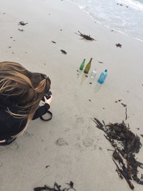
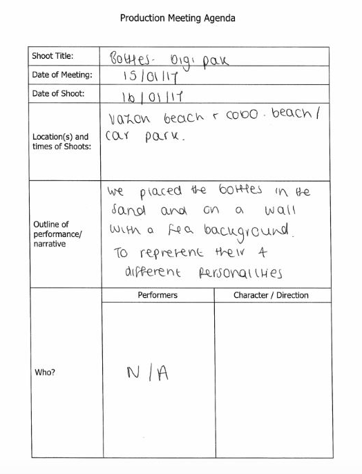
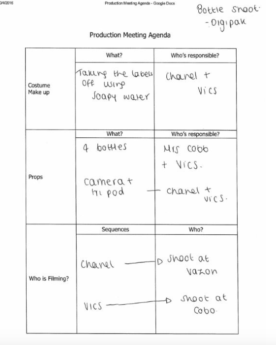
We undertook another photoshoot for the digipak where I went to the beach with Chanel and captured images of bottles in the sea and sand. This was so we could change the inside left cover of the digipak from the band on the beach to a more illustrative and symbolic look to the overall album cover.

Each bottle represents the idea that the band members are all individuals and have their own original appearance. The reflections on the wet sand of the bottles suggest the idea that the band are living two lives, one ordinary life and one extraordinary being famous.

From this shoot I realised that the initial idea of taking photographs of the bottles on the wall just would not work as the wall I went to on by the beach was slanted. Taking photos on the wall also meant the empty bottles were constantly being knocked over by the wind.

Moving to the beach also meant the background and foreground (the sand & sea) linked closer to the other digipak covers.

Even though this photoshoot was organised the day before I feel the outcome was good and I captured some high quality imagery.

Posted on

Digipak – graphic designs/illustrations

Here you are able to see the stages of the illustrations that I have done to complete the catfish side of the digipak. To begin my drawings I simply drew out two catfish wrapping around each other using a simple black pen. I then added in some shading to the catfish and details of the fins and main body.

As you are able to see below I have scanned the drawing into the computer and put the sketch into photoshop ready to edit. To begin this edit I increased the colour balance allowing the lighter lines of the shading to become more prominent and obvious. To do this added a mask on photoshop and chose, selective colour, allowing me to select the blacks, neutrals and whites specifically to enhance and help the image to really stand out.

“Colour change”

screen-shot-2016-12-01-at-13-22-46

After completing and changing the strengths of colours of the illustration I wanted to make the drawing square so that it would be able to fit into a actual digipak cover. To complete this I changed the ‘canvas size’ of the image to 41×41 where as before it was 42×51.53. By doing this is shrunk the image and it became a square. However; I realised the drawing was far too rectangular and wide to fit around a CD, so I took a step backward and created another layer of the image, (shown below, titled ‘image being squashed’) to squash the image down and make it become a lot taller than wide.

“Image resizing, rectangle into square, 40×40”

screen-shot-2016-12-01-at-13-42-23

“image being squashed”

Here is the editing process of making the image taller rather than wide, so that it will fit around the CD nicely as explained above.

screen-shot-2016-12-01-at-14-30-06

After ‘squashing’ the illustration I went along and changed the image size back to 40×40 so that none of the drawing would be cut off.
catfish-1

Above I then added in the shape of a Cd to show the idea of how the drawing would fit behind on the digipak. I am really happy with the overall out come of this illustration even though it is just a draft of our final piece. It really gives us the idea on what our final product will look like.

Posted on

Digipak – Contact Sheet

Below is the Digipak contact sheet, where we took photos of Sades in the white photography studio at school. While I took the photo, changing the aperture and shutter speed; Kris and Chanel held the fishing hooks in front and behind Sades to create the weird, original effect.

screen-shot-2016-12-27-at-21-26-25

From taking these images we were able to select our final photo to edit via photoshop, I placed the top five images into a separate folder so I was able to edit and look at the best photos from the shoot, quicker and more effectively.

Here is another contact sheet of the images taken at the beach looking at the sea crashing into the waves. A image from this shoot will hopefully be used when we edit the catfish side of the digipak, to create a interesting and exciting background.

screen-shot-2016-12-27-at-21-26-40

Posted on

Preparation for the Digipak

To begin the inside left cover for the dgipak I printed off a photo from the photoshoot of the guys outside and then cut out their silhouette to then place onto a plain white piece of paper.

By doing this I was able to scan this document in onto the computers and insert into photoshop.

By cutting out the outline of the band meant I saved a lot of time as I could be precise when inserting a background behind.

Posted on

Digipak – Production Meeting Agenda

Here is our meeting agenda for our digipak photoshoot. We have created this to help with our organisation so that we know when we are taking photos, what of and what we will need for each shoot. This has also helped us to remember to contact the band members and ask them to bring certain clothes, where we will meet them and at what time.

We have also assigned different people to collect different pieces of equipment for each shoot, this is a fair way to organise and distribute out the weight of remembrance.

screen-shot-2016-11-21-at-16-38-02 screen-shot-2016-11-21-at-16-38-18

Myself and Chanel went out to the beach to take photographs of the bottles by the sea, to do this we needed to create a Production Meeting Agenda so that we would be organised and ready to capture some high quality imagery.