Digipak Draft 3

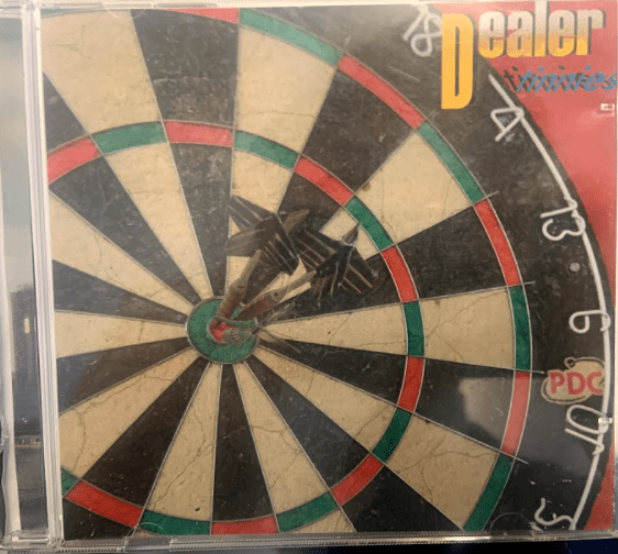
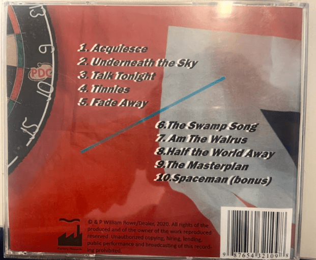
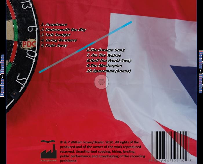
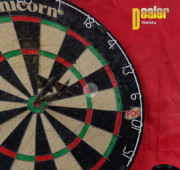
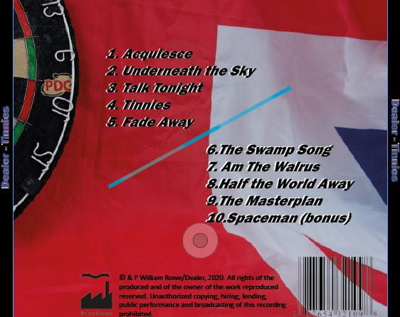
Below is my final draft for my digipak. What I changed is below :

  • Replaced ‘dealer’ logo with the one from my original draft, as the 2nd draft logo appeared too ‘clipart’
  • I minimized the empty space on the front by making the image bigger
  • Made the track listing bigger, again filling up more space
  • Created a RAF Roundel and added it to where the CD would be


Below I printed out my Digipak and put it into a CD case, I then asked people what  genre my digipak was, out of the following options:

  • Country
  • Rap
  • Indie Rock
  • Jungle
  • Garage

As you can see by the results, Indie Rock was the most prominent genre that was voted for. This shows that I was successful in designing my digipak by conventional genre. Most Indie albums do not have the band featuring on the front, they also have a very unique theme and font to them.


Evaluation of shoot

The shoot went well, especially with the limited time I had (50 mins). First I repositioned the objects in a manner of styles, then taking more up close photos of the objects, for example when I took photos of the dartboard up close to give it a more 2d effect. My initial objective of getting the objects from several different angles had been complete. For the last few shots I moved the darts around on the dartboard just to add a bit of differentiation. I felt like the shoot was lacking in several areas. Firstly I felt like there was a lack of objects, creating a lack of empty space throughout the photos, although this could be used for track listing for the album etc. I could have also tried spreading the objects out


Photoshoot Meeting and Risk Assessment

My aims for my first Digipak shoot are the following :

  • Gather an array of distinctly British items that you may find in a pub
  • Place them against a union jack flag and take photos from a range of different angles in the white studio
  • In photoshop I will edit them in a range of manners ranging from color pop to a more desaturated look

For this shoot I have obtained a dart board aswell as empty beer cans, aswell as a union jack for the background.


Branding Moodboard

I create this padlet (seen below), to gather inspiration for my Digipak’s Design. From what I have found, an overarching theme of the designs is a lack of the star, using either a completely regular or unusual image to take their place. I also have found that recognisable fonts are used, to make branding coherent

Made with Padlet