Adverts

To fill some space in my magazine and add more content, as well as show an understanding of my audience, I found two full-page adverts that I felt were relevant and appealing. These being an advert for the guitar and amp manufacturers Fender and Spectrum, and an advert for the Download music festival in the UK. These appeal to my audience in their relevance to the genre, as mentioned in my audience profiling, many fans of the genre will also be interested in playing their own music, therefore including an advert for a guitar would fit. The Download festival also appeals to the audience in it’s range of artists, being a large and popular festival it hosts many musicians of the genre. These are both relevant to the attitudes in the punk/alternative genre, generally being very focused on their engagement and active involvement in the music.

A New Improved Complete Magazine Draft

In response to the feedback I received, I have followed these ideas and proceeded to correct them, creating the below results of which I am generally very happy with.

PDF

From this, the only further alterations that could be made have been highlighted as the following;

  • Make the album covers slightly larger
  • Decrease the line spacing in the cover line captions
  • Further angle the signatures on the photo
  • Change the “and” in the photo caption to “&”

As well as this, it was also commented that on the contents page the colour pink seems quite dominant, however in experimenting with changing some areas I only found that this gave the page a muddy feel that I didn’t like so have decided to leave it as it is.

Complete Magazine Draft

After reflecting on my previous work, adding more detials and refining existing material I have reached the below full second draft of my magazine including the most recent contents page.

PDF

I then sent this file to my teacher for feedback, received as below;

From this, I deducted the following main points on how to further improve my magazine;

Cover

  • Make the price higher
  • Change the yellow sticker on the left side to have a grainier, grungier effect

Contents Page

  • Fix the alignment in the left column
  • Change the colour of the number 10 in “Top 10 Upcoming Bands”
  • Change the mission statement font
  • Move the caption for the giveaway photo and further specify what it is
  • Add a third sample album cover and make them slightly bigger

Double Page Spread/Article

  • Seperate the standfirst from the body text
  • Move the drop capital to the beginning of the body text
  • Justify the both text to both sides
  • Move the photo/article credit
  • Include model signatures rather than a caption explaining who they are

A New Improved Contents Page

Having now completed my contents page with all the information I wanted to include and having refined some existing material, I can now present a second draft of my contents page alongside a peer review recording in response to this.

In completing this, I also recorded a peer conversation/discussion responding to my contents page, following set questions.

From this response, I concluded that top further impove this page I should try to:

  • Change the placement of on of the captions, currently on the model’s knee
  • Colour correct the extra images on the lower half of the page to better blend with the overall colour scheme
  • Bring out the word “Giveaway” in the title “November Giveaway”

Draft of Contents Page

Below is my first draft for my contents page, giving the initial, general idea of how I want it to be laid out and the content I want to display, however of course I intend to add more on the lower half of the page. Nonetheless, I am happy with the product so far, especially in it’s continued conformity to the house style, as well as smaller details such as the model overlaying the title, contributing further to the rough, thrown-together style of the genre.

Click to expand PDF

What is a Contents Page?

A contents page serves an important role in a magazine, acting as a menu to the reader from which they can navigate and choose what they want to know more about. Due to this, it is important that information is clear, easy and engaging to read, without overloading them with information in a massive body of text; since readers go to a contents in order to decide if and what they want to read, not having to read a massive paragraph before they can even make that decision.

Some technical conventions of a contents page include;

  • A clear title of “contents” making it clear to readers what they are looking at and so that they can easily refer back to this page.
  • A list of articles/features either chronological or sorted under subheadings of similar styles/themes for easy reading and finding specific articles.
  • Page numbers shown clearly, often in bold or a different text colour for easy and clear reference.
  • Enticing and clear article titles to let the reader know at a glance what each article is about, allowing them to quickly decide if it’s something they’d be interested in reading.
  • Short summaries of articles to give readers slightly more information and further help them decide if they’d be interested in each article.
  • Relevant photos often featuring the cover star to break up what is otherwise a body of text and keep the viewing diverse and interesting.
Three potential layout sketches

Possible Headlines;

  • Band-At-First-Sight
  • Breaking Down the Boundaries
  • Album of the Month
  • Top 10 Upcoming Bands
  • Everything You Need to Know About…

A New Improved DPS

After reflecting on my first draft, I have worked on it and developed it into an improved version. In doing so, I have successfully covered all the issues mentioned in the previous post, as well as adding extra details such as background graphics. Overall I am very happy with these improvements made, however still feel that there are a few areas that I could further improve after talking to my peers;

  • Remove the mistake indent in the bottom left
  • Give the text a drop shadow to be more easily readable against the background graphics
  • Remove the unnecessary capitalisation of the “left” and “right” in the photo caption
  • Try a slightly alternative layout for the start of the article body, making it clearer where the reading should begin.

PDF of second draft

Side by side comparison:

Draft of Double Page Spread & Reflection

Once I finally had all the elements needed for it, I can begin putting them together as a double page spread, creating this first draft shown below.

Overall, I’m happy withe direction it’s going in, however can recognize where it needs to improve;

  • The background colour/texture doesn’t work as well as it could with the genre
  • Include more smaller photos/features
  • Add page numbers/headers making reference to magazine name/issue
  • Caption the photo – include model names, byline and photographer
  • Remove hyphens and try to increase the spacing between paragraphs
  • Try using a different font/alignment for the questions to make them stand out more
  • Make names (for quotes) stand out more

Second Shoot Contact Sheets

To proceed and create a double page spread, I completed a second photo shoot in town, taking advantage of the environment and choosing to take more photos in the grungy, urban locations around the area such as a small sheltered alleyway with steps shown and a dark empty indoor market space. Both scenes were fitting to my genre in their reserved, out-of-the-public-eye location and muted, grey colours, making the bright yellow i used in the costumes and props stand out more. This lead to a successful shoot, shown below, which I feel the setting contributed nicely to and resulted in some usable and relevant photos.

From this shoot, I then narrowed it down and chose the nine best, as they were the most successful in terms of framing, focus, and lighting in order to convey the mood and genre.

And from these, eventually decided to use this one;

A New Improved Feature Article

After taking in the feedback given and reflecting on the points listed in my previous post I have created a final draft of my feature article content;

———

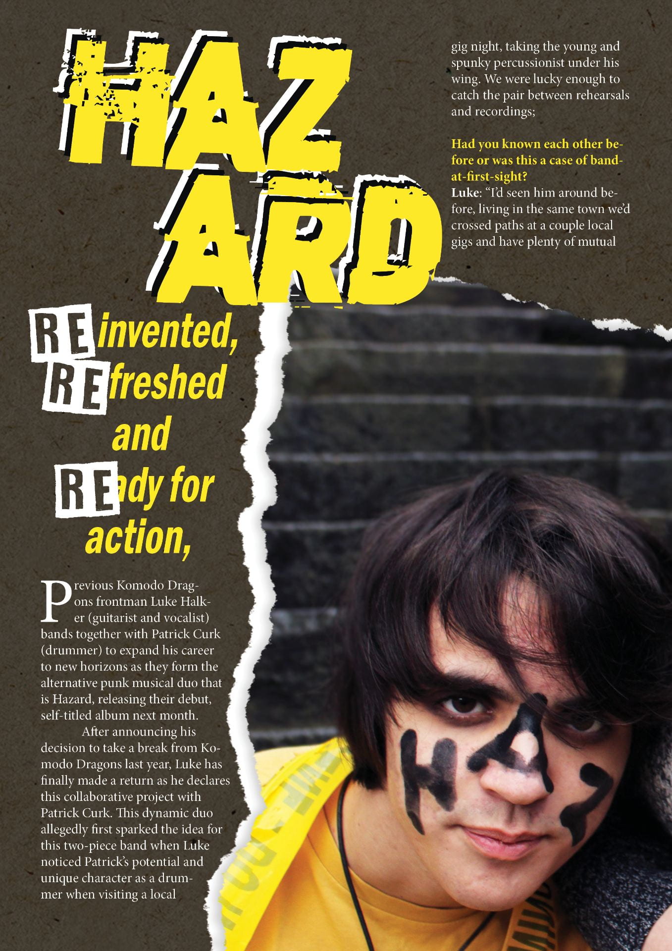
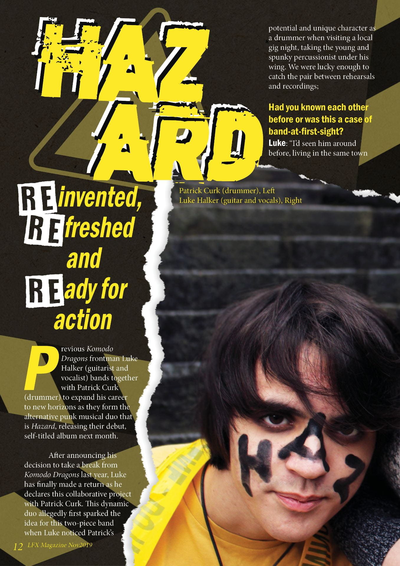
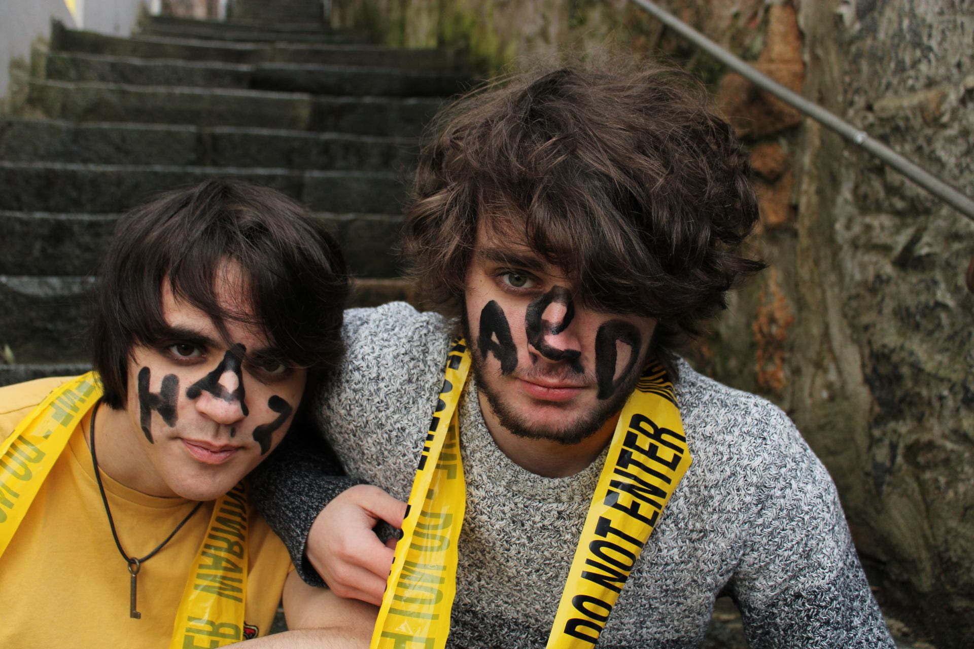
Reinvented, refreshed and ready for action, previous Komodo Dragons frontman Luke Halker (guitarist and vocalist) joins together with Patrick Curk (drummer) to expand his career to focus on new horizons as they form the alternative punk musical duo that is Hazard, releasing their debut, self-titled album next month.

    After announcing his decision to take a break from Komodo Dragons last year, Luke has finally made a return as he declares this collaborative project with Patrick Curk. This dynamic duo allegedly first sparked the idea for this two-piece band when Luke noticed Patrick’s potential and unique character as a drummer when visiting a local gig night, taking the young and spunky percussionist under his wing. We were lucky enough to catch the pair between rehearsals and recordings;


Had you known each other before or was this a case of band-at-first-sight?

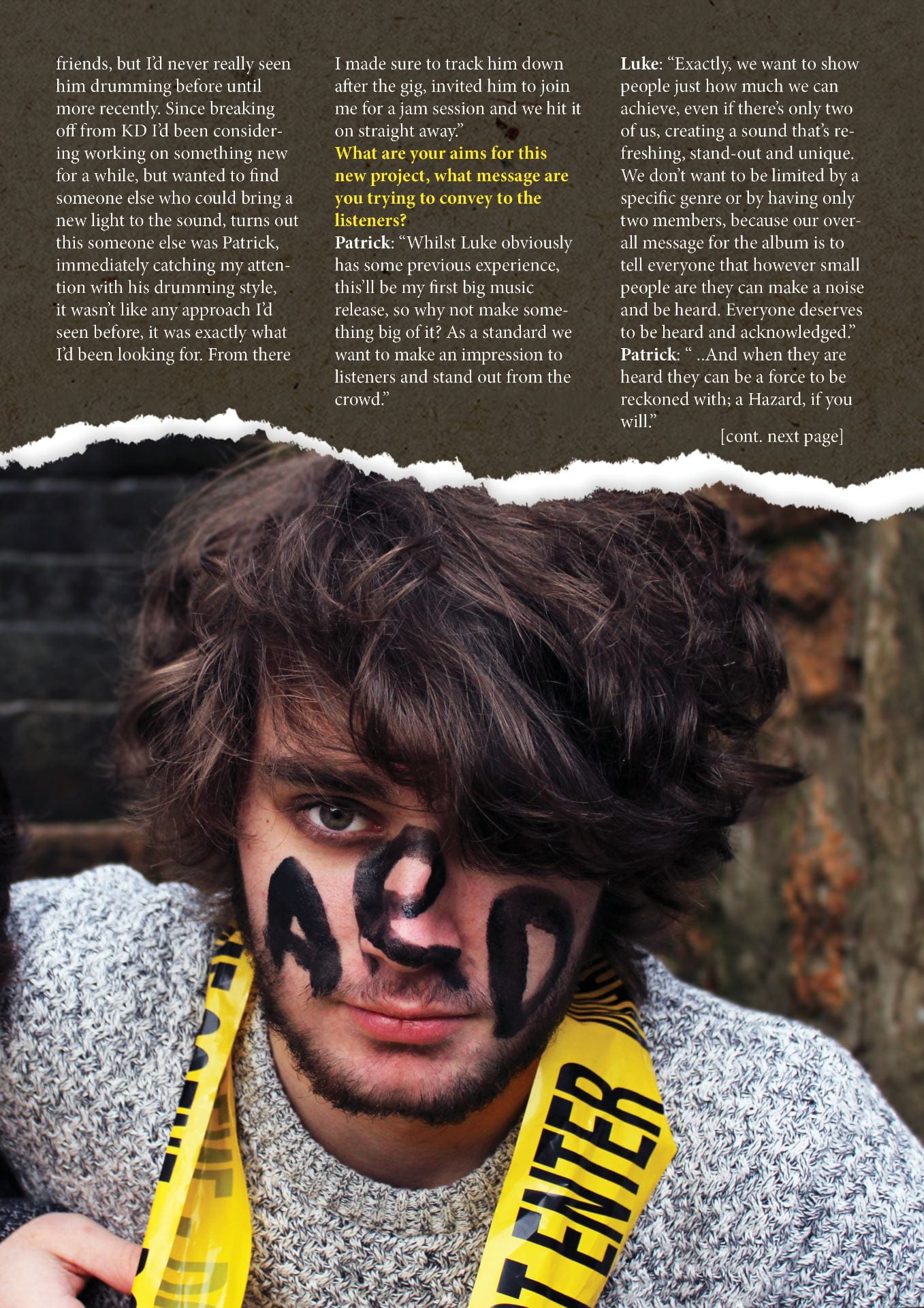
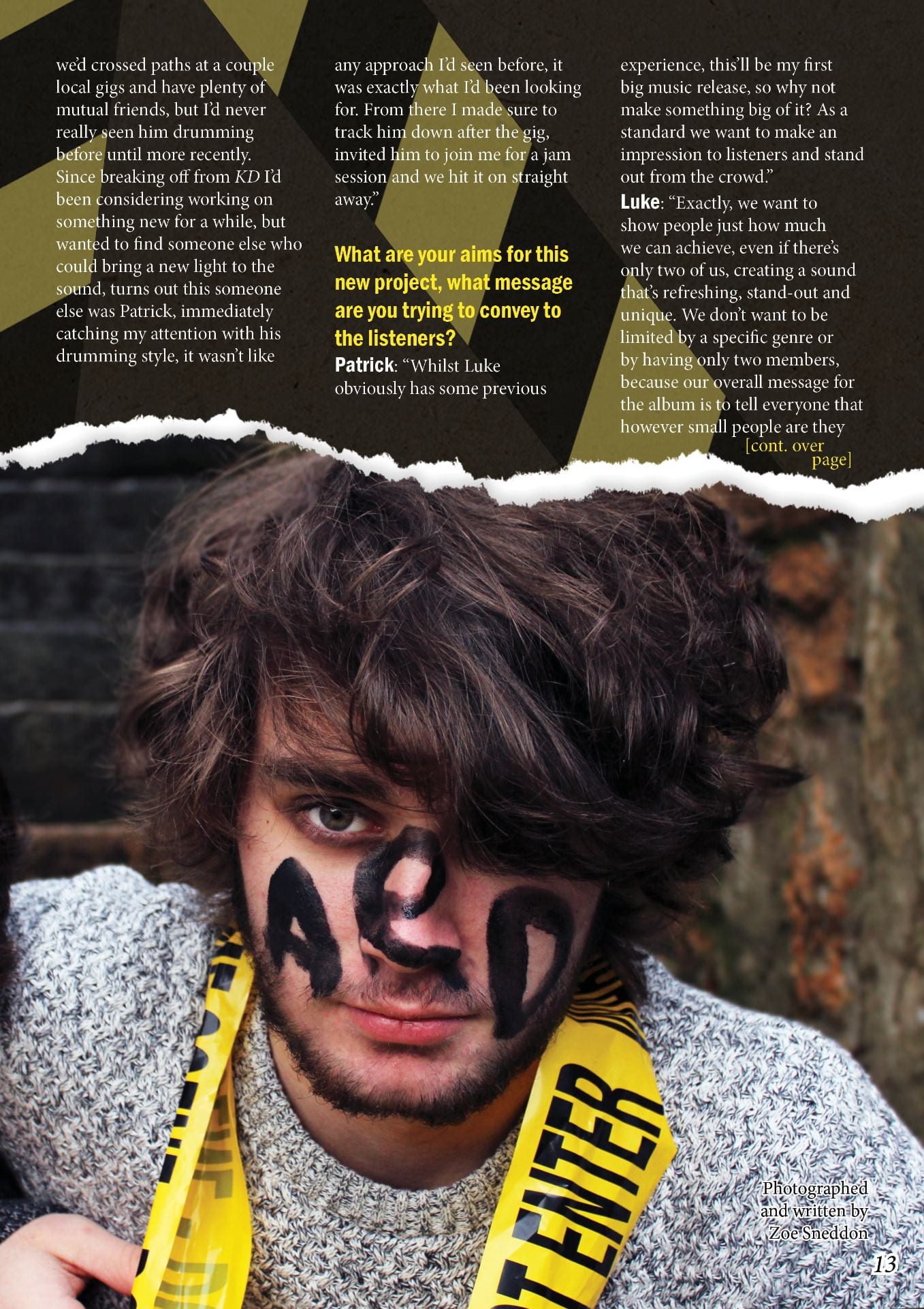
Luke: “I’d seen him around before, living in the same town we’d crossed paths at a couple local gigs and have plenty of mutual friends, but I’d never really seen him drumming before until more recently. Since breaking off from KD, I’d been considering working on something new for a while, but wanted to find someone else who could bring a new spark to the sound, turns out this someone else was Patrick, immediately catching my attention with his drumming style, it wasn’t like any approach I’d seen before, it was exactly what I’d been looking for. From there I made sure to track him down after the gig, invited him to join me for a jam session and we hit it on straight away.”

What are your aims for this new project, what message are you trying to convey to the listeners?

Patrick: “Whilst Luke obviously has some previous experience, this’ll be my first major music release, so why not make something big of it? As a standard we want to make an impression to listeners and stand out from the crowd.”

Luke: “Exactly, we want to show people just how much we can achieve, even if there’s only two of us, creating a sound that’s refreshing, stand-out and unique. We don’t want to be limited by a specific genre or by having only two members, because our overall message for the album is to tell everyone that however small people are they can make a noise and be heard. Everyone deserves to be heard and acknowledged.”

Patrick: “ ..And when they are heard they can be a force to be reckoned with; a Hazard, if you will.”

What are your inspirations behind your new sound, are there any particular artists that have influenced you in making this happen?

Patrick: “Personally, I’ve always been inspired by Green Day, especially when covering a theme like this, inspired by some of the messages from Revolution Radio, as well as the inspiring amount of energy that Tré Cool [the drummer] has in all of their performances.”

Luke: “For me, I feel that there’s a whole collection of other influences rather than one pinpointed artist, for this project in particular I’ve been inspired by the powerful sound that Royal Blood can achieve with only two members, as well as the genre-defining style of My Chemical Romance, and how they can tell such a convincing and heartfelt story through their performance.”

After this release, do you have any plans for the future?

Luke: “We don’t want to reveal too much too soon, but there’s definitely some more big things coming up to do with this release that I’m very excited about…”

Patrick: “Definitely, not to give too much away, but I can say there’s a good chance of some concerts coming up that we’ve been looking forward to and working on for a while, as well as some potentially new merchandise releases that we’ve put a lot of effort and consideration into, in order to bring you something worth every penny! So watch this space and stay up to date with our social media [@haz_ard_band]  for more information!”


    Have no fear, as we at LFX magazine will be sure to keep you all updated as these two release some more info. You can also expect and album review in next month’s issue, as well as more regular updates on our Twitter, Facebook and Instagram to keep you in the loop!

———

 By making these changes I have made sure to include more information about upcoming projects to really create excitement in readers,a s well as generally ensuring the article remains engaging and interesting throughout as well as easy and clear to read.