
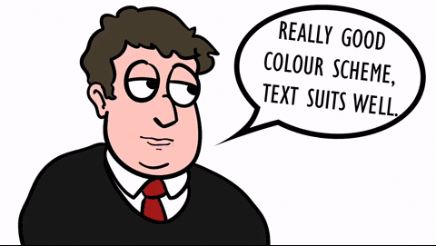
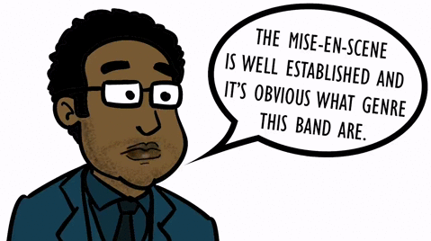
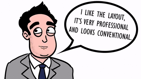
Here I have created some cartoon gifs of some of our peers, and shown their feedback on our advert in speech bubbles. Click images see full moving gif.
Other than this positive feedback. We received a few comments about things people didn’t like. These were particularly things like our title text, as people thought this looked too small and not very eye-catching. Another suggestion people had for improvement, was that they weren’t fond of the way we have positioned the band logo. So it was suggested that we moved the band logo down, and put our star review underneath the title of the album, for a more conventional look, and eye-catching arrangement. We will go ahead and make these changes, to develop our advert to a higher quality.