Titles Design & Production
Within a thriller, titles are very important. Titles help to portray certain emotions to the audience through font and positioning, it is also important that the titles are parallel with the themes of the thriller, I did some research on different colours, animations, and fonts for our thriller “The Wanderer”
This is a list of fonts we found that we could potentially use for our thriller, the green ones are more appropriate to the thriller genre and the red ones do not reflect themes of the genre.

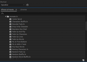
When we found the font we thought was most appropriate for the genre we imported them into Adobe After Effects to start working on the construction and placement of titles and then later, placing them onto our thriller. we also scrolled through lots of animation carefully selecting one that feel would reflect the themes within our thriller. Using After Effects helped me to further my knowledge in using the software in terms of how to animate different things and how to make titles fit with the themes of the thriller.
![]()
^ This is an example of a transition that we have decided that would work best for our thriller.
For the main title of ‘The Wanderer’ we decided to add an animation that would represent the protagonist, we used an animation that looks like it is being blown away by the wind, this represents the protagonist’s environment that he lives in which is outside in a park.


This is a timeline of our titles placed in the thriller each title is renamed and moved into order of significance within the film and the production of the film.