
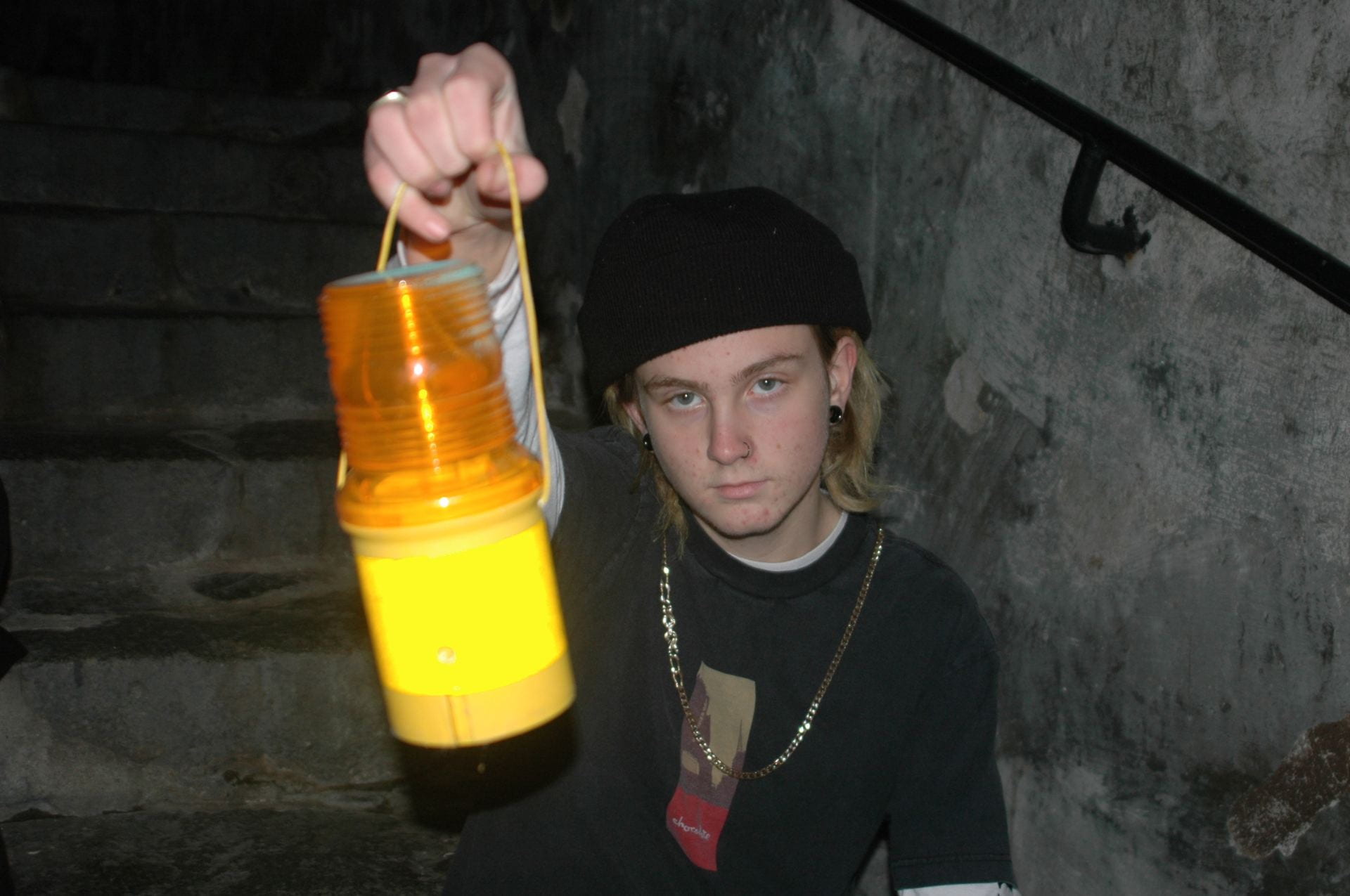
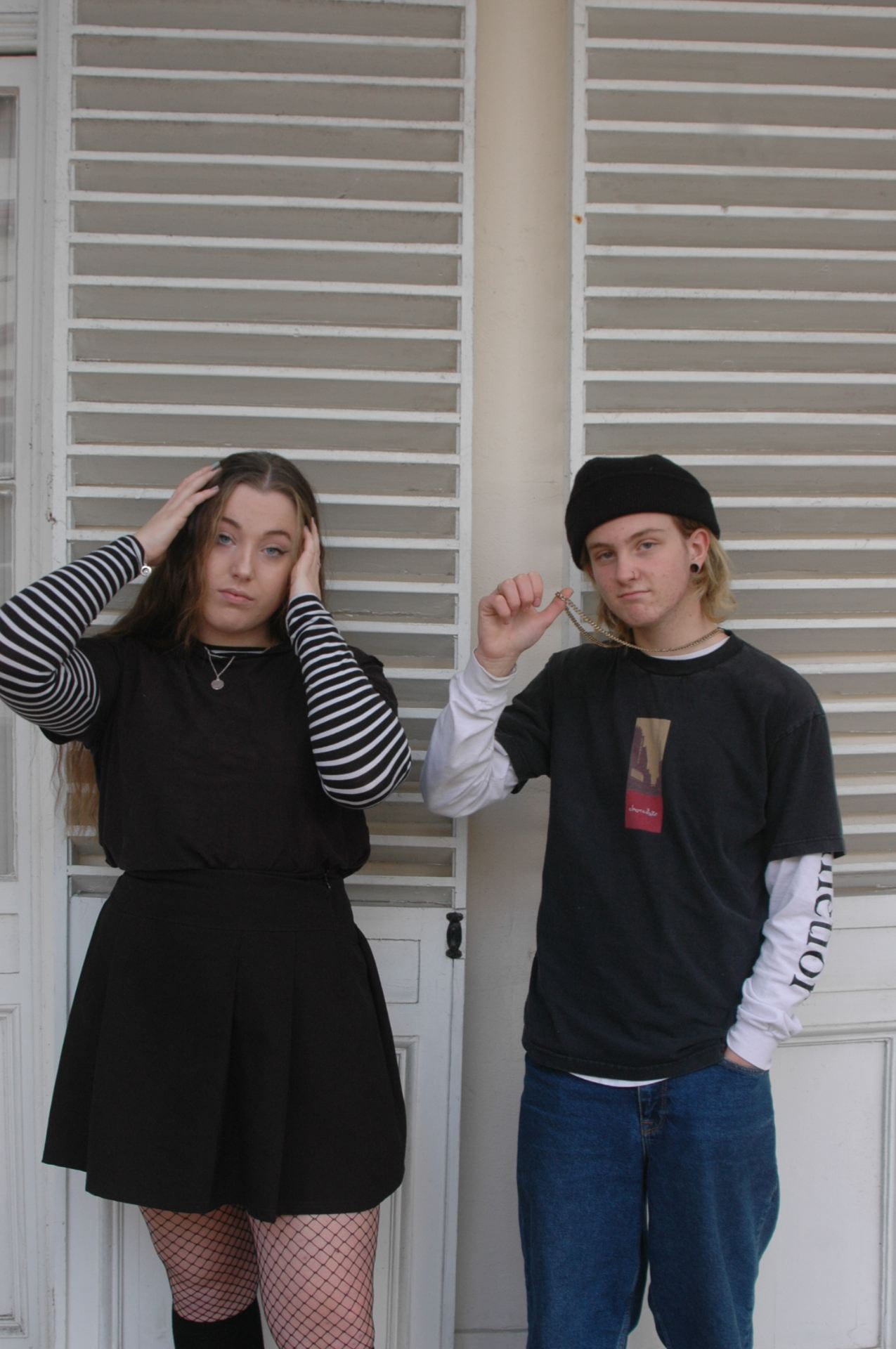

I went to town to take photo shoots for my double pages spread. It worked well in town there are a lot of dark alleyways which helps to link in with my genre, the balcony in town also worked well as it has a lot of neutral colours and because the models outfits were very dark it helps to contrast with them. I think what I could have done to make it better was to make one of their outfits to include orange in it so it makes it looks like it goes with the contents page and front page more. I may use these three photos above as they all include either different gestures and facial expressions or props which make the image more unique. They all include colours that are contrasting helping the subject of the image to stand out.