
What’s new…
- Raise contents a little.
- needs a page number.
- play with the photos in photoshop…filters? saturation?
- fill the black space at the bottom – editors welcome?
- watch the sense of the coverlines…come into the industry – does that make sense?
- Metro Indie interviewed – isn’t the magazine called this? And use the Grammy logo for the coverline?
- Metro Indie – listen to them? confused.com.
- no need to repeat Catfish and the Bottlemen twice in the coverline.
- make the star’s names bigger in the captions.

What’s new…
- make him bigger
- more article or have another photo of a quote in the middle so that you wrap the text around it
- centre the questions
- have some other coloured lines in there i.e. graphics to make the copy more exciting to look at
- caption the photo – i.e. Courcy so that we know who he is and that the article will relate to him
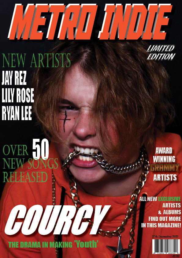
What’s new…
- lighten the photo?
- another cover line at least on the left and one on the right?
- make metro indie…bigger, taller, thicker?
- capital letter September
- make him bigger so that some more of his hair goes behind the masthead
bigger masthead or courcy smaller on front
coverlines line up too close to edge move down middle, left font on righ
conetnst smaller, page no smaller, different colour numbers, grammy logo, 37 different band name, smaller gap on apge 8, 22 another line, green around image, same size font bands
chnage double page to 16, more colours, opaque box behind quote at bottom, line spacing between questiona nd answer same answer closer to question, some of it more spread out bring top right question down, write coourcy on img inwhit, make top qoute smaller