Critical Reflection Essay
Below is my Critical reflection Essay. Click on the image to view the full essay…

Critical Reflection Essay
Social media page draft 2
Since the first draft, we have added lots to our social media page. These post have included lots more teasers, content, interactions for the fans and the stuff that we realised we needed to add from the first draft. I am happy with the finished product of the page and believe that all the posts are all in a good order to release the album and all the items we have promoted along with it.
Below is the finished social media page…

Our finished social media page, including the tree link website in bio.

All of the ten post about the album release.

The final post, which has the release of the album, thanks to all the fans for support and links to the music to listen and buy.
Here is a link to the page…
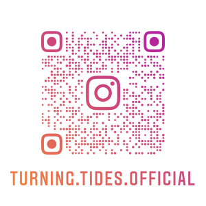
https://www.instagram.com/turning.tides.official/
Once we had finished our first draft of the page our teacher reviewed it and gave us some feedback on what we should add in the next drafts. He did this by following the same successes criteria that we did for the draft 1 reflection. The video for this feedback is in the video below…
In conclusion, I believe that the social media page was a great successes and has promoted the image and information that we wanted to. This is down to a few key things. One, as I have learnt lots from this course work one of the most important parts of the processes is to plan things well. When we have planned well, we have succeeded without any problems. When we didn’t plan enough it has kicked us in the back later down the line in the work. By planning each individual post with the post timeline it has helped us keep on track. Another reason for the great success of the page was looking at what other artists and bands have done for there release of albums on their own social media pages. Seeing the processes of how they tease the fans and interact with them was important and key information to take and apply to our page. From the teacher reflection we found out that we had not put enough links into the posts or added parts for the audience and fans to interact in.This is something we targeted for the second draft of the page. We managed to do this by creating a tree link for the page. This involves a link in the bio to our own website with all the links that we have listed in the posts in one place. This is done for the fans to interact to our content and engage. By adding these extra links it will create more ideas for ADIA and more of the audience will interact by creating a bigger buzz of the overall marketing campaign.
Social media page draft 1
So far we have created our social media page and started to add content to it. We have transferred some of the content and logos from the digipak to the social media page to show it as more of brand. We have published four posts so far, this content includes teasers for the album and the single. We have also released the single with the music video. We have also posted some of the behind the scenes for filming more music videos and shoots for media releases. Something that we looked at when doing are research for the page from what other artists have done in the past was the use of of stories and highlights on Instagram. We have taken this idea and tried to apply it to our social media page by using stories to promote things and keep them saved through the highlights on the page.

This is are most recent version of the page.

This was the page once we had added the first few posts and teased the new single

This is the page once we had released the single
https://www.instagram.com/turning.tides.official/
Once we had done draft one of the page we had to create a self assessment to make sure we had hit the criteria we needed to. Also to think what typical conventions a social media page for a band or artist would have in theirs. It was good to do this reflection as it made me release what conventions and essential things that we have in the page but also what we need to add in for the next draft This reflection sheet is below…

This assessment for draft one was really helpful & useful to do. This is because it’s realized how much we still need to add in for the next drafts. In draft 1 we have included lots of the conventions you would see on a social media page and the basic things such as a call to action, interaction & engagement, content and design coherence. However there is still things like cross media convergence, synergy, promotion of live events and social issues we have not shown/promoted. This is something that we will need to improve and change for the second draft and without the assessment we would have probably not realized we need to add in these important features to it.
Timeline and Marketing ideas
Now that we have analysed and looked at other bands social media pages that are similar to our bands genre, it is now time to start planning what we are going to include in our social media page and what platform we are going to use. We have decide on using instagram as we feel it very popular with the genre we are going for and what most people in are target audience use. The task we had to complete was create a post it timeline of all the planned posts and marketing campaigns that we are going to upload to the Instagram page in order to promote the new release of the bands album. These posts that we create must involve teasers, launch dates, promotions, social interactive content, and excitement.
This timeline of posts is below….

Once we had come up with some ideas for the bands instagram page we then had a look at what other artists have done in the past in order to make releases of the songs and albums exciting and popular within there fan base. We had to choose 3 examples of things bands had done previously that we liked and thought maybe we could use on our social media page. These 3 artist were…
Coldplays marketing campaign consisted of for the 20th anniversary of one of their albums to create a website with a playlist of their music on and a map of the world. Then the more fans listened to this playlist across the world in each country the more that country glowed up on the map. I think this is an awesome idea as it gets the fans interacting with their music but also gives them and idea of who listens to their music most around the world so could help for advertising in the future. This could work for out social media page as we could have the same thing for the music video and see who would listen and watch it the most.

Coldplays marketing campaign for the 20th anniversary of there album Parachutes
Oasis’s marketing campaign was based around the 25th anniversary of they major album (Whats the story) Morning Glory? The idea of the campaign was to grow their online presence between platforms and and by doing this growing there younger audience.The band create a lip-sync challenge of one of there favourite songs Wonderwall which fans to sing along to online. It was also the perfect opportunity for the band to create a Tik-Tok account and also share these challenges using specific hashtags. They also partnered with big platforms like youtube to release exclusive content of the songs and behind the scenes of when the album came out. I think we could use some of these ideas for our social media page and include lip-sync challenge of some of the albums songs in oder to interact with the fans and and build on this fans base and online presence.

Oasis’s marketing campaign for the 25th anniversary of their album (Whats the story) Morning Glory?
Leonard Cohen sadly passed away in 2016. He was a big music inspiration for pop music and Thanks For The Dance decide to create a instagram account for him in order to grow his audience by getting more younger people into his music and know about his life. They used the new feature on Instagram of story highlights and used this to the best they could by creating one for each on of his new songs from an album. Each highlight told a story about the song and showed the lyrics. This gave new fans a beautiful way to really engage with each track and digest the lyrics from Leonard fully. This is a really good idea and I think we could really maximise the potential of the Instagram highlights where the audience can look back on stories that we have posted of the songs, merchandise, albums and information we promote.

Leonard Cohens Instagram page and songs that tell a story
From doing this task it has prepared the group more in making our social media page. We know what posts we are going to do and also how to attract the audience attention into are music and what we have to offer to them by using some of the marketing campaigns that we have looked into. With all of the is knowledge and information we can now create the social media page and start to upload some pots to attract the audience from our genre.
Audience interaction with a social media page
- An analysis
The task was for us as group to analyse an artists social media page online. To look for the key conventions that they use on it. We decide to choose the same band that we did the song from our music video, Catfish and the Bottlemen. Once we had decided on an artist or band and found the type of social media we wanted to analyse which was their instagram. We then had to answer several questions on what we found out, these were.
As a group we answered these questions and record them over a screencastify which you can watch below.
This task was useful to do as we learnt more about features that the bands and artists use to promote their start image to the audience through their individual social media pages. Whether this is on Twitter, Facebook or Instagram. But not only to promote the band but also to show what they are up too, when they are releasing new things to the public, announcements and what they believe in and they views on what is happening in the world. The questions answered what type of people the band is and whether they are extraordinary or ordinary stars. It also gave us and insight to what type of audience the band has and why they like Catfish and the Bottlemen and the music they produce. All of this information is important to look into, remember and would be vital to add into are social media page when we create it.
Social Media Page Terminology
Once completing are digipak for the band our next task is to create a social media page for the band. The idea of creating this social media page is to promote the new release of the album and music video we have made. Before we create this social media platform we have to get understanding why bands have social media pages, what they use them, for and what this means for the typical target audience member in the genre. To do this we need to know the key terminology and technical conventions used in these social media pages. Then apply this into a band or artist who is similar to our genre and look at their social media page and annotate and find these key terms. My example is in the slideshow below…
From doing this task I have gained helpful knowledge and information on the terminology used in a social media page which a band in are target audience would use and having a social media page. This is good for their fanbase, global presence and to continue to grow as a brand in order to create promotion and awareness of upcoming tour dates and songs or album releases as part of their marketing campaign. It has been helpful as we now know what key features we will need to include when creating our own social media page into the coming weeks and what they individually mean and what effect there have on our own brand.
Digipak draft 3
I am really happy with the final outcome of our digipak and I think the rest of the group are too. We managed to stick to the plan well and it has come out like we wanted it to. Along the way we changed a few of the ideas but the main covers are very similar to what we planned on the draw up sheet. It was also good to get feedback from some of my fellow piers and my teacher on what they liked about it and some things we could do to improve it. It wasn’t till we printed the covers off and put them into CD case we really got a idea of what it looked like and how all of the components worked together and made it look like a real digipak. Below is the final draft of the digipak…


Once we had printed of the final product and put it in the CD cover we then conducted a survey where we showed some people the CD cover and asked them what genre they think it went under. We then wrote down the results from the survey and they are shown below.
In the survey we showed 14 people our digipak and asked them what genre they think its from the results were….
Rock – 6
Drill – 1
Indie – 4
Pop punk – 1
Indie Rock – 2

Finished digipak in CD cover – Front

Finished digipak in CD cover – Inside covers

Finished digipak in CD cover – Back page
In conclusion, I and the rest of the group are really happy with the finished product of the digipak. We feel like we have promoted the message and story that we wanted to. We have been able to do this by using the typical conventions in the genre for things like the colours we used and font/typeface. Hopefully our target genre understand this, and the meaning behind it and each individual song. The survey we did was useful to do and gave us confidence in the work we had done. As the genre for the album and band is Indie rock we feel like the people we surveyed could see this. Although we only got two votes for Indie rock which was 14.28%. We managed to get six votes for Rock and another four for Indie which equates to 71.42 % of the votes. This tell us that the typical audience have a rough understanding on what genre we are trying to promote. I feel like this has also given a good image of the start image and band. Hopefully now we have started to build on this brand we can use it for future coursework like our social media page.
Digipak draft 2
I am happy with the changes we have made between the first and second draft of digipak. I and the rest of the group think we have made good progress towards the finishing product with only a few small things to change and it will ready. Below is the second draft of the digipak.


Draft two has been very successful. The tweaks that we have done from the first draft in the graphic and colour palette hopefully show more of the typical conventions of a album in our style of genre. This means in terms of the Brand it is represented more through the star image/ band in the photos.
Digipack Draft 1
After our successful shoot last week we took are favourite shots and started to put together draft 1 of are digipak. We are happy with what progress we have made and know where improvements can made. We managed to stick to the original plan we set out to do. We did this by looking at our draft that we drew up. We decided to go for the second choice for the inside left cover as we felt like it suited genre and general vibes of the digipak as a whole.


Once completing the first draft of the digipak. We had to self assesses are work by following a assessment criteria and giving ourself a grade at the end of it. My self assessment is in the slideshow bellow….
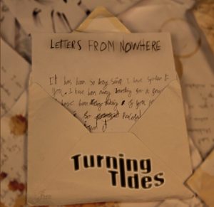
I am really happy with what we have done for the first draft of the digipak. I feel like there are improvements to be made but this can be made in drafts two and three. But it has been a good starting progress for what we can work up on and make better. Things that I especially like from it is the band names front/typeface that we have done using the graphics ideas and photoshop. I also really like the simplistic look of the back page and how the only thing on it is the letter which in theory tell a lot to the typical audience member. A third thing that I like about it is the just the layout and how the album is like a story of lots of letters. I didn’t know how good it would look when we planned it and the group took a bit of a risk but feel like it has worked out really well and the hopefully the audience get the same message. All this work helps build the star images brand and works along with the music video and soon the social media page to create a integrated advertising for the band as one big package. I look forward to working on the second and third draft and seeing the finishing product.
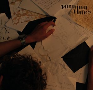
Evaluation of shoot or graphic design
From doing our photo shoot for the digipak the other day. We had clear plan of what we wanted out of the shoot and I feel like we were successful in this capturing this in shots we got. When taking the photos we really tried to take them so they have the real meaning of the digipak and look what some of the features that a typical digipak would have for the target genre and use these to inspire us for ideas. Hopefully this shoot has set us up well for making a start in the digipak in the next few days.


