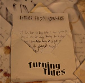
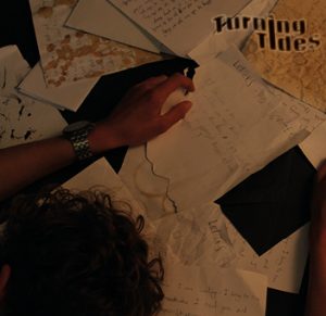
Digipak draft 3

Digipak draft 3

I am really happy with the final outcome of our digipak and I think the rest of the group are too. We managed to stick to the plan well and it has come out like we wanted it to. Along the way we changed a few of the ideas but the main covers are very similar to what we planned on the draw up sheet. It was also good to get feedback from some of my fellow piers and my teacher on what they liked about it and some things we could do to improve it. It wasn’t till we printed the covers off and put them into CD case we really got a idea of what it looked like and how all of the components worked together and made it look like a real digipak. Below is the final draft of the digipak… 

Click on the top image to view the full PDF of the covers

Survey

Once we had printed of the final product and put it in the CD cover we then conducted a survey where we showed some people the CD cover and asked them what genre they think it went under. We then wrote down the results from the survey and they are shown below.

In the survey we showed 14 people our digipak and asked them what genre they think its from the results were….

Rock – 6

Drill – 1

Indie – 4

Pop punk – 1

Indie Rock – 2

Finished digipak in CD cover – Front

Finished digipak in CD cover – Inside covers

Finished digipak in CD cover – Back page

Reflection

In conclusion, I and the rest of the group are really happy with the finished product of the digipak. We feel like we have promoted the message and story that we wanted to. We have been able to do this by using the typical conventions in the genre for things like the colours we used and font/typeface. Hopefully our target genre understand this, and the meaning behind it and each individual song. The survey we did was useful to do and gave us confidence in the work we had done. As the genre for the album and band is Indie rock we feel like the people we surveyed could see this. Although we only got two votes for Indie rock which was 14.28%. We managed to get six votes for Rock and another four for Indie which equates to 71.42 % of the votes. This tell us that the typical audience have a rough understanding on what genre we are trying to promote. I feel like this has also given a good image of the start image and band. Hopefully now we have started to build on this brand we can use it for future coursework like our social media page.

Digipak draft 2

Digipak draft 2

I am happy with the changes we have made between the first and second draft of digipak. I and the rest of the group think we have made good progress towards the finishing product with only a few small things to change and it will ready. Below is the second draft of the digipak. 

Click on the top image to view the full PDF of all of them

The main changes from the first draft
  1. We have moved the band name on the front cover to the center of the page
  2. We have changed the look of the band name. By adding some effects and using the colour palette to the font/typeface to give it a bit more pop.
  3. Not much has changed on the inside covers just a few small positing tweaks to the photos
  4. We have fixed the background of the back cover as there were two different types of black showing.
  5. The Album name has been put on each side of the back cover as this will fold to the sides of the CD cover.
Teacher feedback from draft 1

Things that we did well……
  1. Great concept
  2. Good Mise en scene
  3. Depth of field is good on the inside right bringing out the sharp focus and colours
  4. Brilliant photos and shots
Things that can be improved for the next draft…
  1. Reposition the ‘turning tides’ writing closer to the middle and enlarge
  2. Change the colour of the band name
  3. Make the track list easier to see. Maybe put a ring around each song ?
  4. Add a frame around the cover photo
  5. On the inside left have more of the star image in the picture to show how it is
  6. Add the spines on the back cover
  7. Sort the copyright and barcode on the back page
Reflection

Draft two has been very successful. The tweaks that we have done from the first draft in the graphic and colour palette hopefully show more of the typical conventions of a album in our style of genre. This means in terms of the Brand it is represented more through the star image/ band in the photos.

Digipack Draft 1

Digipack Draft 1

After our successful shoot last week we took are favourite shots and started to put together draft 1 of are digipak. We are happy with what progress we have made and know where improvements can made. We managed to stick to the original plan we set out to do. We did this by looking at our draft that we drew up. We decided to go for the second choice for the inside left cover as we felt like it suited genre and general vibes of the digipak as a whole.

Click on the top image to view the PDF of all of them

Draft 1 Self assessment

Once completing the first draft of the digipak. We had to self assesses are work by following a assessment criteria and giving ourself a grade at the end of it. My self assessment is in the slideshow bellow…. 

Things to improve for the next draft…
  1. Adjust the position of where the band names is on the front cover.
  2. Add the bar code and bands copyright info on the back cover.
  3. Sort out what we are going to do for side panels of the digipak.
  4. Maybe tweak the inside photos to get a better positioning.
  5. Slightly angel the back letter to add a less in order and straight effect.
Reflection

I am really happy with what we have done for the first draft of the digipak. I feel like there are improvements to be made but this can be made in drafts two and three. But it has been a good starting progress for what we can work up on and make better. Things that I especially like from it is the band names front/typeface that we have done using the graphics ideas and photoshop. I also really like the simplistic look of the back page and how the only thing on it is the letter which in theory tell a lot to the typical audience member. A third thing that I like about it is the just the layout and how the album is like a story of lots of letters. I didn’t know how good it would look when we planned it and the group took a bit of a risk but feel like it has worked out really well and the hopefully the audience get the same message. All this work helps build the star images brand and works along with the music video and soon the social media page to create a integrated advertising for the band as one big package. I look forward to working on the second and third draft and seeing the finishing product.


Evaluation of shoot or graphic design

Evaluation of shoot or graphic design

From doing our photo shoot for the digipak the other day. We had clear plan of what we wanted out of the shoot and I feel like we were successful in this capturing this in shots we got. When taking the photos we really tried to take them so they have the real meaning of the digipak and look what some of the features that a typical digipak would have for the target genre and use these to inspire us for ideas. Hopefully this shoot has set us up well for making a start in the digipak in the next few days.

Some of my personal favourite shots from the shoot are below..

Things that were successful from the shoot…
  1. We had a clear plan and knew what we wanted to do before the shoot which helped a lot
  2. We used a verity of distances, angles, lighting when taking the photos
  3. We managed to get some great depth of field shots for the what we think will be the inside covers
Things we could have done better….
  1. Got a few more shots of each cover side to have a bigger verity to choose from.
  2. In a few shots we could have had a bit more lighting to show the letters better
  3. In the shots of me on the floor we could have had a wider angle to show more of the star image


Contact Sheet

Contact Sheet for Digipak

The other day we did the photo shoot for the digipak. We had clear plan of what we wanted out of the shoot and I feel like we were successful in this capturing this in shots we got. We got a verity of distances, angles, lighting and layouts for each side of the covers. We really tried to use these things to show the real meaning of the digipak and have some of the features that a typical digipak would have for the target genre. This means we have lots to choose from when making up the drafts of the digipak.

Click on the image to view our full contact sheet from the shoot

Some of my favourite shots from the shoot are… 

When we planned the shoot we had a different idea for the inside left of someone grabbing the letters. When we did the shoot we tried the something different of me laying around the letter on the floor.

Our idea for the inside right of the digipak. This is where the CD will be.

A different angle of the inside right of the cover

This is the idea we have for the back cover of the digipak. Again it is a letter with all of the song names in bold. Most album covers have the songs on the back so used this idea and linked it in with the conventions

A different idea idea for the back cover. Instead of the simplistic look we have used some of the ideas for the inside covers for the back.

Our idea for the front cover of the digipak. A simple design with the album name as the title of the letter

Reflection

Overall upon reflection and chatting to the group we think that this is one of the most successful shoots we have done towards all of the course work. We believe this because we had such a precise  and detailed plan of what we were going to do during the shoot. We knew exactly what shots we needed as we had made the moc up of the digipak so it was just a matter of taking a few shots of each cover and then changing a few things like lighting and distance to get a good verity of them. Something we have learn’t from the shoots we have done in the past is its defiantly better to get more shots than it is to get too little shots and not having an enough to work with. As on previous shoots we hadn’t had as good of a plan and not know the exact shots we wanted meaning quite a lot of it was guess work and thats where things could normally go wrong. By having all of this information and experience it was a simple task of going to the black room taking the photos we wanted and downloading them onto the computer all in very little time. Now we have these photos and picked the favourites we can start working on the first draft of the digipak which we will do in the come days.

PMA For Digipak

Production meeting agenda for Digipak

Now that we have an idea for what the layout of the digipak is going to look like we can know plan when we are going to do the shoot for it. To do this we made a production meeting agenda with all the information on it. It included the shoot list, where we are going to do it, props we might need and the equipment needed. We decided we are going to do the shoot at school so we do not need to make a risk assessment for this.

Below is the production meeting agenda sheet. 


The production meeting agenda sheet. Click on the image to view the full document.

Reflection

This task was useful to do as it we have now our planned the shoot. We as a group now know what we have to do in order for it to be successful and the shots we need for the covers of the digipak. It has given us a better understanding who’s going to do what to get ready for it and will use it to look back on when actually doing the shoot.


DP mockup

Digipak mockup

The task was for us as a group to draw up what we wanted are digipak to be with all of the conventions in it. We all had lots of ideas so it was hard to work out what was the better one to go with which also worked with are genre. In the end we all agreed on an idea we liked and put it onto the paper.

This is the layout of our digipak. It is following the style of the album name ‘letters from nowhere’

Reflection

For are digipak the design is all based around the album name we have come up with of ‘letters from nowhere’. We see it as each song is a letter and each one tells a story which all links to a narrative of the album. We hope that this idea is obvious from the layout of it and gives an understanding of who the band and star image is. From doing the research on other types of digipaks a typical repertoire of elements in the genre we noticed is that lots have a minimalistic look to them with very simple plain designs too them. The groups idea was originally to try and copy this for our digipak. But once we came up the album name we preferred to try and base the layout on that. I feel that it still does have some aspects of this in the front and back covers of it. We can also adjust some of the layout if we want later on if we don’t things look right.


Digipak Conventions Analysis

Digipak Conventions Analysis

In this task the group each had to find an album from are genre and annotated it looking at the layout of it, some of the themes that are used and could be used in most styles for the genre and the techniques the band has used to draw the reader in to buying it.

Reflection

From doing this task it has widened my understanding of digipaks. I especially highlighted on from this one about how they are made, what the formal key elements that are in every digpak like the track list and barcode, how they are specially made for the target audience to buy and listen too, what message the band is trying to convey to the audience through it and what the generic features are that are in more digipks for that genre like having a simple design too them. This has given me a better understanding and made me  realised what we need to put in the groups one in order to hit these targets and it too be successful and the represent what are band is.

The Look Book – the package

The Look Book - the package

From the task we did on our bands mission statements and aims we now had to take some of this information and the ideas we had come up with to make a mood board. This was a selection of the ideas, inspirations, styles, fonts, images and colours that could work well for our digipak and social media page.

Below is our mood board…

Made with Padlet
Reflection

This task was good to do as the group got to put some of our ideas together and looked at what the competition is. Something we noticed when collecting  information was a repertoire of elements in that lots of bands in the genre we are looking at have simple album cover with bold simple colours and a creative design to it. Another thing we noticed from the social media pages is how important it is to advertise information to the target audience in order for them to invest in the bands mechanise and tours. All of this collecting of information is good work towards building the band and the brand around it.

Our Mission Statement – The Package Brand

Our Mission Statement - The Package Brand
Introduction

Now we have finished are music video we now need start planning for a digipak and social media page. In this task we had to find out who are typical audience member would be, how does the audience engage with the band, who is the bands competition is, why is our band special and what is so unique about them and write a 50 word mission statement to sum up the band. We have gathered all of this information and put it into the slide show below.

Reflection

This was great way to gather some ideas as a group on what we are wanting and what we are looking for in our digipak and social media page. We now know what the typical audience member is like and also what competition we are up against when when promoting this new band to the consumers. This was a good task to do as it prepared us for the following task we are going to do and lets us as a group start to talk about what ideas each person is think of doing for both the social media page and digipak. We now have looked a lot more into the genre of our band and how other artists promote this in certain ways to click with their audiences in order for them to engage with they brand.