Category Archives: Digipak

DP DRAFT 2

This our draft 2 of the digipak:

The following are the targets to be changed:

  • Change the way the sea is utilised on the inside, or keep it the same and make it the primary source of atmosphere.
  • Emphasis on the design choice.
  • Increase the size of the artist and include some more editing (filters).
  • Change the order of the lyrics and make them more equal.
  • Increase the depth of the background by a factor of two.


DP DRAFT 3

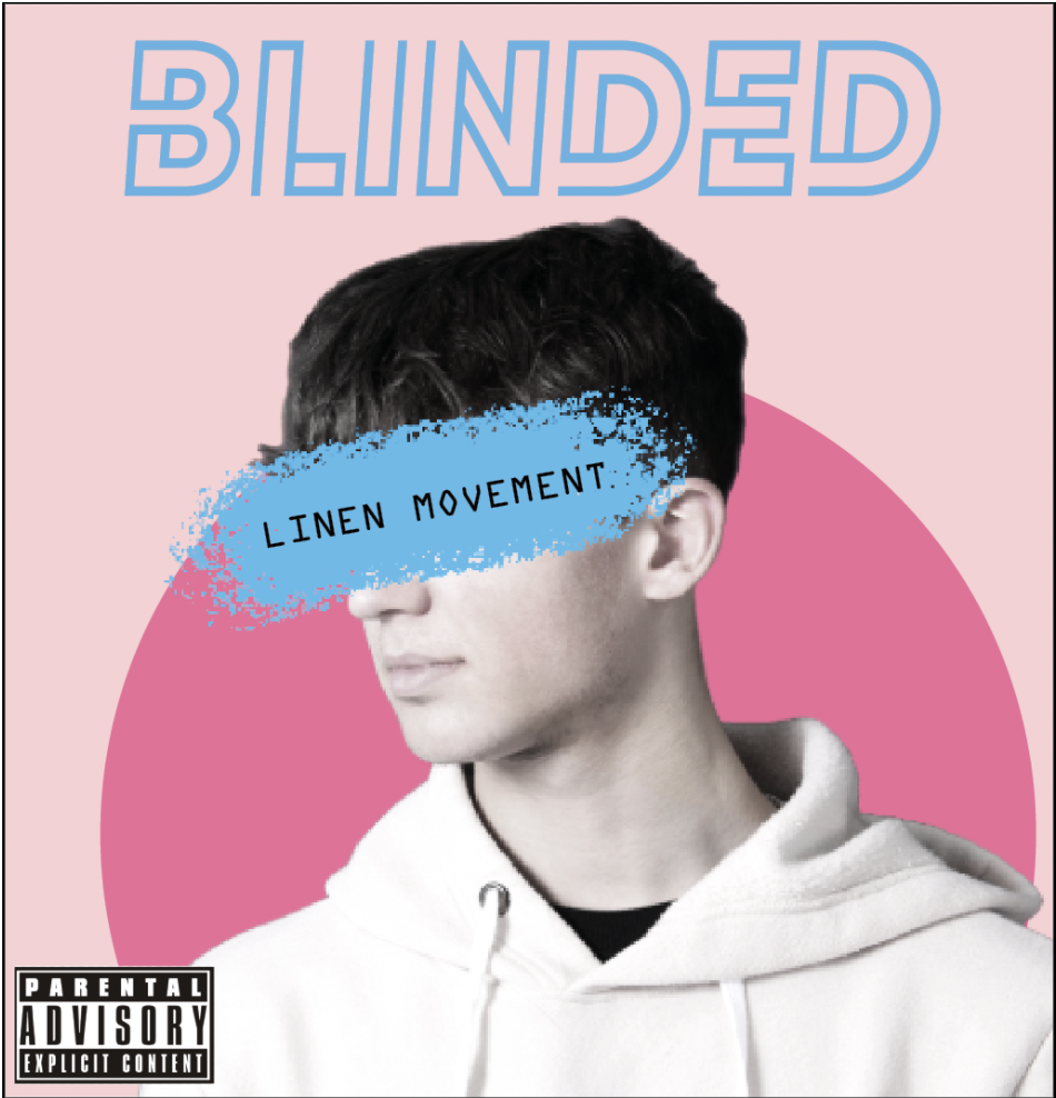
Here is our third draft for the digipak:

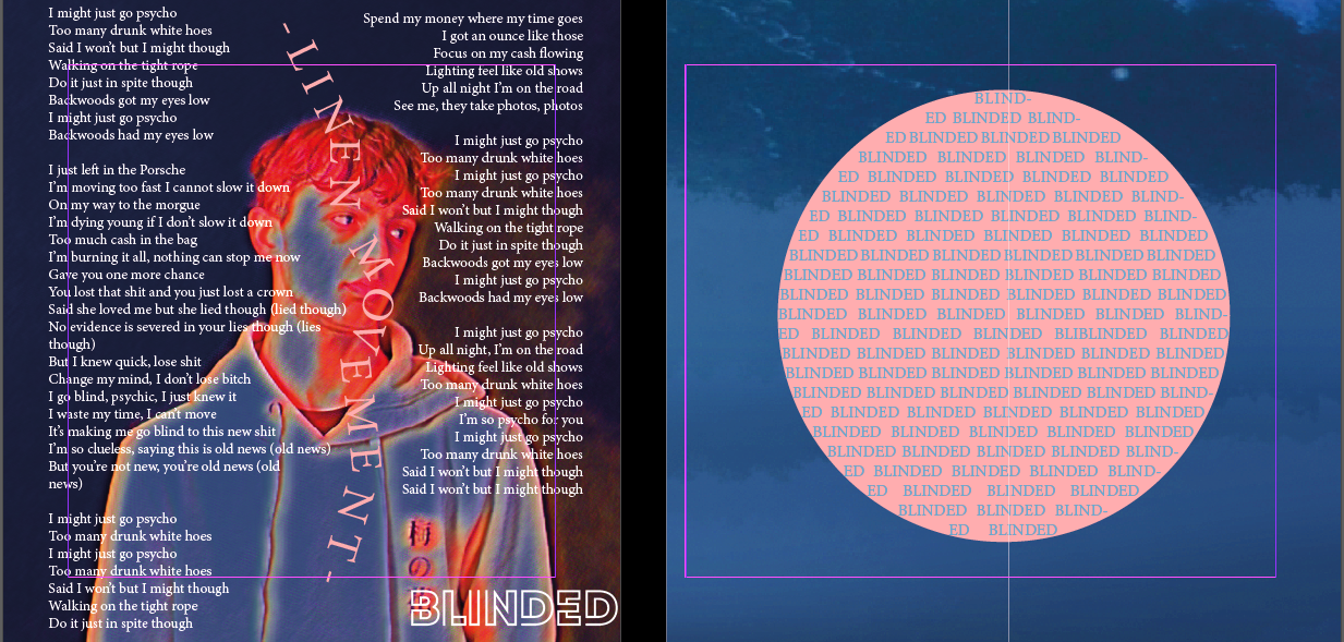
In draft 3, we changed the inner circle, wrote the name of the album again and made a pink circle around it. After that, we took a poll to see if our digipaks were in line with the genre we had chosen. In addition the two inner panes of the digipak by adding a picture behind the lyrics. This makes the inside of the digipak more interesting and makes it more visually appealing. We showed our classmates a lot of different types of music and then asked them to figure out which one our digipak belonged to.

Here is the result of a survey done on our digipak and what genre people think its from:

Using genre conventions and connotations to our advantage clearly proves that we selected the suitable genre for our album and that the audience can know which genre our album belongs to just by glancing at the front cover of the record. Our digipak was seen as a blend of hip-hop/emotional rap (our genre) (11 votes) and pop (9 votes), with indie music, alternative rock, and folk each gaining one vote.

Digipak Key Coventions

Here is an album cover from our type of music, so you can see how it looks.

In our genre of emotional rap, the album covers are usually very simple. They can be cheap (eg. people just stand on the street and get a picture) or very expensive (eg. drawings of the artist or images like the one below).

In fact, this cover is very well-known. The album is so big that the cover designers didn’t even need to put anything on it that said who the artist was or what the album was called because everyone in the target audience can recognize it right away.

DP – FIRST DRAFT

In comparison to our mockup, this is my group’s first draft of our digipak. We’ve made a lot of changes since then, such as changing the colour palette and overall layout of the panels, and we’ve also added a designed inside panel that adheres to the design conventions found in many albums of this genre.

SELF ASSESSMENT REGARDING TO THE CRITERIA

  • When we converted the image to black and white, we utilized the camera and lighting to produce some harsh shadows on the artist, which added texture and depth to the image when it was converted to colour. We utilized the brush tool in photoshop to create the stroke across the artist’s eyes in order to give some excitement to the cover and to differentiate it from just being a shot of the artist standing.
  • We could have done a better job with the Mise en scene since the artist was wearing a plethora of diamonds around his neck, which you couldn’t see in the shot. However, the artist’s clothing, consisting of a hoodie and a tee-shirt, is extremely traditional for the genre.
  • We utilized digital text processing (DTP) to add the text to the digipak; first, we picked a retro-looking font to use for the album’s primary title, and then we added the rest of the text. This made it possible for the colour palette and typography to blend together and give the digipak a nostalgic appearance. We decided on a sans serif font in order to produce a contemporary and boxy style that would contrast with the old lettering on the title and other elements.

Targets for improvement:

  • To make the front cover more fascinating and eye-catching, alter the copyright name to LINEN MOVEMENT instead of WIKINS
  • add some more interesting texture to the front cover to make it more intriguing and eye-catching.
  • increase the usage of Photoshop and the amount of time spent on alteration and depth

DP – CONTACT SHEET

For our digipak shoot, we concentrated on capturing the winning photo for our star image and branding; however, because we had a limited amount of time (10 minutes) due to the fact that other groups were waiting outside the studio, we rushed the process, which resulted in fewer images than we had anticipated or preferred. Nonetheless, we obtained some excellent shots that will be used in our digipak design; however, a reshoot may be required.

DP – MOCK UP

This is the first mock-up of our digipak that my group has created. The design is fairly basic, and it could need a great deal of development in terms of general conventions and so on. It is the fundamental concept that the artist is placed front and center on the front panel in front of some type of brightly colored backdrop. The tracks are housed  with a little designs on the rear panel, which is all that is there. Using information gathered from our genre’s artists and what their album designs were intended to mirror, we created this rough mock up of what we believe our digipak and artist would look like. It represents all of the requisite norms found in the genre.

FRONT:


BACK:

MY MISSION STATEMENT

This is my group’s mission statement and marketing techniques and music video. The importance of a marketing strategy is that the producers can focus the product on what they want the end product to look like and to what effect is it going the promote/ advertise to the appropriate audience as wells as how effective will the product be at making money back to the produce. Therefore the mission statement is important as it sets a baseline of what they want to happen on shoots with MES and other key components.

LOOK BOOK

This is our look book for our music videos album cover designs. This will help inspire us in making an effective and informative designed album cover.  We want our audience to buy this album because they like the genre of music we are making to do this a key component is the design of advertisements and the product itself. Furthermore, it helps us define the use of elements that work to promote this genre of music i.g bold colours, big words, captivating images, fitting backgrounds and above all it works with the music in the album for example a lot of the music from Kendrick Lamar’s DAMN features many down to earth and realistic song that talk about past experiences and life lessons learnt by Lamar.

Made with Padlet