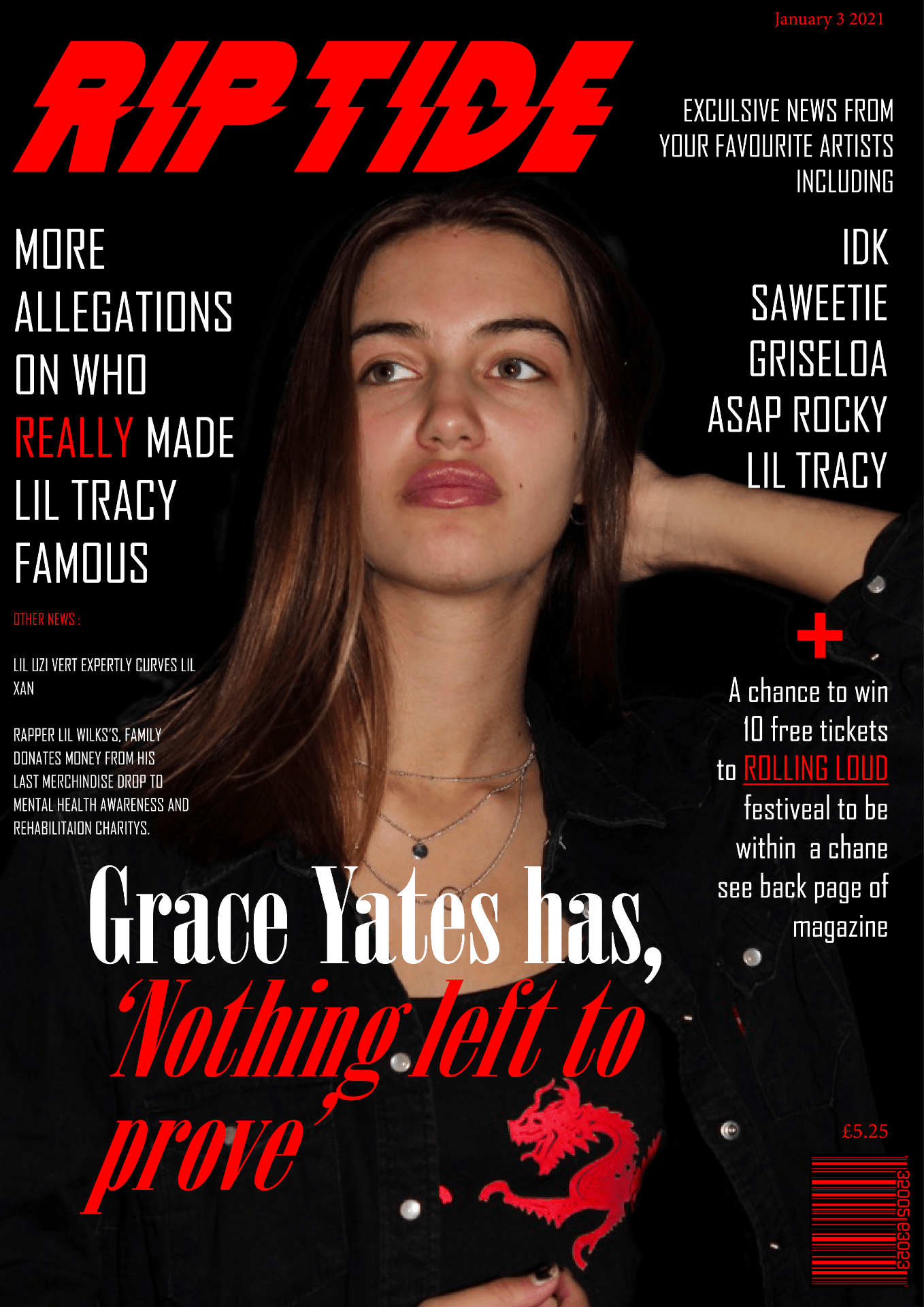
Category Archives: Music Magazine

The Brief Component 1/2

Component Brief 2:

A promotion package for the release of an album, to include a music video (major task), together with a
website for the band and a digipak for the album’s release (minor tasks).

Component brief 1 :

This is the finished product of my music magazine with the flip stack. after listening to my peer teachers peer assessment in screencasting I have amended the issues brought up and changed the placement of some of the text and images to fit the page better.

Front cover:

Contents page:

Double page spread and article:


Flip stack pf complete magazine:


Advertisment

Bose "Space Out"|adRuby.com

I have chosen this advert for the Bose headphones for my music magazine as they relate well to the magazine I have learned this by studying multiple demographic conclusions of this genres audience. Furthermore, the audience that of which the youthful music genre have chosen will be able to relate well to this product as they often listen to music and hold it close to their personality as well as interests. It will offer them of way to express themselves through music whilst listening to their favourite album using a premium product designed for the best sound. Below I have added a screenshot of demographic graphs that prove my theory about the interests of the audience.

East Coasters, Get Pumped for Charlotte's Breakaway Music Festival! – The Charlotte Sessions


For my second advert, I have chosen a music festival advert from a magazine. It would be a good idea to involve a means of self-promotion for another festival/concert as the audience that is in my chosen genre often go to a concert of their favourite artist whenever they get a chance. Therefore giving the consumer more information about big events or concerts will be considered very help full and could help promote the magazine as a billboard to get the riptide name around.


DRAFT OF COMPLETE MAGAZINE

What’s new:

I changed the position and size of the masthead as well as the size and grammar in the cover line.

Most of the design of this draft is the same as the last draft apart from the peer assessment tasks which were mainly resizing.

What’s new:

For this draft of my contents page, the music magazine I changed the top image from an image I found on the internet to my own and photoshopped it to fit in with the colour pallet.

I also highlighted the keywords in the contents headings to make it more eye-catching for the audience as well as making it easier to read.

Furthermore, I added the page number making it more like a real magazine.
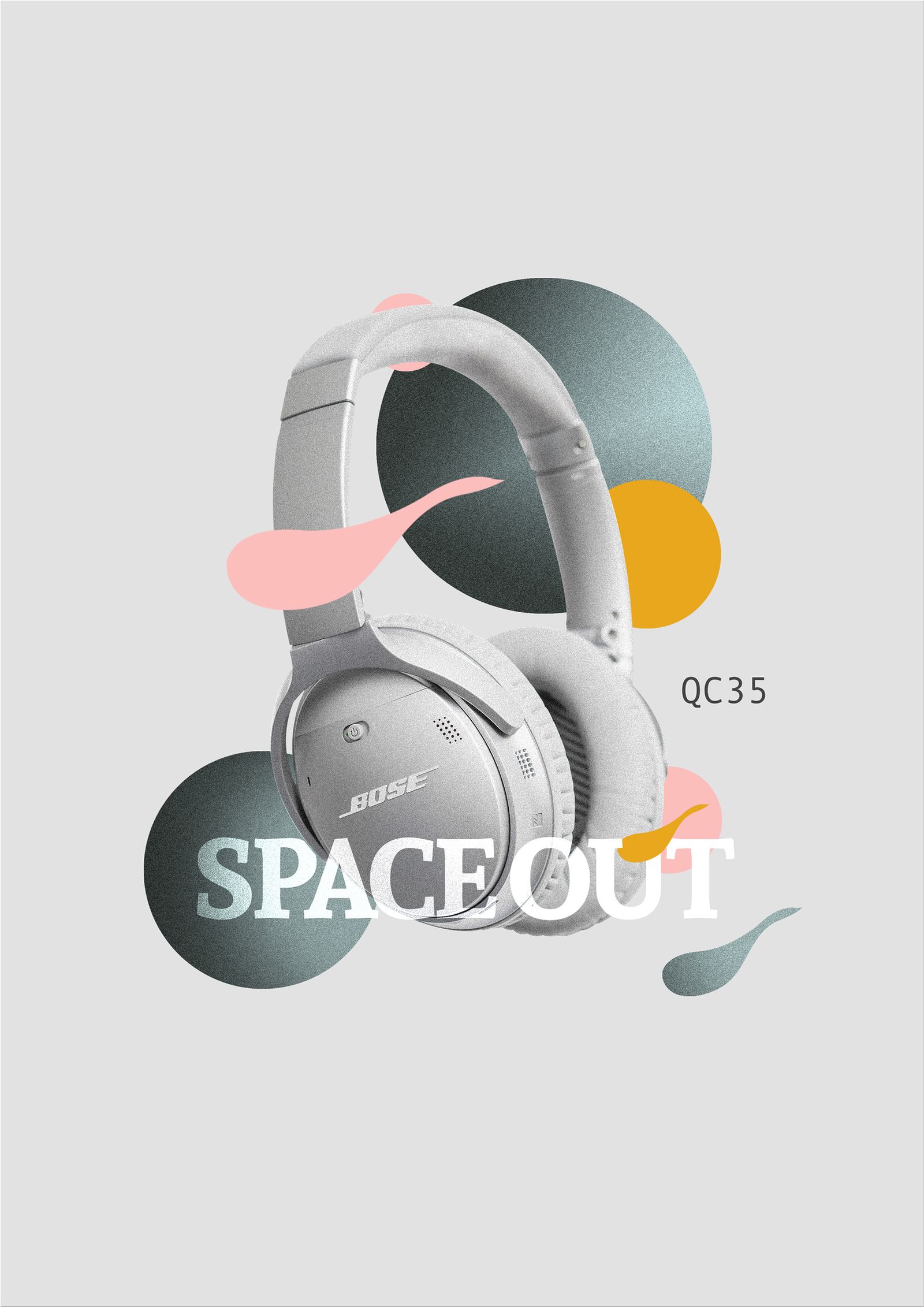
What’s new:

move the right image around and moved the article paragraphs more to the right and fixed to the subheading to fit the page better.

proofread the final article and changed the story around a bit, also added the masthead at the bottom of the first page ‘ grace reflects on tragedy to give more context the article.


Screen castify peer assessment:

Looks good and is mostly finished just need to tweak the layout of the pages to make it more appealing to the audience changed some of the grammar and where the subheading and title around the page/ made bigger.  Good pictures. tweaked the contents page to make it even and make fonts bigger ad remove the page in the page number from the last draft.  make the number match up and give more contested about the DPS article in other parts of the magazine.  Move images around to make fit on the page better/ don’t leave empty spaces.

Screen castify link:

https://mail.google.com/mail/u/0/?tab=rm&ogbl#search/screen+castify/FMfcgxwKkRLkdSDhSFMWCXvPQjtMTbzh?projector=1


CONTENT PAGE DRAFT 3

This is my 3rd content page draft after changing the previous draft to suit better the the intentions of advertising thought previous peer assessments.

WHATS NEW:

I change the # and the masthead around to make more appalling to the audience.

I added her name and who took the image to the bottom right side on the page for reference.

I changed the front of the number to standout more as well as fit the page design.

Lastly I changed the grammar an most of the contents titles as they there didn’t make sense or were to long for the boxes even/


Peer assessment:


DRAFT 2nd OF FRONT COVER MUSIC MAGAZINE

Here is my second draft for my music magazine front cover based around emo rap. below I have include a peer assessment of this draft so that i can improve the product further. As well as what I did differently to this draft.

what is different:

  • I photoshopped her eye lips and design on her shirt to give the image more depth and represent her bolder than before.
  • I changed the Masthead size and font to make it stand out more as well as making it more eye catching to the consumer.
  • As well as adding more content such as pugs.

peer as

mast head bigger

main cover line should be Grace yates has ‘nothing left to prove’ and look at line spacing and perhaps a different font for Grace yates

one more cover line under the famous one

make the 3 on the right hand side make sense

issue and price etc.

make the skin tone slightly less flushed?

make her bigger

CONTENTS PAGE DRAFT 2

What’s new:

Over all most of the design has changed since the last draft. this incudes most of the text in the contents box:

  • The image
  • The fonts
  • The color palette
  • The overall design


PEER ASSESMENT:

  • PROOF FOR TYPOS…THING OR THINGS?  SUCCESS, THING, EAST COAST,YEAR FREE? CONCERTS
  • WATCH THE BANNER SYNTAX AND SENSE
  • OWN IMAGE AT THE TOP?
  • WHO IS SHE? CAPTION HER?
  • MAKE THE NUMBERS A DIFFERENT FONT AND LARGER
  • WATCH THE LINE SPACING IN THE COVER LINES…WHY NOT HAVE A HEADLINE AND THEN THE DETAIL..DIFFERENT COLOUR
  • SWAP RIPTIDE AND CONTENTS AROUND….REMEMBER THAT THE MASTHEAD SHOULD REMAIN CONSTANT…

DPS DRAFT 2

Here is my second DPS for my music magazine based around the m rap genre with a article written by me. Using the peer assessment give to me last draft is made the design better and more eye catching for the audience. Below I have include and third peer assessment for me to us on my next DPS draft, in order for me to make the product the best it can be.

Peer assessment:

  • make her larger
  • could you add a quote on his or her picture?
  • the drop capital is where the article starts as your stand first i.e. your opening para needs to be in a larger and bolder font, then you get the drop capital
  • separate the byline from the caption in the inset
  • page 6 in red too?
  • pull the copy away from the edge of the black column
  • why not justify the copy right and left
  • still not convinced by the wider column of copy at the bottom


DPS DRAFT 1

Above I have added my first double page spread draft. for my music magazine based around emo rap with my article written in. I asked one of my peers to give me feed back in order for me to make second draft and use the points brought up by my peer.

  • Make her bigger and manipulate in photoshop – more contrast
  • stand first in bigger font and bolder
  • then a drop capital for where the article starts
  • wouldn’t normally say Page…just the number
  • not sure about Rosen….too blurry…make it extra blurrywind in photoshop? and move him higher as wasted space at the top…perhaps sharpen the name Rosen to stand out?
  • anchor the main image…who is she?
  • byline – who wrote it and who did the photography?


Language Analysis – Music Magazine

Language analysis for my music magazine.

Reference Wyclef Jean’s 10 tips on life article published in (September 2017).

Click on the pages to few articale full screen:

Structure:

  • The article is written in a shore hand style and has an interview layout with proof that it is about his ten tips/commandments.
    It is divided into ten parts, each with a sentence and a number as the subheading (e.g. 1,2, etc.), making it simple for readers to navigate and understand. ‘Money isn’t anything,’ for example, and ‘know when to move on’ are two subheadings that entice and make you want to learn more.
  • ‘3- music will literally change your life!’ is an example of his subheading comment. It’s interesting because each part is written from his perspective, but he didn’t write it, so this could be considered an interview.
  • There are also plugs in the centre. Regarding song reviews, have central images that break up the text and attract the reader’s attention.
  • The magazine’s overall design is simple: white and black, with red used purposefully in places like the picture and pugs in the middle, and the arrows pointing to the names.

Presence of journalist:

  • Mode of address – it’s curious because the writer wrote a segment in the first person from the perspective of the celebrity, but the star obviously didn’t write the post, so it could be classified as an interview.
  • The journals/writers may have done this to strengthen the connection between the readers and the celebrity; it gives them the impression that they are personally interested in the discussion rather than through a third party. While the author cites some of the artists’ direct responses, he continues to write as if he were the artist.
  • He has no real presence in the text itself, aside from his name in the magazine’s corner, in the credits.

AIDA

  • Attract: The intriguing picture of the star in this article can entice the reader. He dresses in every day and/or smart casual clothes that are appropriate for his bold declaration that he knows what makes a true gentleman. The reader is still drawn in, but the font used, as well as the fact that it is bolded, plays an important role in making it stand out.
  • Interest:
  • Desire:
  • Action: