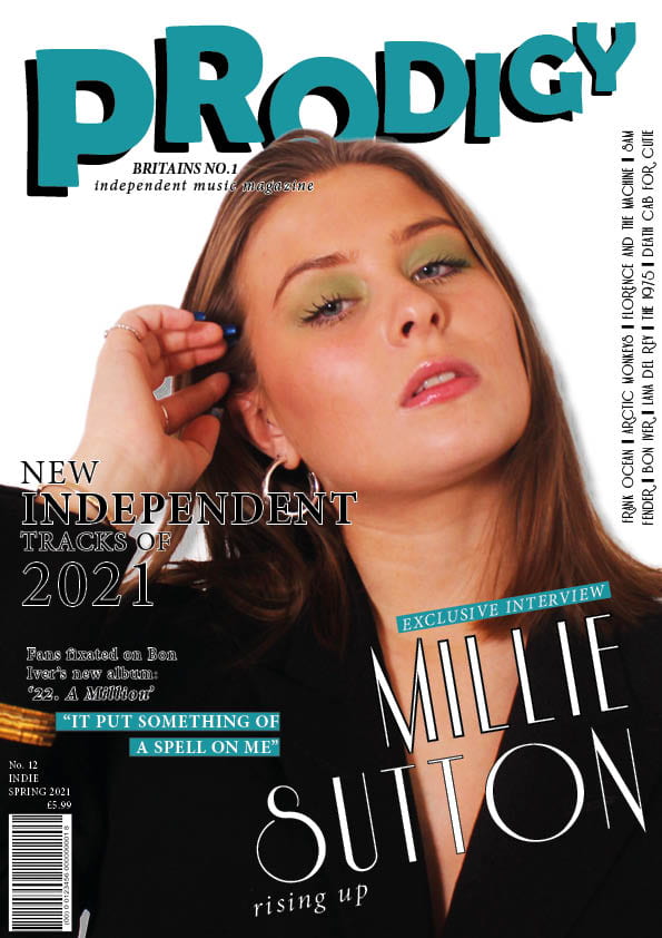
After reviewing my targets for my front cover, I have changed my draft to make it even more conventional and appropriate for my target audience.
Click on image to view PDF
What’s new?
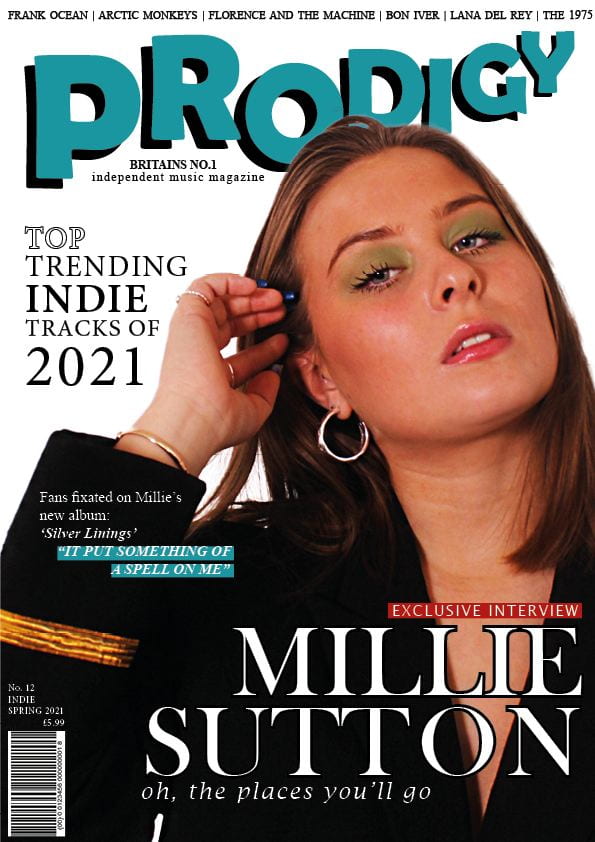
I have made numerous changes to this design. I started with focusing on my seven targets that I thought would be good to aim for when completing my first draft. Firstly I made the face brighter to accentuate the facial features. I did this in Photoshop using the dodge tool. This allowed the model to stand out on the page more prominently. After this I decided to have the cover stars name bigger and bolder. I thought for it to stand out as much as I wanted to, I had to place it horizontal rather than diagonal. This will now catch the readers attention much faster. In addition to this, the cover lines on my first draft were difficult to read, therefore meaning that my target audience could reject my issue. I simply fixed this by:
- Adapting the main cover line so that it wraps around the model without it overlapping. I changed the word ‘independent’ to ‘indie’ in order to do this. By doing this. it has made it much more attractive and less crowded for my target audience to read.
- Changing the small cover line from a white font with black outline, to a basic white font. This immediately made the writing stand out more on the page.
Another thing that I changed was the placement of the artists names. They were originally vertical on the right hand side of the page and I eventually saw this as an issue because the reader would have to turn the magazine in order to read what it said. I also think it took up unnecessary space that I could use to make my image bigger. I have now placed and fitted it at the top of my cover. This way you can read it with ease and takes the form of a plug and doesn’t look out of place. A small difference that I made was changing the Bon Iver cover line to making it about Millie instead. I think this makes the cover fit together much better. Furthermore, I also changed the cover line underneath ‘Millie Sutton’ from ‘rising up’ to ‘oh, the places you’ll go’. I think that this slogan-type headline is much better associated with the article that goes with it. I also think it will attract a wider audience because it’s written in a way that almost talks to/is aimed at the reader. As well as acting on my targets I also did a couple of other things that I didn’t mention in my aims. I made the ‘exclusive interview’ text box red so that it would more urgently catch the readers attention as red is a colour that people are generally drawn to. Finally I made the word ‘top’ white with a black outline. This made the word stand out more on the page and the language that I have used will hopefully make the audience want to pick up and continue reading my magazine.
What’s next?
- Create a drop shadow on the cover star – give her some depth
- Make cover star less orange in Photoshop – will match rest of magazine better
- Add in some pugs – competitions etc
- Include insets – fill the page more
- another smaller banner centred at the bottom?
- two coverlines about her…make her the main coverline but change the other one to another artist as it is lacking reference to what else is in the magazine…choose one of the coverlines from the Contents page to hook it to
- Regulate the line spacing of the main Top Tracks coverline
- Bit of red at the top somewhere?