Digipak Draft 3

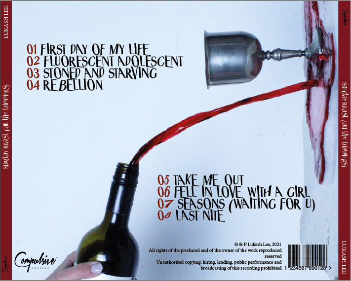
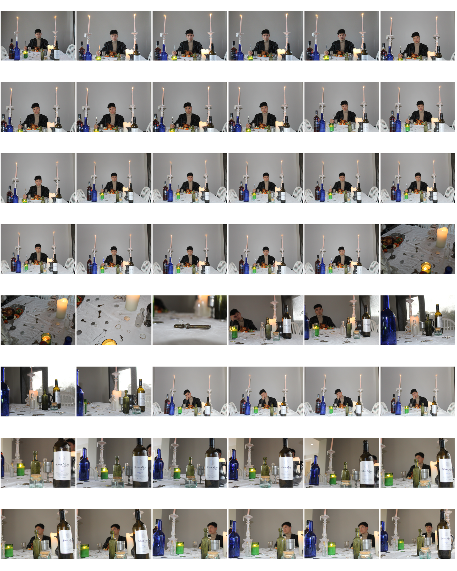
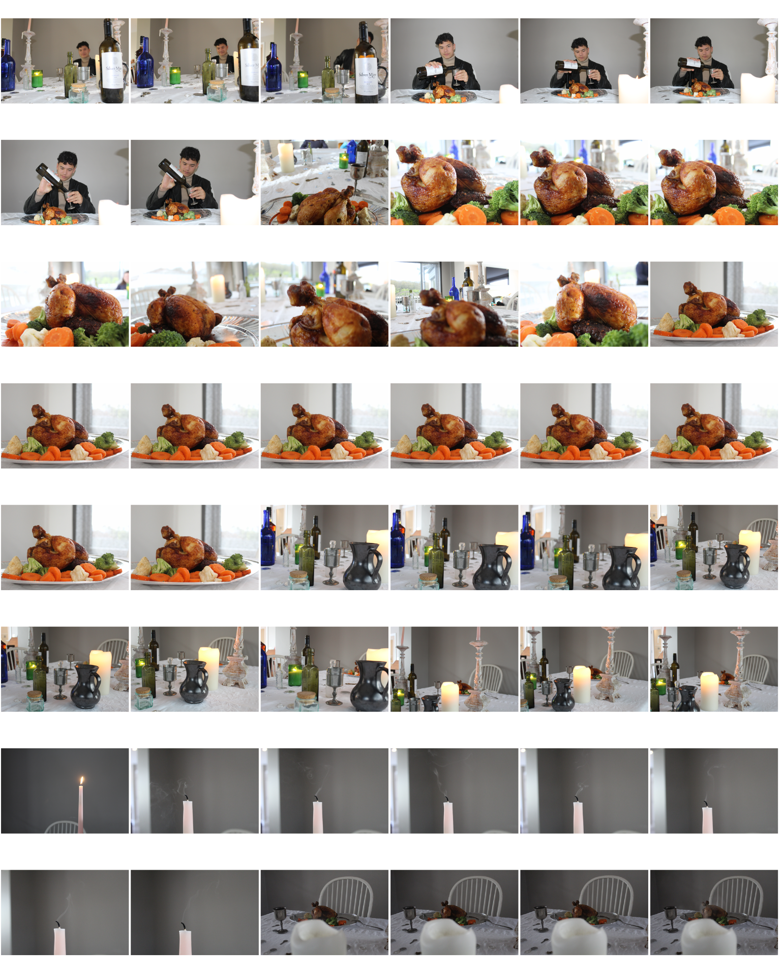
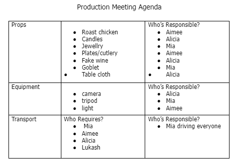
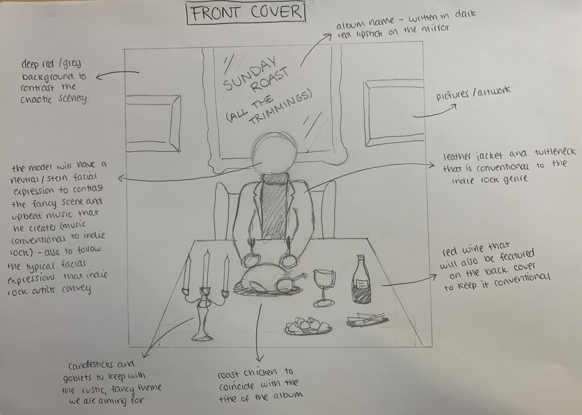
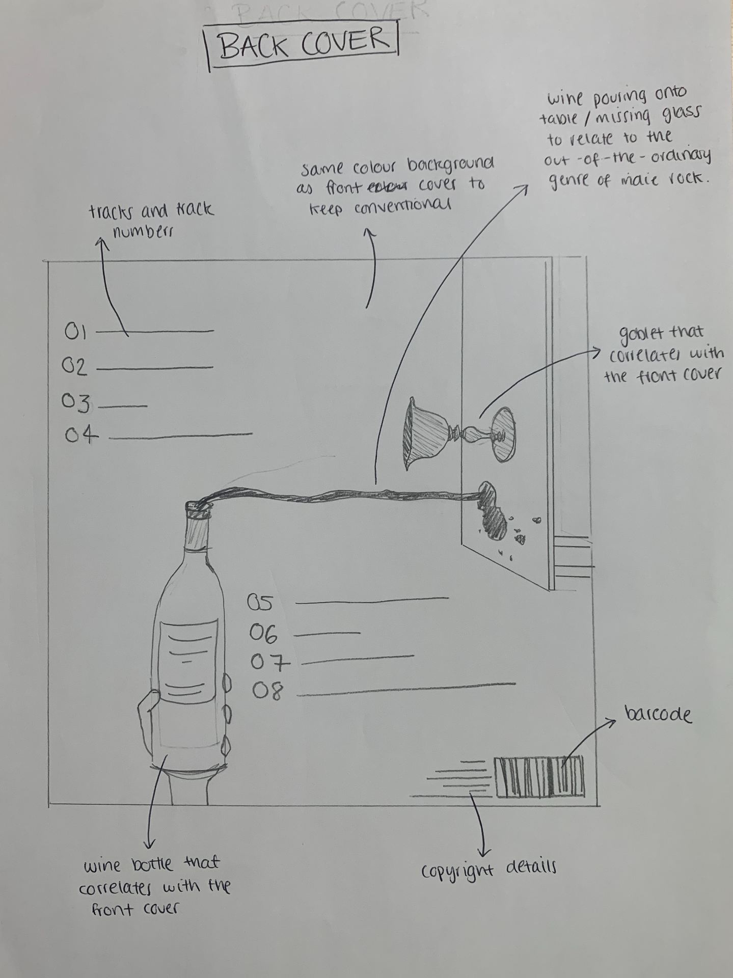
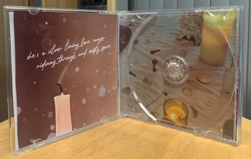
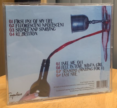
Below is our draft 3 of our digipak. We have printed it out and inserted it into a plastic album case which gives us more of an indication as to what it would look like if it were a real, published DP, and how our consumers would view it.

Peer feedback:

We got our media classes to look at our digipak and decide from various music genres, which they think our DP most resembles. From this we are able to establish whether we have achieved the conventions of our music genre, or whether we have strayed and influenced our peers to think its a different genre to indie rock.

Indie pop – //// (4)

Pop – ////////// (10)

Hip-hop melodic/emotional rap – ////// (6)

Indie rock – ///// (5)

Rock – (0)

Folk – / (1)

Alternative rock – (0)

From this peer feedback it is evident that some changes need to be made so that it is more obvious as to what genre our DP is. We believe that the DP has little-to-no conventions of a pop album so are unsure why this has been the most popular choice. However, I can understand why peers may have chosen the hip-hop melodic/emotional rap. The opulent mise en scene that we have included may steer people to think its an upper class rapper playing with their wealth and creating unique scenes. It is clear that we have not made the DP clear for our consumers in regards to our audiences demographics as indie rock was the third lowest genre opinion.

Digipak Draft 2

Below is the 4 panels of our Digipak draft 2 album. We have considered the various technical conventions such as; the colour palette, typeface and conventional composition and framing associated with the indie rock genre.

We have completed our draft 2 for our digipak and below is a Screencastify from our teacher consisting of feedback for our next draft.

Targets for improvement – Screencastify

  • Include more of the table on the front cover image  –  have the candles at the top
  • ‘Sunday Roast all the trimmings’ as a track on the back cover 
  • Make the red on the back more distinctive – make it more blood coloured
  • Reposition inside right so that there is more of the chicken visible
  • Sharpen the trinkets on the table 
  • Straighten the left candle on the front cover
  • Add a shine to the goblet 

Digipak Draft 1

Below I have inserted the front and back cover of what we have completed for our digipak draft 1. I have additionally self assessed this work against the assessment criteria – helping me to understand whether our DP star image included the correct conventional and technical elements. From this I can then see if what improvements need to be made for draft 2.

Below I have self assessed our digipak draft 2 and this close analysis will significantly help me and our group when it comes to completing the draft 3.

Targets for improvement:

  • Change the typeface/positioning of the artists name on the front cover so that it is more easily recognisable and clearer for the audience to read
  • Straighten the left candle on the front cover so that it does not disrupt the cover by drawing attention to it rather than the star themselves
  • Play around with the colour layers on the front so that it has more correlation to the back cover – making it more of a ‘package’ DP rather than two individual items
  • Placement/colour of the album name? May need to be readjusted
  • Add in some deep reds to the front cover so that it matches the back cover
  • Create more line-spacing between the tracks on the back cover so that it is easier for the audience to read

Contact Sheet

Below are the contact sheets that I have created from the images that we took for our digipak. We carried out two shoots – one for the front cover, and inside right and left that we took at Aimee’s house, and one for the back cover that we shot in the white studio at school.

These two shoots that can be seen above were very successful and we had numerous shots to choose from that we thought fitted the conventions of our genre and star image. Some of the shots in both shoots have got a very low exposure, so these are our anomalies and we are not planning on using them in our album.

Shoot one was specifically for the front cover of the album however we were able to utilise this shoot for both the inside left and inside right also. This shoot was successful because we were very organised and worked together to ensure that the positioning and framing of each prop was accurate. Our model was also cooperative so this made sure that we could communicate the correct mise en scene and ‘vibe’ to our audience through his body language and facial expressions. As seen in the images, we tried to make the roast chicken the focus of the shoot – alongside our artist – as it has a direct reference to the title of our album. The lighting for this shoot was already brilliant for what we wanted to achieve however we may need to use some photo manipulation techniques in order to make the colour palette even more conventional to our genre.

Our second shoot was purely for the back cover of our album. This was another successful shoot as it mainly consisted of props and we were fully prepared with these. We tried hard to get the correct lighting, so much so that the ‘wine’ was the focus of the photographs, but again photo manipulation will have to be used so that it matches the same colour palette as the front cover. Additionally, it was necessary to set the shutter speed on the camera to much faster than usual so that we could capture the ‘wine’ while it was in full flow. This is important for our album as it heightens the quality of our overall product massively.

Production Meeting Agenda and Risk Assessment

Below is a production meeting agenda to specifically lay out what our group needs to remember to bring to our photoshoot. By putting this information into a table, ensures that we are organised – which is the most important aspect of carrying out a shoot such as this.

In addition to the PMA we have created and signed off a risk assessment so that we are aware of any potential hazards that could occur at our location on the day of our shoot. It is mainly the props that could pose risks to us so it is necessary that we are careful with how we handle them.

DP Mockup

As a group we created a slideshow including a photographic mockup, colour schemes that we are looking to use as well as an explanation of what we want to name our album, and what we want to achieve on the front and back. In addition to this we have drawn exactly what we are planning on creating for our Digipak album. On the front cover, we want to convey our star image as someone who is controlled, yet unique. On the back of the album our star image will be communicated to the audience as someone who is anarchic and extraordinary. The wine being poured and missing the glass indicates the out-of-the-ordinary genre of indie rock.

This will all be achieved by using a repertoire of elements as well as considering the various conventions of indie rock – the anarchic, extraordinary, engaging themes that it communicates. By carrying out these conventions we will successfully attract our unique selling point to support their preferred readings, and ensure that our audience does not reject the text. We will have to encode the genre to such an extent that our target audience decodes the narrative in the way that we are looking for. We have a good understanding of what an indie rock album conventionally includes and due to this, our album should draw in the correct audience and be accepted.


Digipak Conventions Analysis

For this task I needed to explore how digipaks are designed to work as part of a multimedia package to support the launch of a new album. To analyse media like this you have to look into the blueprints of the album and thoroughly underline the denotations and connotations of the album. Below I have decoded an album cover (front and back) to get a deeper understanding of the technical conventions that are included in this form of integrated advertising.


As we are coming up to creating our own digipaks this task will help me massively in understanding the technical conventions of an alternative indie rock album. These conventions, or stray from conventions for some artists, help to represent the star image of the artist and reflect on their genre. We need to fully acknowledge who and what our star image is all about so that we can create a digipak that conveys the correct artist portrayal to our target audience consumers.

Look Book – The Package

Below is a mood board made on Padlet of styles, colours and graphics that are relevant to our star image and indie rock genre. We noticed that the repertoire of elements are conventional and convey the indie rock genre that we are trying to communicate. We have found images to inspire us from social media sites, album covers and tour posters, and analysed them in detail – showing what they communicate and how they represent the audience and the band/artist themselves. We have found out that all artists and bands use various integrated advertising techniques such as; DVDs, records and merchandise, to sell their star image to the widest audience. We can use these techniques in our digipak to get out brand to our target audience more clearly and efficiently.

Made with Padlet


Our Mission Statement – The Package Brand

Below is our PowerPoint for our mission statement and marketing strategy. We have considered who are audience are, the call to action, who our competition are, the USP and our mission statement. This is so that we got a better understanding of what our audience are likely to enjoy, and therefore our branding. We want to ensure that they do not reject the text that we create.

This developed knowledge of our audience and our music genre will make it so that we can produce the best form of integrated advertising for our consumers, and promote it across numerous platforms. We have also deepened our comprehension of our star image – we now know how to portray him to our target audience and entice our consumers more thoroughly via our digipak and social media page.