Print Production- Draft 2 Feedback/Targets
After creating draft 2 for my digi-pak and advert, I got feedback from other media students in a variety of ways.
Digi-Pak.
I created some vines, click below to view them:
‘Your shots are well composted and they all create a good sense mise-en-scene.’
Here is the process of collecting feedback through camera recording, vines and the feedback sheets, it briefly shows the media product too.
‘I really like the use of colours.’
I asked the audience what they thought the genre of our digi-pak might be to see if what we had created using the conventions of the Indie genre would be recognized by the audience.
Other media students looked at the digi-pak and gave us feedback on what they liked and disliked.
‘I like the font.’
From my recorded feedback, I got feedback on both my advert and my digi-pak.
For the advert, the star is positioned well. The title colour are the same as the daisies so it ties in and with the hit single of Wings appearing on it reflects our music video and ties all three media products together. The colours are used appropriately and they’re good. The use of mise-en-scene is good and the background stands out. The text and font fits in with our Indie narrative and genre.
From the digi-pak, our use of mise-en-scene is appropriately fitting for example, the use of colours. The digi-pak design and fonts tie in with the advert and the locations used in the design appear in the music video therefore they all reflect each other. Also the same costume on the front and back is good for continuity and the performer being alone on the back cover looking out to see reflects the theme of her being alone which is presented more in the music video.
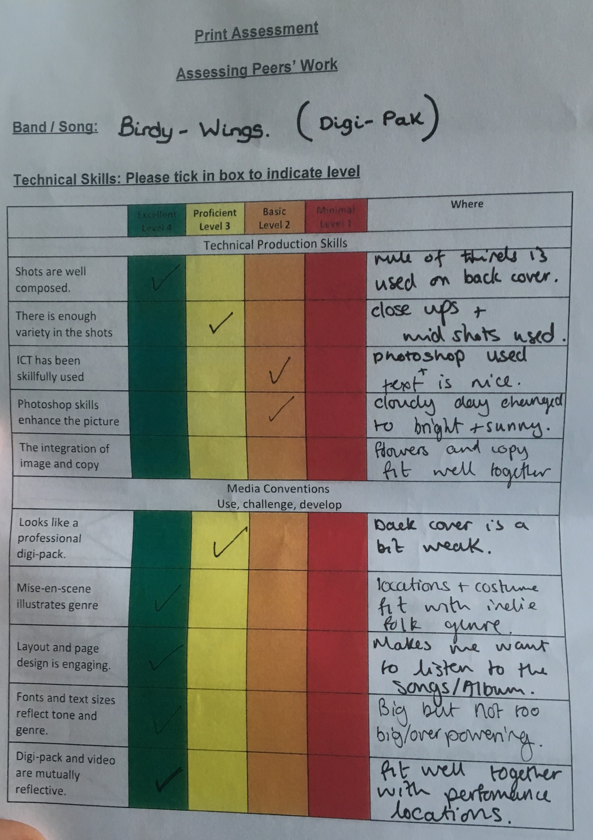
I got some feedback from a media student in my class on a feedback sheet. From this I learnt that we used rule of thirds correctly and our shots are well composted. Also the variety of mid shots and close up’s used which reflect our genre. Photoshop and ICT have been used from making the sky slightly brighter. Our use of mise-en-scene for the locations and costume fits in well with the Indie genre. The layout and design makes them want to listen to the album. The use of fonts are big and bold but not too overpowering and the digi-pak and video fit well together and reflect one another.
Advert.
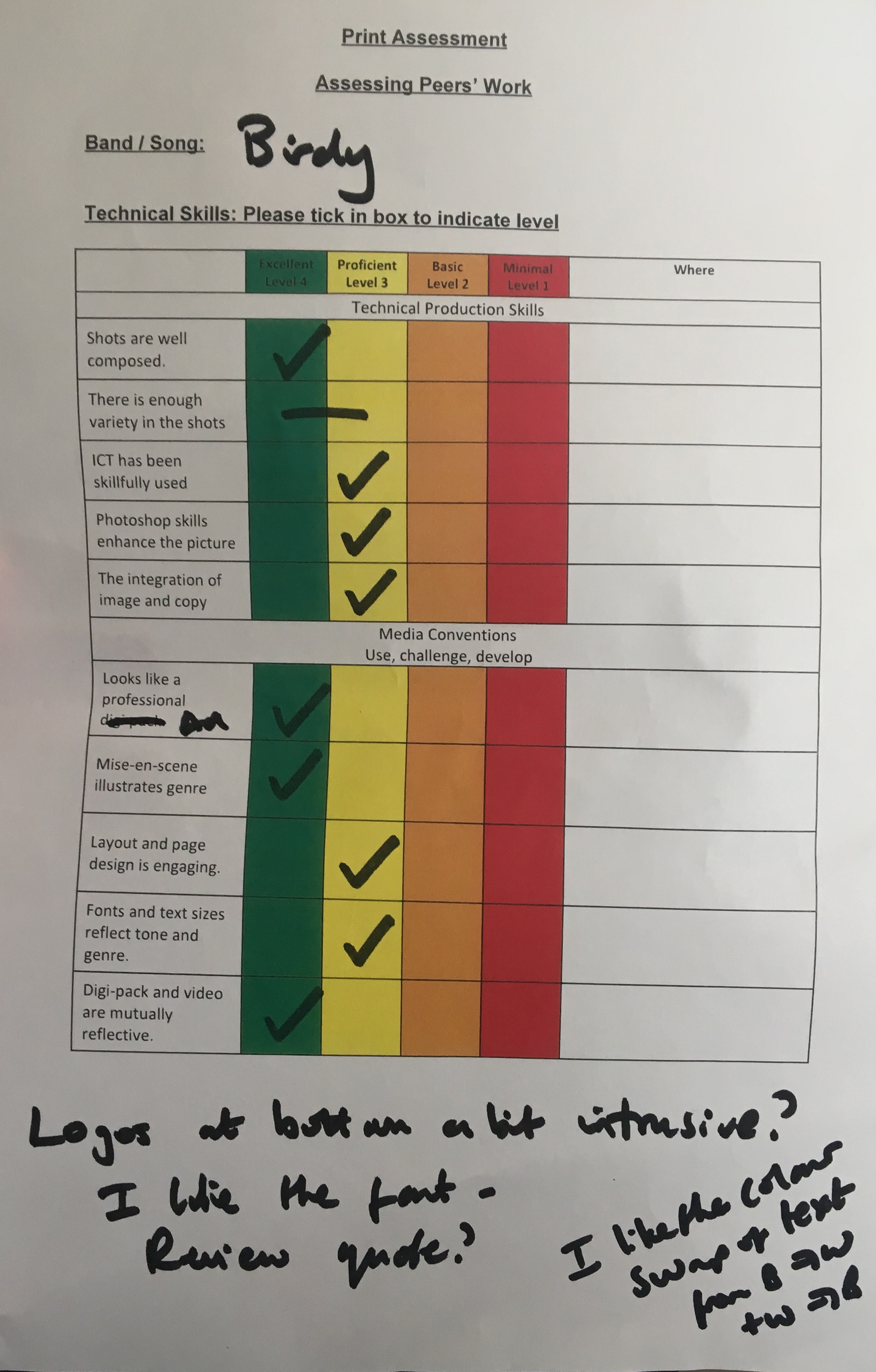
From the feedback sheet for my advert, we used good composed shots and it looks professional and reflects the digi-pak. Also, the mise-en-scene illustrates the genre. However we could make the logos a bit smaller because they’re a bit intrusive. However, the colour of the text and how it swaps from white to black and black to white is effective.