Category Archives: Component 3
Critical Reflection Prep
Social media page Draft 2
I made many amendments and utilised the feedback I collected to enhance my social media page in order to attract engagement from the audience. I believe it is appealing and intriguing for my audience. As well as it is successful in building a desire for the audience throughout the lead up to the album release. Overall I am extremely happy and pleased with the final page.

CLICK ON IMAGE FOR LINK TO PAGE
I have also created a slide show, in case the page gets taken down for any reason and showing you what it looks like on a phone to ensure all the posts are seen correctly, as the layout differs. Also it shows and explains all the different elements to the posts.
Social Media page Draft 1 self assessment
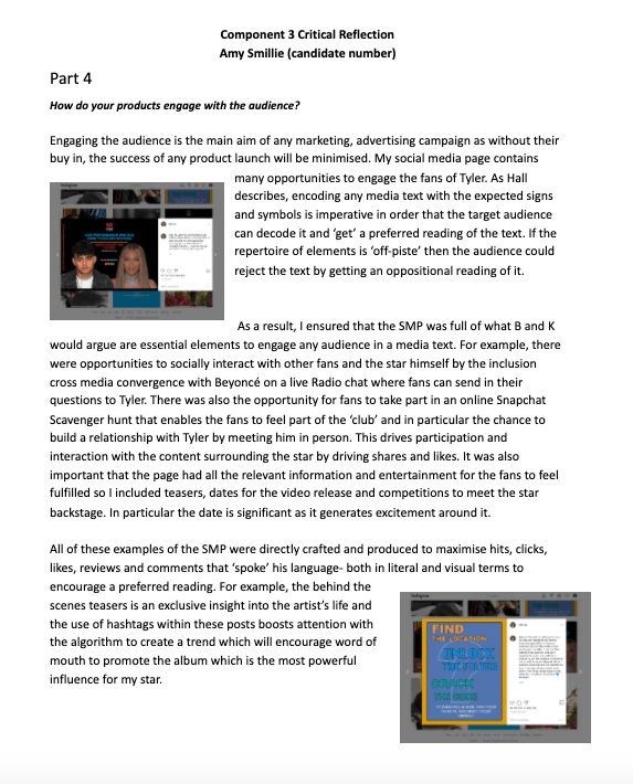
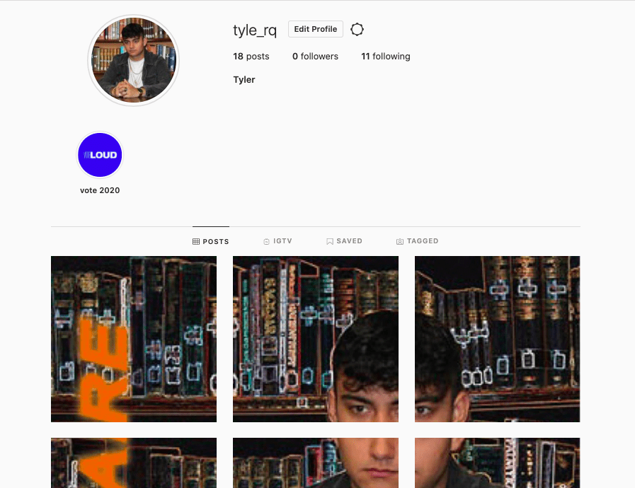
I created my Social Media page for my star ‘Tyler’ using Instagram. I have included teasers, candid images, advertisements and political content. I have created links with other brands and products that would appeal to the audience as I have used other platforms such as Snapchat for my campaign as well as airing the live performance and radio feature on Youtube and showing various tweets. Within my social media page I wanted to create a sense of building excitement leading towards the release date of the album, by including teasers and challenges for the audience. Beyonce was my chosen artist to feature my star with as she is an extremely well known, hard working artist who is ideal for any artist to collaborate with as she is an empowering role model to many people. There is a clear link to point of sale (iTunes, Spotify, Deezer YouTube) for the music as shown on my release posts. There is an insight into the ‘real’ life of the star and an opportunity to see them as an authentic person through my candid images. I have included many ways the audience can interact with the star for example through live chats and invitations to comment and ask questions to engage with the star and see his real personality. To make the digipack the main promotion of the way the audience can listen to the album by creating 9 posts, each including one section of the digipack to make the whole image when looking at the page. This creates a statement and draws attention to the digipack to ensure it is the main focus and people will see this and want to have their own copy instead of downloading one online. This is more beneficial for my star as he would make more money from this. There are many links to current political issues including the recent vote for the American president as this is close to the star’s heart and is a useful way of developing a compassionate and engaged star image.
CLICK ON IMAGE FOR LINK TO PAGE
Self Assessment:
So far I am extremely happy with my social media page but there is a few adjustments that I need to make. I believe that my page builds lots of suspense and engages the audience to see my preferred image of the star. This has allowed me to understand how social media can be used to drive engagement, promote the star image, and build a fan base.
Targets for improvement:
- I need to include appropriate link to my music video and use the repetition of the hashtag in all of the posts.
- Improve the quality of the 9 posts which make up the album cover as the individual images look very blurry and unprofessional for a huge star, from the application I used.
- Improve on the captions as some posts aren’t as engaging as others.
Teacher’s Screencastify:
Summary of comments:
- Good use of cross media promotion with Beyonce.
- Add the #onmymind to every post to engage with the audience as well as the necessary links where needed.
- Clever use of followers and emphasis on the vote 2020.
- Good use of GIF but add caption on male mental health and the benefits sports has on this.
- Loves use of participation posts allows the audience to really engage with the star.
- Correct the quality of the 9 images that link.
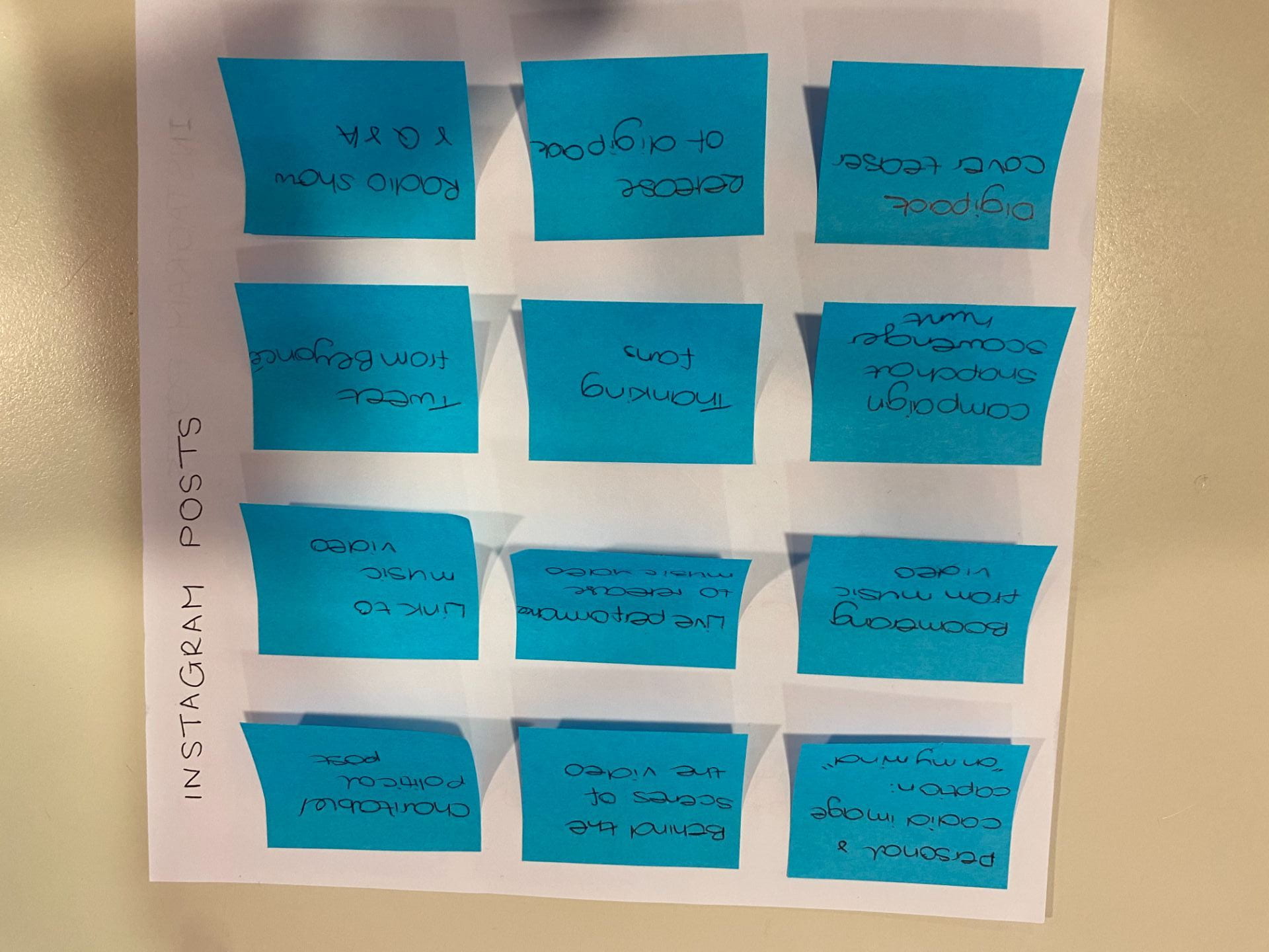
Timeline and Marketing ideas
I created a chronological timeline of what I will need to post and when for the Marketing campaign. By planning I have prepared myself and thought through the process and I now am ready to post on my social media page.

Audience interaction with a social media page – an analysis
In preparation to making my own social media page, I understand that it is really important to analyse and look into what other artist from the same genre do conventionally. I have analysed Khalids’s facebook page using AIDA, and Uses and Gratification. To present this I used screen castify to explain the different conventions and considered the key terms relating to my star image. This task enabled me to understand what is expected and conventional of both a social media page and the alternative R&B genre and has improved my knowledge for when I create my own social media page for my artist.
Social Media Page Terminology
To explore the terminology of the technical conventions of a social media page on Facebook I created an analysis of an artist similar to my own, it is extremely important to understand, apply and use in my work. For this I chose Khalid and took some screen shots from his Facebook page and annotated the screen shots with the key terms that I now know are important when talking about, designing and using a facebook page for promotion. Many of the terms are relevant for all social media platforms.
Digipak Draft 3
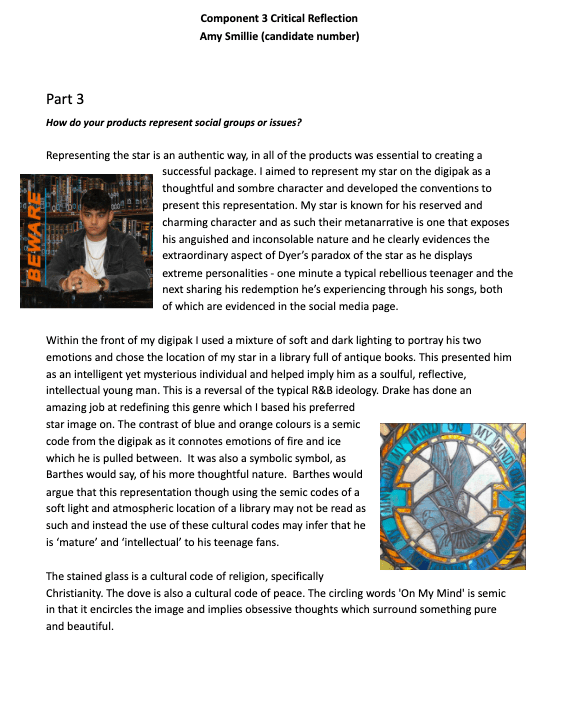
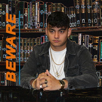
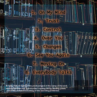
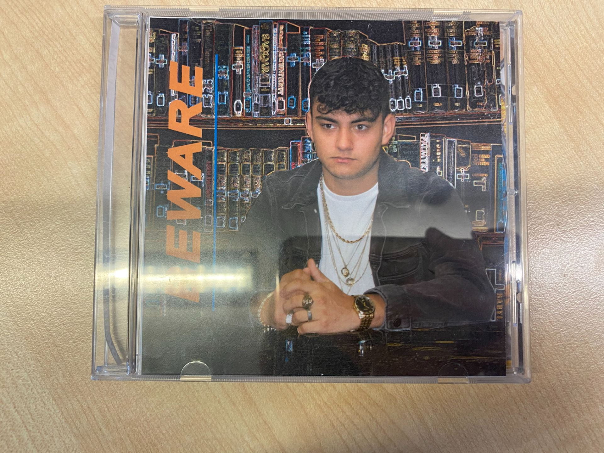
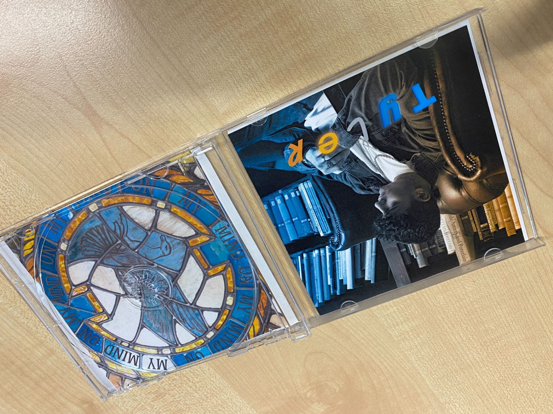
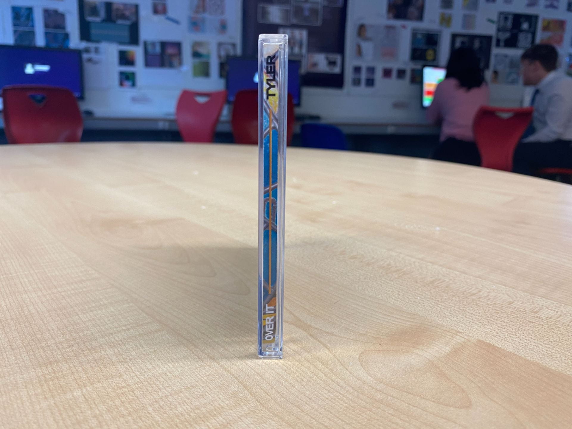
This is my final draft of my digipak and I am extremely pleased with the outcome as it portrays the key themes of anguish and anger that I wanted to display through the colours of blue and orange. This represents my preferred star image for the artist as he is conveyed as sombre yet compassionate.


![]()
Improvements from Draft 2:
- For the front page I decided to remove the border and use an image with the star facing towards the camera as this brings more engagement with the audience, but his face still remains serious and sombre which keeps the effect of mystery I had previously. Also I changed the fonts of the artist name to create a softer look from the bold album title, which also adds to the contrast of his different emotions. With this, I moved the artist’s name to the inside cover as he is already a well known, established artist.
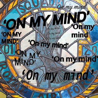
- The middle two pages have been switched around so that the circle affect in the stain glass window will fit with the circle of the disc. Also I removed the writing on the window using a clone tool and replaced with the quotes to create a more minimalistic look as the cover was too busy. I used an image of the star turning away from the camera and edited a dual lighting effect using the contrasting colours of orange and blue to convey the connotations of anger and sorrow he feels.
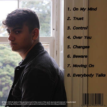
- For the tracklist I used an image of a bookcase and used the glow outline filter as used on the front as a background for the tracklist. This created a fluidity of glow through the pages linking to the front as the same effects were used. I changed the fonts to create more engagement with the audience as there is an element missing and added a glow for a pop of colour as the page looked dull and tedious. To also add some colour I used a blue box with a low opacity in order to make the tracklist stand out from the image behind, this contributed to the glow that is repeated throughout the album.

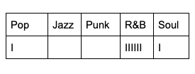
Below is a tally of results from when I showed my product to my friends and other students to gather their opinion on which genre they thought my digipak fell under. My genre for my album is R&B which was the category with the most votes. I was pleased with this as it represents how I have used the appropriate conventions for my genre and they have been received successfully to my audience.
Digipak Draft 2
Here is my draft 2 for my digipak, I am happy with the progress I am making with my digipak however there are many adjustments and improvements I want to make.


![]()
What’s different to Draft 1?
- Added a bright and distinct gradient colour to the image used on the front cover.
- Changed the typefaces into a more bold and unusual typeface.
- Experimented with the colours of the border and the typefaces to coordinate with the gradient on the image.
- Changed the images for the inside and back covers to experiment with new creative ideas for the digipak.
Teacher feedback:
- The border on the front page works effectively as it creates a frame within a frame.
- The colour theme of blue and orange are complimentary.
- Add different fonts for artist name and track list to make it softer.
- Switch pages two and three to link the stain glass image to the circle from the CD.
- Use less quotes and possibly use the quote instead of the writing on the actual image itself.
- The picture of the jewellery should have an element added to create more engagement with the audience.
From this feedback, I am going to make improvements to my digipak:
- For the front page I am going to experiment with lighter colours for the border to gain back the vibrant blue used in album title, and add stroke to the image of the artist to make it pop from the border. Also I will change the font of the artist name to create a softer look from the bold album title, which also adds to the contrast of his different emotions.
- The middle two pages will be switched around so that the circle affect in the stain glass window will fit with the circle of the disc. I will also use less fonts and maybe remove the writing on the window using a clone tool and replace with the quotes to create a more minimalistic look as it’s too busy. For the jewellery picture I will need to add an effect possibly a glow line affect to represent the feelings flowing through him. This will then lead onto the track list and both images will have a different colour to represent the orange and blue connotations of anger and sorrow.
- For the tracklist I will need to crop and remove the wall from the image and change the fonts to create more engagement with the audience as there is an element missing. This will include a glow of fluidity of glow through the page linking to the middle page.
Digipak Draft 1
I am happy with the result of my first draft of my digipak as I have included all of the typical components that are essential for me to include.


I assessed my first draft of my digipak using the assessment criteria to understand how it will be marked and if it contains the necessary elements to get a good grade.