(PDF won’t accept the font used for my masthead)
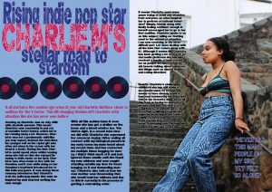
What I like about my double page spread:
- The font I’ve used in the title- this is my favourite design convention because it is unique and stands out. The floral pattern fits in with my indie theme.
- The vinyl’s- I like these because the name of my magazine is ‘Vinyl’ and vinyl’s are commonly used for indie music.
- The colour scheme- The colours I’ve used across the spread co-ordinate quite well and compliment each other.
What I need to improve:
- How I have spaced out the vinyl’s– they are unevenly spread out and it looks unprofessional.
- Change the font I’ve used in the bottom two paragraphs- the font I used isn’t supported by InDesign, so you can’t see simple things such as quotation marks. It is also hard to read.
- Check for spelling mistakes
- Add lines between the bottom two paragraph- it will look more professional and separate them completely
- Separate paragraphs